

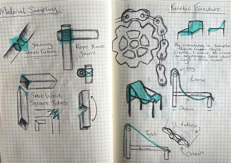
My initial idea at the end of UC1 was a chair made fully with metal with an adjustable seat using bike chains and cogs. I did initial sketches of it which you can see here and I also showed them in my UC1 portfolio. Here are the original sketches of my physical samples next to my plan for this unit, I hoped to create something similar however I knew it was ambitious with the skill set, and time I had.
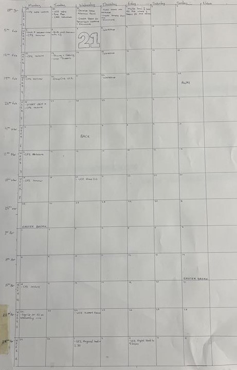
During week one we were set a handful of tasks to complete for the following week. We had to create a time plan for the rest of the semester, adding all the key dates including deadlines, critical analysis, holidays, etc.
I created this time plan on January 30th, right at the start of the unit. Completing this task was essential because it allowed me to visualise how much time I had for each project and when I would be working on both projects at once. This task had a big influence on my design development. I learnt after last semester to not be indecisive with design choices and ideas as I spent a lot of time last year working on things which later didn't contribute to my final piece and weren't relevant in my portfolio.
During the afternoon session after creating my time plan, I still was thinking about my initial design from UC1. I knew It was a chair I originally wanted to make and knew all my research from last semester was about chairs. However, I wasn't sure if I had the skill sets to execute this product within the time frame we were given. I spoke with Geoff and Rachel to get some advice as I was also considering creating a light fixture instead of a chair and I was thinking about moving away from my original ideas because of the complexity of my initial design.
Artist Research
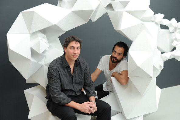
Aranda/Lasch
Aranda/Lasch is a design studio founded by architects Benjamin Aranda and Chris Lasch. The studio, established in 2003, operates at the intersection of architecture, art, and design. Benjamin Aranda and Chris Lasch are known for their innovative and experimental approach to design, incorporating computational processes, digital fabrication, and material exploration into their work.
Aranda/Lasch has gained recognition for a variety of projects that range from architectural installations and public art to furniture and product design. They often employ parametric design methods, which involve the use of algorithms and computer-generated models to create complex and highly detailed structures.
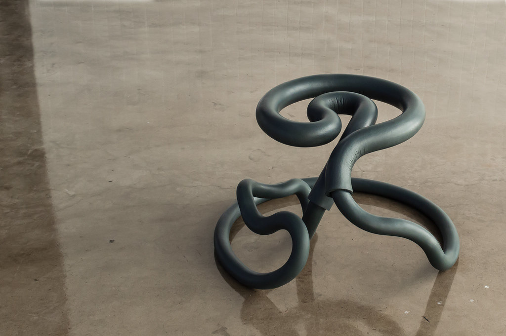
Railing Series
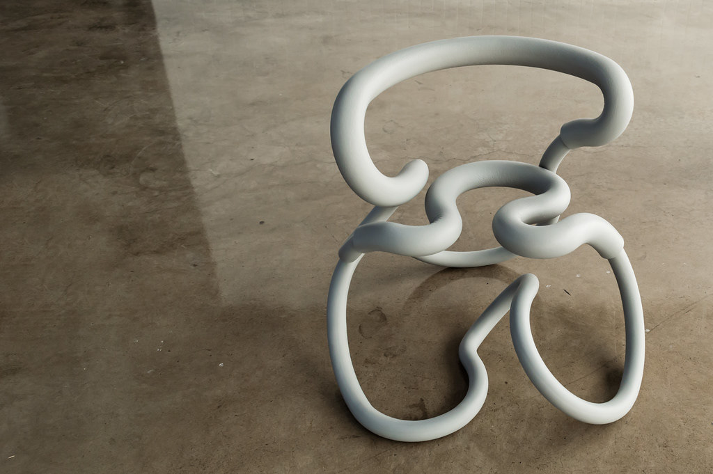
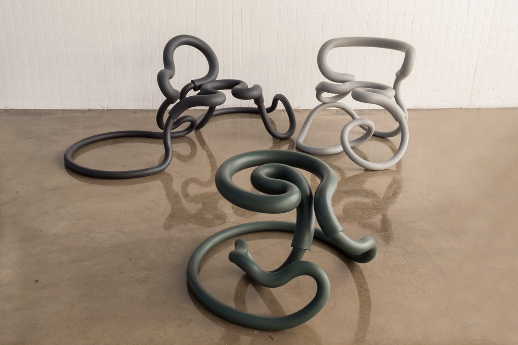
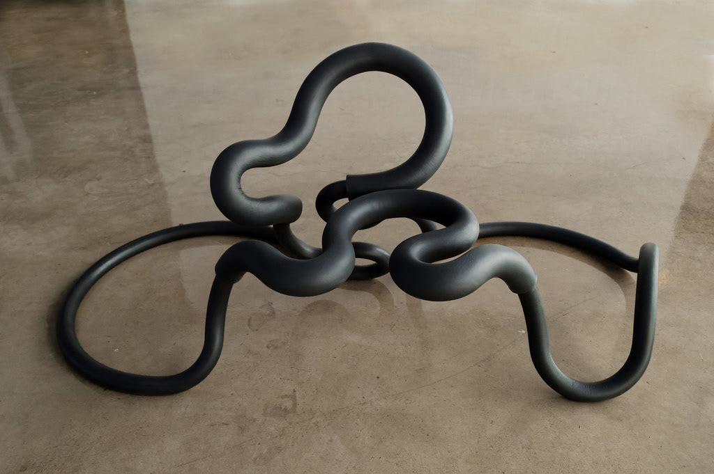
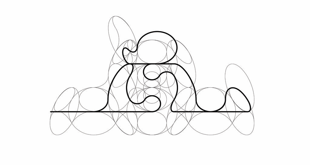
The 'Railing' collection represents a continuation of the exploration by studio founders Benjamin Aranda and Chris Lasch into modularity, employing a distinctive language of arcs. Each seating element is crafted from a singular loop formed by numerous circles. However, this isn't the conventional, infinite geometry we typically perceive; instead, the chairs and stool delve into the potential of a circle, not as a complete entity but as a form evolving into itself. The geometry conceived by Aranda/Lasch for the framework of the furniture challenges its own dimensions, seemingly striving for an endless quality.
Both the chairs ('R1' and 'R2') and the Railing stool ('R3') are constructed from a single line that winds its way through a lattice of fractal circles, eventually returning to itself to create a seamless loop. This arrangement enables the distinct pieces to be fashioned from the same set of modular stainless steel pipe arcs. The metal is enveloped by upholstery, forming a soft and comfortable seating space. This plush component is available in a variety of colors (off-white, black, green) and textures (foam and leather), reimagining the material language inspired by bicycle handlebar grips in a curvilinear dimension. The three objects showcased at Design Miami/ 2015 are displayed with both silicone foam and hand-sewn leather upholstery styles.
I Have chosen to look at this collection by these artists because of the similarity in their work to mine. These pieces will use similar materials and techniques to achieve the same function. Although my design may be considered simplistic in comparison to this collection I think looking at their work and seeing what materials they use, how the product becomes functional and what sort of price range they list this work for has become helpful in knowing where I stand in this industry and how much I would be looking to charge for my work.
Each piece in this collection sells for between $5,000 to$15,000 per item. Where they differ from me is that their work is made from stainless steel and silicone foam. These are more premium compared to the mild steel I've been using.

Marcel Breuer
Marcel Breuer is famous for his tubular steel furniture, yet his real interest was architecture. For our Bauhaus 100 series, marking 100 years of the influential school, we profile the Hungarian designer who championed a rational approach to design.
For many, Breuer is immediately connected to the Model B3, also known as the Wassily Chair. This iconic tubular steel chair, inspired by bicycle frames and made with the latest in steel-bending technology, was given its nickname when it was reproduced by Italian manufacturer Gavina.
Named after an anecdote whereby a curious Wassily Kandinsky, expressing interest in an early version of the chair in Breuer's studio, was one of the first recipients of a post-prototype model for his own office.
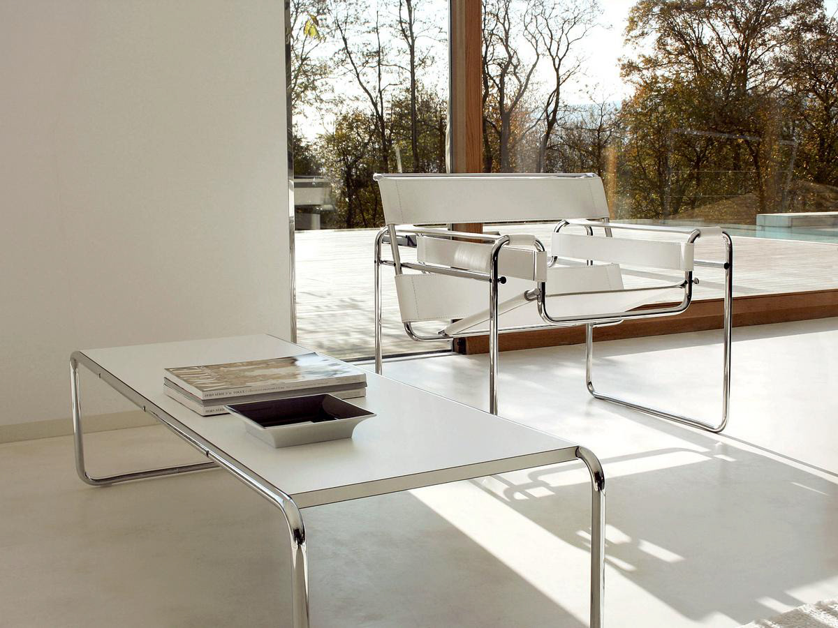
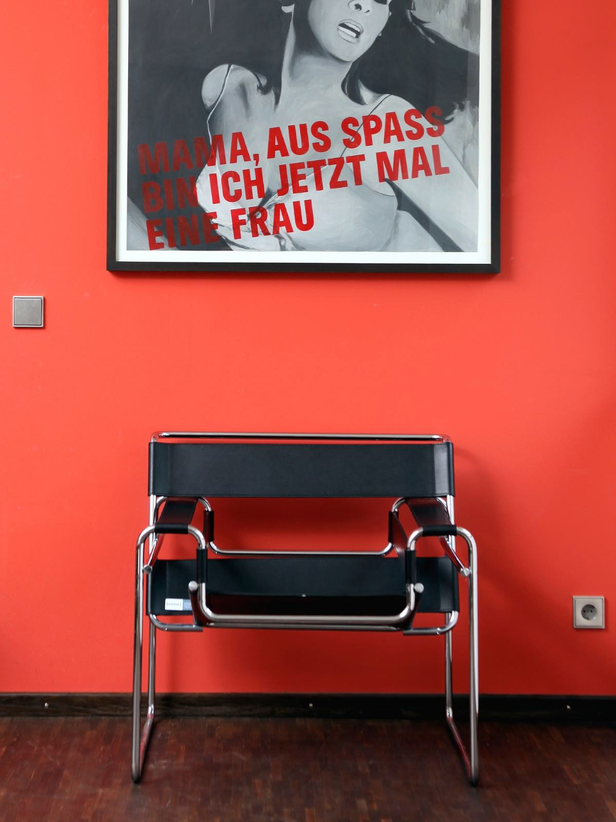
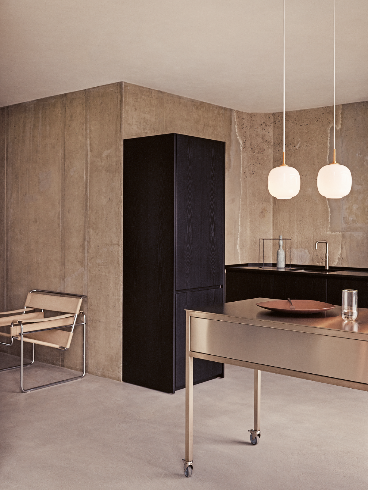

As shown on the smow.com website, they demonstrate straight how you can select different options and customise the chair to your needs. They also show a blueprint of the chair explaining the dimensions of the chair to the customers to make sure the customers have the right space for the piece.
I like this idea and plan to recreate and showcase ideas like this for my final piece. I want to have more variety of options to choose from. The frame of this chair is only sold as "highly polished chrome". I love the look of mirrored metal however when I was sampling finishes for my piece I fell in love with the satin finish. This was also influenced by my trip to Milan which confirmed my decision to go with this finish for my final outcome.
The options for fabric also are a big variable when purchasing these statement chairs.
I love this design however, I believe it's missing the modular aspect. I understand that this chair was made in the 1920s and that modular design wasn't what it is now. However with today's living situations around the world and design moving on so fast I believe its a big selling aspect that will be more heavily considered in the design world.
Product Research
MECCANO
Photos from MECCANO HOME
Meccano is a metal construction toy that allows users to build models using metal strips, plates, wheels, axles, and various nuts and bolts. It was invented by Frank Hornby, a British engineer, and was first patented in 1901. The name "Meccano" was later trademarked in 1907.
Meccano was at its peak popularity around the 1930's. There are so many reasons why this toy became the largest toy manufacturer in the UK during this time. Meccano sets were highly versatile, allowing users to create a wide variety of models, from simple structures to complex machines. The standardized parts could be assembled and disassembled, promoting creativity and experimentation. Not only was it versatile, but Meccano also had great educational value. It helped children and enthusiasts develop their engineering and problem-solving skills by encouraging them to understand mechanical principles and explore how different components worked together.
Meccano sets were made of durable materials, primarily metal, which made them long-lasting. The sturdy construction of the parts allowed for repeated use and ensured the longevity of the sets. It's iconic design was a huge selling point for this product, its distinctive metal strips, gears, and bolts gave the models a mechanical and industrial aesthetic. The design of the parts contributed to the unique appeal of Meccano and set it apart from other construction toys.
This product/toy has a worldwide influence with a devoted fanbase across many many countries. Due to changing times within the industry and toy preference it no longer holds its spot at the top as the biggest toy manufacturer. However, the brand and business still go on while keeping up to date with technology while keeping the brand's core values. Today, Meccano sets may include plastic components and incorporate electronic elements, but they continue to inspire creativity and engineering skills in builders of all ages.

Today, Meccano is still being used by children, students, and professionals. Over the years there have been many projects using Meccano's design to build life-sized bridges and furniture.
This project on the right is a bridge built in Bury, manchester. It was designed by artist Liam Curtin, on 20th October 2012 and later started construction in December of that year. It had a big opening ceremony in the spring of the next year (April 2013). It brought a playful modern look to the old style of industrial brick bridges. I believe it shows how the industry of engineering has been revolutionized with simple mechanical designs like this.
This space designed by Liam has become a top destination for dog walkers and engineering enthusiasts to collect inspiration and has a rich contrast between the old and the new. Not only has he built the bridge to cross the old canal but he has created two park benches to create a social space to sit and admire the structure.
This artwork commissioned by Little Lever, was a scaled-up version of Meccano's design. each piece was precisely cut to a large scale but making sure all measurements were equally scaled up. It is made from galvanized mild steel making this artwork fully functional and resistant to manchesters rainy climates.


Liam is not the only person whose dream was to build functional art with this childhood toy. James May, a famous engineering enthusiast and car journalist most well known for his work on Top Gear, also dreamed of pushing the limits to his favourite childhood toy. He embarked on a project based in Liverpool as part of his 'Toy Stories' series showcased on BBC2. Similar to Liam, James designed and engineered a bridge with this product, the difference between their designs was that James you the original-sized pieces making it more difficult to add structure for a long platform.
May walked across the 23 m long bridge constructed entirely from traditional Meccano. Although he was harnessed this still was a big accomplishment for himself and the product. I believe this was a tribute to the home of the product the "Factory of Dreams" which closed in 1979 with over 70 years of production. It was a triumph on the product's native soil.
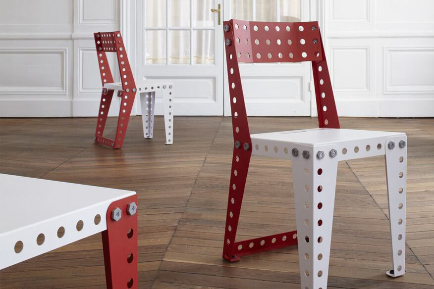
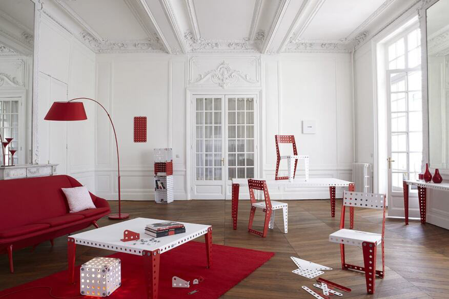
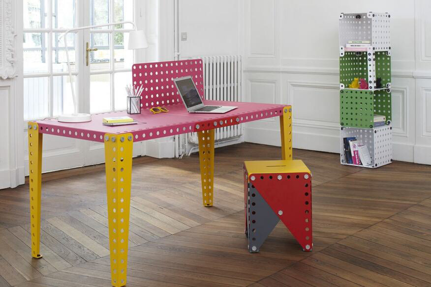
MECCANO HOME
Meccano Home is comprised of 20 modules which can be assembled to create a vast range of furniture pieces. Just like the original games, Meccano Home meets specific perforation standards that are compatible with Meccano’s familiar nut and screw system. This hardware sees the leg of a chair also being used for supporting a coffee table, or a stool. It is the nut, that was designed and built by the Meccano Home team which is at the centre of the modular concept, allowing simplified assembly and dismantling of pieces without any damage. This hardware is available in eight different colours, interchangeable with metal modules — all of which are treated and finished with the same paint used for outdoor furniture, ensuring resistance and durability.

Summary:
The reason this product is so relevant to my work is because of the creative freedom it gives consumers. From researching this brand I have learnt that the versatility of such a toy has such a big market and has a target audience of children, students and professionals of all ages. I want my customers to be a part of the making process, just as seen with Meccano's audience.
This toy was primarily aimed at boys and men due to the job role stereotypes seen in history. With my idea and the current times, I believe this could change and not have a limited audience with both men and women having an equal interest in interior design and home living.
I remember playing with Meccano as a child and loving the freedom it allows you to have whilst also giving you direction, ideas, and inspiration. I also can say whilst sampling my ideas in the workshop and playing around with components, I got the same feeling I had when I was a child, sitting on my floor, thinking about what I could create.
. I think my work demonstrates interactive art. I want my consumers to feel like they are a part of the making process and that's exactly what Meccano does. You may get a set with certain instructions to build their design but nothing is stopping you from scrapping the instructions and having complete creative freedom with this amazing product. Their components also allow you to connect sets in any way you can imagine. Their metal pieces show that the product is long-lasting and involves precise design and craftsmanship.
LEGO
Lego is a globally renowned construction toy system that consists of interlocking plastic bricks, gears, mini-figures, and various other elements. The name "Lego" is derived from the Danish word "leg godt," meaning "play well." Lego sets are designed to be versatile, encouraging users to use their creativity and imagination to build an endless array of structures, vehicles, and scenes.
The core component of Lego is the plastic brick, which is characterized by a unique interlocking design that allows it to connect firmly with other bricks. The versatility of this design enables users to create intricate and detailed models by combining various shapes, sizes, and colours of bricks. Lego sets come with instructions for specific models, but the open-ended nature of the bricks encourages users to explore their ideas and designs.
In addition to basic bricks, Lego sets often include specialised pieces such as wheels, windows, doors, and minifigures – small, articulated figures with distinct features. These elements contribute to the diversity and realism of the creations built with Lego.
Lego sets span a wide range of themes, from cityscapes and vehicles to fantasy worlds and licensed properties like Star Wars, Harry Potter, and Marvel. This broad appeal caters to a diverse audience, including children, teenagers, and adults. The company has also embraced digital technologies, offering digital building experiences, robotics kits (such as Lego Mindstorms), and video games.
Lego is not merely a toy; it is also recognized for its educational value. Building with Lego promotes skills such as spatial awareness, problem-solving, creativity, and fine motor skills. The modular and interchangeable nature of the bricks allows users to experiment and learn through hands-on construction.
Over the years, Lego has evolved beyond its original plastic brick sets, introducing various product lines, collaborative partnerships, and even theme parks dedicated to the Lego experience. The enduring popularity of Lego can be attributed to its commitment to quality, innovation, and the timeless appeal of creative play.
Lego has been seen taken into bigger projects, usually by Lego's master builders (the Lego team) for projects they hold at Lego Land etc. However it has been seen used by artists filling holes in walls and creating hidden miniature spaces which would usually be plastered over or left to decay.
Milan Research
Whilst on my trip to Milan, I made it my aim to use the time to collect research which would impact my design and craft. Although i wasn't visiting Milan during the design week I found all sorts of amazing inspiration which definitely impacted my design choices.
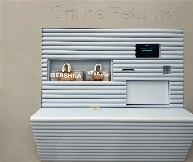
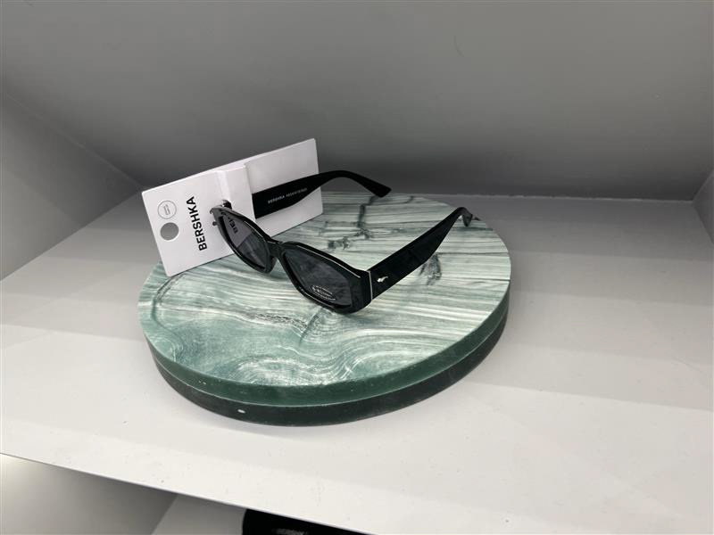
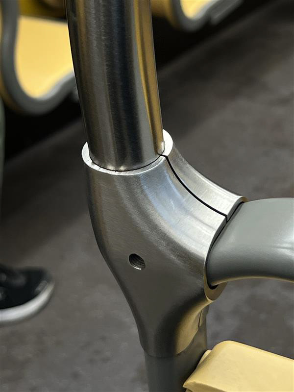
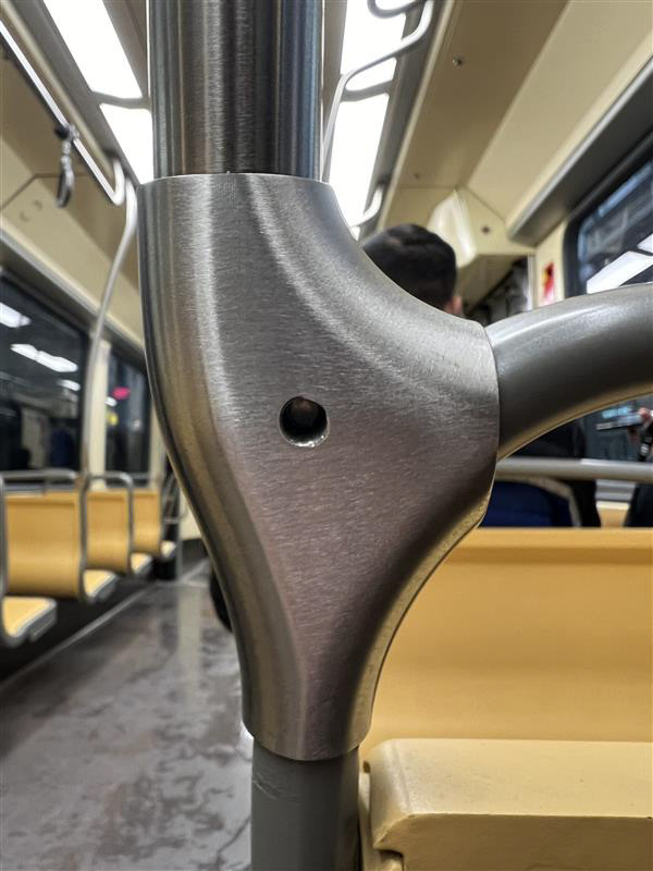
I was imediatley captured by the architecture throughout the city and the interior design of most of the shops was overwhelming. The images below are from the Bershka shop on the high street not far from Duomo. From the layout to the materiality of this interior was amazing. This really swayed my decision on finishing my piece as there was so much satin, brushed steel. I was origionally planning to polish the steel to the best shine I could however I found more interest in the texture and reflection of this brushed steel.
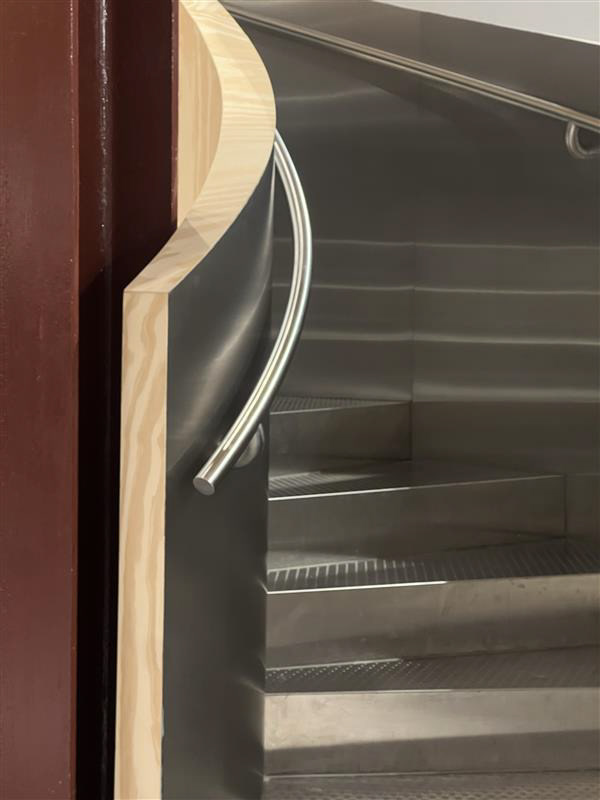
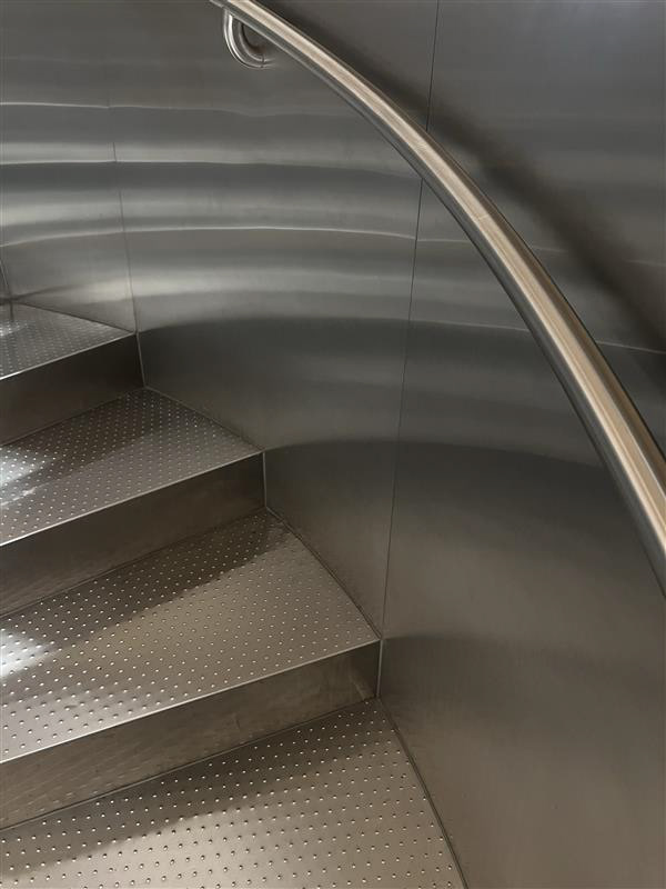
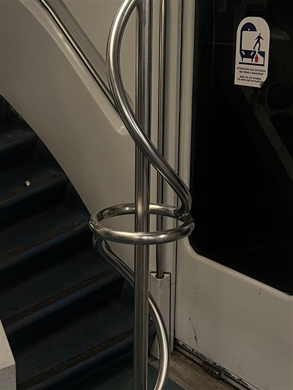
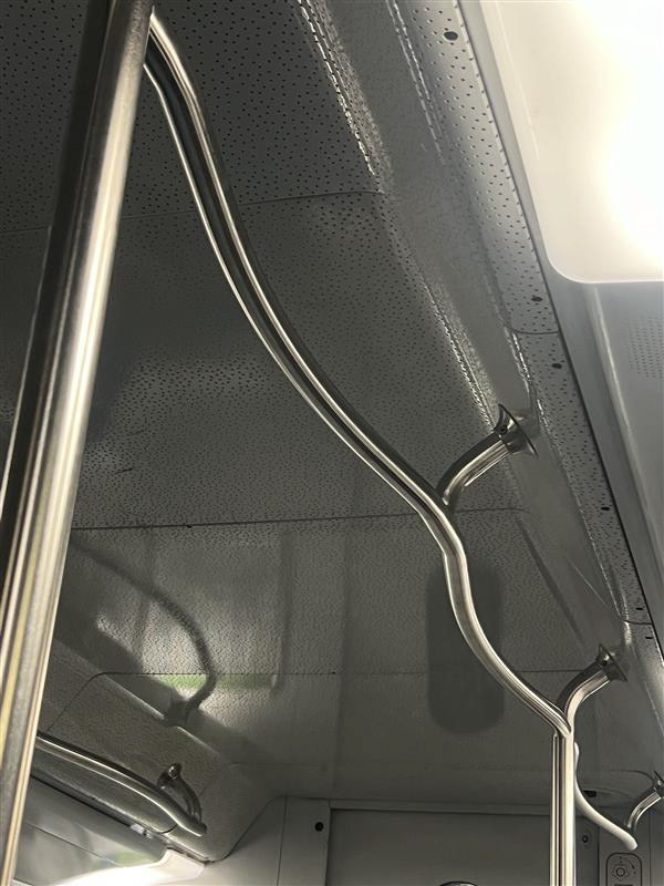
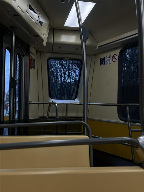
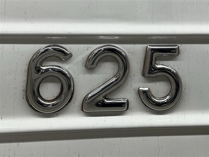
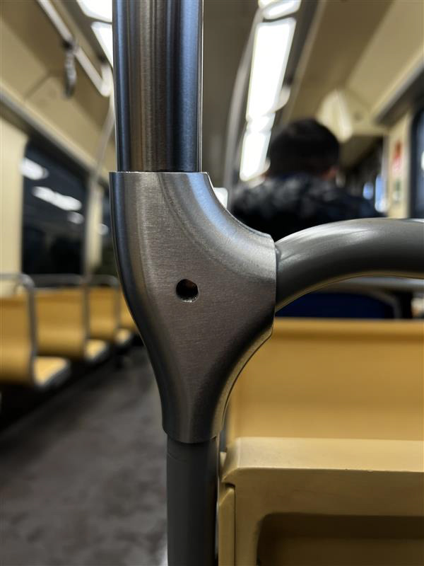
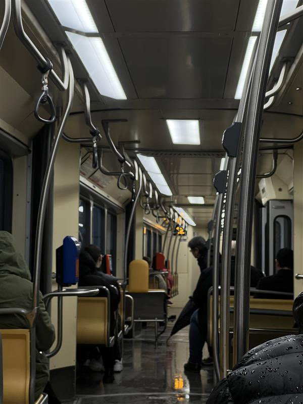
There were so many interesting design elements even on the subway. I was interested in the different forms and shapes I have seen on handrails and the different finishes of metals in certain aspects. The chrome polished (625) was the carriage name or number and stood out as a point of interest. I liked the way the polished metal caught my eye and now wasn't fully sure which finish I preferred!
Interior Trends
Trends are forever changing within design across all practices. There are all sorts of things that influence the evolution of design trends such as Technological Advancements, Art and Fashion Movements, Historical Revival, and even Media and communication. All trends tend to have a lifespan and some people have theories that trends will come back around every 10-20 years. The reasoning behind looking at these interior trends is to apply design elements to attract the target audience. It will also be important to reflect back on when taking the context photos of my outcome.
What is a trend?
A trend refers to a general direction or pattern of change over time, indicating a popular or prevailing tendency in a particular domain. In the context of design, fashion, culture, or other creative fields, a trend represents a collective shift in preferences, styles, or behaviours that gain widespread acceptance within a given period. Trends can emerge in various areas, such as fashion, technology, design, lifestyle, and consumer preferences, reflecting the evolving tastes and interests of a society or a specific community.

Before I start looking at trends for all interiors I need to narrow down the place function and location of which my chair will fit. Since starting this project I have overly considered whereabouts this chair would go or who it would go to. After my trip to Milan and after spending lots of time in different fashion retailers from vintage thrift shops to new luxury designer shops I thought a statement chair in these surroundings would look perfect.
END. is a specific shop interior which has inspired me. It hosts a range of high-end designer clothes alongside top streetwear brands. It has always been one of my favourite shops primarily due to its design.
It's almost a brutalist style using lots of grey tones like concrete, marble, and brushed steel with touches of light wood and the use of botanicals to add life to such a clean aesthetic. This allows the main focus to be on the products they sell. These products add a touch of colour and stand out in the shop. The design and layout of the shop almost mimics an art gallery's display with podiums for sculpture products or any other artworks.
So how will I use this information?
For my product, I need to consider two finishes for each component. The first is the components the frame of the chair which is made with mild steel to keep costs low in comparison to using materials like stainless steel, I also like the urban industrial look of mild steel however nice the polished chrome look you can achieve with stainless steel.
I sampled a few finishes which you can achieve on this steel which is spoken more about on my making page. Choosing from these finishes proved hard because there are outcomes I prefer and outcomes more consistent. I like the raw textures the tubes show. I quite like the idea of the welding line showing up in jagarded patterens which changes depending on the angle in which you see the chair. I also like the satin wire brush finish which I was alot of in milan.
As I liked the industrial look I did not want anything too clean and polished and if I were choosing to achieve a finish like this I would opt for stainless steel to make life easier without using chrome mirrored spray paint which takes away the feel of cold raw metal.
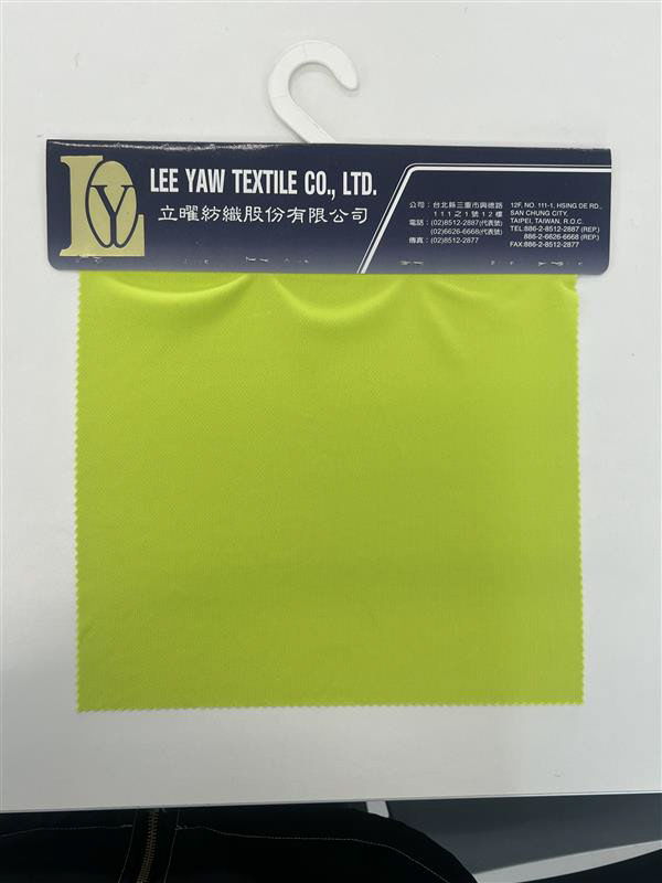
Colours to pair with mild steel are endless as it's such an easy colour to create pallets, mainly because I don't think the steel will be the predominant colour you will see when laying eyes on my chair. The fabric of the seat will have the bigger surface area, so makes more sense to use that for the predominant colour in the pallet.


These are the muted tones I am drawn towards however I also would quite like to look at more vibrant colours as these could look very dull in certain lighting. I also didn't want to dictate this aspect of my design, I wanted people to be able to freely choose the colour they wanted. If someone had a light room and wanted to add dark elements they could add a darker colour fabric to contrast and stand out in the room.
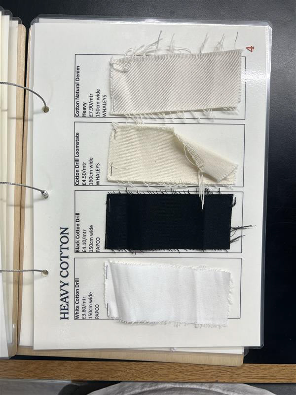
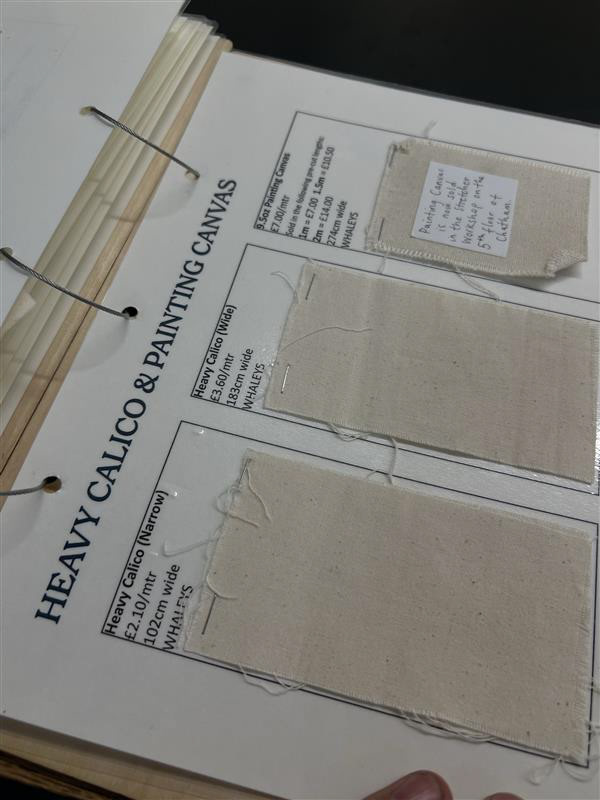
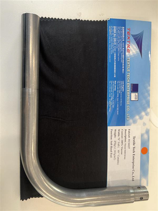
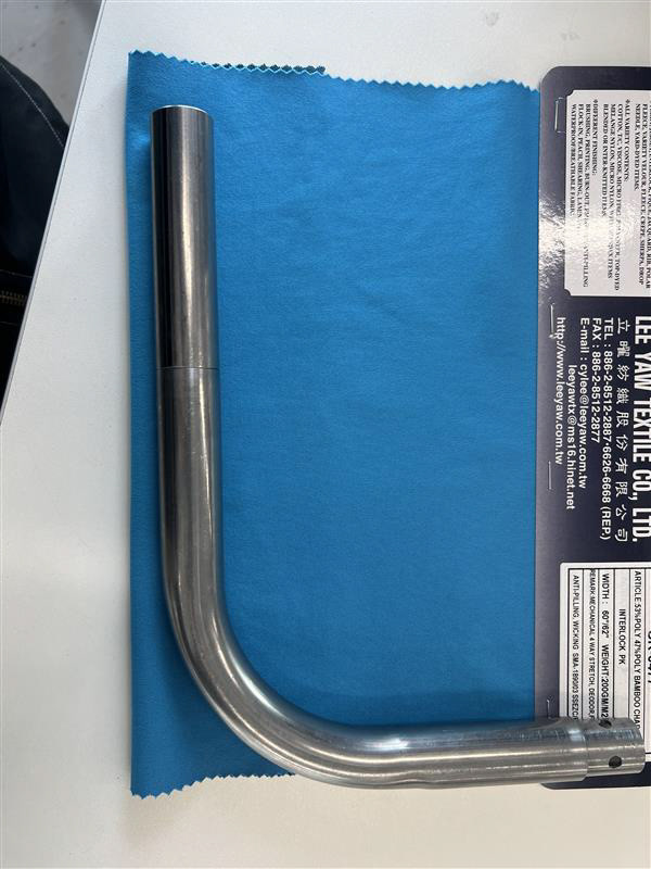
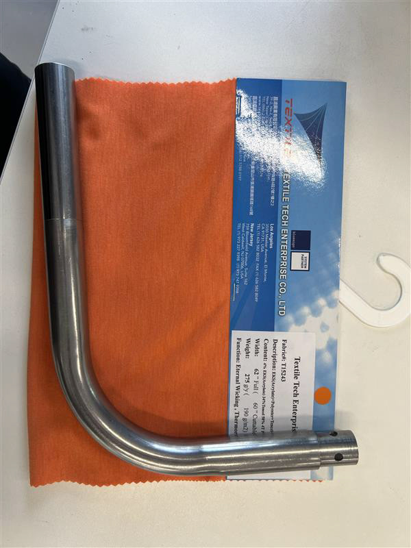
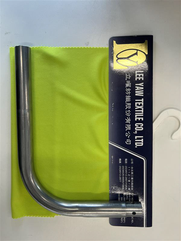
Fabric
The research around fabrics for my seat leads from the previous research on interior trends. I want my design to be simplistic and industrial. I like the combination of steel and concrete and as I have a steel frame and would photograph it against concrete backdrops I needed a fabric to compliment these factors.
Alongside the fabric matching my preferred aesthetic, the more important factor of this research is finding fabrics that were strong enough to hold enough weight which exceeds the the average weight of a man (85kg). Ideally, I'd like to have a fabric strong enough so I didn't have to worry about a weight limit and would hold 4 times that weight but I needed to see which was the best sort of material to fit this niche.
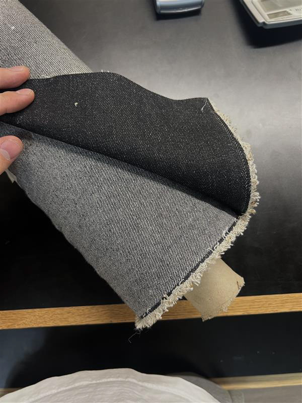
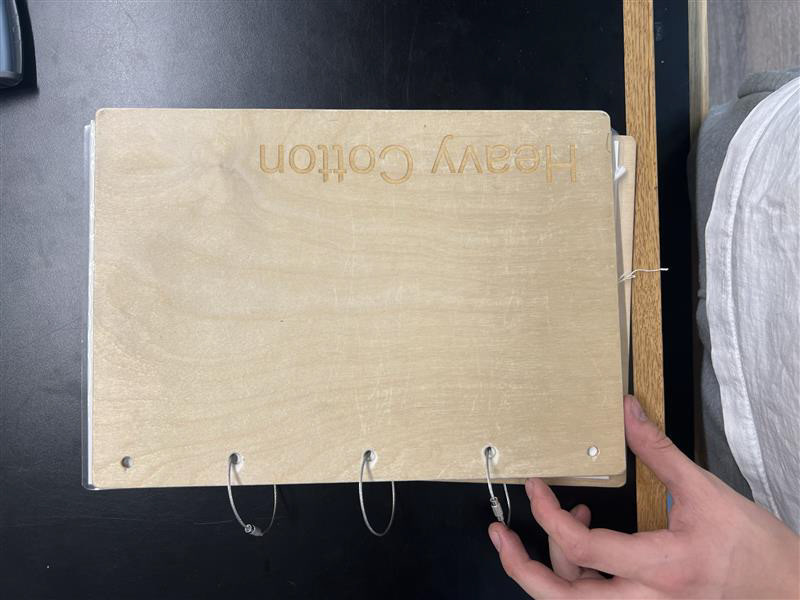
I started by speaking to peers, friends and technicians who have more of an idea of what fabrics would be best for what I want. I got alot of feedback and the fabric which was mentioned the most was calico, specifically heavy calico. This was also available at the make more store.
I also did my own research before just taking the advice straight away. I found that synthetic fabrics can be stronger however some natural fibre fabrics hold more than enough strength for what I need them for. I found silk was the strongest natural fibre, however, I know this is one of the more expensive fabrics and usually it is quite a thin material.
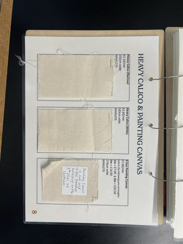
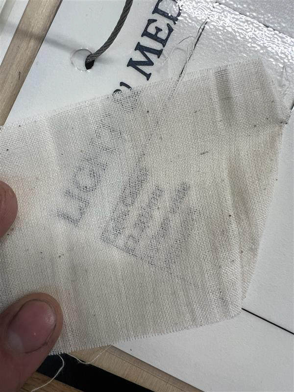
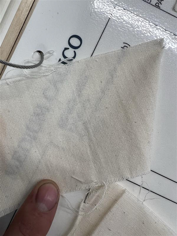
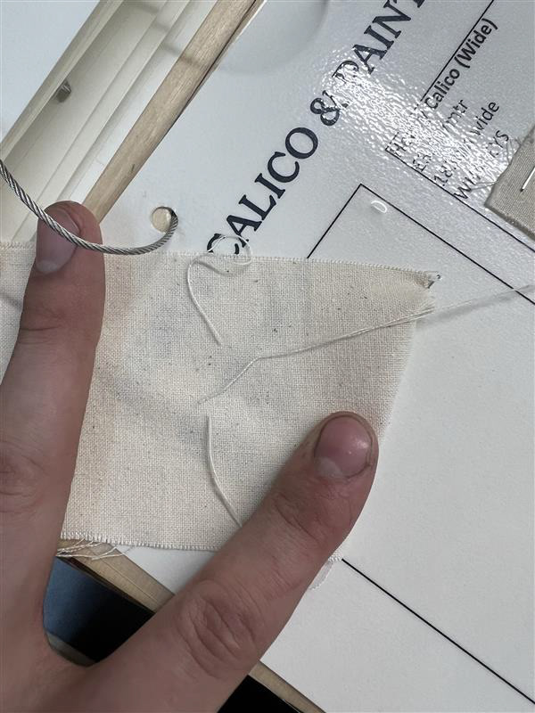
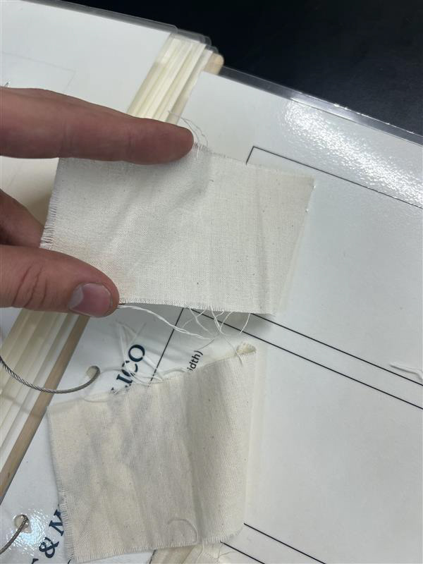
In these images above you can see how I was testing and visualising the thickness of the calico, I was holding it taught against the laminated sheet it was stuck to, to see if I could read the text through then fabric.
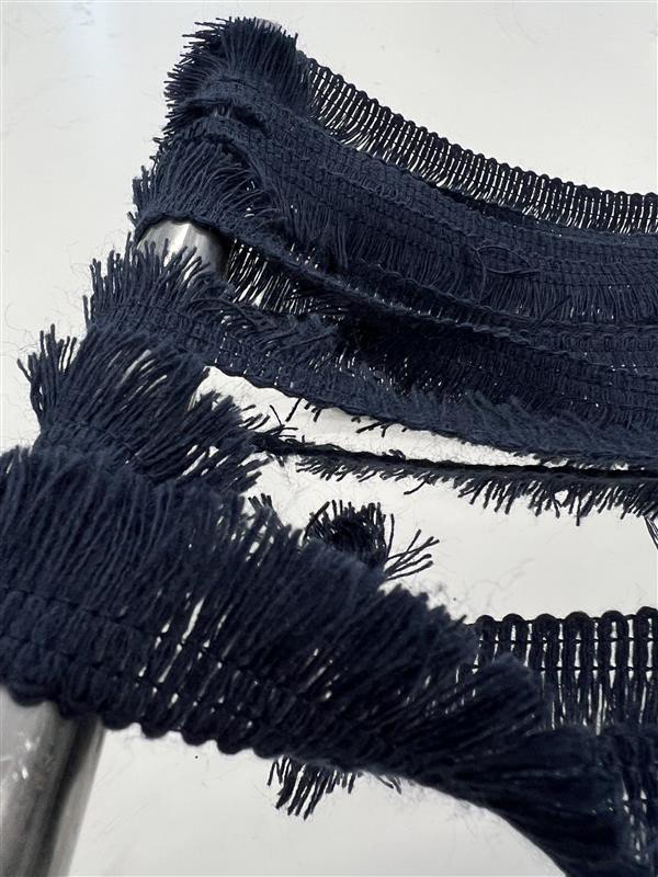
I then started the process of testing how slack I wanted the fabric to sit. As there wouldn't be tension in the fabric, I needed to measure how much fabric I needed by deciding how low I wanted my bum to sit. This made a bit more sense once I had done the size and scale research. I made some sample seats with some scraps, the first one I used duct tape to make a seat. Unfortunately and unsurprisingly this broke pretty quickly and I didn't manage to document this. I then tried some scrap frilly fabric I found in the bins of the Make More store which also had alot of fabric swatches which I used here for colour references.
At this point, I was also starting to put together the different forms of my chair. I was so surprised on how flexible and versatile this design was and I knew the frame would provide so many different functions which also made me think about what else I could use for the main surface to allow it to fit around all the different forms I now knew I could make.
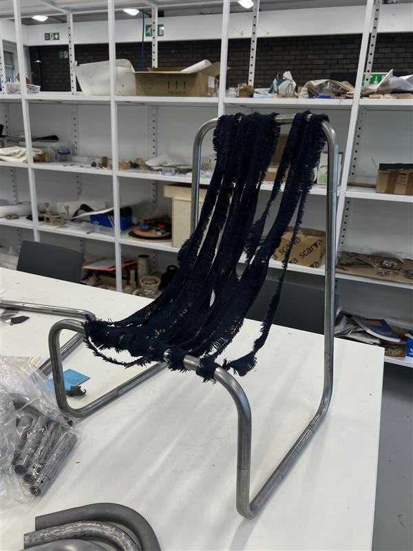
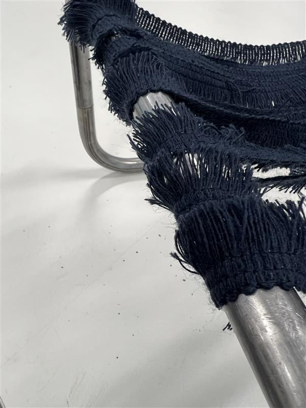
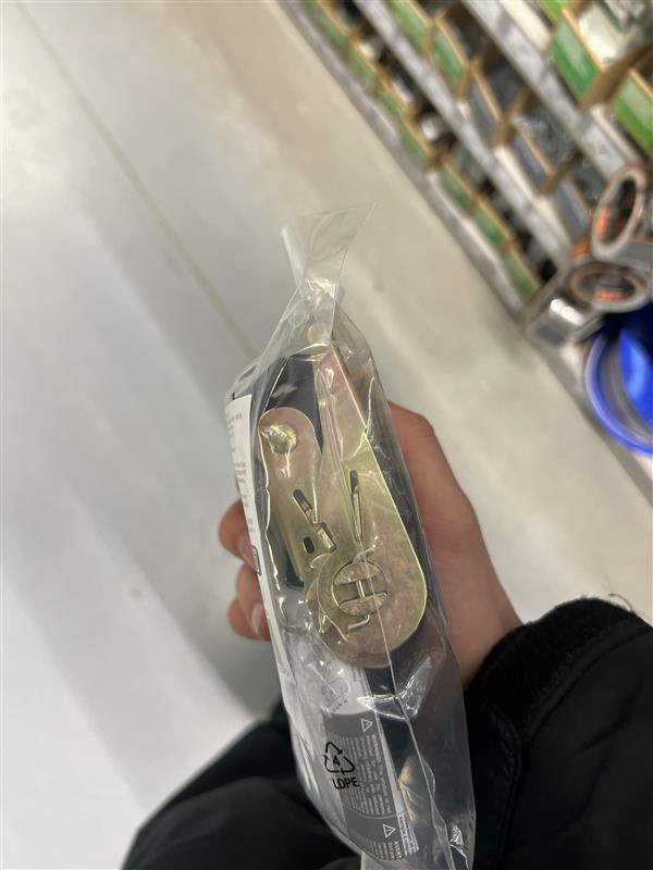
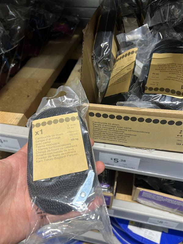
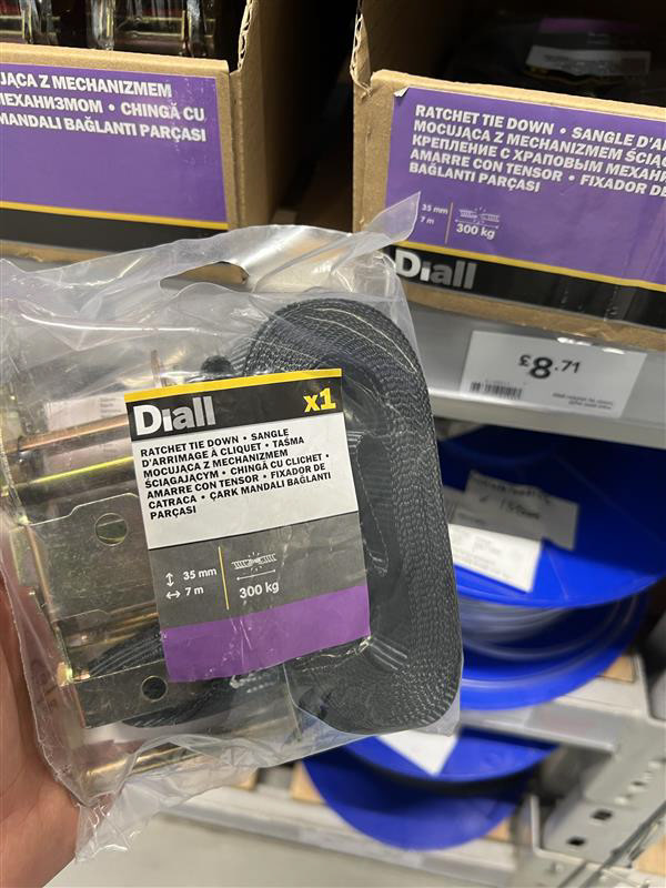
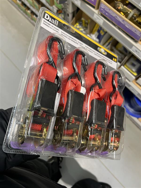
After sampling this lacey fabric I thought of the idea to use ratchet straps, I found that strips of fabrics like that can work for the seat and aren't uncomfortable if you have enough of them pushed together. I also immediately knew that these ratchet straps would allow my design to be completely flexible.
I had a look in shops as I wanted to see the colours, lengths, prices, and strengths of different straps. I found that they were very expensive but I really liked the idea so found some cheaper ones online. They also were strong enough to hold the required weight
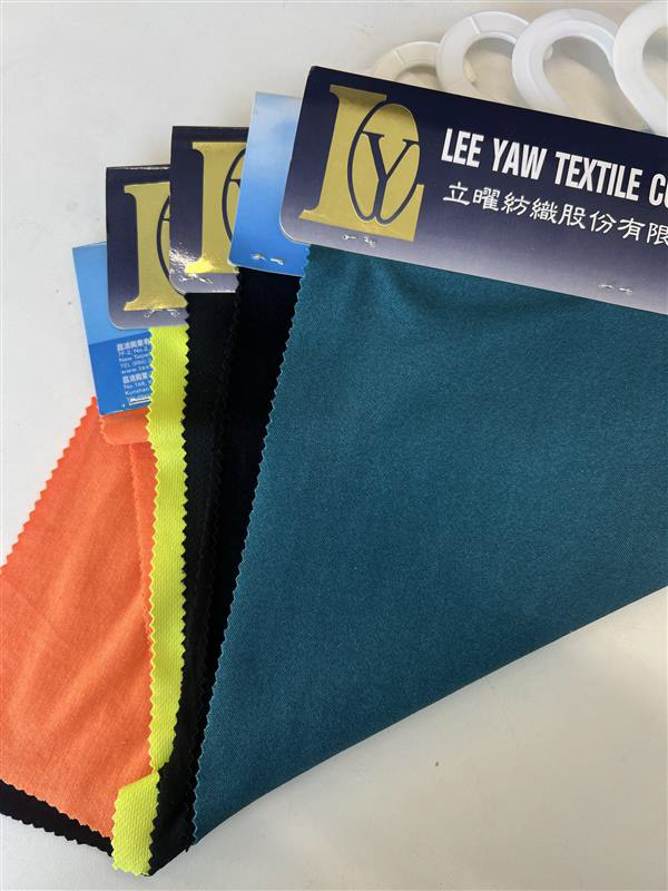
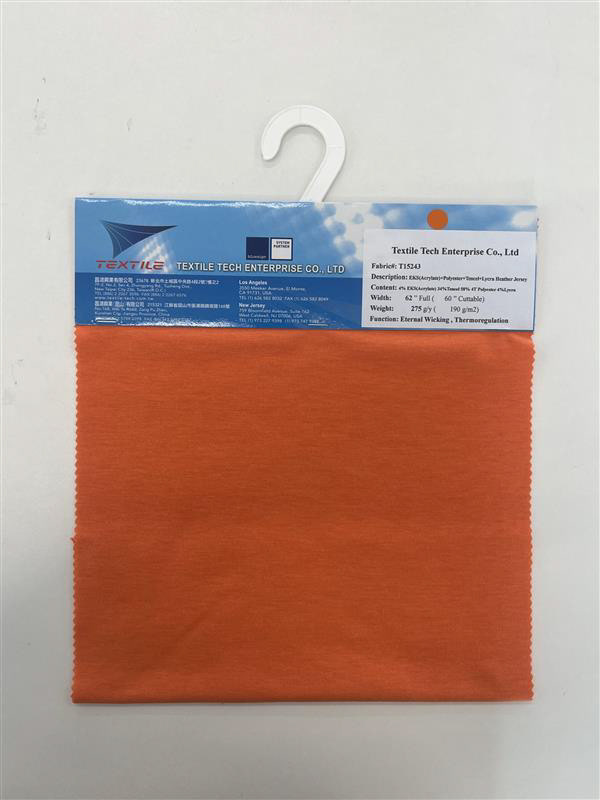
After using the fabric swatches earlier, I already had an idea of what colours I liked and didn't like. I really liked the orange as it is one of my favourite colours, and in branding and marketing, it is the colour that represents creativity which is also a big aspect I wanted to show in my design. I decided to order some rachet straps to try the idea and as I found a good deal I brought 8 straps which I knew would be more than enough.
Size & Scale
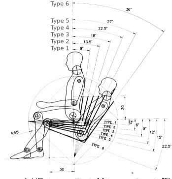
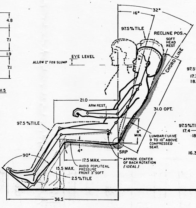
In the early stages of designing and sampling my idea, I was told to consider anthropology and the human anatomy as it plays a big role in designing chairs and other seating. I looked into different reclining positions that you can see in the diagrams below, this is so I could make important decisions on how big to make the overall frame.
As a big aspect of my design is modularity changing the posture of whoever sits in my seat was always a consideration. I did inital designs showcasing this idea for UC1 which demonstrated a changing the tension of the seat using cogs and bike chains.
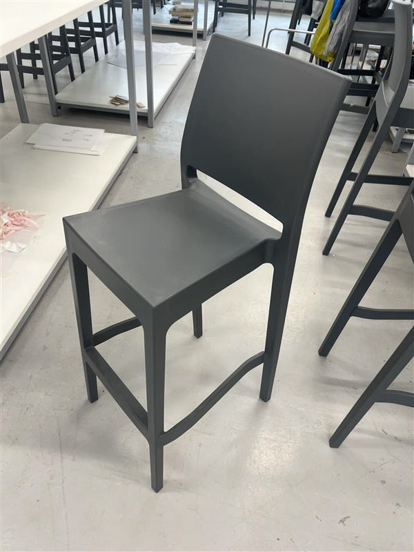
As this whole design is based around my style and interests I thought of no way better than to design it to fit me. I first tried to gauge how high I wanted the chair to be off the ground. When I've looked at the shapes and different scales of other chairs I've shown interest in low and wide chairs.
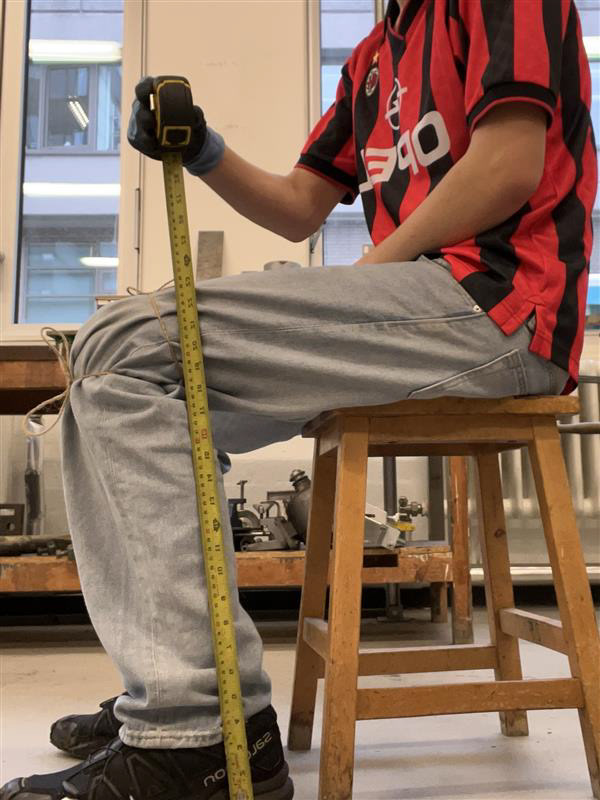
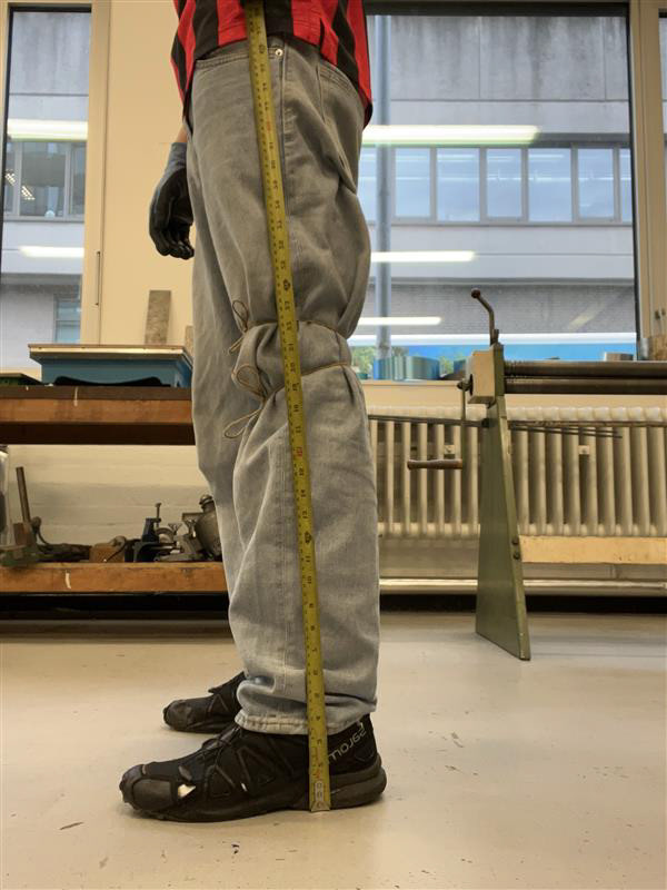
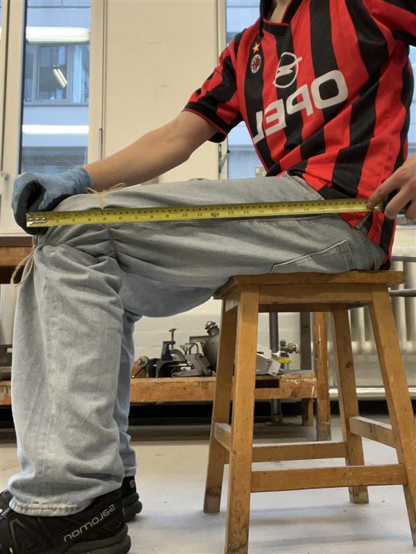
In this exercise, I tied 2 pieces of string around my knee, one over the top, and the other one below. I did this to see the space on the back of my knee, I thought this may help however I soon realised that that space closes when you sit down.
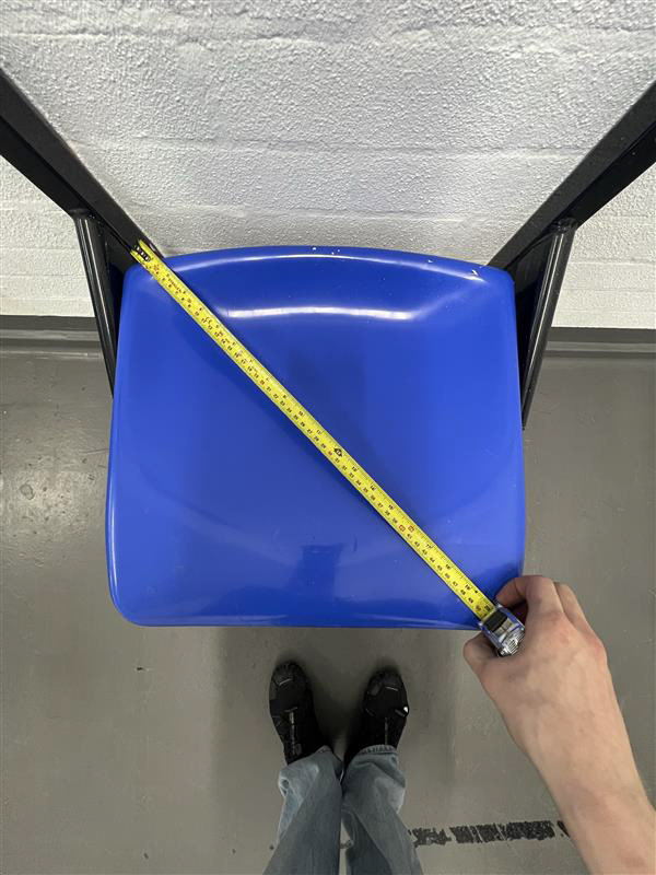
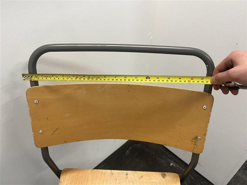
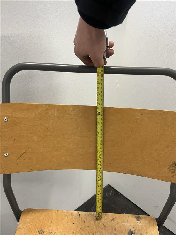
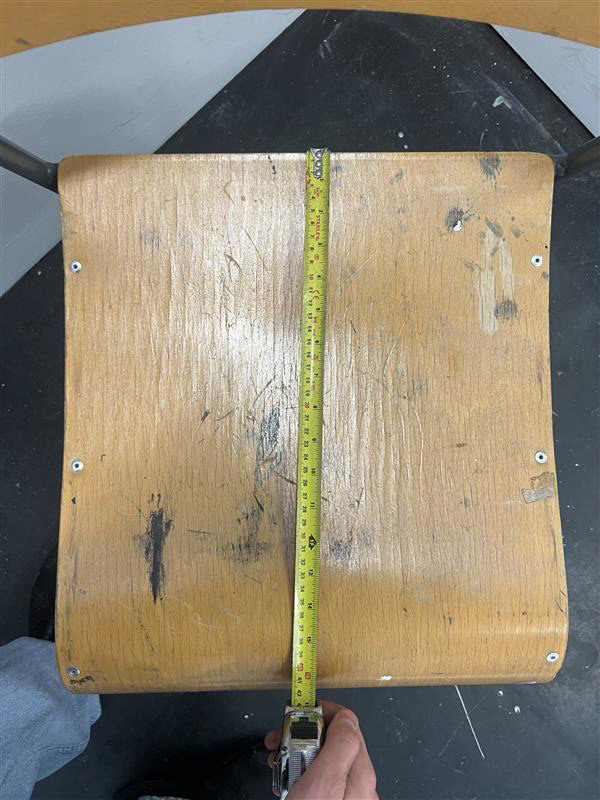
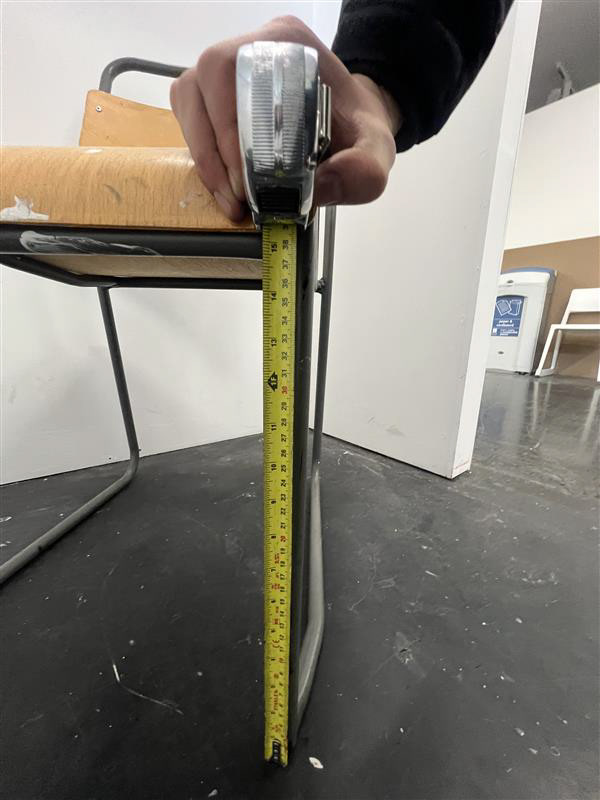
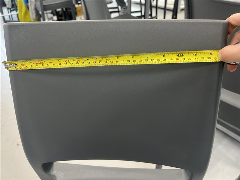
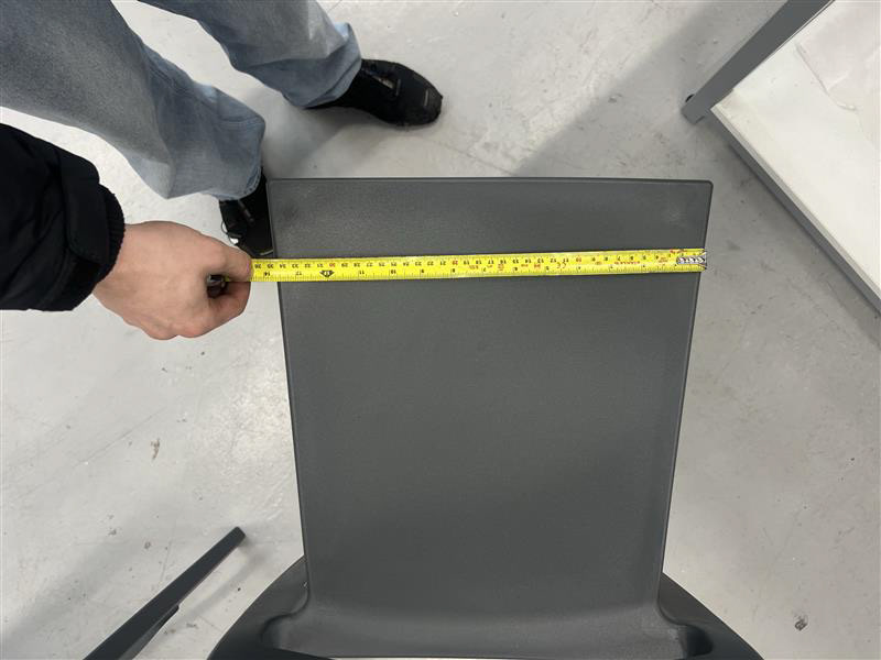
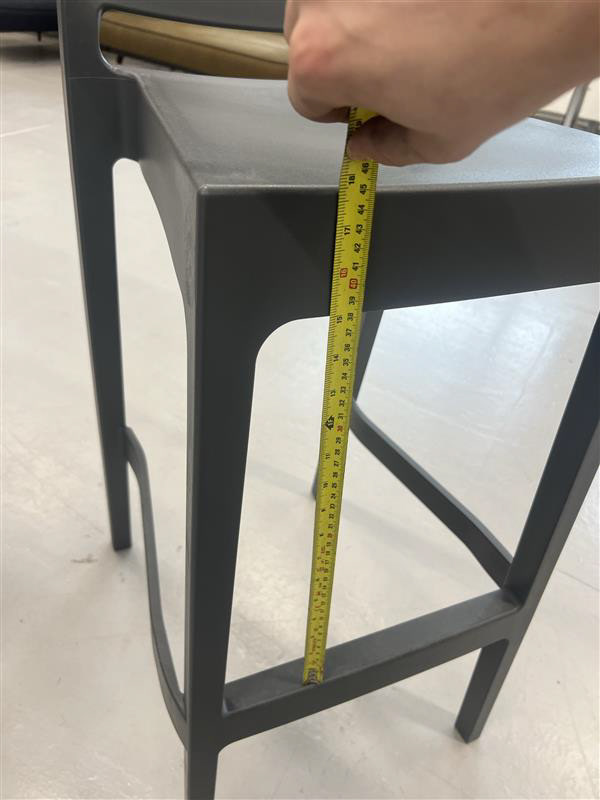
I still got measurements of the height and the length of my body when I sat on this stool and later on, I also measured the width of my shoulders to figure out the width of the chair.
These are the measurements I got from this research:
Height - 45cm
Length - 55cm
Width - 50cm
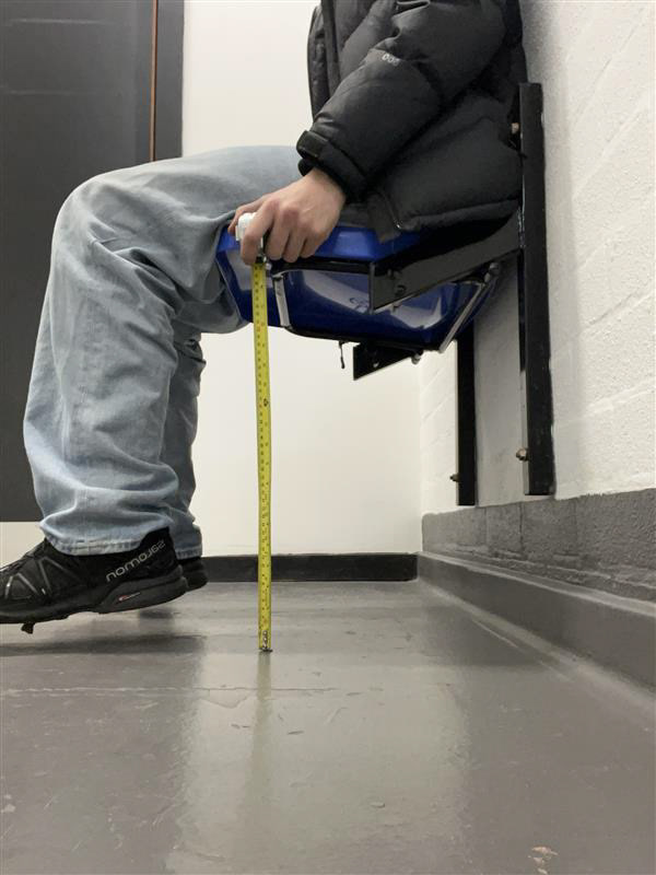
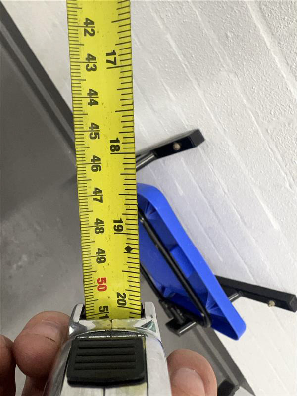
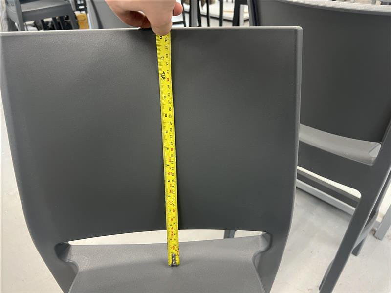
I also continued my research to back up my current evidence on selecting the size and scale for the design and each component.
This first chair was fixed on a wall which was 50 cm high, This proved that I didn't need it any higher than 45cm otherwise I couldn't reach the floor with my legs at a 90-degree bend.
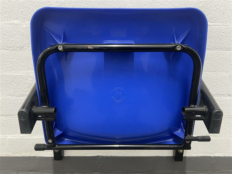
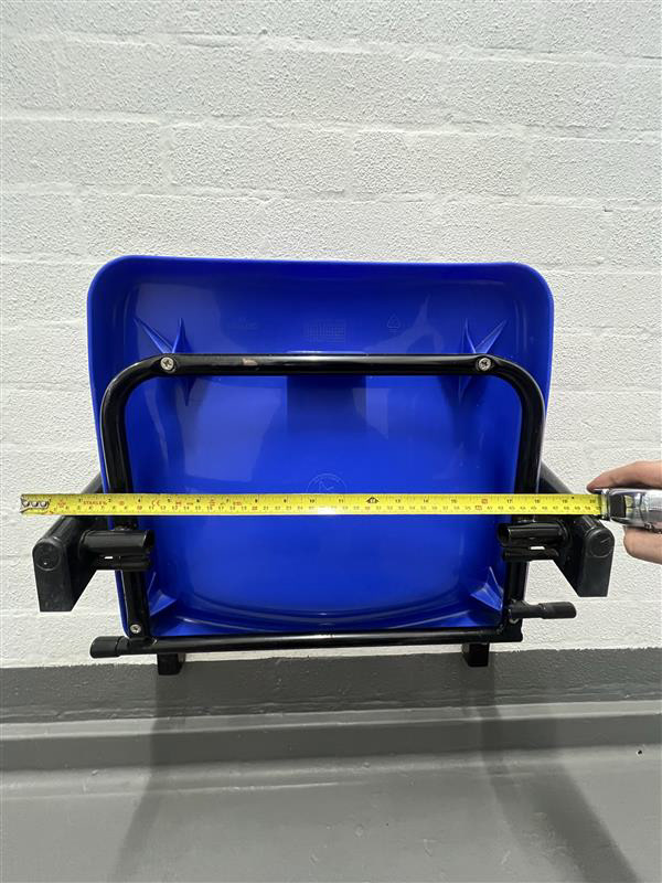
I got pretty consistent measurements from my other testing with all measurements being between 40cm to 50cm which matches the average of my primary measurements against myself. The only between the measurement of my anatomy and the average of these chairs was the length of the chair (front to back). I measured 55cm from my knee to my back when sat down however this was from the front of my knee and not the inside of my leg.
Choosing the Seat
This is a main component of my design, the fabric which will hold you from the ground. Choosing the colour, material, and application of this chair has been challenging. At points throughout this project, the seat itself has become an afterthought as I have been so concentrated on engineering the frame to specific specifications.
After more thought, it has become a primary component, something that turns my project from just some steel tubes to a functional seat or a bench for two. It is something I knew I needed to get right as it would make or break a first impression on whoever may buy this product.
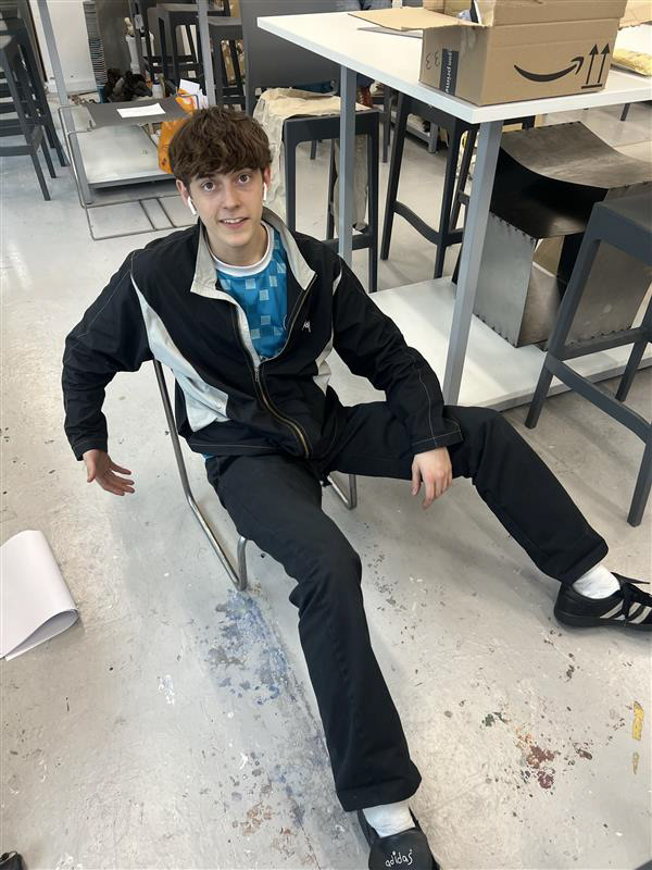
For my hand-in for this project, I had 2 ideas to choose from. Someone had mentioned the uses of ratchet straps in furniture and I really liked the idea as it allows for complete versatility and flexibility around whatever form you create, however, I understand that this may not be the most comfortable option for a seat. I looked over this as I wanted to explore how ropes/straps would work around the seat and allow me to envision more forms and functions so I went into B&Q to see how much they are before swiftly fining a better deal online.
In these videos, you can see my experimentation using the ratchet straps and how they worked for the desired functions. I had friends sit on the seats I had put together to get their feedback on how it felt. Was it comfy? but could you stay sat for a long period of time? Alot of them were initial hesitant to sit at all but after I showed them it easily held my weight they had a go a sitting in the chair themselves. Most of them were pleasantly surprised and almost all of them loved the vibrant orange colour of the ratchet straps against the steel. I didn't ask if they sit on it for longevity however I observed how fast everyone got up. From this I knew that this shouldn't be the only thing I hand in, I also was aware that these products were pre-brought and not designed or crafted by myself so I wanted to craft my own seat with more of a priority of comfort, you can see and read more about this process in my making document.
Instruction Manuals
It only became apparent to research these aspects of design once I had a fully developed idea. At this point, I had sampled all ideas of form, function, and finish and knew it was time to start on my final piece. It was also around this time were I was helping out on another project building some Ikea furniture and noticed the precise and understandable design of their instruction manuals. I figured that it would be a brilliant and necessary addition to my project so decided to do more research and possibly propose my own set of instructions.
I first google what key aspects make a good instruction manual and found a good article to reference I've attached the link here. It is an idea I really wanted to take forward but with the workload I had at this point it didn't look like it would have time on my list of priorities.
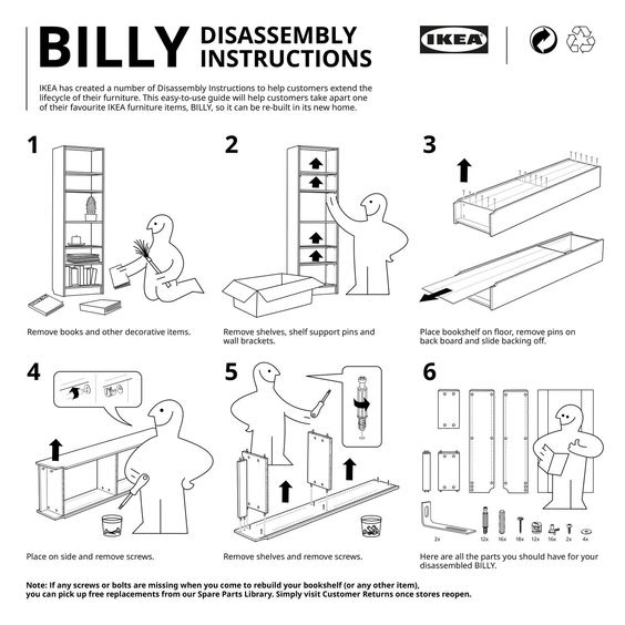
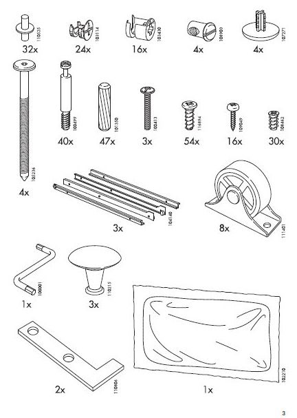
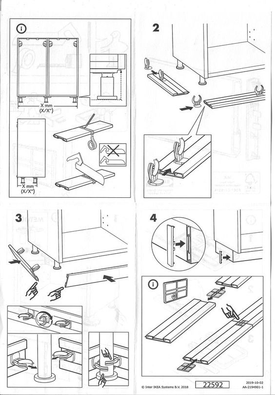
Ikea's commitment to providing clear instruction manuals is integral to its brand identity and customer satisfaction. The manuals are designed with simplicity and visual clarity in mind, featuring step-by-step instructions supplemented with diagrams and illustrations. This approach caters to a diverse customer base and minimizes confusion during assembly. Each manual follows a structured layout, starting with an overview of package components and progressing logically through the assembly process. By using straightforward language and ensuring accuracy, Ikea makes DIY furniture assembly accessible to customers with varying levels of experience. The importance of getting this process right cannot be overstated, as it directly impacts customer satisfaction and brand loyalty. A positive assembly experience fosters repeat purchases and positive word-of-mouth publicity, while a frustrating one can tarnish the brand's reputation. Additionally, Ikea's practice of packaging components separately within the box serves to streamline assembly, prevent damage during transit, and optimize packaging efficiency. Overall, Ikea's focus on clear instructions and efficient packaging underscores its commitment to delivering a seamless and satisfying customer experience.
CAD Development
Throughout this project, I have taken it upon myself to develop my skills in Fusion 360. I have thoroughly enjoyed learning this software and believe it could be a very useful skill in the future so it's something I wish to further develop.
Despite my not designing the components of this software before making them, it has helped me understand how precise you can be in manufacturing and on software like this. this has been a huge help for the pricing aspect as I have got quotes from companies which are the exact cost for x amounts of these components


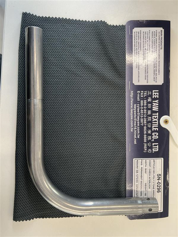
These are the exact measurements for the curved components which I made by creating the perfect centre line and using it as a past the extrude the pipe from offsetting the extrusion the radius of the pipe I used which worked out to be 12.7mm


these are wireframe drawings showing all the lines so you can see the interior and exterior shapes which build up my components, this effect is great but you don't get the sense of material so I also have these photos below of the components showing them in mild steel which captures the reflections and shadows bring the designs to life.


I wish to use these designs in 3D printing as its something I've never done before. I may not get this done for the hand-in however it is something I aim to do with my time over the summer. I also would like to see these components factory-made using either an injection moulding machine or a CNC.


