
Curation is a major part of our project this year—something I hadn’t really considered before but have come to appreciate as a skill in its own right. Introduced to us as part of this academic brief, curation has challenged me to think beyond just creating work; it’s about how pieces interact, how they’re framed, and how an audience experiences them.
Our task was to curate and create an exhibition that brings together all of our work within The Box—a small but dynamic space in our studio. This constraint made the process even more interesting, forcing us to be intentional with our selections, layouts, and themes. Through this, I’ve started to see curation not just as a means of display, but as a creative act in itself.
At first, I wasn’t convinced that curation was all that relevant to my work. Since my designs are heavily focused on functionality, I never really saw the value in learning how to curate them properly. To me, the purpose of my work has always been about use rather than display.
Initially, I thought a more fitting approach would be to use my designs as a framework for showcasing other people’s work. This idea felt more aligned with my functional approach—allowing my pieces to create space for others rather than being the focal point themselves. I imagined crafted objects displayed on my shelves or a carefully arranged selection of work decorating my coffee table. Instead of simply presenting my designs, this approach would highlight how they interact with and enhance other creative pieces.
To explore my idea further, I experimented by using samples from other people's previous projects to present the concept of my work as a display framework. I wanted to see how my designs could function as a platform for showcasing other crafted objects. However, when I shared this idea with the group, it became clear that not everyone was on board. Most people had their own visions that better suited their individual projects, and my approach didn’t quite fit within the collective direction of the exhibition.
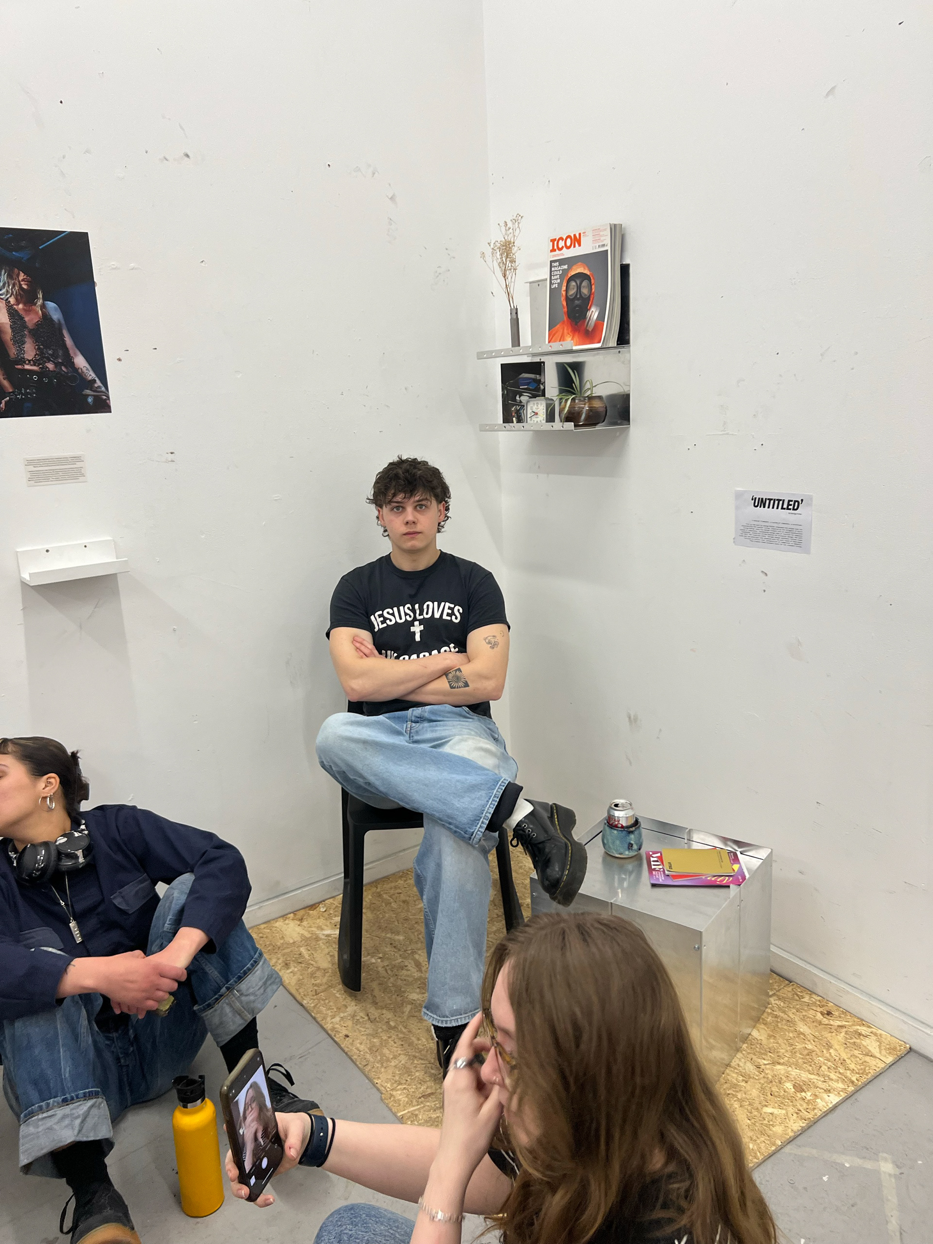
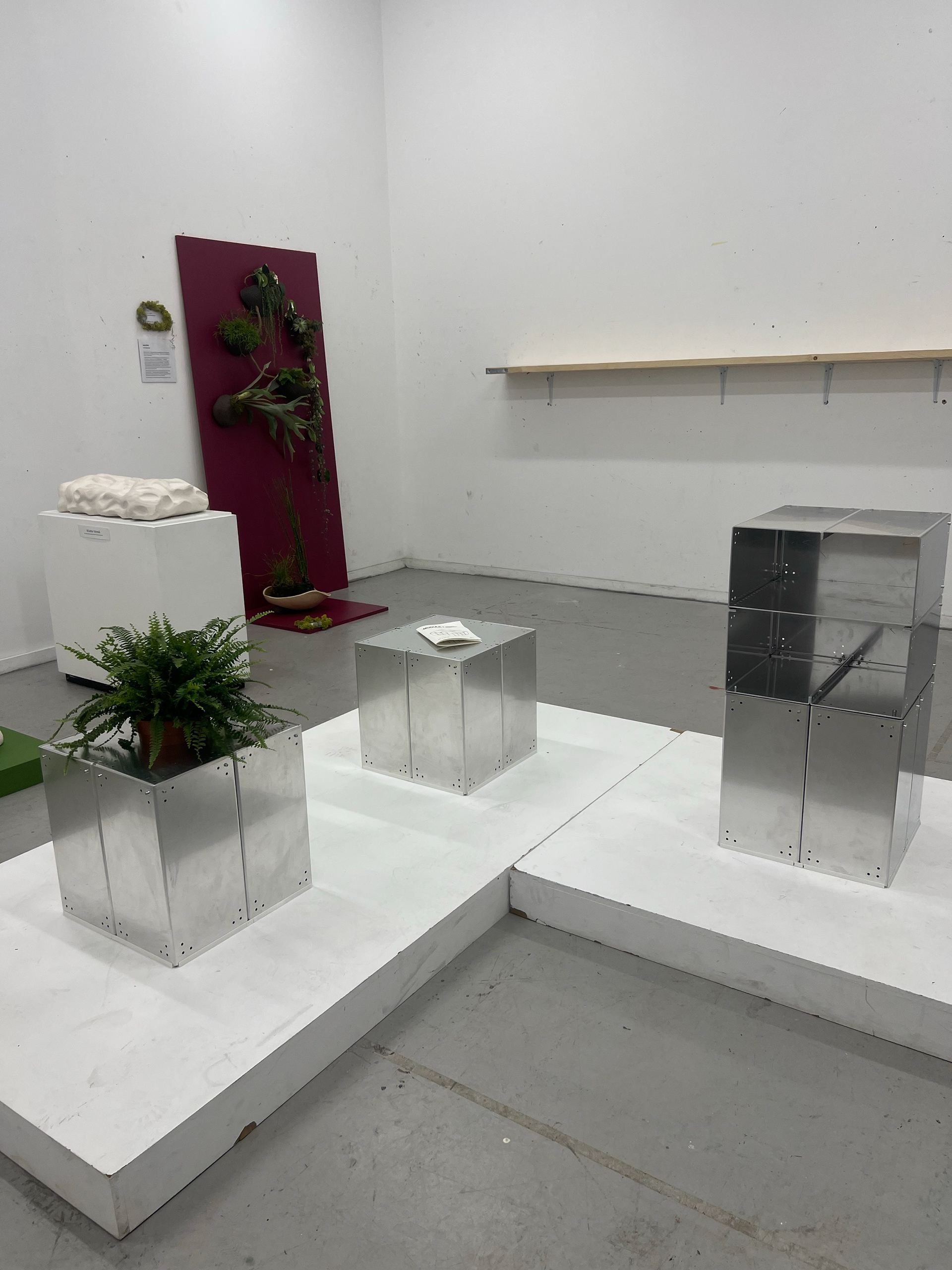
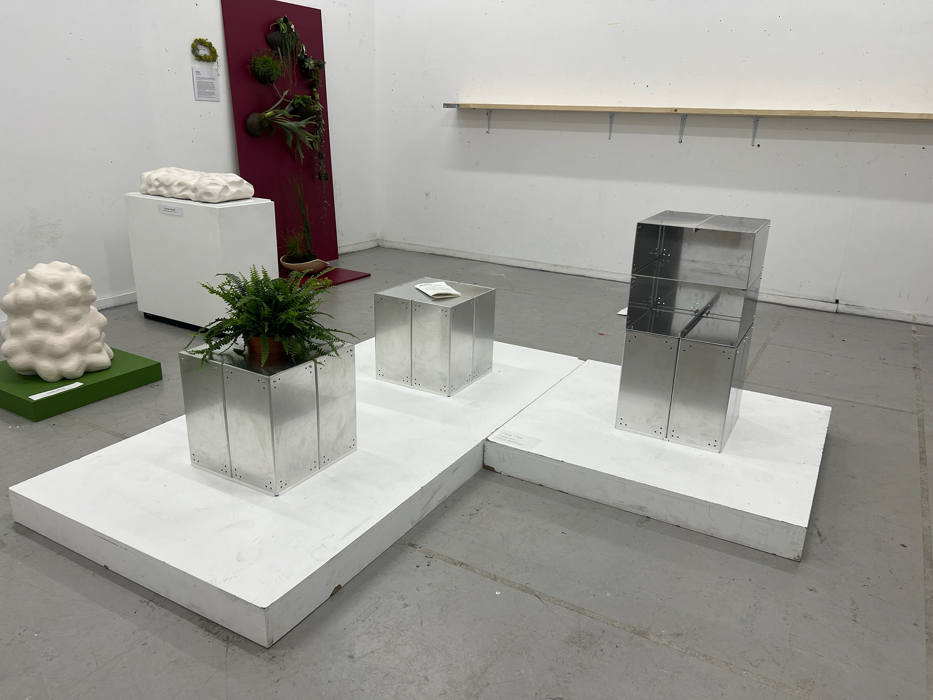
With that in mind, I reconsidered my approach and decided to curate my space to resemble a domestic environment as closely as possible. Rather than simply displaying my work, I wanted to make it feel lived-in—using props to create a sense of real-world functionality. This shift in perspective allowed me to lean into the usability of my designs while still engaging with the creative aspects of curation.
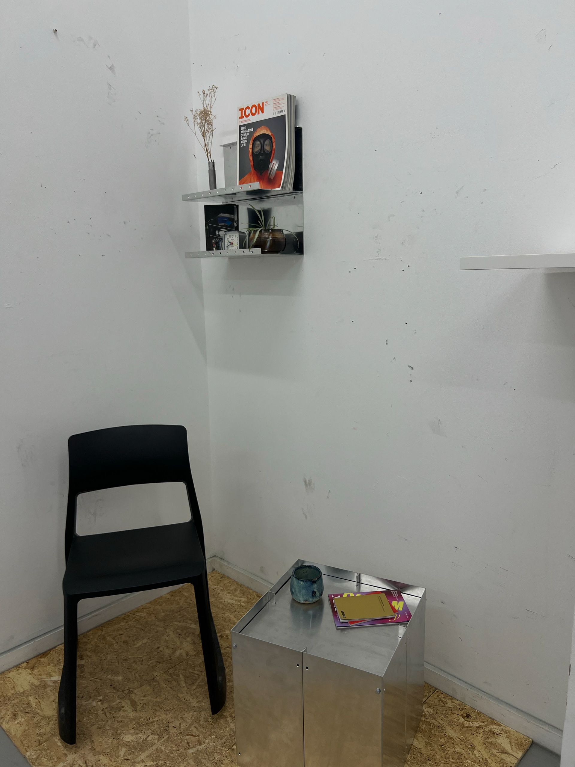
For the deadline of this workshop, this was my final setup. I used chipboard as flooring to ground my pieces, mounted two of my shelves on the wall to help enclose the corner space I had chosen, and added a chair to reinforce a relaxed, welcoming atmosphere. My goal was to encourage interaction with my work rather than just passive observation.
I liked the overall idea and felt I was resourceful with the props, especially since this was an experimental workshop where we were advised not to go out of our way to make or buy anything extra. That said, I knew there was plenty of room for refinement, and I was confident that my next attempt would be stronger with more time and planning.
Despite this, I was really impressed by the exhibition as a whole. Seeing everyone’s works in progress was inspiring—it gave us all a sense of momentum and excitement for the degree show, making the whole process feel even more real.
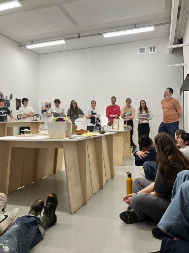
Throughout the morning of the curation display, Geoff and Lillie (the curation assistant) walked through the space, discussing everyone’s setups and the thought processes behind them. Despite the heat and the small space, it was a really insightful experience. Hearing Geoff’s perspective on each display sparked a lot of conversations about what worked well and what could be improved, and it was great to share ideas with the group.
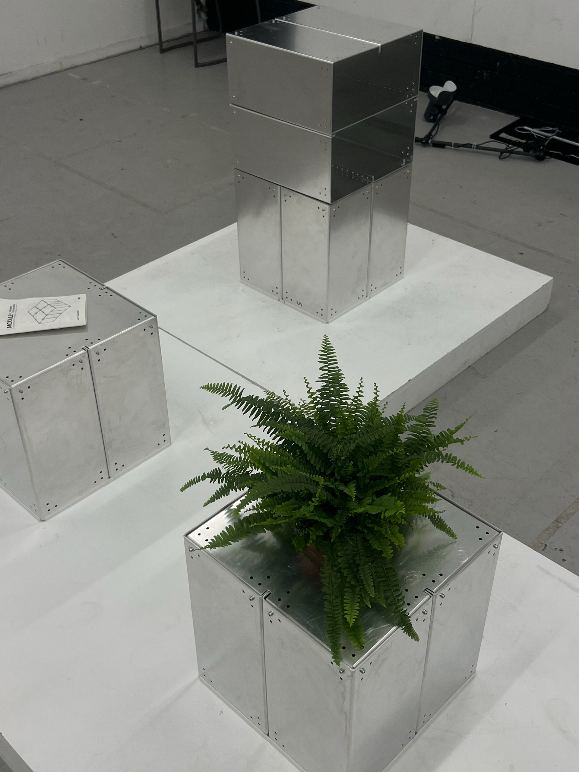
When Geoff spoke about my display, he encouraged me to think about it from a more creative perspective. He understood my reasoning for using props to create a domesticated setting but pointed out that, at the degree show, text and images would already communicate that my work is furniture. Instead of focusing solely on functionality, he suggested looking at how furniture is presented in window displays—experimenting with elevation and angles to create a more dramatic effect.
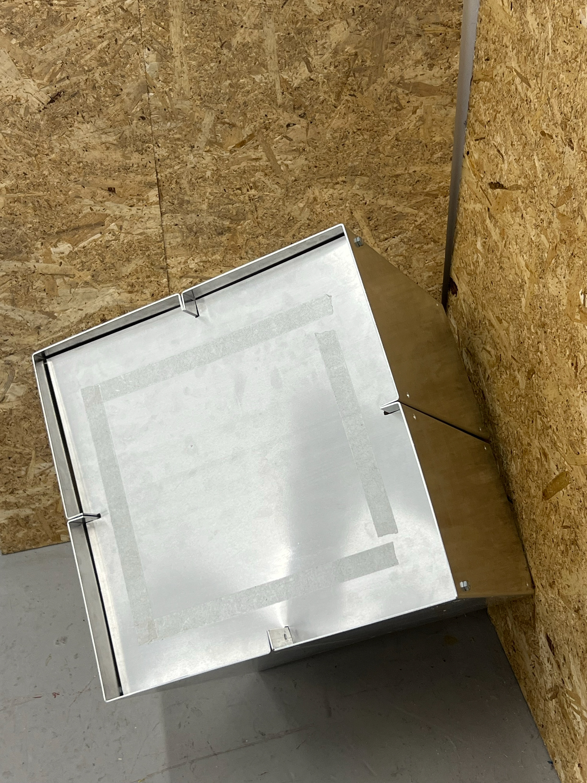
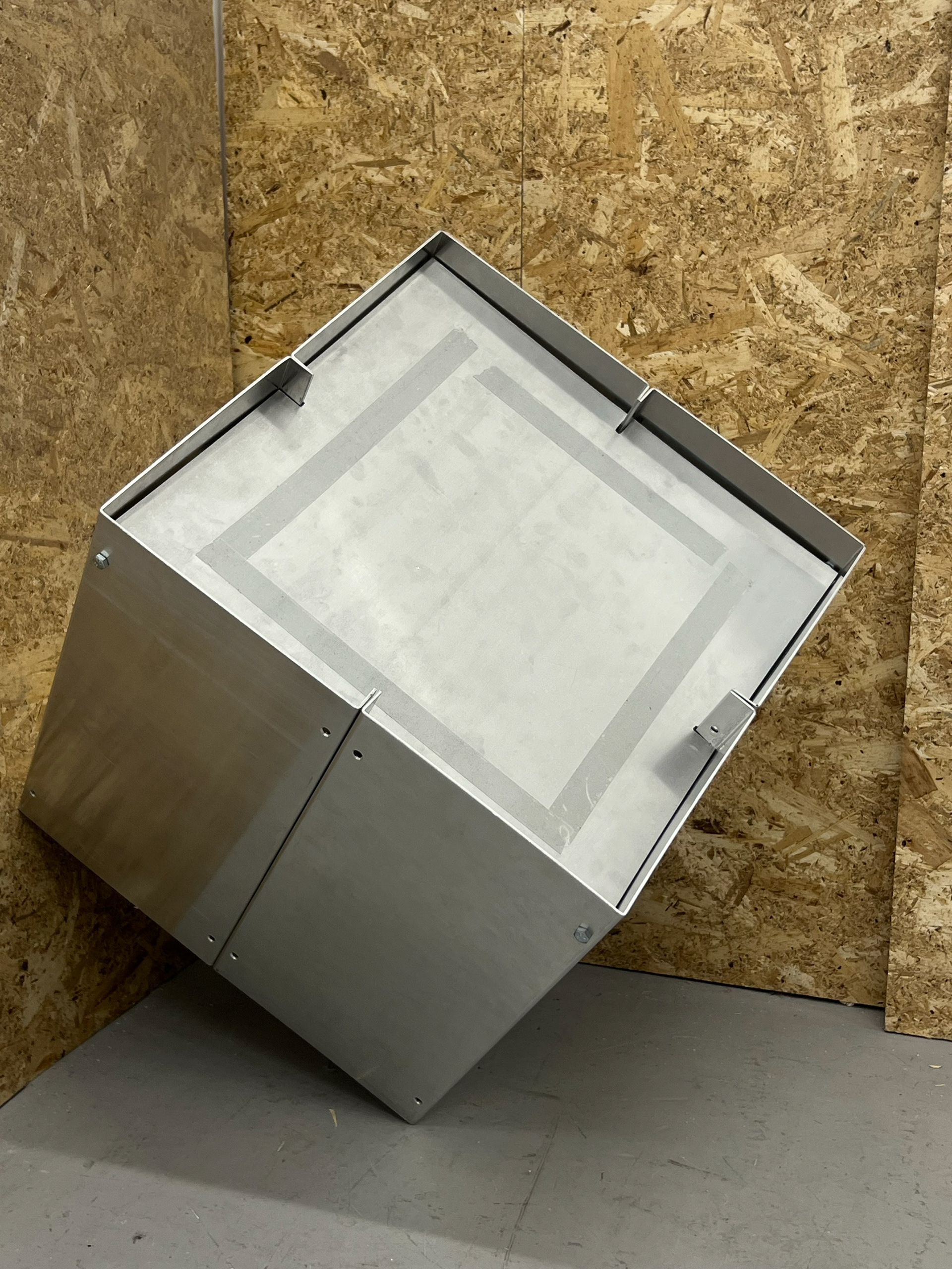
We decided to test this idea during our break, moving my pieces around and propping them up using one of the chipboards I had initially used as flooring. To my surprise, this simple shift completely changed how my work was perceived. It was something I hadn’t previously considered, but seeing it in practice made me really keen to explore this approach further. It helped me visualize how my work could be displayed in a more engaging way beyond just creating a functional space.
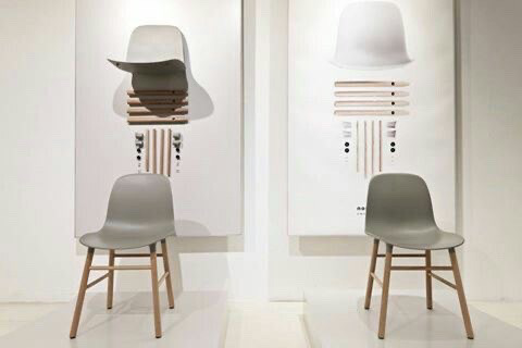
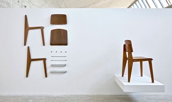
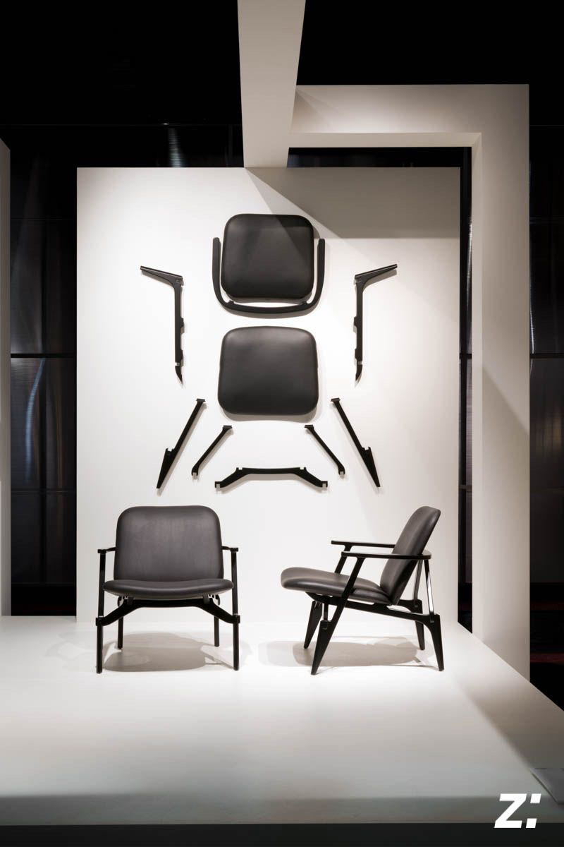
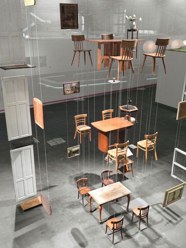
After receiving Geoff’s feedback, I decided to research more creative ways of displaying and curating my work. One of the first approaches I came across was the idea of separating each individual component and flat-laying them next to the assembled piece. While this method was visually interesting and playful, I noticed it had been done a lot, as seen in the images above. It felt like a well-worn concept, and I wanted to push my display in a direction that felt more unique.
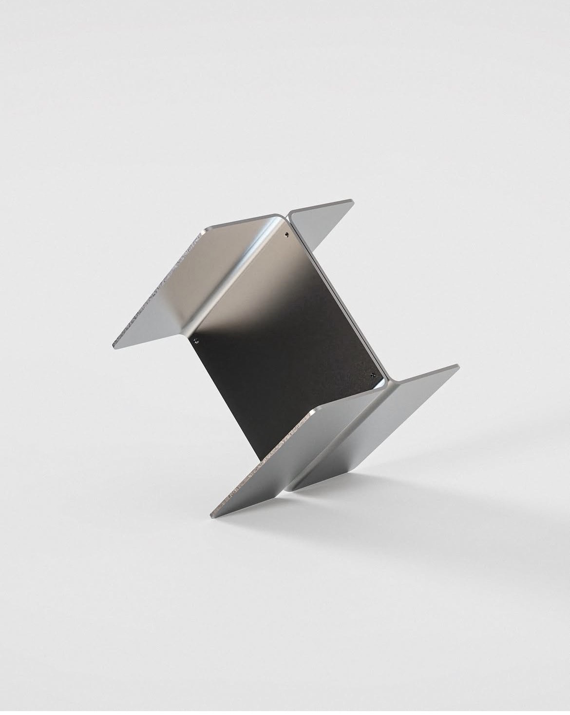
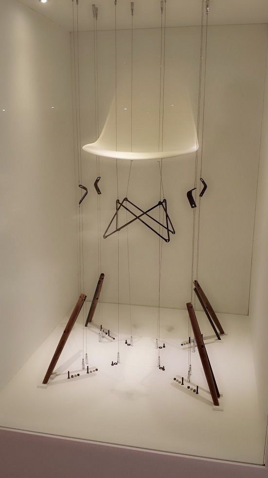
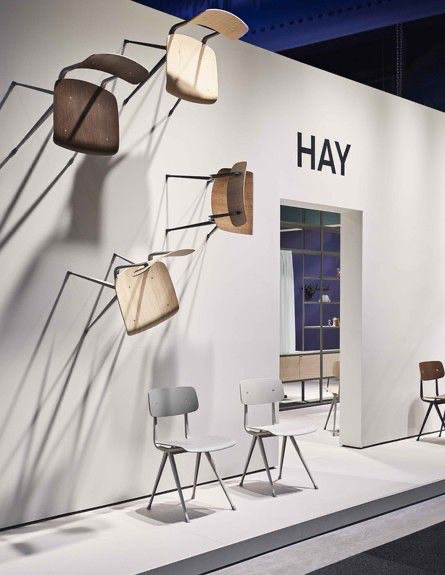
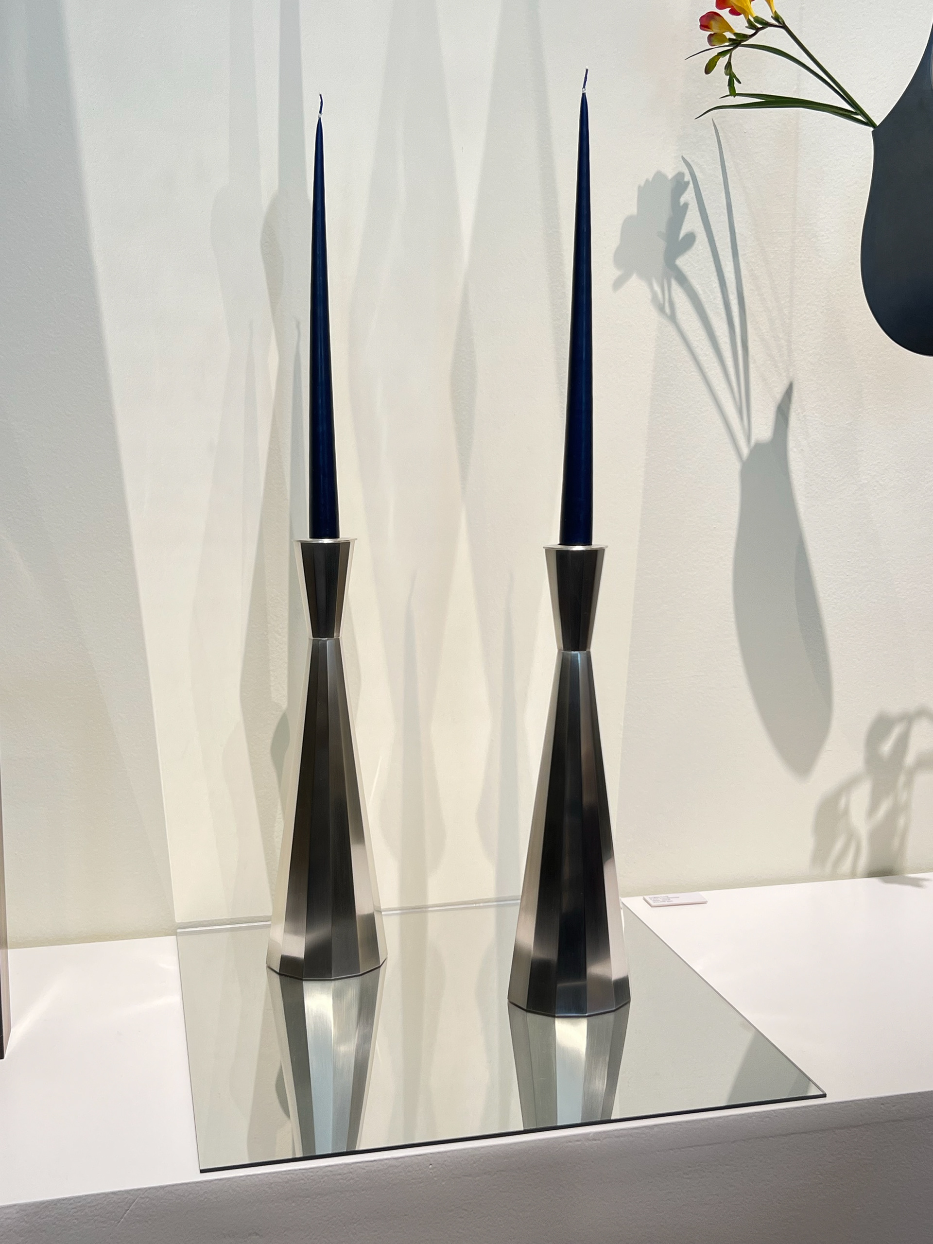
I kept coming back to Geoff’s suggestion of elevating or angling my work. Not long after, I came across an image of a metal side table—very similar in design style to mine—displayed at an angle. It seemed to have been edited to look as if it were floating, likely just for a photo, but it immediately caught my attention. This led me to find more examples of curation where furniture was suspended or held in the air, aligning with Geoff’s recommendation.
Seeing these examples made me even more excited to explore this idea further. I wanted to experiment with how I could apply these techniques to my own work, pushing beyond the purely functional display I had originally envisioned.
INSIGHT FROM COLLECT 2025
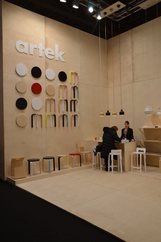
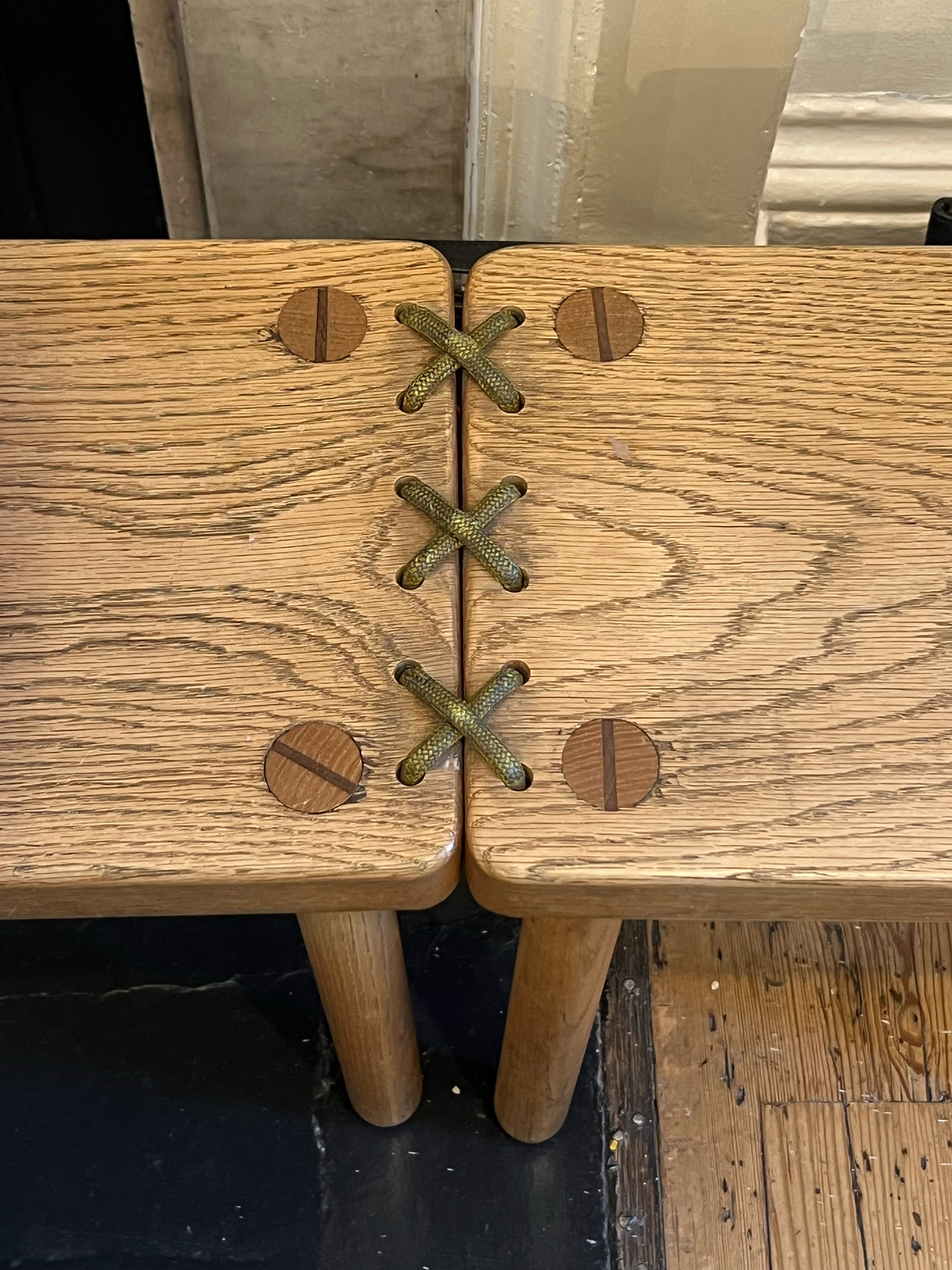
Looking back at our research trip to Collect 2025 in London, I found myself reflecting on how the curation of different exhibitions influenced the way the work was perceived. The show featured a wide range of beautifully crafted pieces, from intricate textiles to bespoke furniture, but it was the furniture displays that really caught my attention.
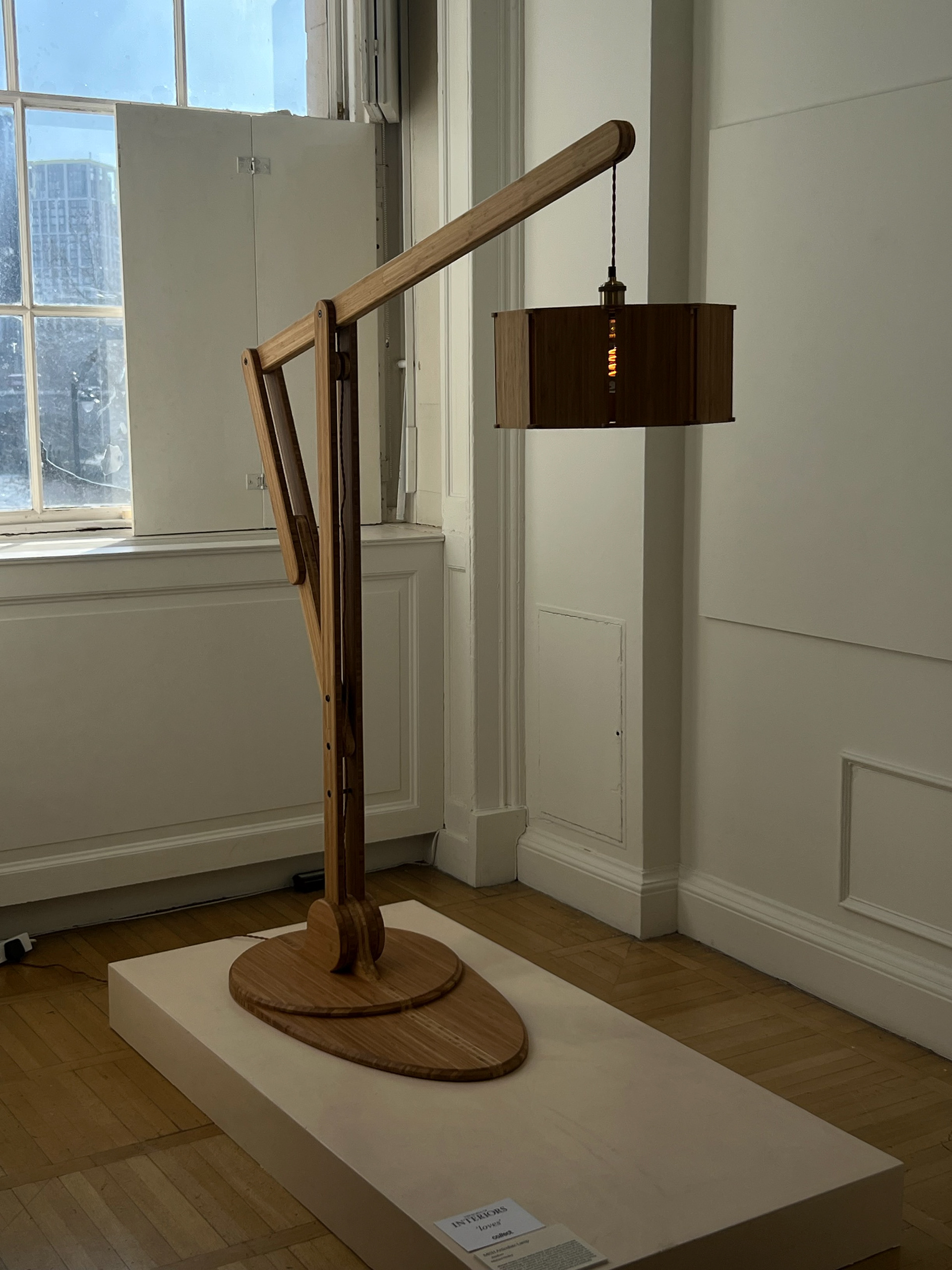
One piece in particular stood out; a standing floor lamp tucked away in a bay window. There was nothing excessive about its presentation, yet it commanded attention purely through its design. This made me reconsider the role of curation; perhaps sometimes less is more. From our own practice exhibition, we had already discussed the need for more space, and seeing this lamp at Collect reinforced how a well-placed object can make a strong impact without overcrowding.
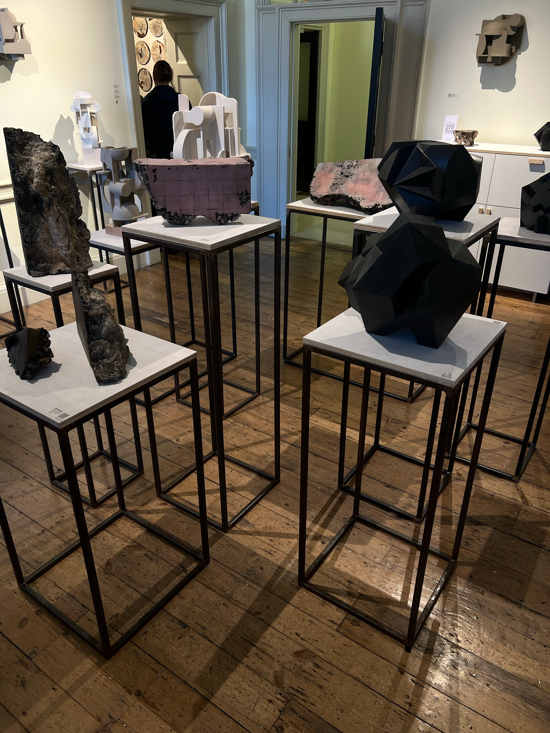
Another element that stood out was a large plinth extending across half a room, displaying the work of multiple craftspeople and designers. The spacing between the pieces allowed each to breathe, preventing visual clutter. The plinth itself played a key role in elevating the room—both figuratively and literally. By raising the pieces closer to eye level, it allowed viewers to appreciate the intricate details that would typically be harder to see if the furniture were positioned lower, as it would be in a domestic setting. This approach made me think more about how elevation and spacing could enhance my own curation.
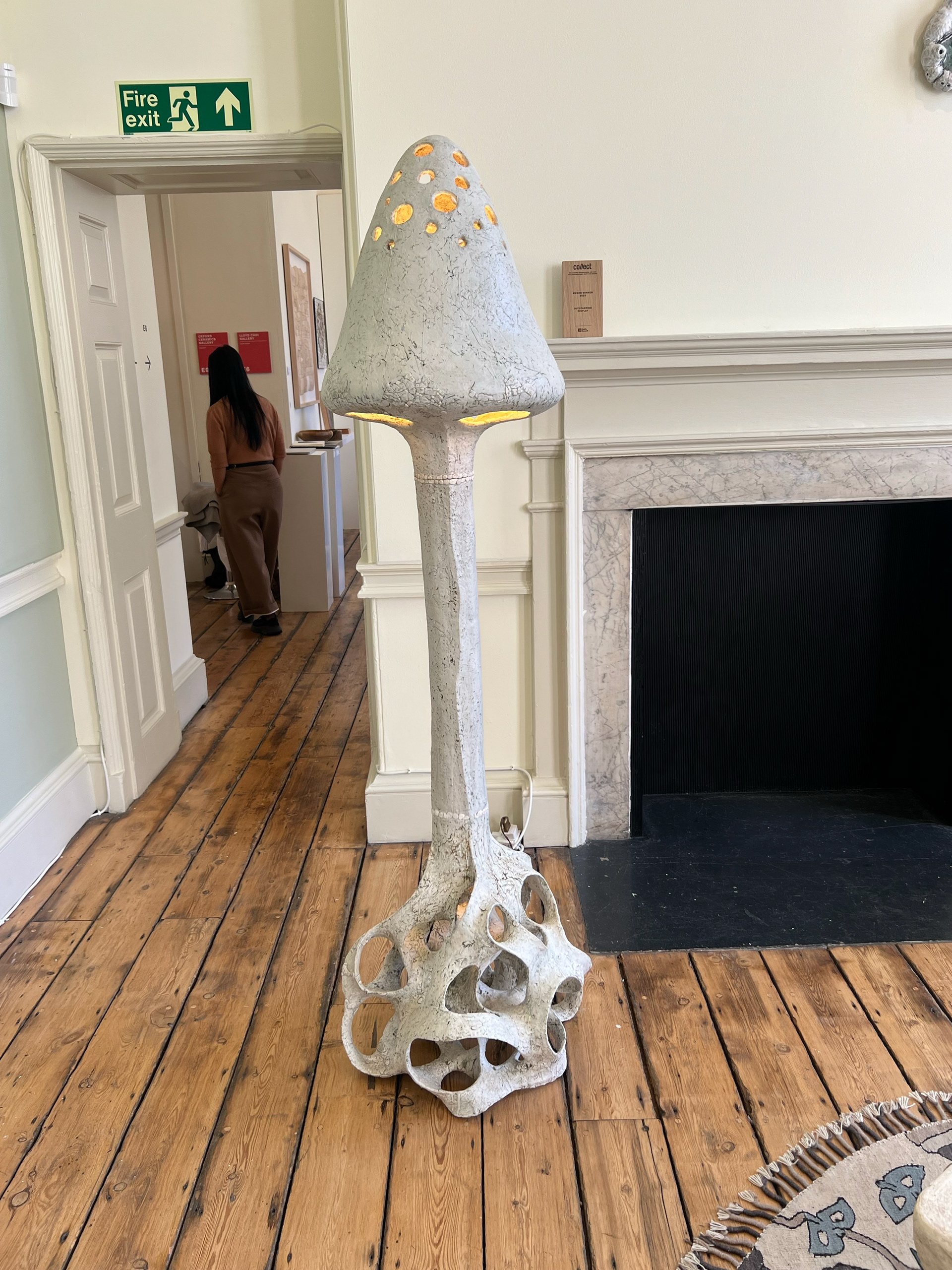
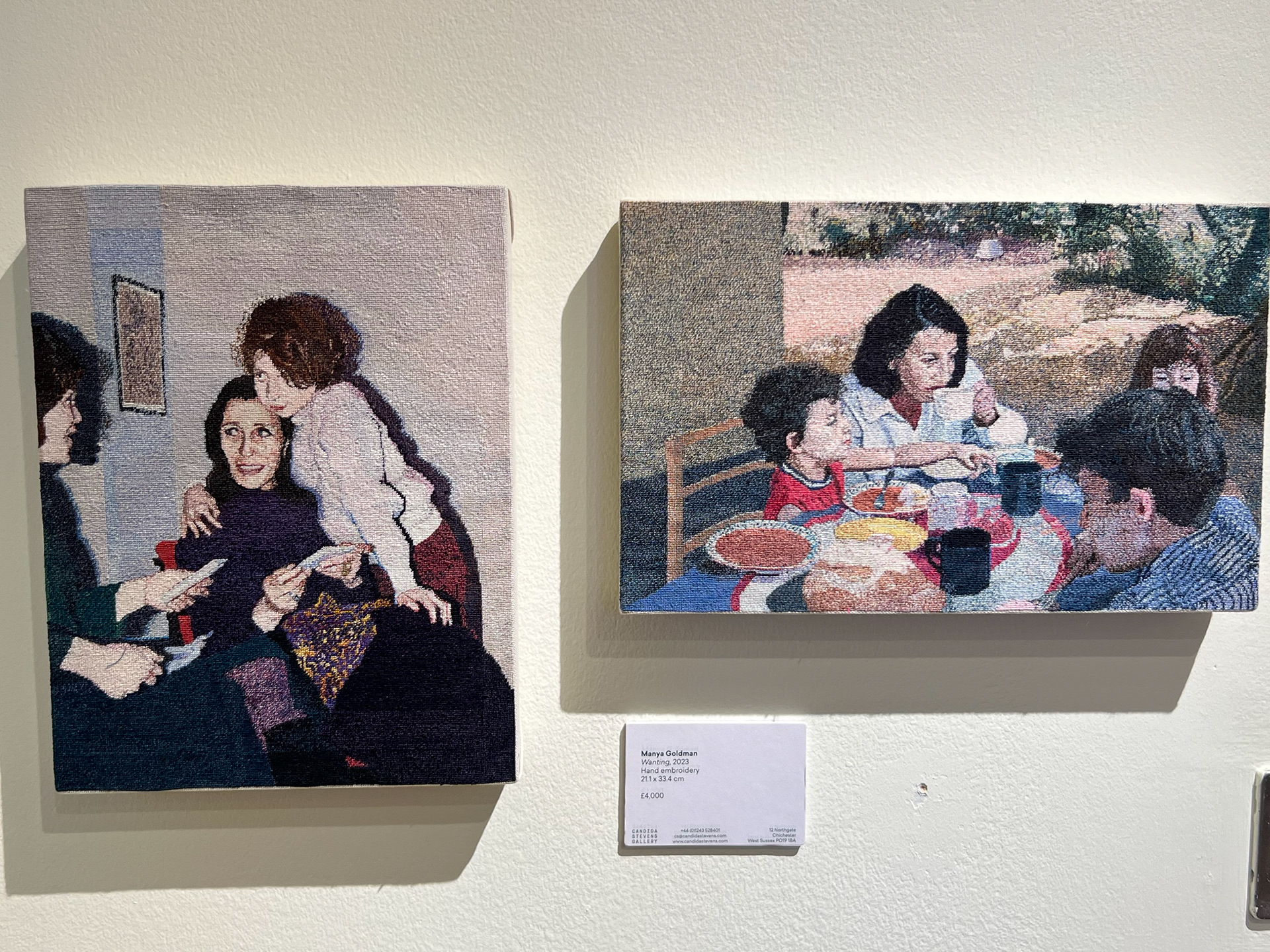
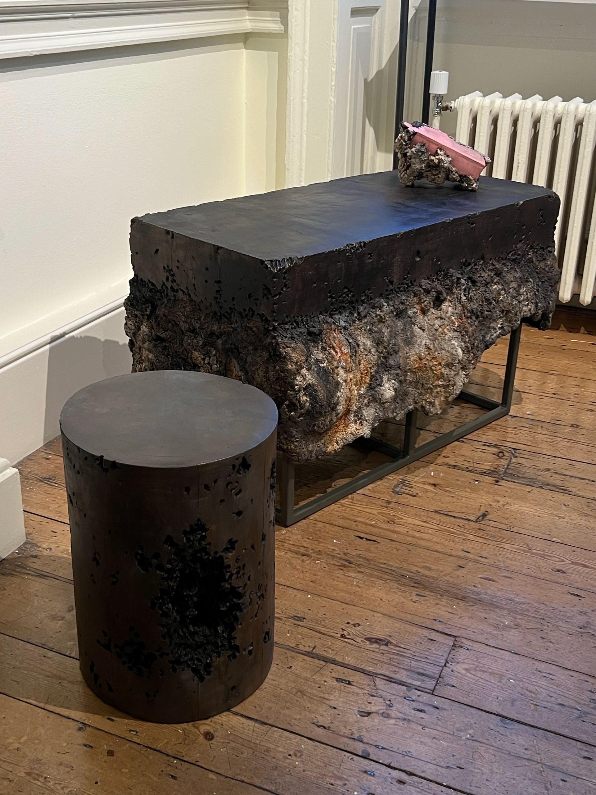
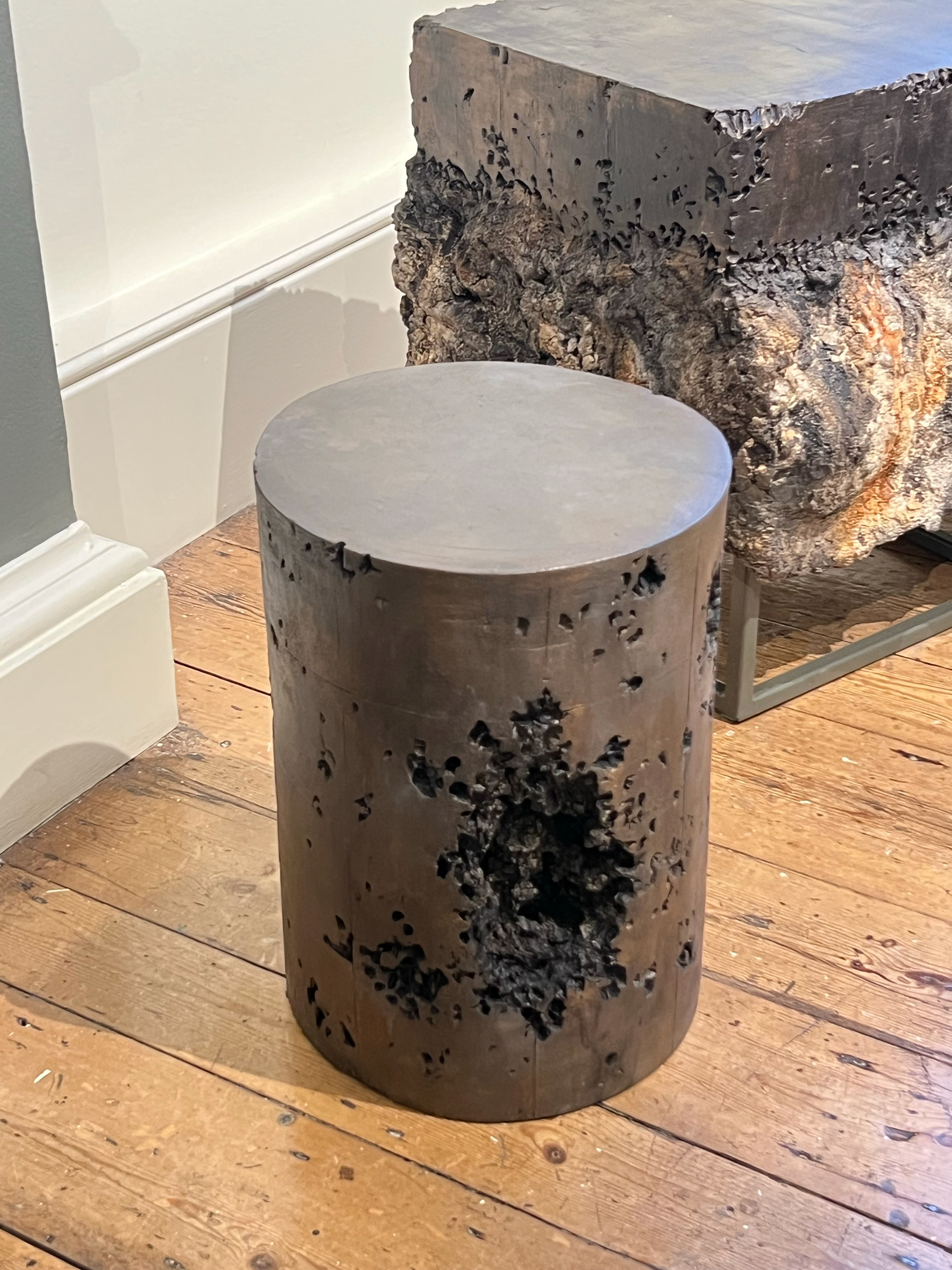
In another room at Collect, I was drawn to a display that recreated a domestic environment. This setup featured a designer’s collection of furniture—including a lamp and a coffee table—but what made it particularly striking was the material choice: ceramic. These were some of the largest ceramic furniture pieces I had ever seen, and it was fascinating to observe how the designer played with an unconventional material to create functional objects. Some pieces were glazed, while others incorporated mixed materials like glass, making each object feel distinct and sculptural. The entire setup, arranged around a fireplace with a rug and other homely elements, created a convincing domestic scene that felt immersive yet intentional.
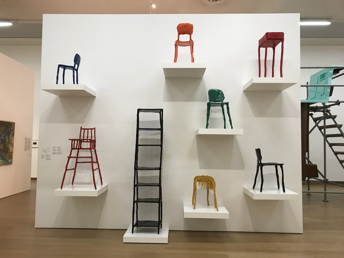
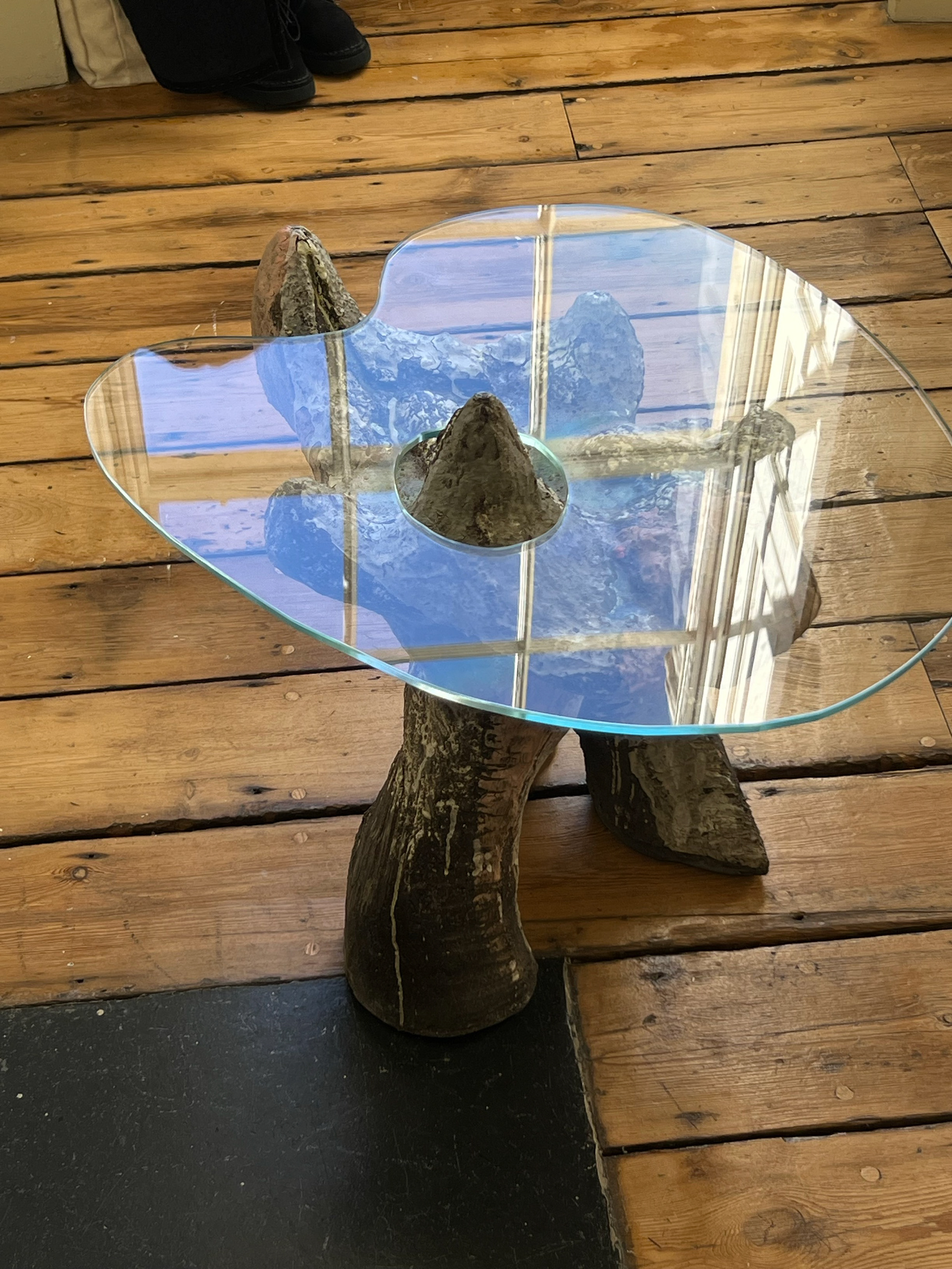
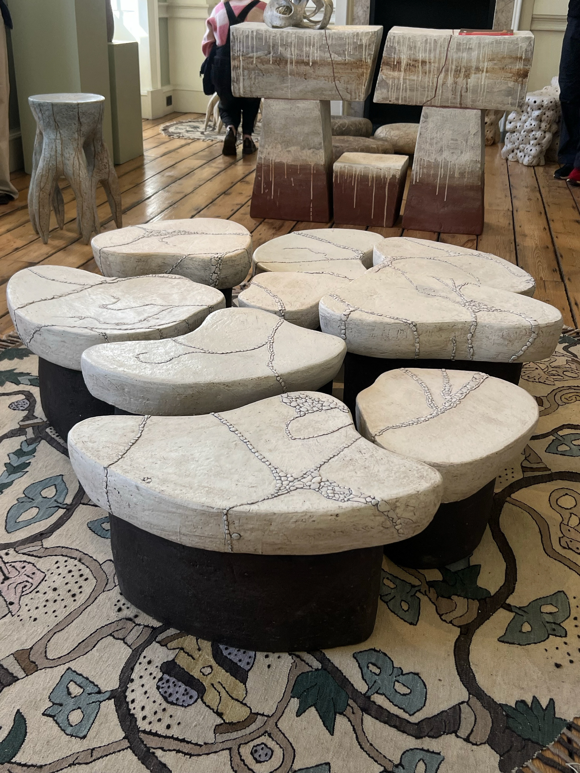
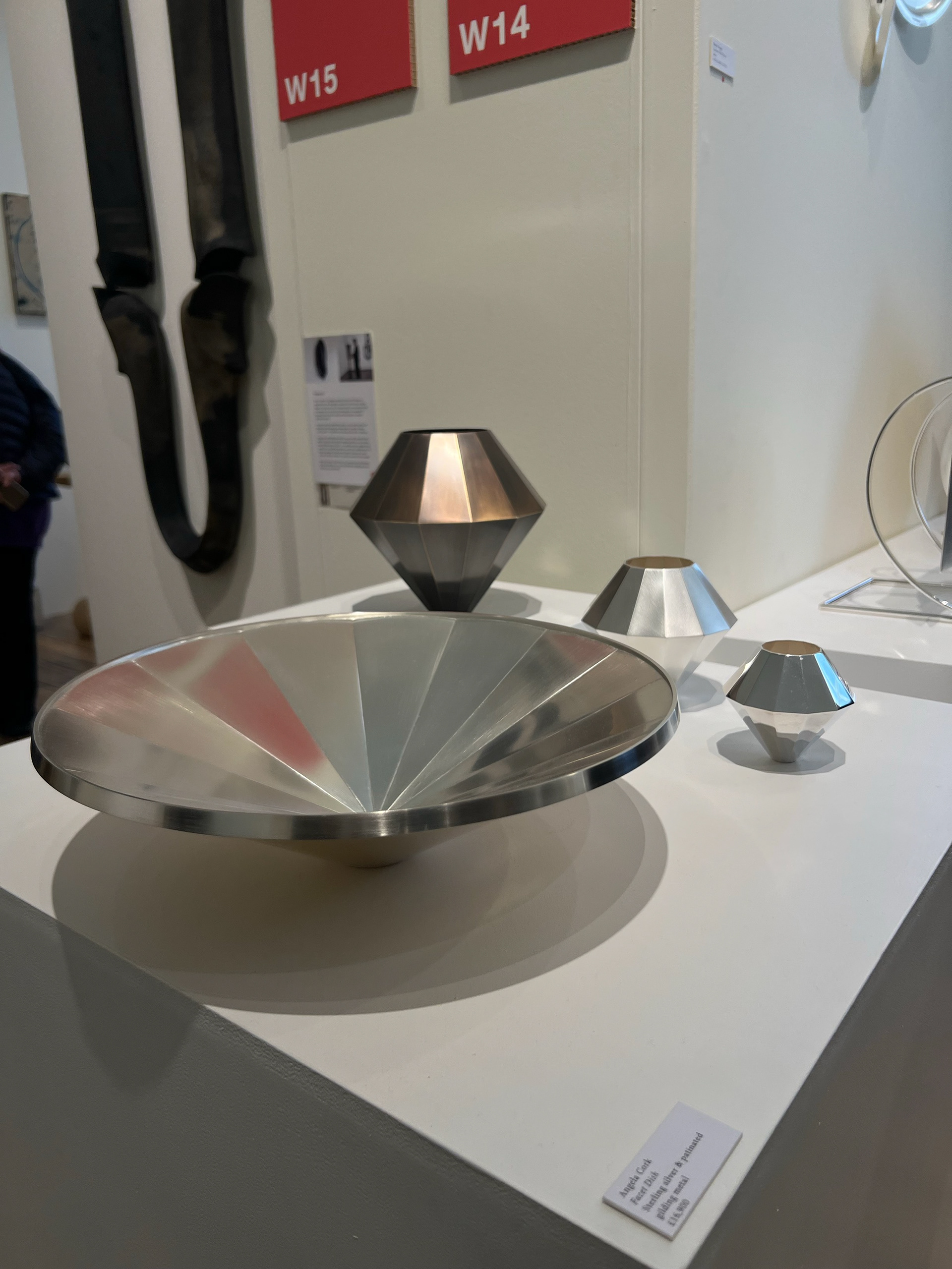
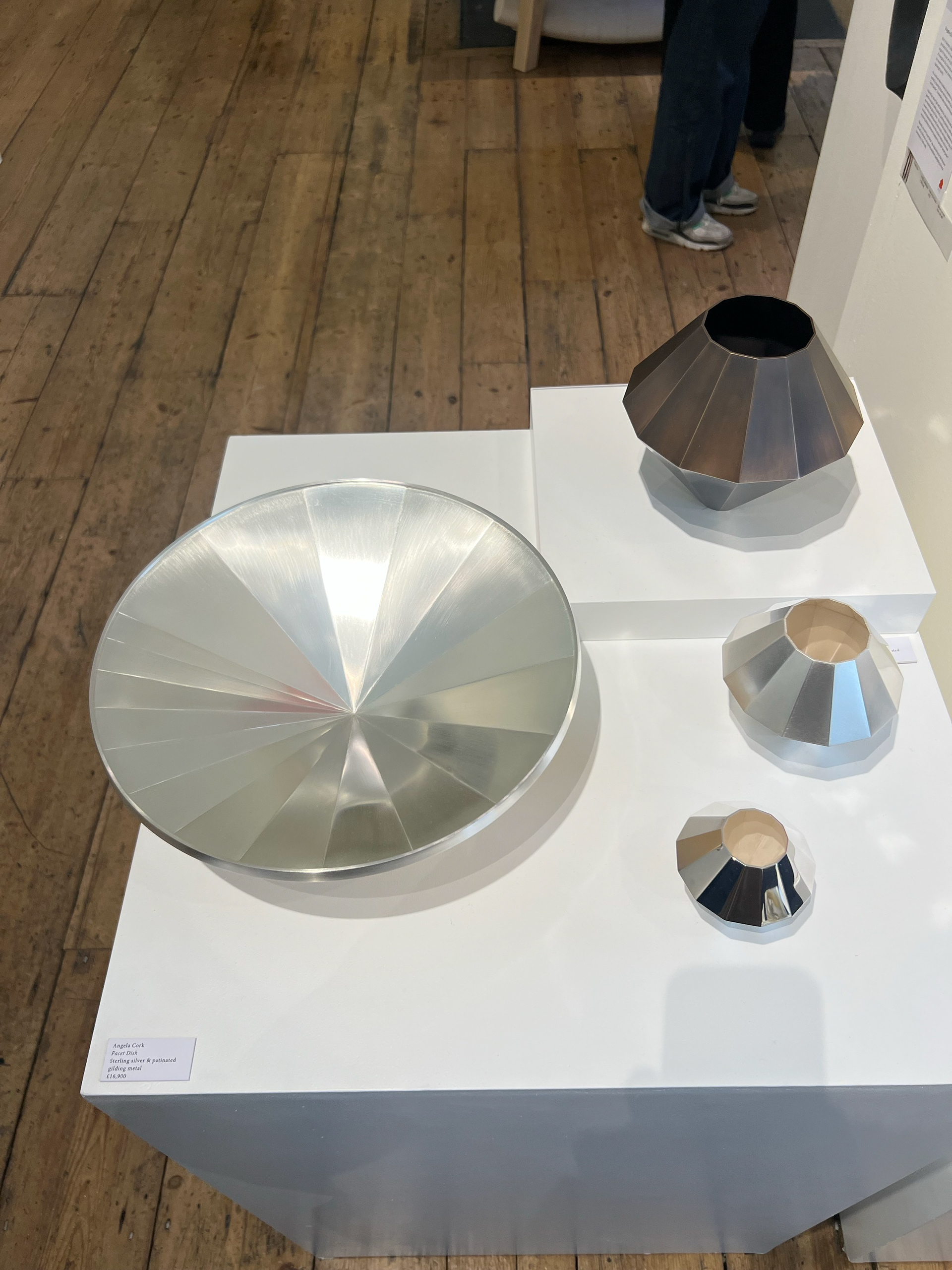
Here are some more pieces that caught my attention. Not only was I looking at the layout of these pieces but also the connections between collections. You can see how designers have been paired with other people who share similar styles and material processes to curate a space of work that complements each other.
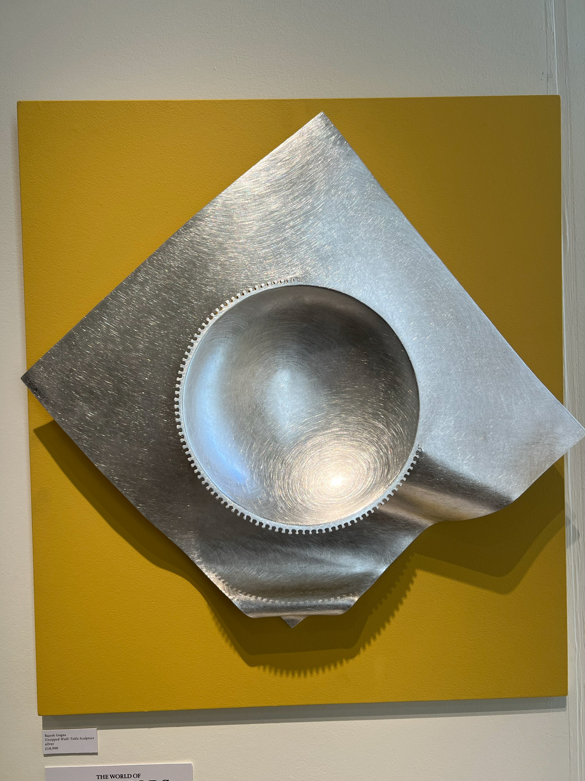
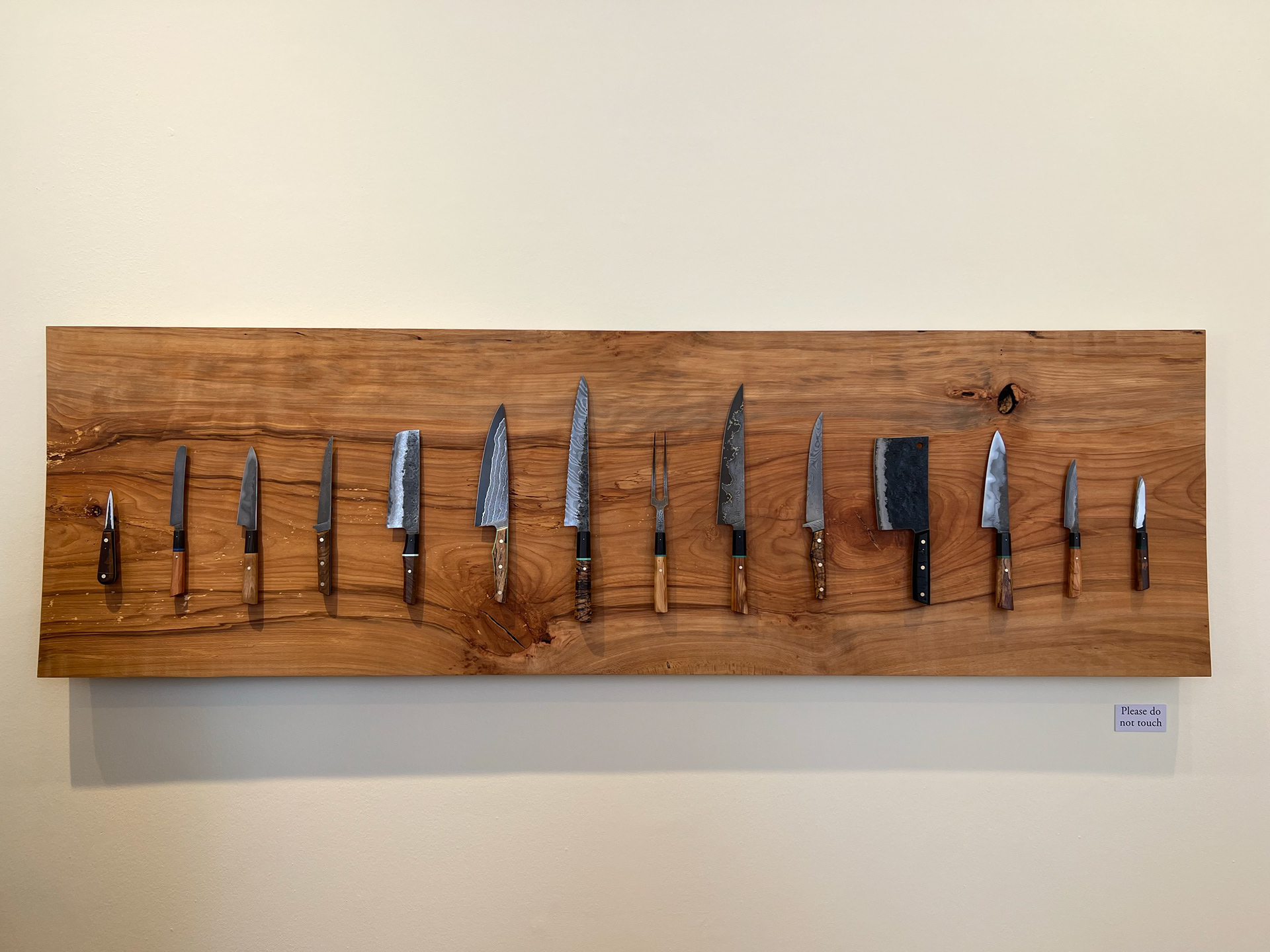
One that really stood out was Rajesh Gogna’s Unzipped Wall Sculpture. The bold yellow backdrop wouldn’t be a colour you'd typically consider, but it made the piece stand out in a really striking way. It showed me how unexpected colour choices can enhance a display and draw focus to the finer details.
Seeing these different approaches made me rethink my own display strategies. From minimal, space-conscious curation to elevated platforms and immersive domestic settings, there are so many ways to guide an audience’s experience. It reinforced the idea that curation isn’t just about placing objects in a space—it’s about shaping how they are understood and interacted with.
PLANNING FOR THE DEGREE SHOW
The next stage in my curation journey was planning how I wanted my work to appear at the degree show. We were given another deadline to submit the dimensions of our display space to Lillie, along with details of any tools or structures we’d need like plinths, lighting, or frames.
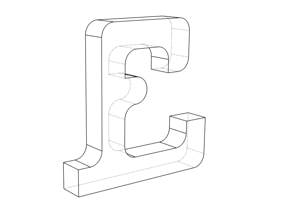
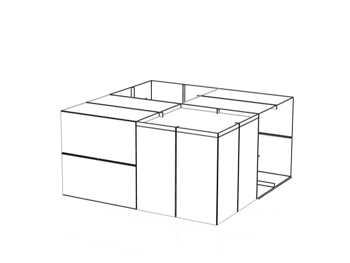
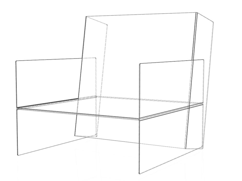
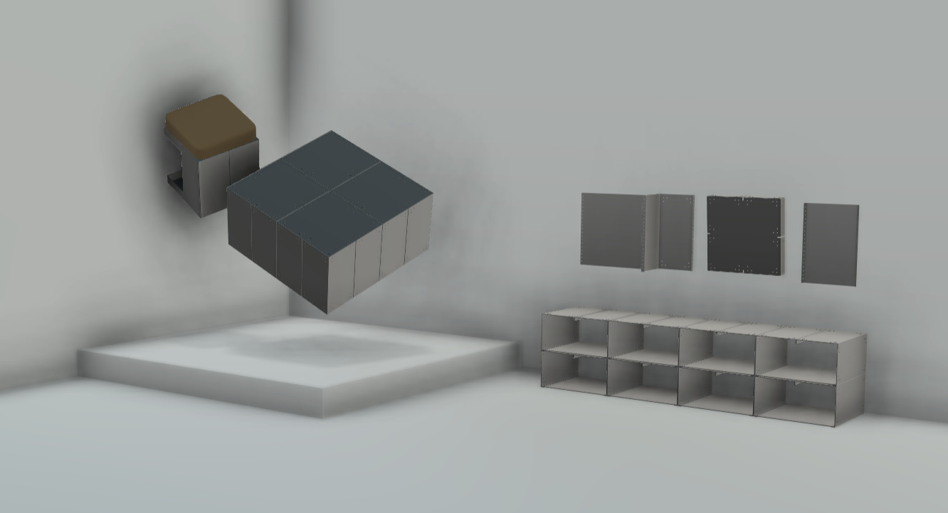
To start, I revisited my research and thought carefully about how I wanted my work to be displayed. I sketched out a reference drawing to visualise the setup and confirm the direction I wanted to take. Using that sketch, I began rendering the space—importing my 3D models into a separate document. Similar to how I created my expression of interest for New Designers, I built a basic room template (not to scale) and experimented with layout.
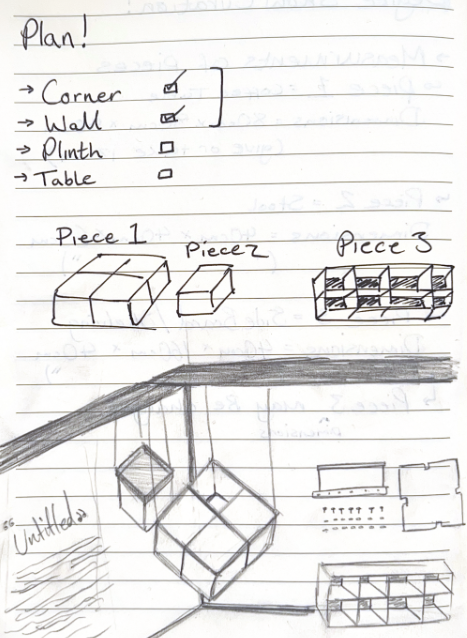
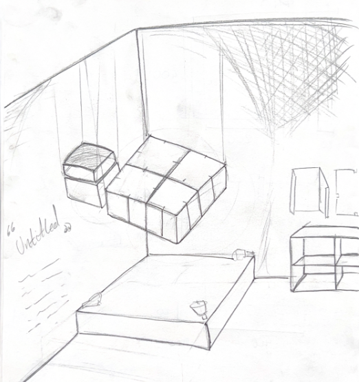
After a bit of playing around, I ended up with the drawings below. I was really happy with how they turned out, and honestly surprised at how quickly I put them together; especially considering how much I struggled with even basic layouts just a few months ago. It felt like real progress. I then sent all the necessary dimensions and info over to Lillie.
As shown in the drawing, my main requirements were:
– A corner space, so my piece could be angled and only viewed from two sides
– A suspension method (we discussed using wire rope) to hang the piece from three points
– A low plinth beneath the elevated piece, both to prevent viewers from getting too close and to give the work a cleaner white base instead of sitting directly on the concrete floor
Curation Tutorial
The week after I provided Lillie with the specific requirements for my curation concept, we had a group session to run through logistics and assess how everyone’s ideas could work together within the space. I was informed that there was only one corner available, and multiple people had requested it. After reviewing everyone's proposals, Geoff and Lillie concluded that realistically, Alice was the only person who truly required the corner, as her work was specifically designed to interact with connecting surfaces.
This meant I had to rethink my display strategy to ensure my work could be effectively viewed from all angles.
Showroom Layout
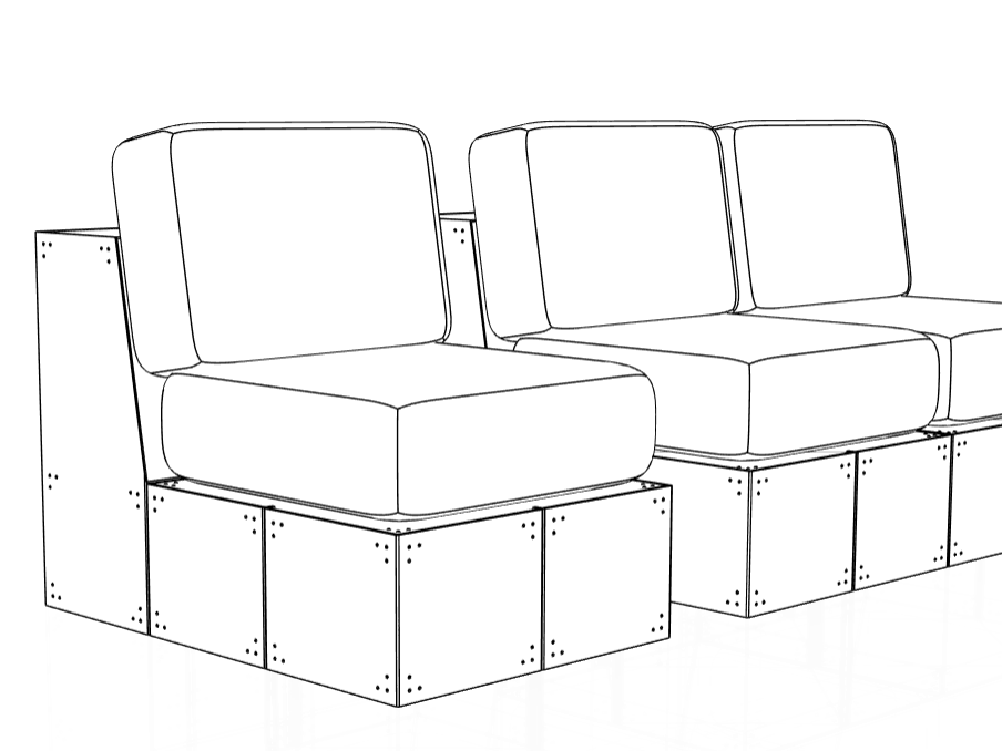
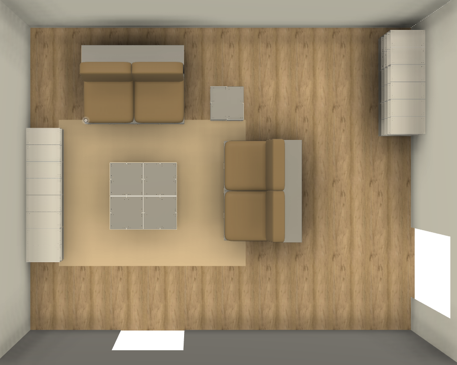
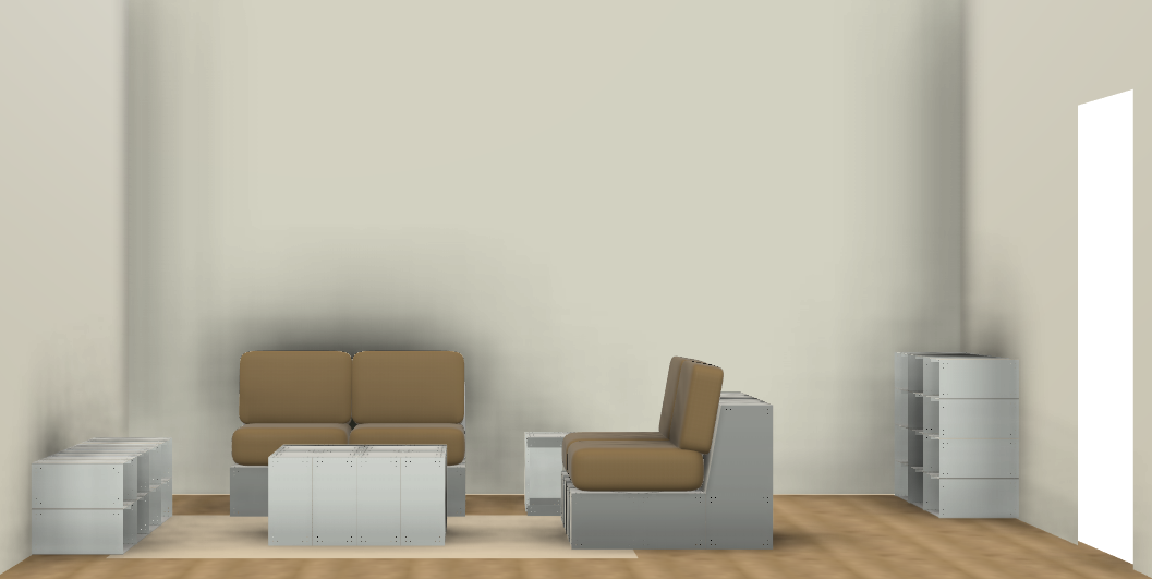
As I continued to explore the narrative behind my project, I became interested in visualising how my collection might look in a domestic environment. This exercise helped me understand how the pieces could potentially sit within the category of showroom furniture. I designed a small showroom layout, similar to those found in IKEA, not specifically for my degree show, but as a way to clarify where I envision my work being placed and experienced in the future.
Hand-in Display
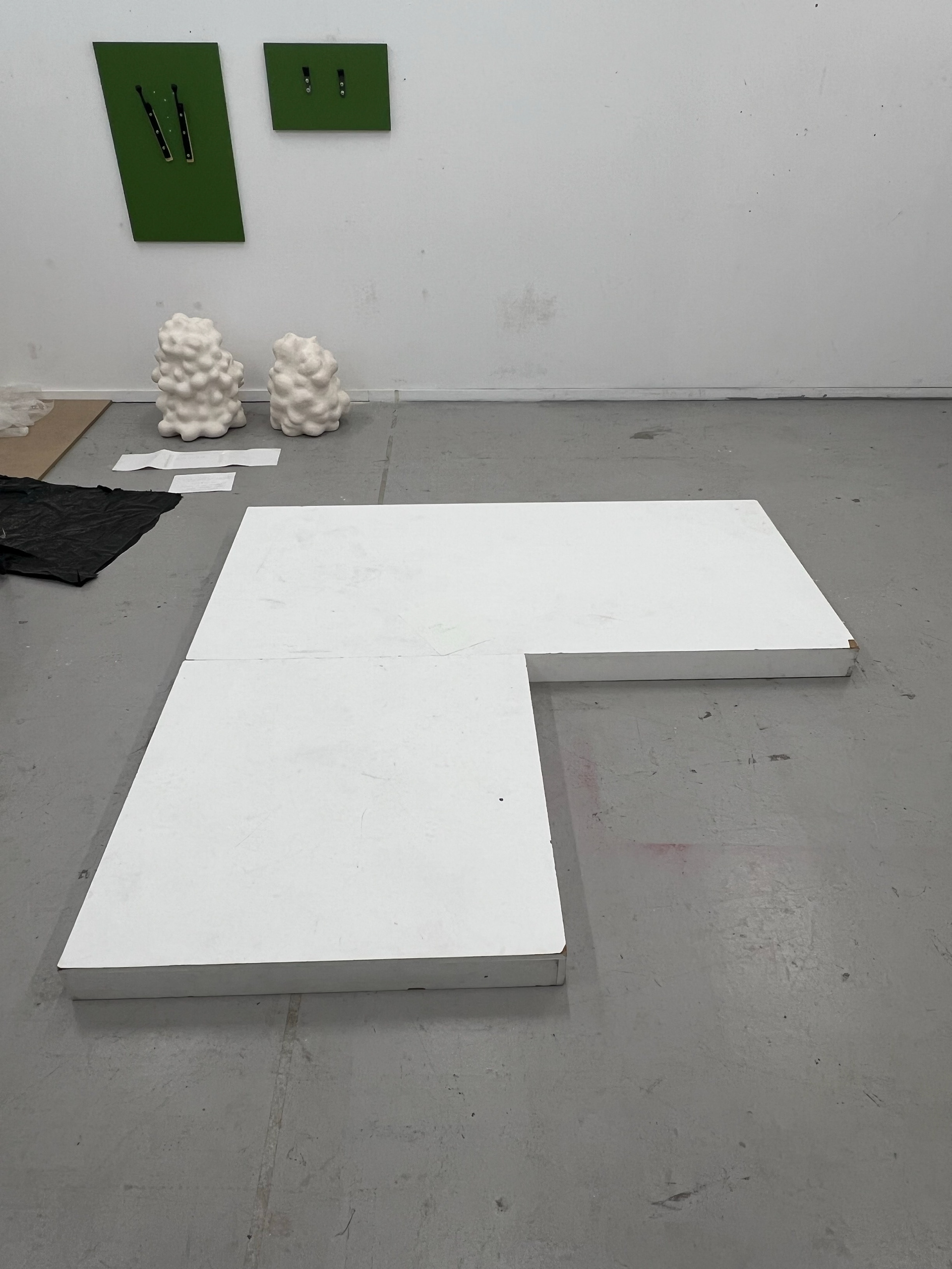
For my hand-in, I wanted to explore one last idea I hadn’t yet tested. During the curation workshop, I preferred having my work tucked into a corner, but for the final submission, I decided to do the complete opposite—allowing the piece to be viewed from 360 degrees. Using two plinths, I discovered this setup not only opens up the work visually but also introduces depth and variation in perspective. Different lines of sight reveal new details when the pieces are elevated. This layout also gives me enough room to showcase separate components so that examiners can pick up and interact with the final editions of the piece more directly.
Reflection
I’ve always overlooked the importance of curation. My mindset used to be: what's the point in displaying something if you can’t sit on it or test how it feels? But this project has shown me that curation is far more than just presentation—it’s about professionally showcasing your work to attract interest and potential buyers. In many ways, it’s a form of marketing, and doing it well can significantly strengthen your identity as an artist or designer.
This semester has really challenged my conventional thinking and encouraged me to push boundaries so my work stands out. Reflecting on our trip to London helped too—it was insightful to hear how others approach curation, what styles they prefer, and why.
I still don’t have a set curatorial style that I’m fully confident in, but it’s something I’m keen to explore further as I exhibit at New Designers and other future shows.