
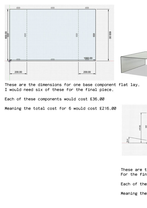
INITIAL THOUGHTS
During Future Me Week, I signed up for the Vertical Gallery tour. I was very excited about this opportunity after seeing what previous L6's and postgrads had done for the verticle gallery. I knew this would be a great opportunity to expand my practice and use it to design and create a space of leisure through thoughtful design.
RESOURCES
EXPRESSION OF INTEREST
The first stage of applying to the vertical gallery was to curate a document expressing your interest in this project. There were around 150/200 students applying for this commission, so a key piece of advice I found from the talk was to make myself stand out against the rest. I used my layout design skills on Adobe InDesign to create a document that shows my minimal/brutalist style.
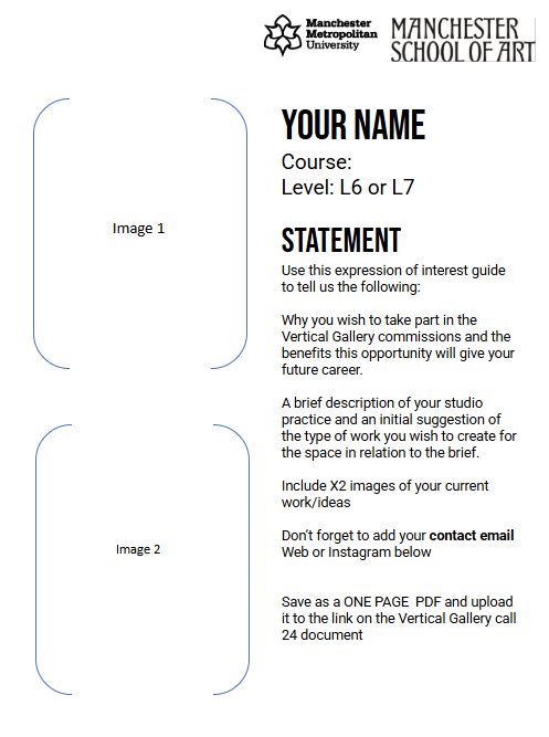
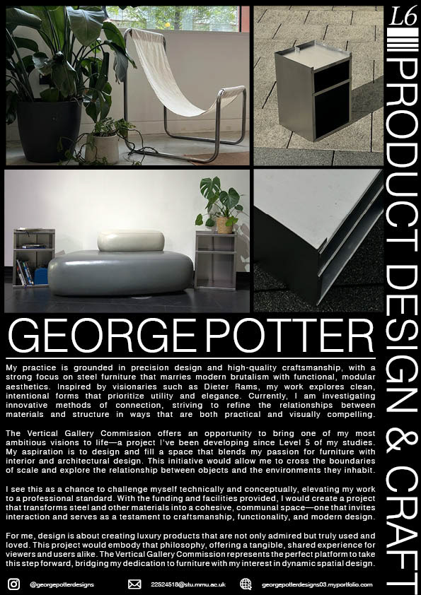
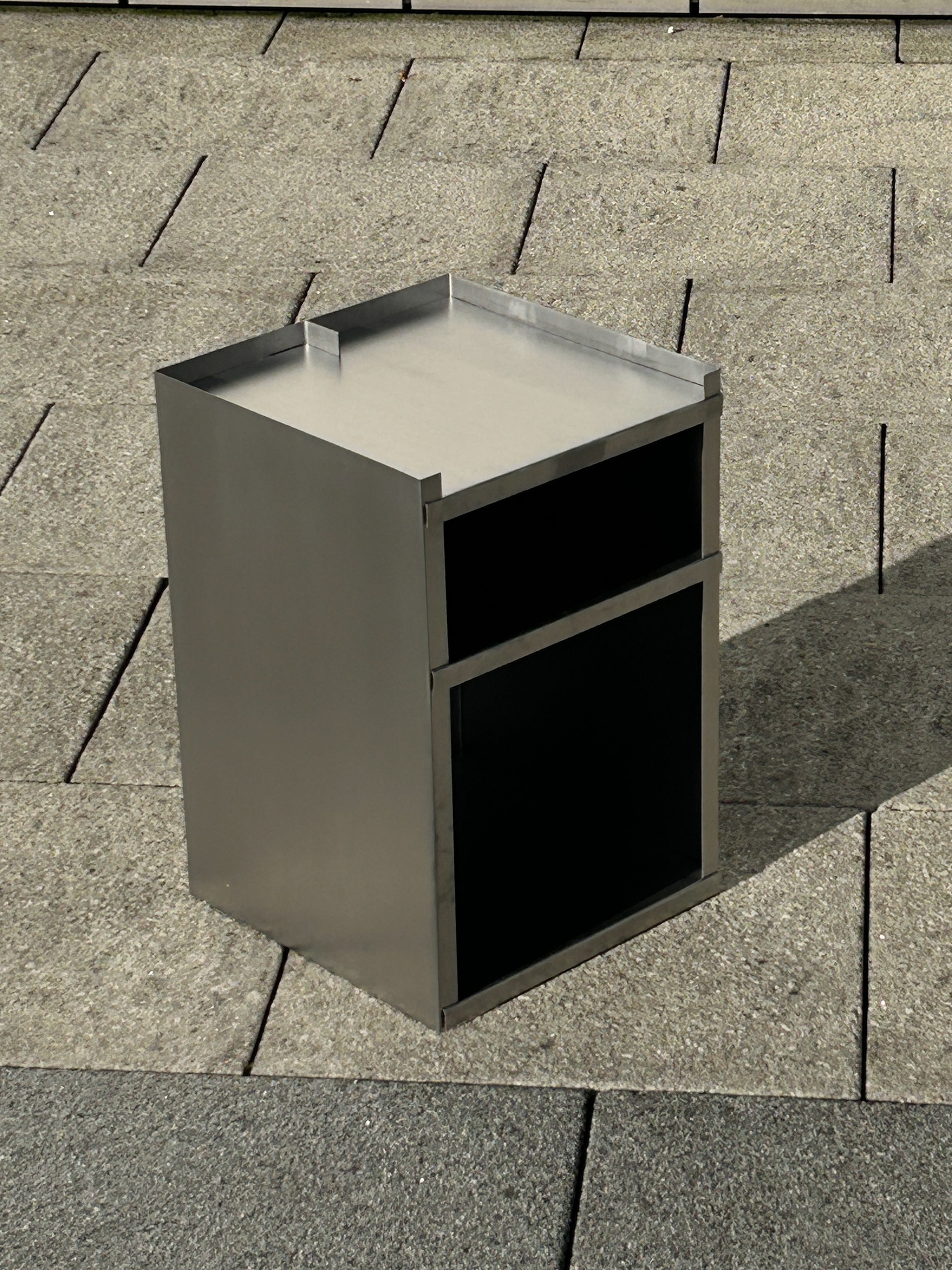
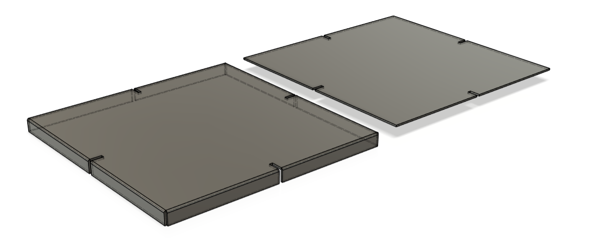
These images above showcase the template and outcome of my EOI.
On the left we can see the template of information they require on this document. We needed to include some images of out previous work which demonstrate our practice and a reason why we are so interested and excited about this project.
On the right is my outcome, which I handed in on January 30th. This outcome took some refining. I made almost 5 different layouts until I found one I was happy with. As I was so excited about this, I wanted to spend more time making sure it was perfect. I used Pinterest to gather inspiration for the layout, looking at brutalist and mid-century poster designs.
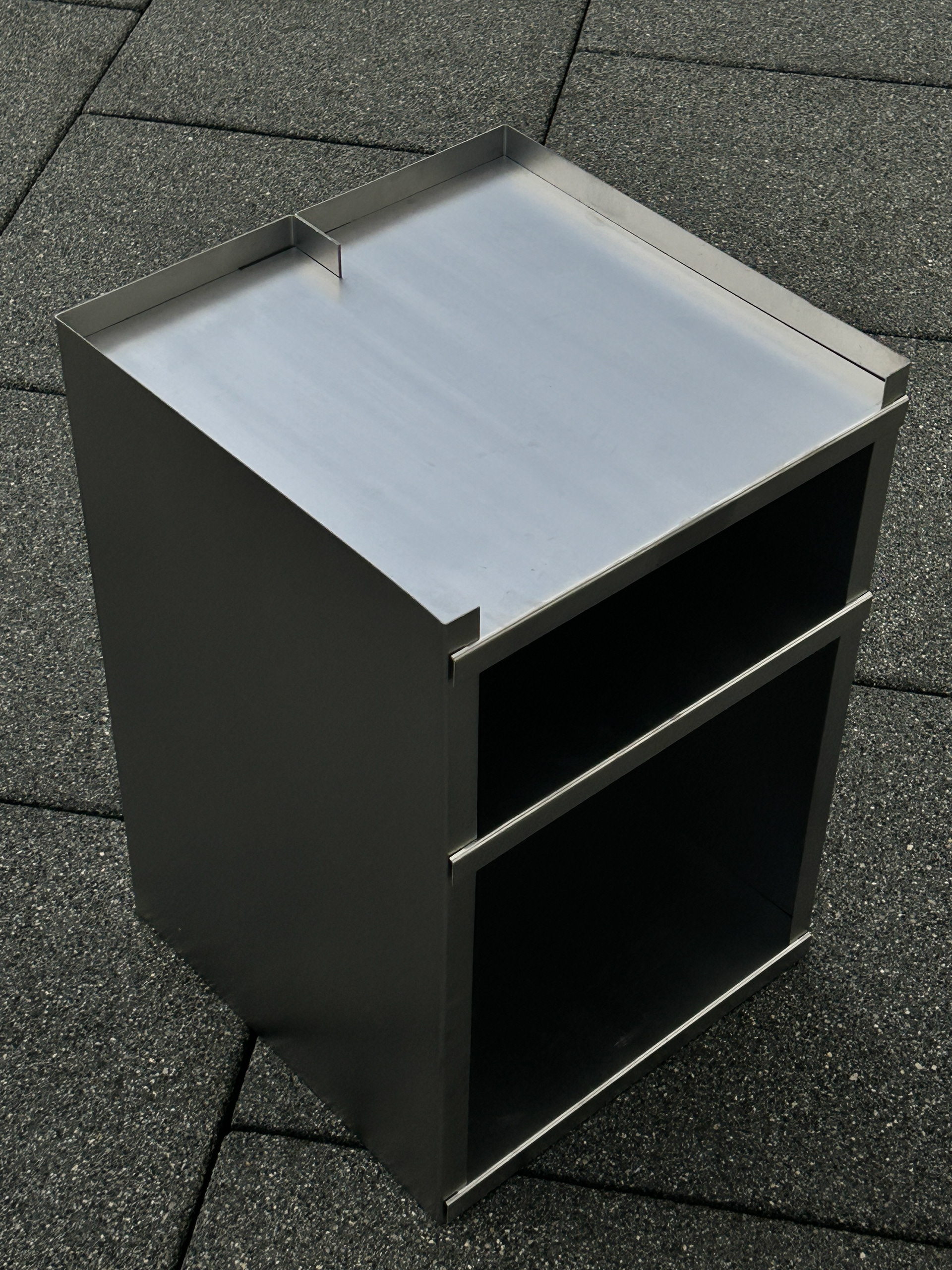
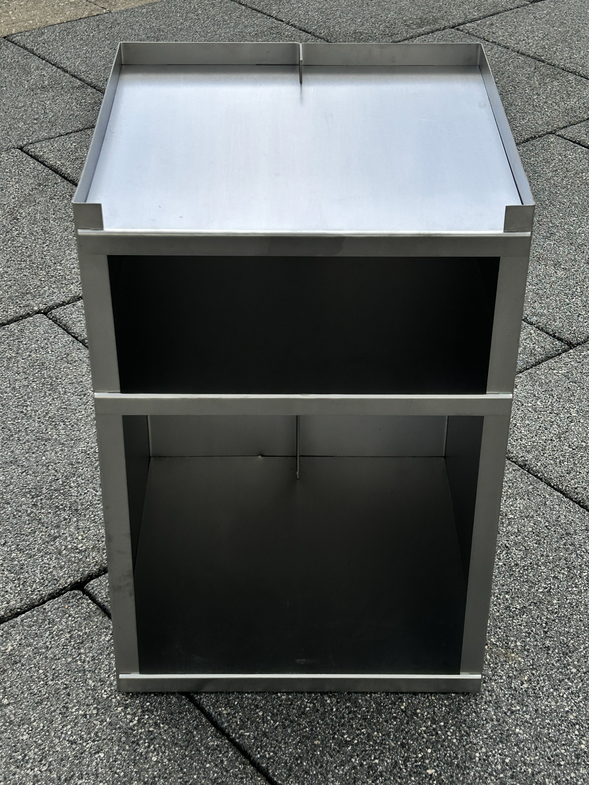
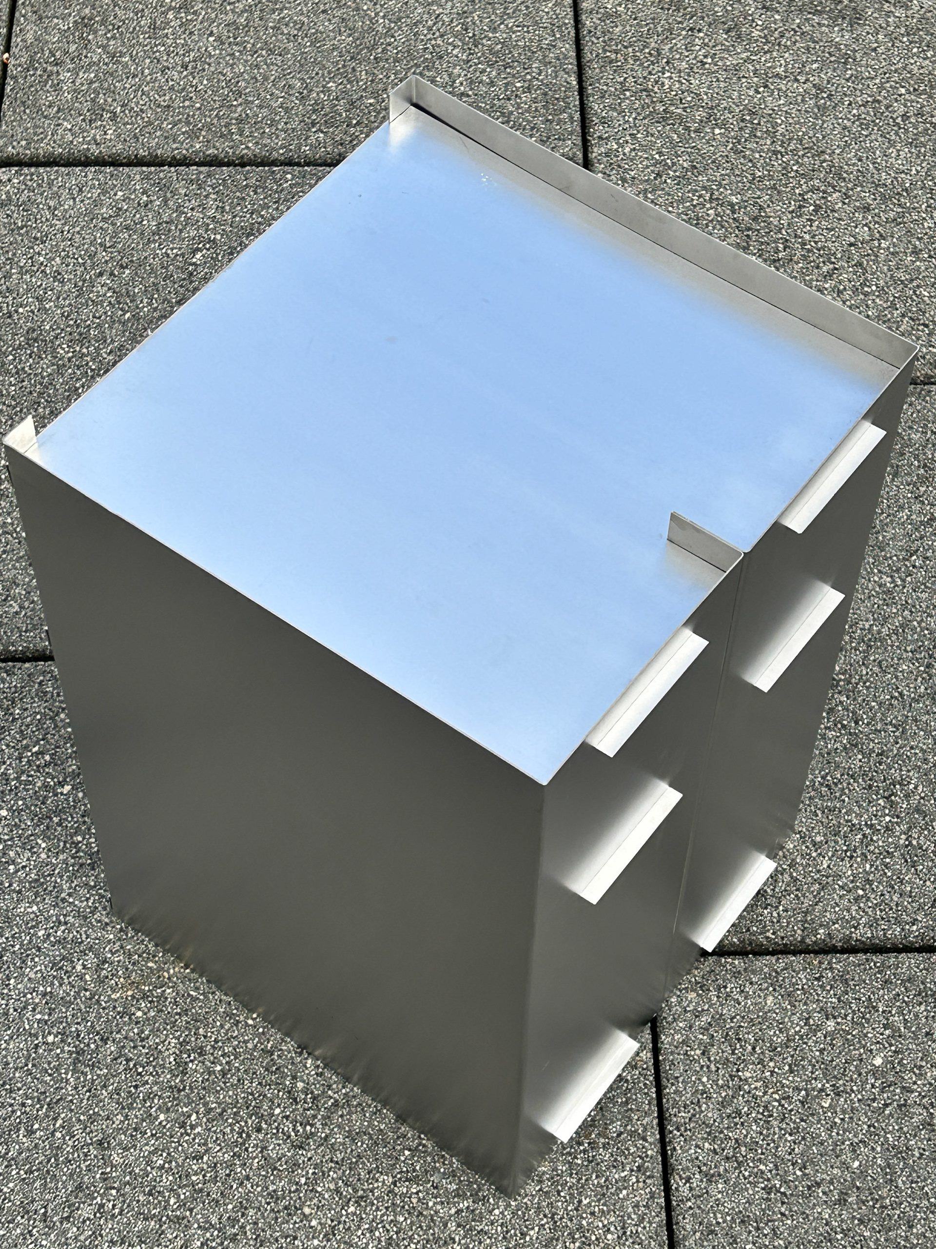
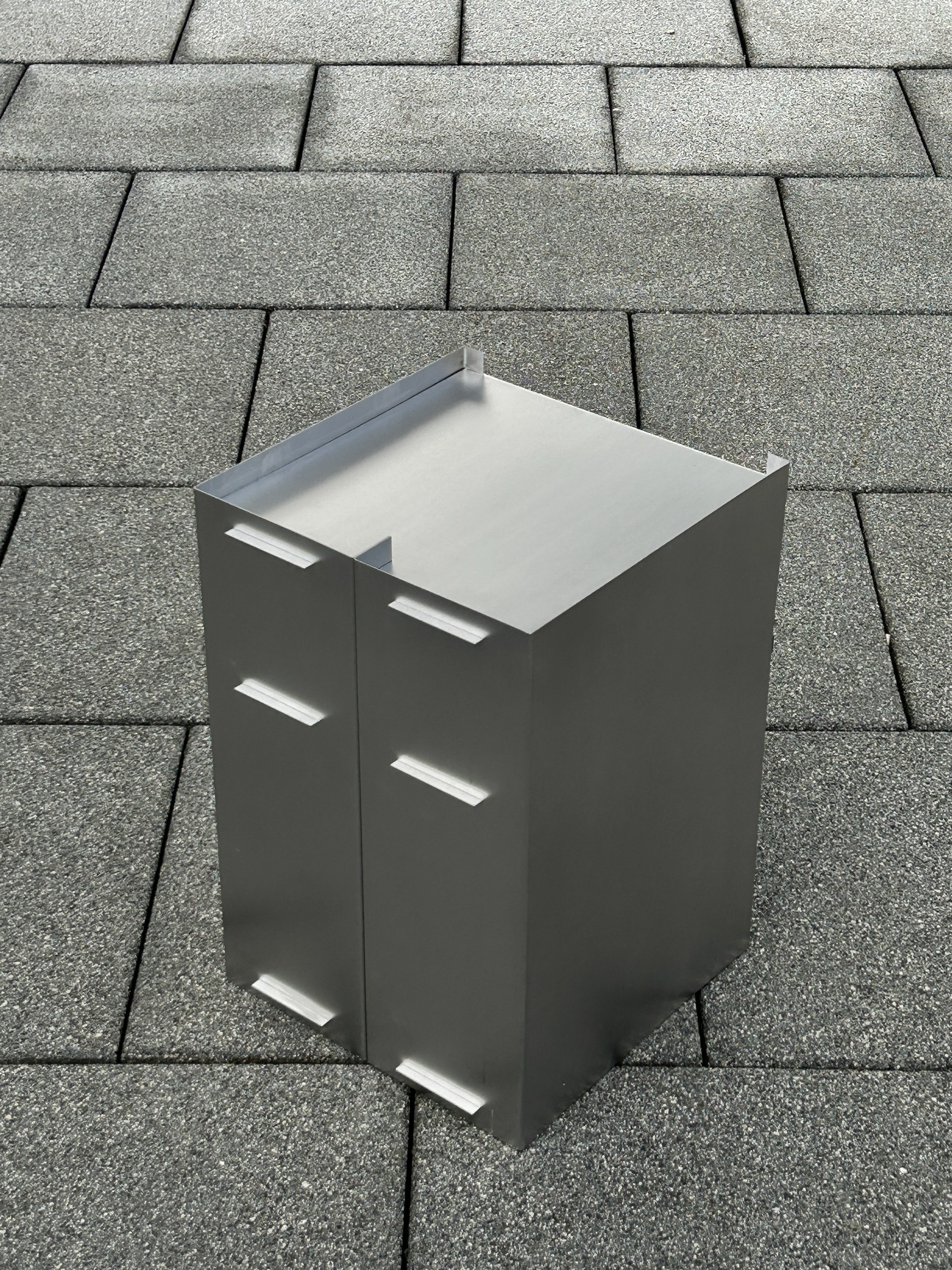
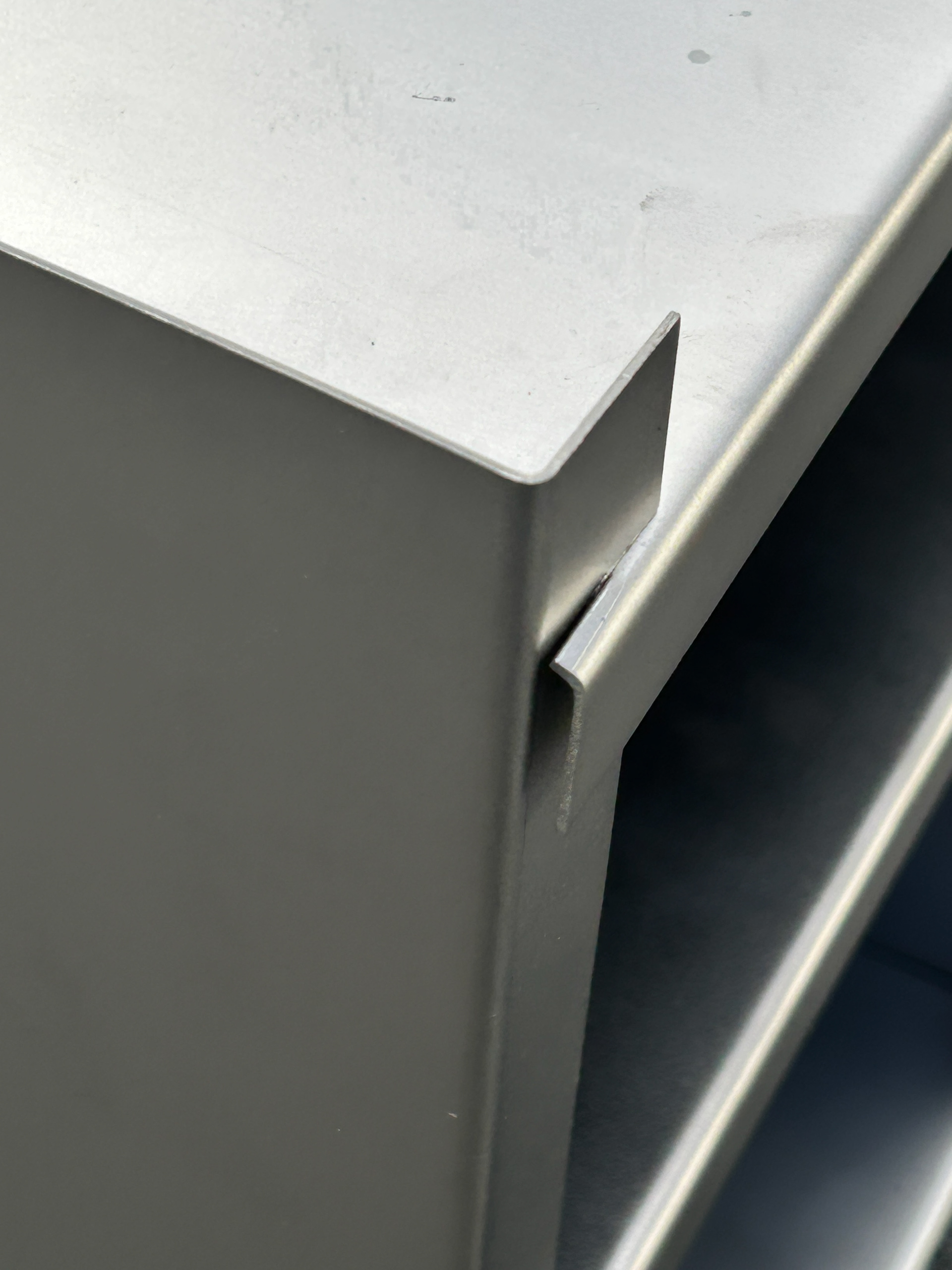
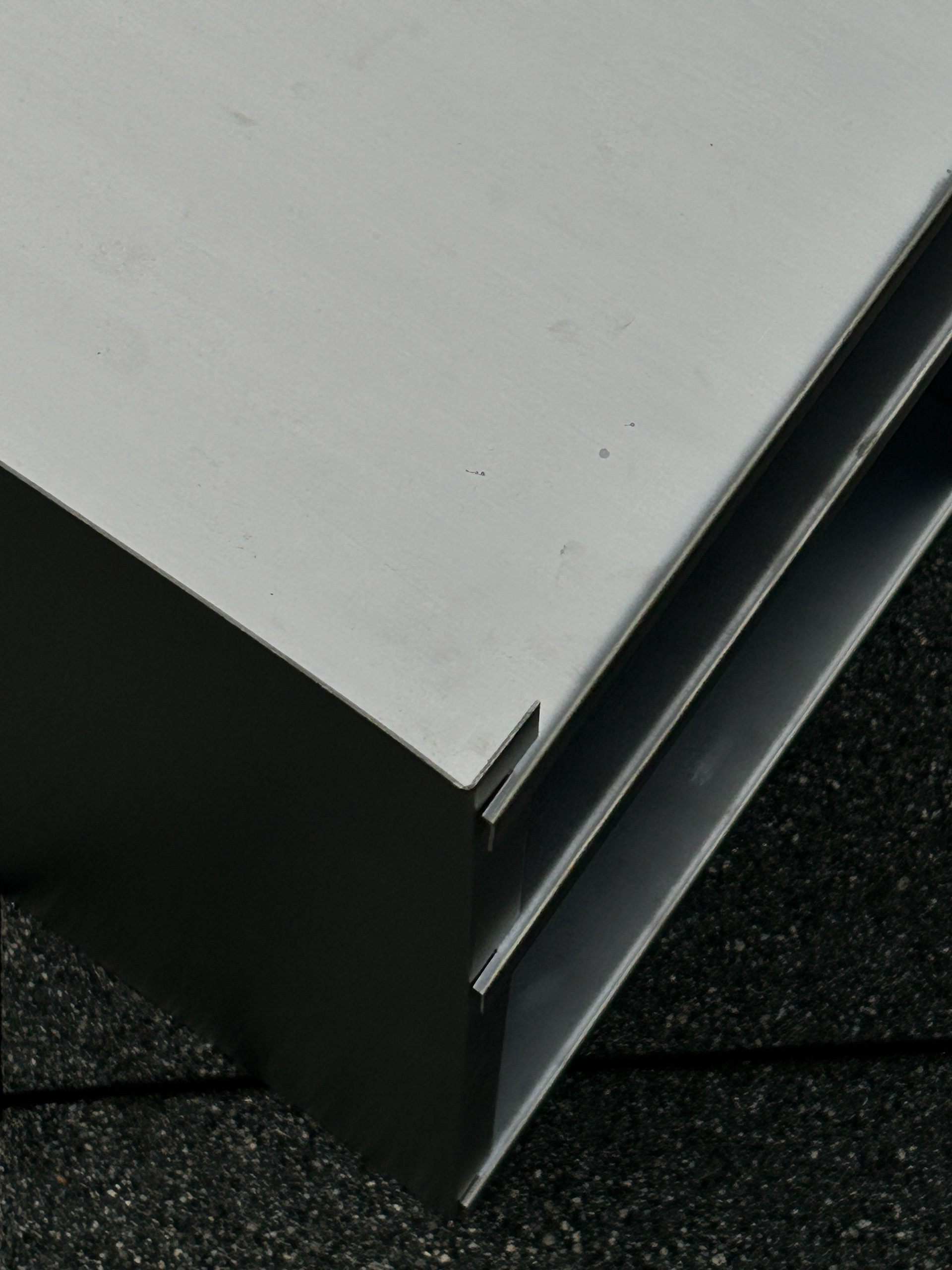
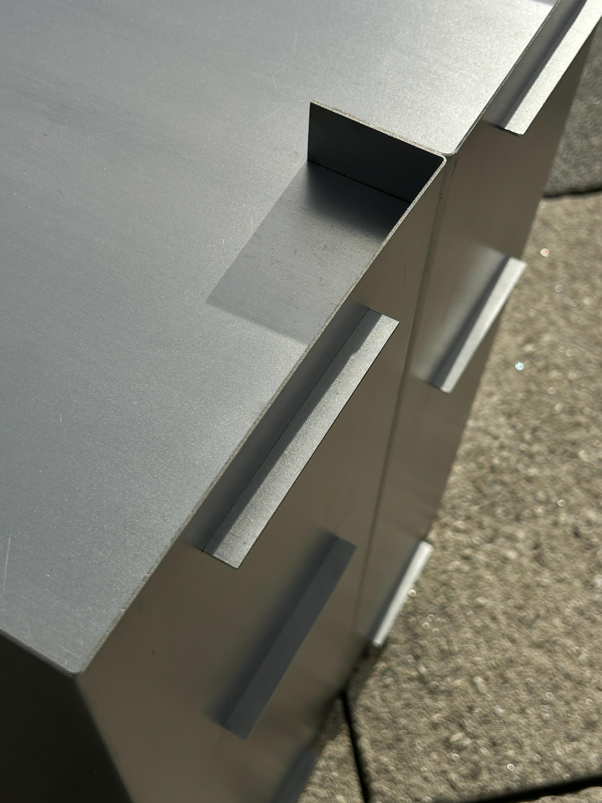
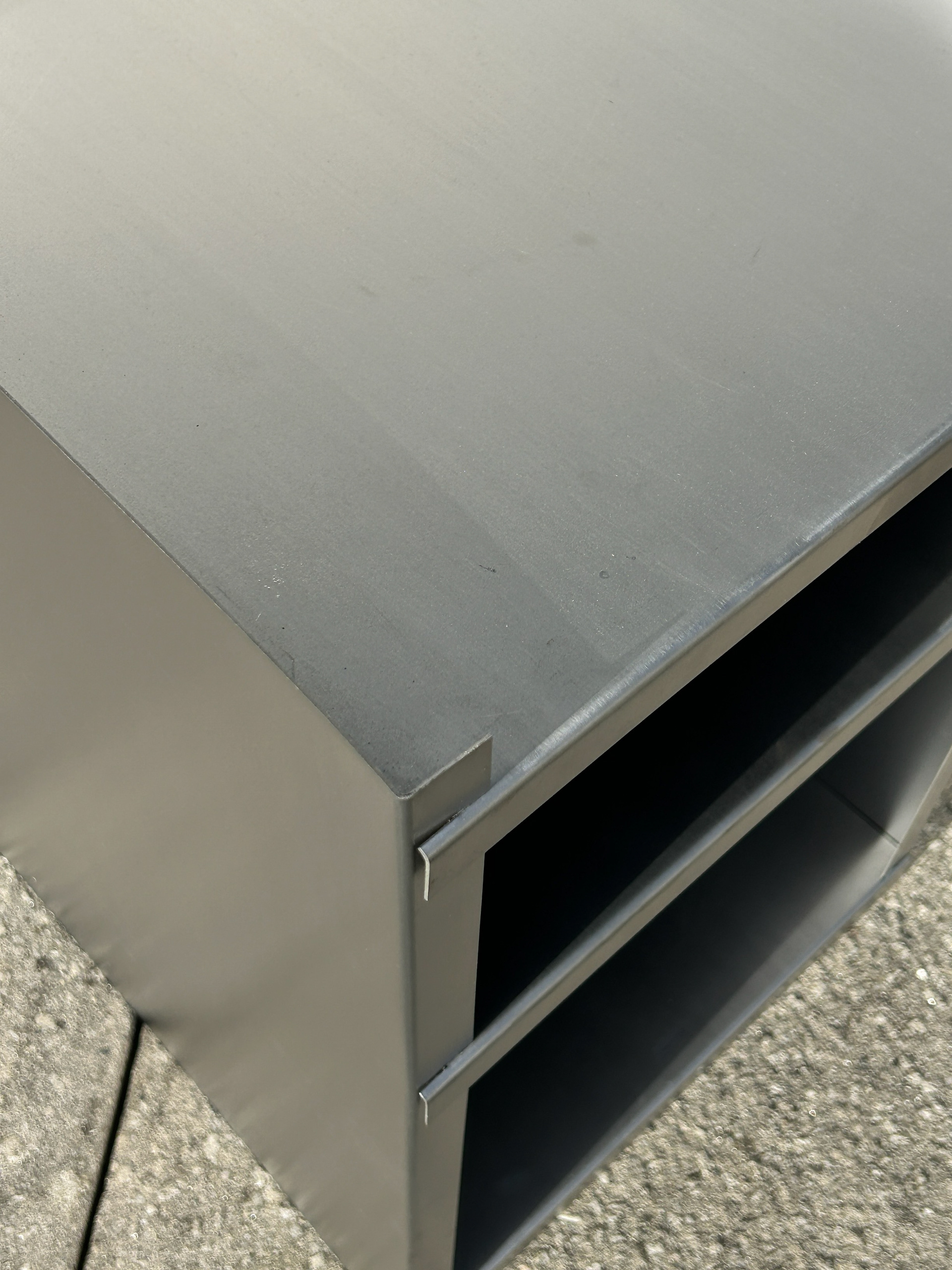
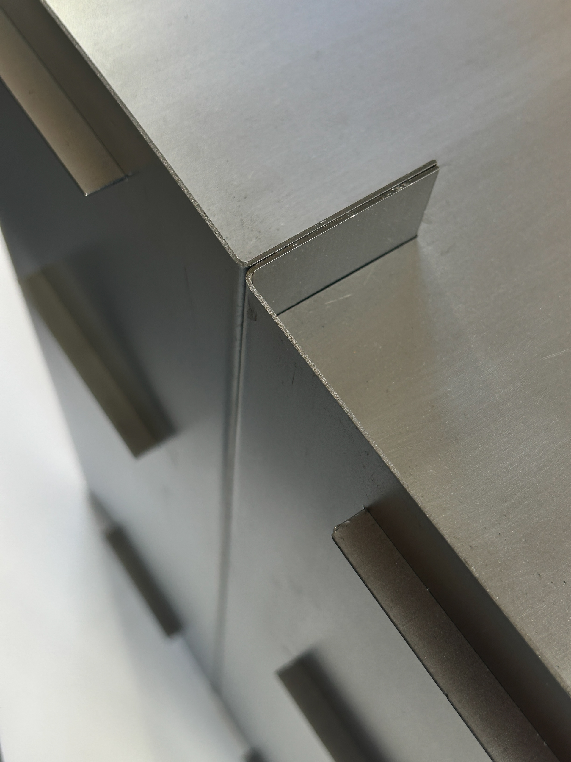
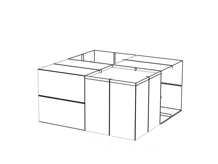
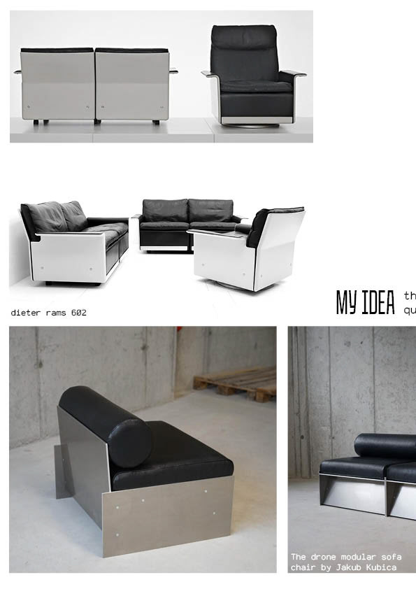
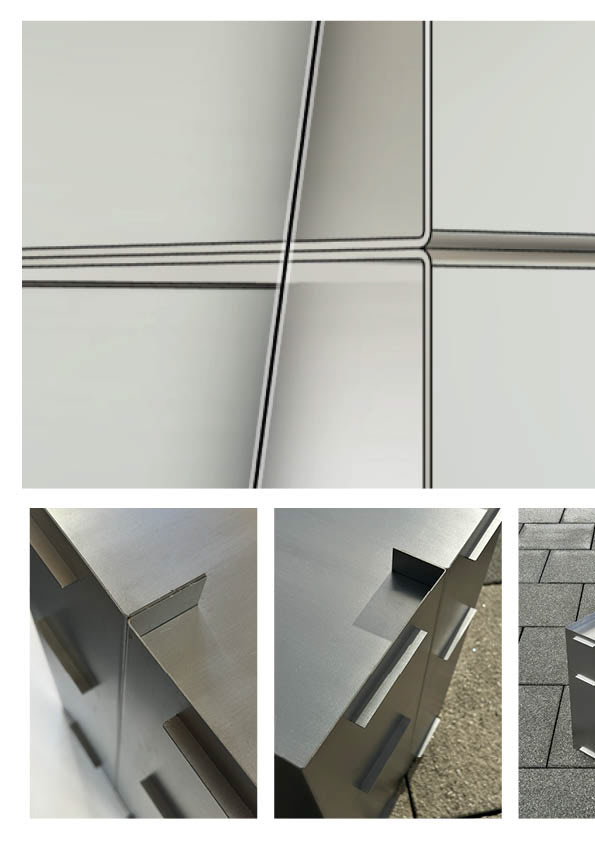
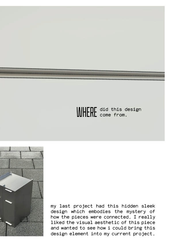
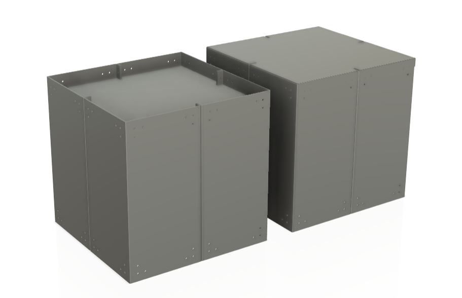
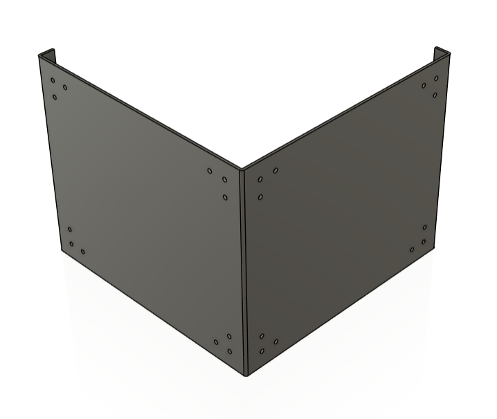
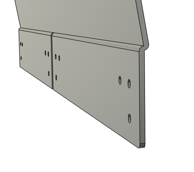
After speaking with Geoff During our Thursday tutorials, he suggested I get more images of my cabinets, which better demonstrate the connections of my cabinets. I had suggested in my text that the drive behind my projects has been the connection of components; however, the images I had didn't truly show the precision and refinement of my design.
VERTICAL GALLERY PITCH
I spent a lot of time preparing for this pitch because I was really keen to be part of the project. I began by sharing my inspirations, highlighting the designers who have influenced my practice, and presented my initial design ideas through early renders. I also explained the origin of the concept, which stemmed from a previous space proposal project, and gave a rough outline of the budget I would need to bring it to life.
For the space proposal, I wanted to clearly communicate how my design would work within the environment I was pitching for. To achieve this, I spoke with Geoff, who recommended using Adobe Aero — a tool that allows you to place digital designs into real-world settings using augmented reality. Learning to use this software was really exciting and helped me visually demonstrate how my work would function within the proposed space.
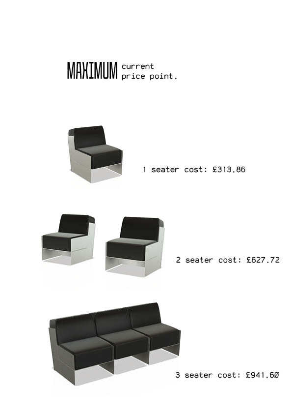
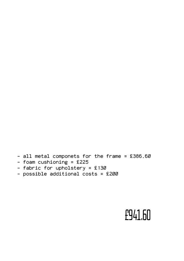
Finally, I created some rough cost estimates, which brought the total to just under the maximum budget of £1,000.

My pitch went really well. I was initially nervous about presenting my ideas in front of a group, but once I started, I felt confident in what I was saying. I believed in the strength of my concept, and everything flowed smoothly.
We had been told we’d hear back by Friday at the latest, and sure enough, on Friday evening, I received a confirmation email letting me know I had been selected and awarded the full budget I applied for. I was ecstatic!
First Group Meeting
The following week, we had a group meeting with all the selected participants. The aim was to bring everyone together so we could share our project ideas and get a sense of the wider vision for the communal space. It was really exciting to see so many talented artists from different fields coming together with such creative concepts. This is also when I was officially paired with textile student and artist Rebecca Price, which made the outcome even more exciting and helped ease the pressure of getting accepted. Knowing I had a collaborator allowed me to focus fully on designing and building the framework for a functional modular sofa. This was also where they told us that we had a joint budget of £1,500!
Right after the meeting, Rebecca came straight over, and we exchanged contact details. It was clear we were both genuinely excited about working together. As we both had other commitments that day, we arranged to meet up a few days later to get to know each other better and talk through our ideas in more detail.
Collab
Rebecca is an amazing textile artist, specialising in hand weaving. I was very excited about being paired with Becca, as a lot of her work takes inspiration from architecture. I've put some of Becca's designs below so you can see the different types of weave design she makes.

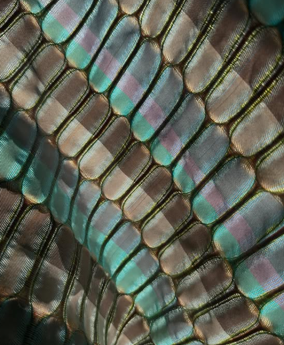
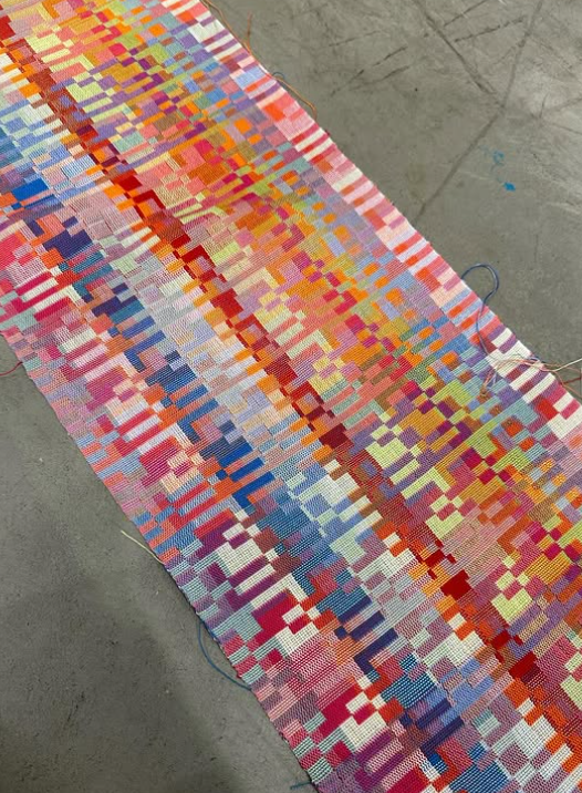
Rebecca uses a variety of thread types to achieve different visual and textural effects. One of the first samples she showed me — inspired by the texture and tones of concrete — immediately stood out. It felt like a perfect match for the brutalist aesthetic of my design.
We met again the week after the group meeting, and she brought along a lot of her previous work to share. It was great to see her process and the range of her textiles in person. We also used this time to set some key timeframes for decision-making and explored further inspiration together to help spark ideas and keep the creative momentum going.
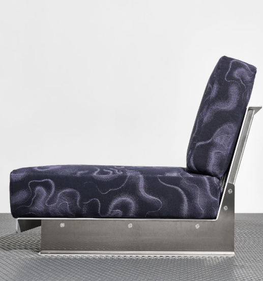
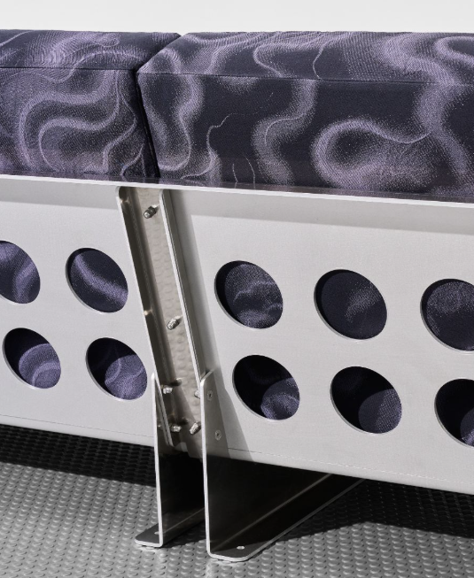
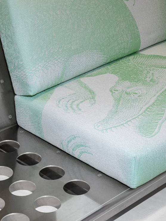
When we met up, I showed Becca one of my favourite design pieces — and one of the biggest inspirations behind this entire project: NM3, whose work was recently showcased at Milan Design Week. She absolutely loved the purple, liquid-like fabric, though she mentioned she’d need the material to be simple enough to align with her own style and fit alongside her other projects.
We then explored another major influence of mine — Standard Equipment. While I’ve already included a detailed section about them in my research archive, this time we focused specifically on their upholstery fabrics. Rebecca was especially drawn to the herringbone weave. She said she’d been considering doing something similar, but with small, subtle injections of colour, which could add a unique twist while complementing the modular structure.
Rebecca's Design
I wanted to include Rebecca’s final design sketches for this piece, even though the final outcome won’t be ready before our unit submission. At this stage, I’m not entirely sure how it will look, as she hasn’t produced any samples yet — she’s planning to have it manufactured soon. That said, I’m really excited to see how her work develops alongside mine and how the two will come together in the final installation.
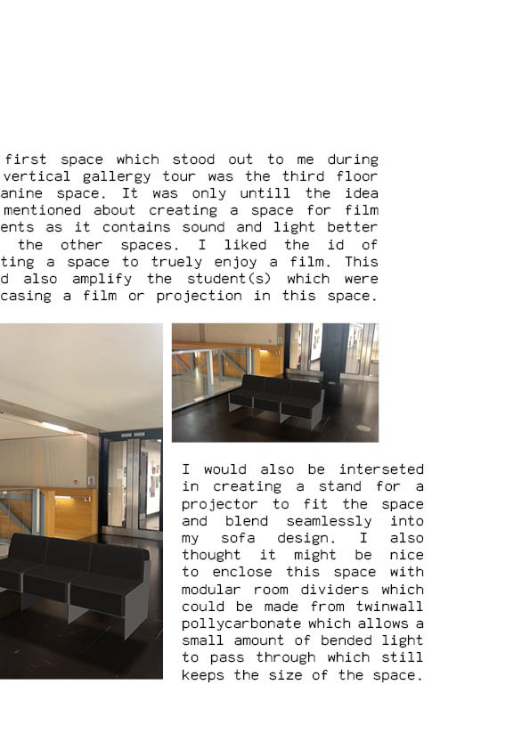
You’ll be able to see the completed piece on display on the ground floor of the Lowry Building.
Yarn type: Z Hinchliffe lambswool 2/17 2 Ply
Warp 24 ENDS PER INCH
WEFT 16 PICKS PER INCH
1 M WEAVING WIDTH
2 Colours over 6 Blocks
Warp 24 ENDS PER INCH
WEFT 16 PICKS PER INCH
1 M WEAVING WIDTH
2 Colours over 6 Blocks
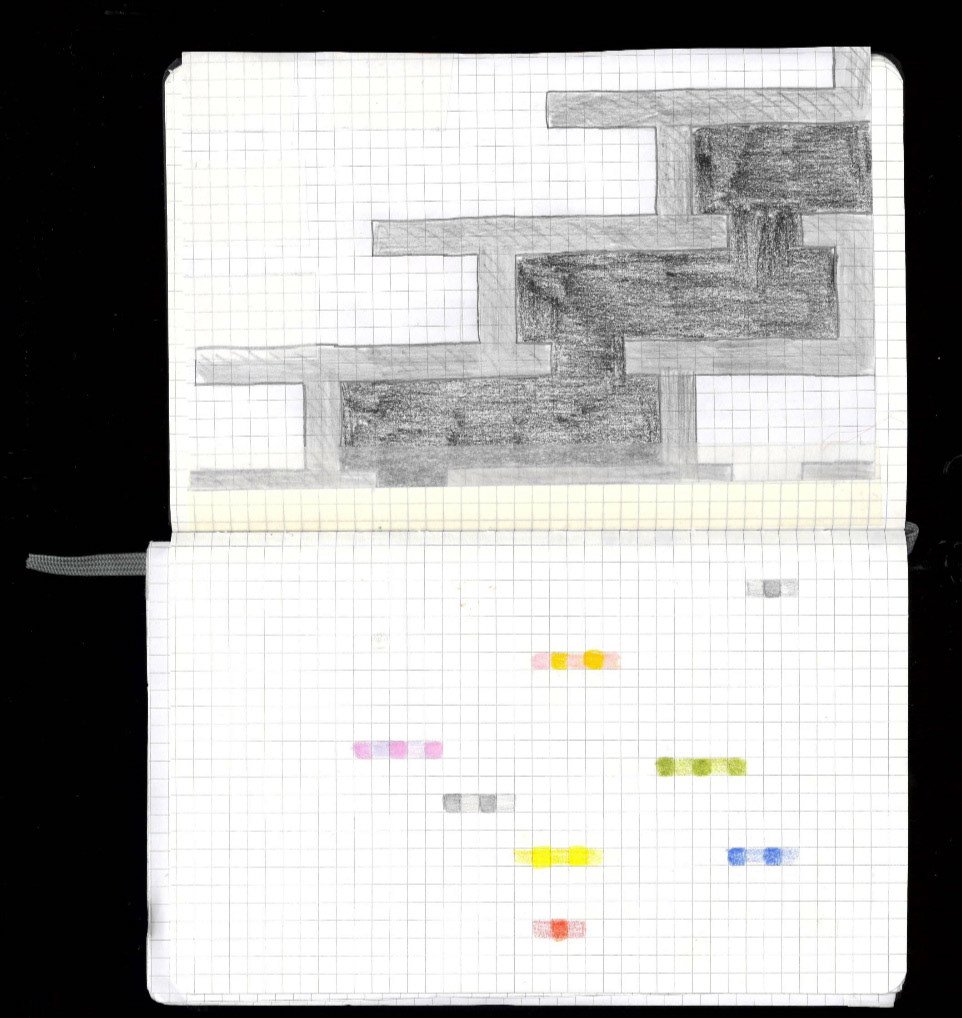
I input Rebecca’s weave specifications and sketches into ChatGPT to help visualise how the final design might look. I was really pleased with the outcome — it gave me a better sense of how everything could come together and has made me even more excited to see the finished piece in real life.
This may not be accurate and might look completely different, but I wanted to add it anyway.

As this is an ongoing project, I cannot document it all the way through. It will be up in the vertical gallery for the degree show on the ground floor, just under the stairs by the reception desk.
As a last-minute decision, Rebecca has decided to purchase fabrics instead of getting the weave manufactured. She is going with a design similar to this.
Further Process Development
This section is a follow-up from my project process page. I decided to section my process of designing the sofa under the vertical gallery to balance the amount of information on each page.
MAKING A SOFA WITH THIS FRAMEWORK
At this stage, I needed to start making some critical design decisions. As I had just been accepted into New Designers to display this modular shelving/table unit, I had already been commissioned to create a sofa by the university for the vertical gallery. At this point, it all seemed too stressful. I was considering dropping out of the vertical gallery and focusing on making a singular piece for New Designers; however, I still really wanted to make a sofa and needed the funding I would receive from the vertical gallery to fund my designs.
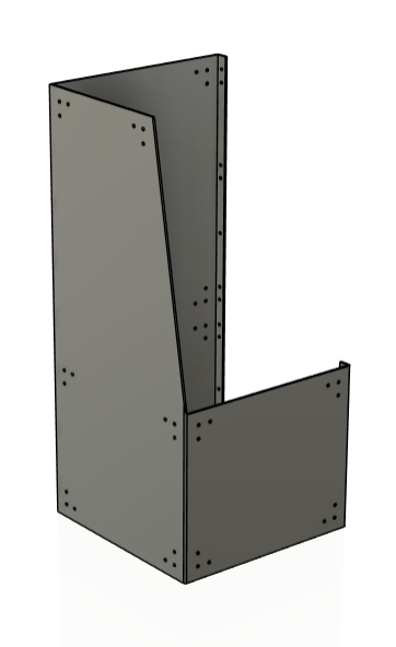
Using the prototype as a base, I returned to CAD and began exploring new arrangements and forms that could resemble a sofa structure. This stage was about adapting what I’d learned from the table and shelving variations and applying it to larger, seated furniture while still using the same modular language I had developed.
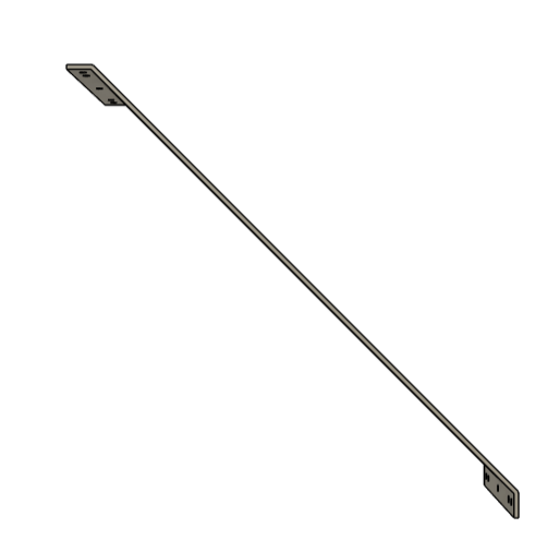
It quickly became apparent that I would need to make more specialised components to create something as complex as a sofa. Otherwise, creating designs like these above would create a huge problem when it came to creating the cushions and sorting upholstery. I knew it wouldn't be impossible, but as I knew I was collaborating with a textiles artist who was also known for furniture and upholstery, I didn't want to make her process more confusing than it should be. With this, I continued developing ideas and created some new components.
I liked this design; I thought it held a lot of potential. However, there were still lots of key issues. I realised that I was designing the frame without the thought of cushion thickness in mind. A problem I have had in previous projects is having fabric and other materials as an afterthought, and I didn't want to make the same mistake again. I really needed this to work and wanted it to be comfortable.
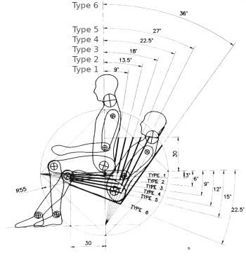
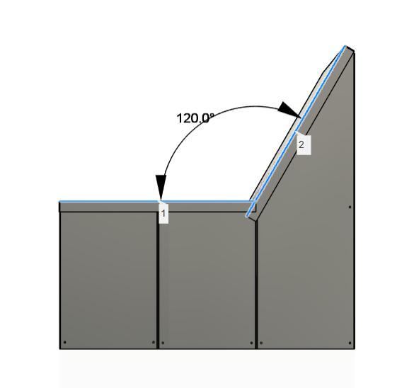
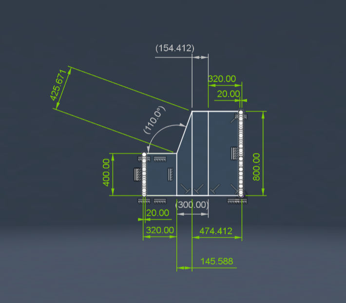
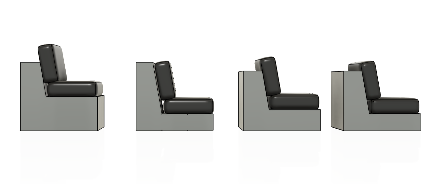
With bigger, thicker cushions at the forefront of my design thinking. I created this statement piece. I think something like that works a lot better as "art furniture," but unfortunately, it wasn't what I was going for. It did help me get a better idea of forms and shapes, and also helped me consider the angle of the backrest. This was another HUGE aspect of designing a sofa I had overlooked, and I needed to further research what is comfortable. If you look at the 2 different designs above, you can see how laid-back the first design was in comparison to this design. The angle of the first design was 120 degrees, and the angle of this second one sat at 110 degrees. I needed to see if this was still too much or too little, so I looked into what angles other companies stick to.
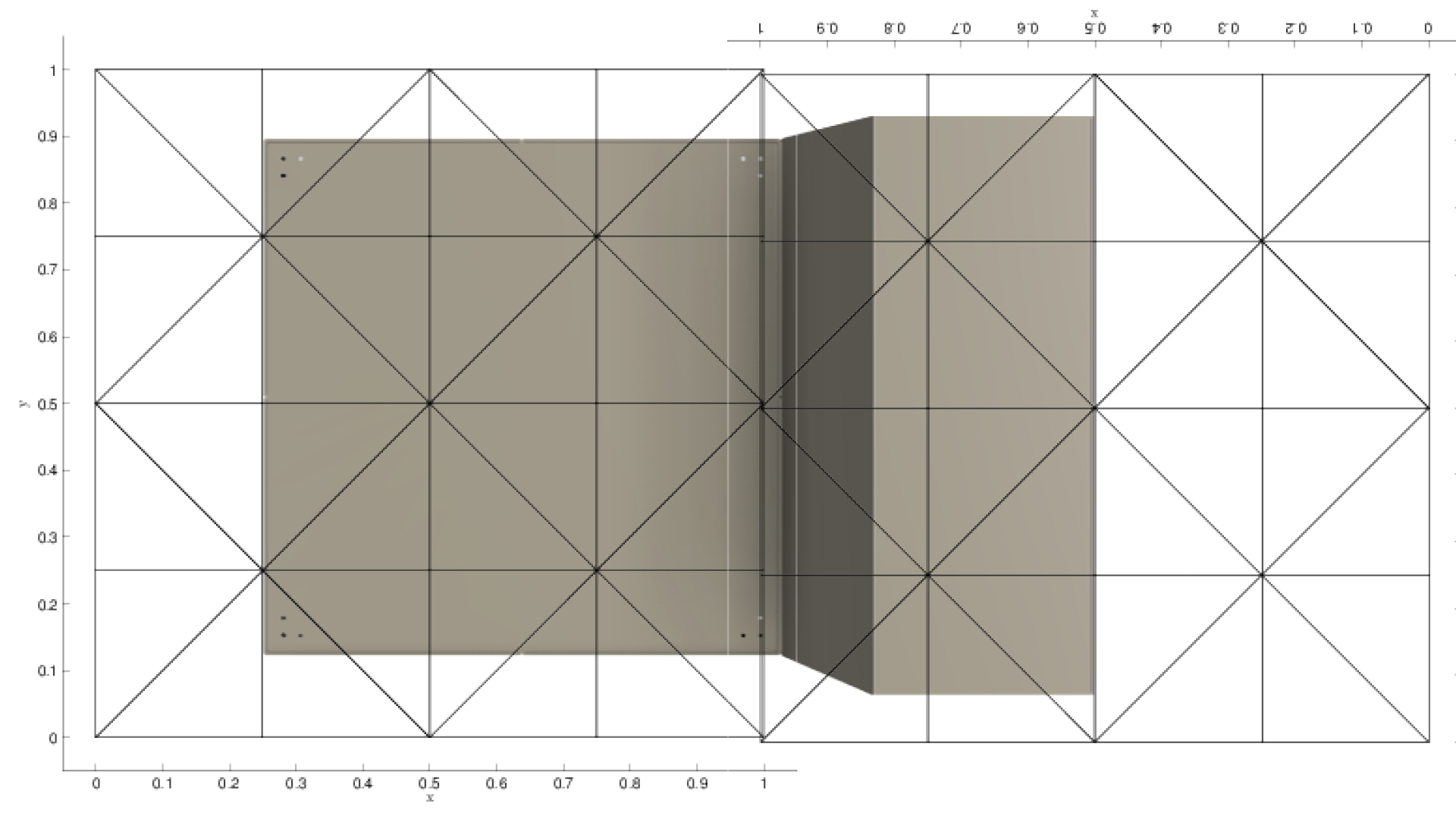
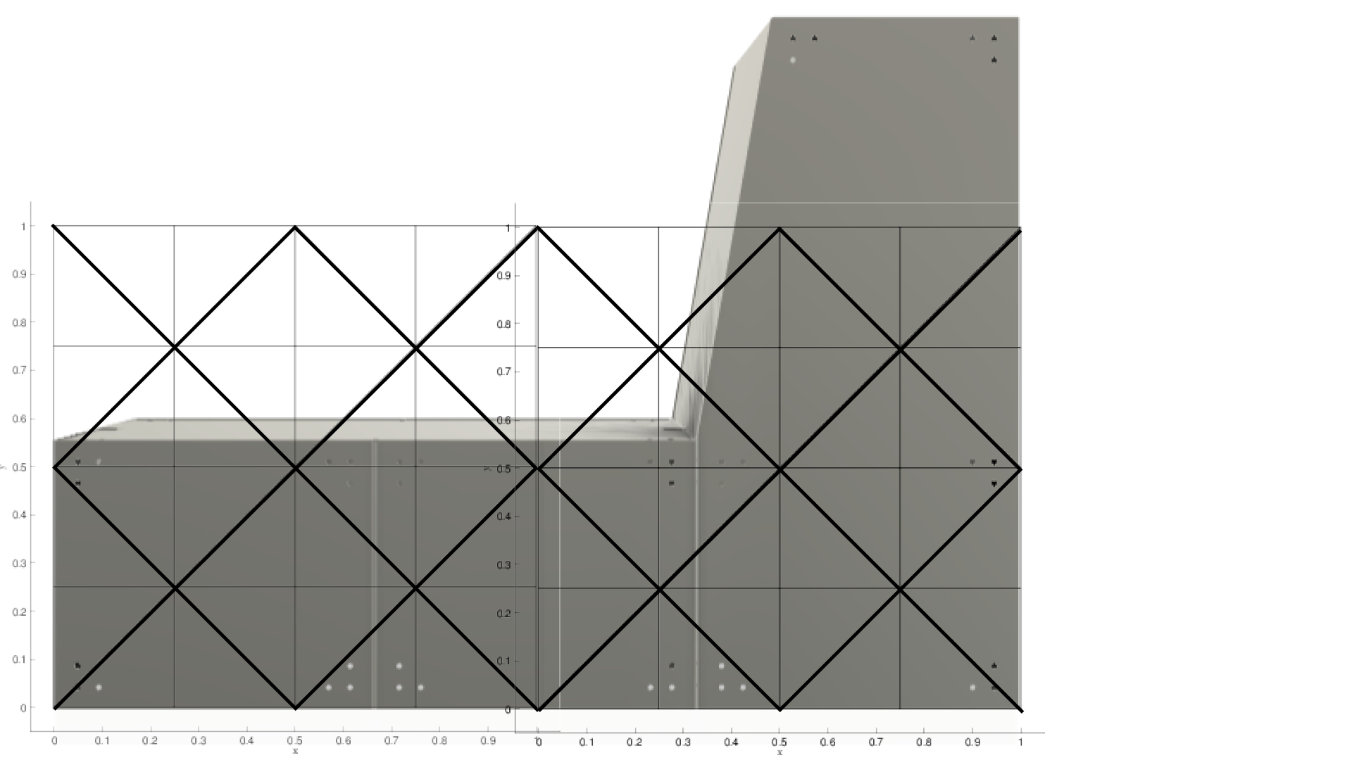
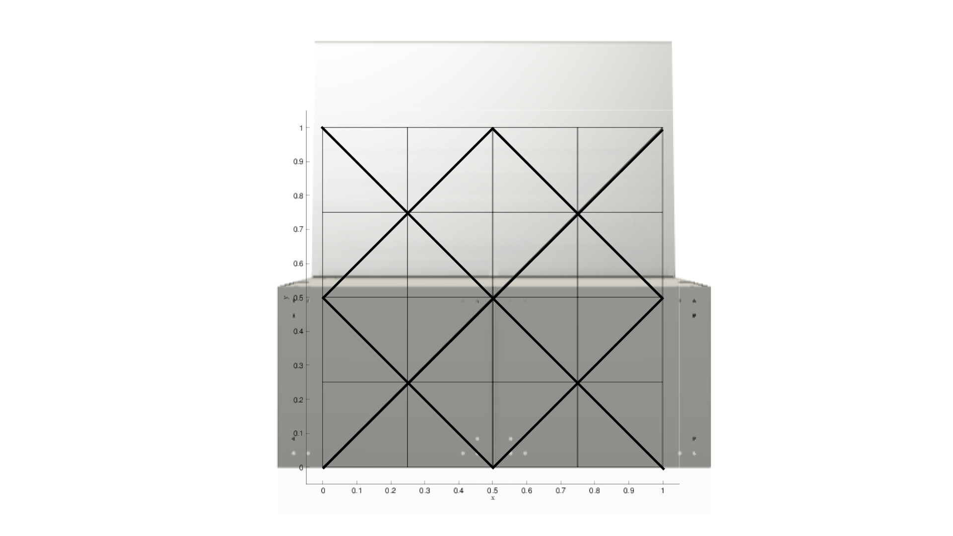
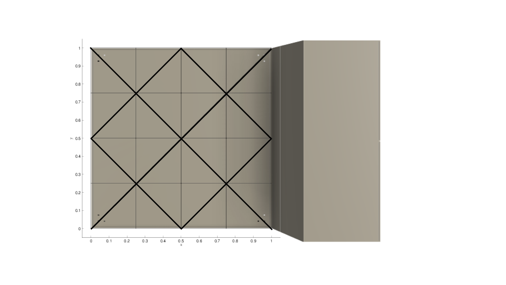
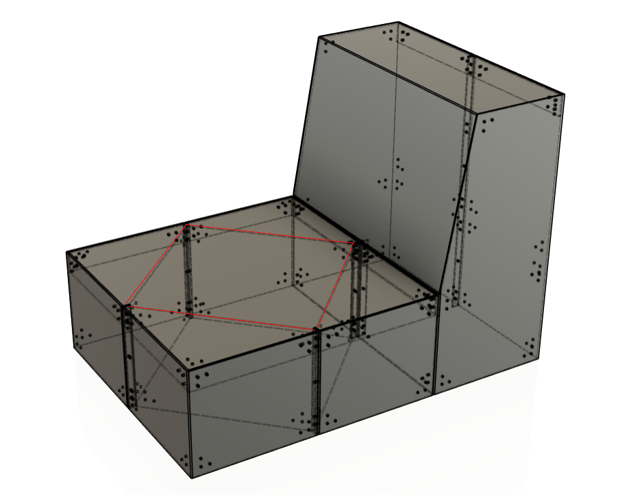
I looked back at this diagram, which I had previously looked at in another project. It's a bit of a confusing diagram, so I decided to make my own. Something that had concerned me whilst looking at this was that the bigger the angle (further back you lay), the lower the intersection between the backrest and the base of the seat. The reason for my concern was that I didn't want to adjust the base as it mirrored the design of my modular unit, and I thought changing the base component would take away from the collection's style.
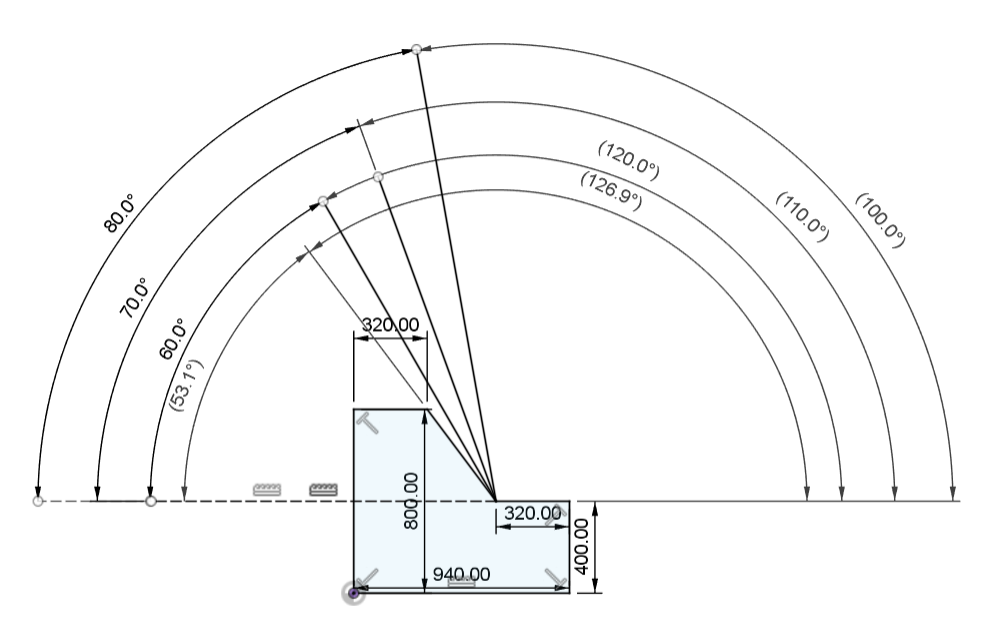
I created this diagram to visualise the different angles of the backrest. The shape I made to help visualise this was based on the flat lays of my modular component, but adjusted with the dimensions I got when I previously looked into standard sofa measurements. I didn't want this sofa to be too upright, as I wanted it to be a place people could comfortably sit and do work, but I didn't want it to be too reclined, where people felt like they couldn't get in and out.
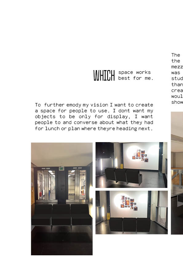
It was around now that I needed to narrow my focus down to the context of these pieces. I needed to decide: was this the type of sofa to be found in a house or flat, or was this piece meant to be hosted in a public space like a lobby or a cafe?
I always had my mind set on furniture for a domesticated space; however, this piece had been commissioned by the university to be placed in a more public environment.
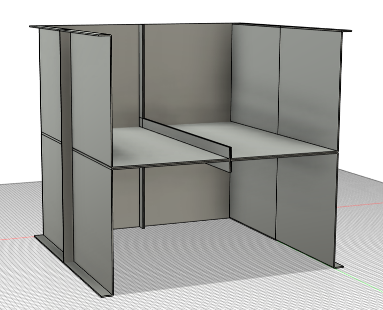
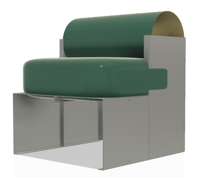
Whilst thinking about this, I created this model you can see on the left. I used the base components (at the correct dimensions for a sofa). And turned the flat lay diagram above into a folded 3D model. Once I had put these together, I made a quick makeshift "lid" for the frame so I could properly visualise this without it looking like a hollow frame.
I went straight in for a 120-degree angle, as I just went for the median in the angles I was looking at. This was still inconclusive as I went back to the drawing board to see other real-life examples.
I turned my attention to benches. This was due to sofas having a more relaxed style, and I wanted something more formal for a public space. The only measurement I am interested in here is the angle between components 1 and 2. We can see that component 2 angles its set at 3-degrees below the edge. This is a 97-degree angle against the backrest panel (component 1). This equates to 100 degrees; this seemed better, and when looking at most chairs around me, they tend to look between 90 and 100 degrees.
I started to mess around with the most current components I had, arranging them in different ways that suited the context I decided to follow. This also helped identify some more design issues. I wasn't happy with how the back came to a point. Not only did I think this could be dangerous in a busy environment, but I also didn't like how it looked.
With a better idea of form, I moved back to refining practicality and dimensions.
TESTING CUSHIONS
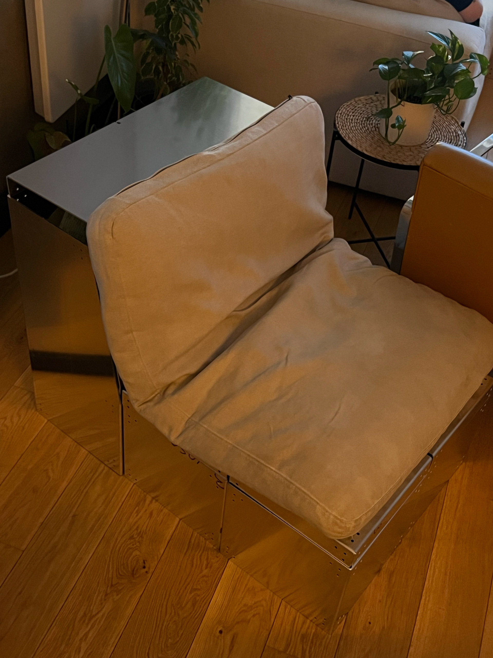
Now that I had a clearer idea of the sofa shape I was aiming for, I needed to test whether my previous prototype was strong enough to actually support the weight of a person. To do this, I made a very basic, makeshift cushion using some soft foam cut to match the top of the prototype — roughly 400mm x 400mm. I’ll admit it was probably the worst upholstery job ever, and I just taped the cushion to the top for a quick test.
I was genuinely unsure if the piece would hold any weight, especially since the top panel was just resting on the bolts connecting the side walls. But to my surprise, once I sat on it, it held up really well, and was actually reasonably comfortable. Encouraged by this, I asked a few other people to sit on it and give feedback.
A few people mentioned that the exposed metal edges wrapping around the cushion were uncomfortable, especially against the backs of their legs. This was helpful feedback and got me thinking about how I could redesign the top panel to hide or soften those contact points. Others suggested the cushion should be thicker, which was something I had already planned to improve later down the line.
This meant I needed to reconsider a top component that would work better in this scenario. It also probably would also require changing my coffee table design as well but first we had to think of what could be the fix.
I started badding folded tabs on each end. It seemed like the most obvious and practical answer. I added a 20mm tab on the underside of the original top design I had prototyped. I followed the 4 central slits down the tabs so it could easily sit on the pre exisiting tabs.
I also found when the cushion was ontop of and tucked inside of the frame, It would get bunched up where the tabs met inside. I knew this would be a nightmare for my collaboration as it could add a whole new level of technicality to the upholstery process. I think these small tabs could lift the top so it sit level with the top of the side components
You can see the before and after changing this here.
FURTHER REFINMENT
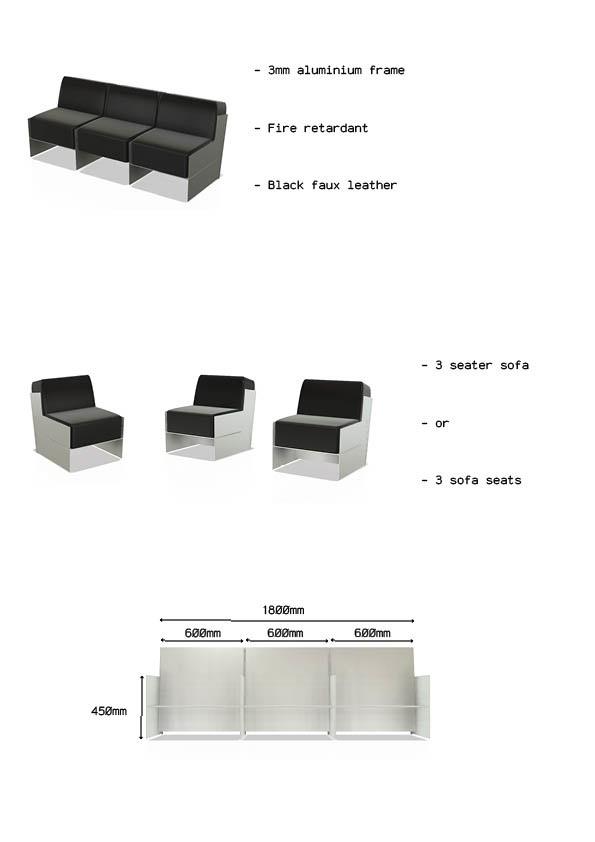
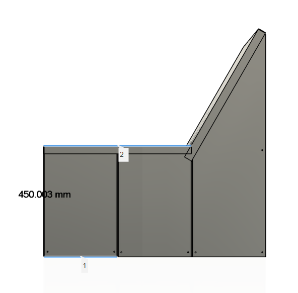
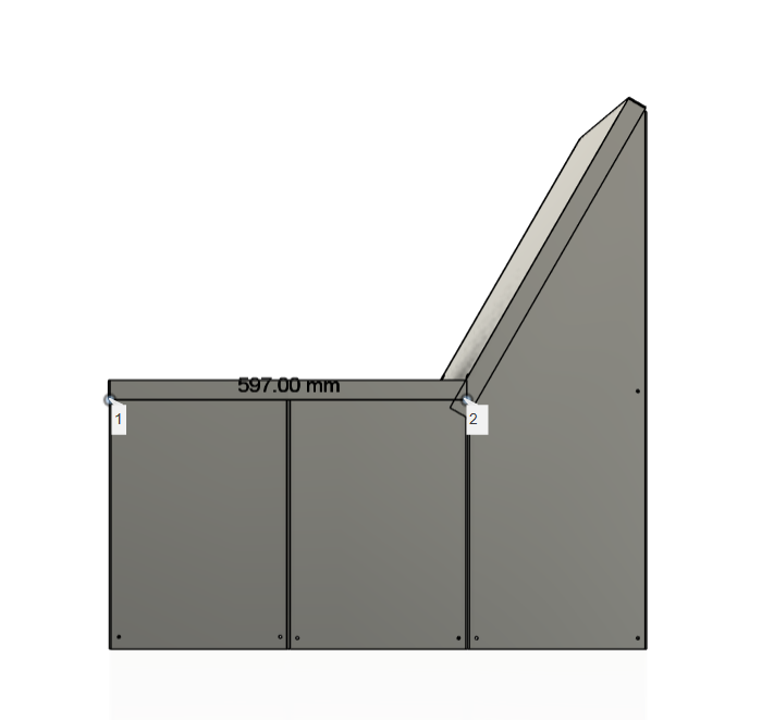
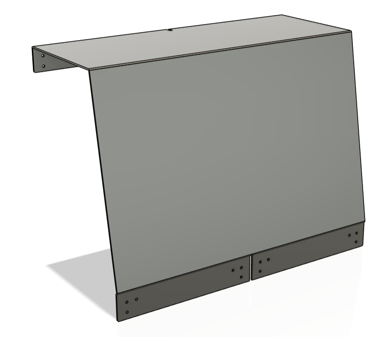
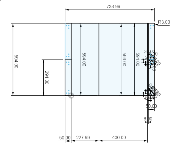
I found that I had used the wrong dimensions for this piece. This was okay, as I could just use these for my coffee table. However, I now needed to adjust the size so it would match the large scale for the sofa. I wanted to keep the original dimensions I got back from my research, which was a base area of 600mm x 600mm per seat. I also still wanted the height from the floor to the top of the cushions to be 450mm. I also wanted the cushion to be thicker than 50mm, so knowing this, I needed to adjust the sides for the back panel. Firstly, you can see the adjusted 'lid' component below. I expanded the base and also made the tabs bigger (from 20mm to 50mm) so I could connect them at three points per corner and not just one.
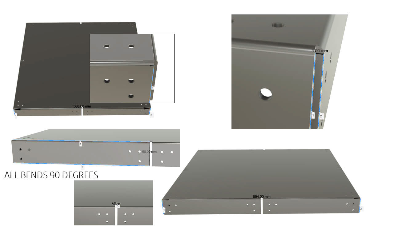
The image above is part of another document I sent to a manufacturer with some measurements.
Using the shape of the revised design as a guide, I created a new sketch with more accurate measurements. While these weren’t the final dimensions I’d settle on, they marked a real turning point — it finally felt like I was getting somewhere. Building on this progress, I began sketching out alternative shapes that followed the same structural logic but explored different dimensions. To test how these variations might function as a seat, I extruded each side profile sketch by 600mm to form full 3D models.
Once I had a few different forms, I mocked up some simple cushion designs to sit on top of each one. This helped me visually test and compare the proportions to see which size felt most appropriate for a comfortable and practical sofa. This process gave me a much better sense of how the design might come together at full scale.
Before moving on to any of the more technical components, I needed to finalise the design and dimensions for the base unit—this would also form the foundation for my coffee table piece. I looked at four scaled design references and chose the third one across, as it offered the best balance of proportion and visual weight. I had already confirmed that the base would be 600mm x 600mm, but I still needed to decide on the height. This would be determined by the cushion thickness.
I opted for a thick, 250mm cushion with a fairly firm density. Rather than working around a standard cushion size, I decided to define the dimensions myself and have the upholstery tailored to fit the design. This approach gave me more freedom to maintain clean lines and structural simplicity. You can see the refined version of the base design below.
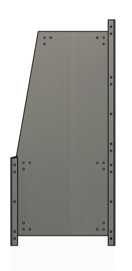
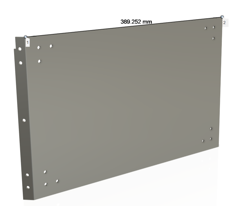
I then moved on to designing the backrest panels. To begin, I revisited the earlier version I had created before testing the cushions, analysing what worked and what didn’t. Using the dimensions I had already gathered from the rest of the structure, I refined the design to fit more practically within the overall framework. I ended up with a version I was genuinely happy with—not because of how it looked, but because it worked.
At this stage, I was focused much more on functionality than aesthetics. My main priority was making sure it was structurally sound and comfortable to sit on. I wasn’t too concerned about making it visually polished just yet; I just wanted to prove the concept worked in a full scale.
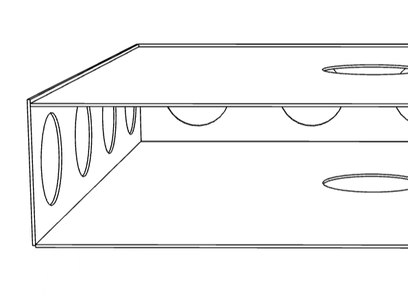
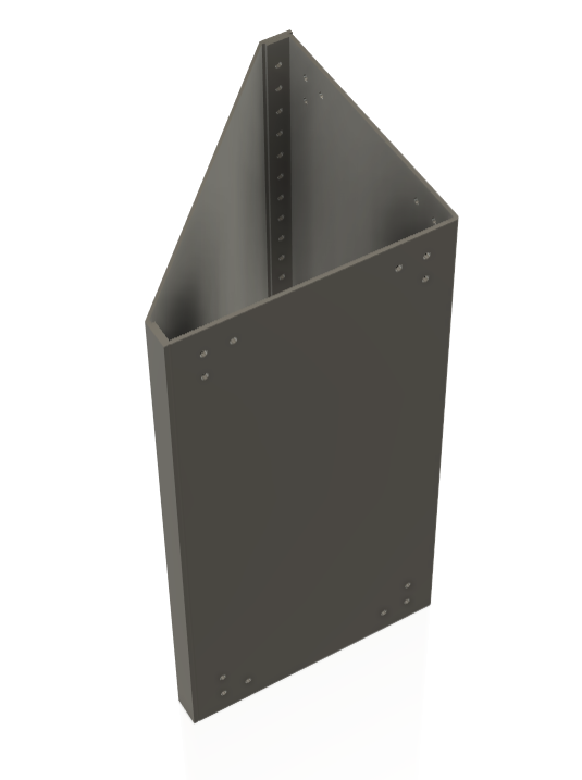
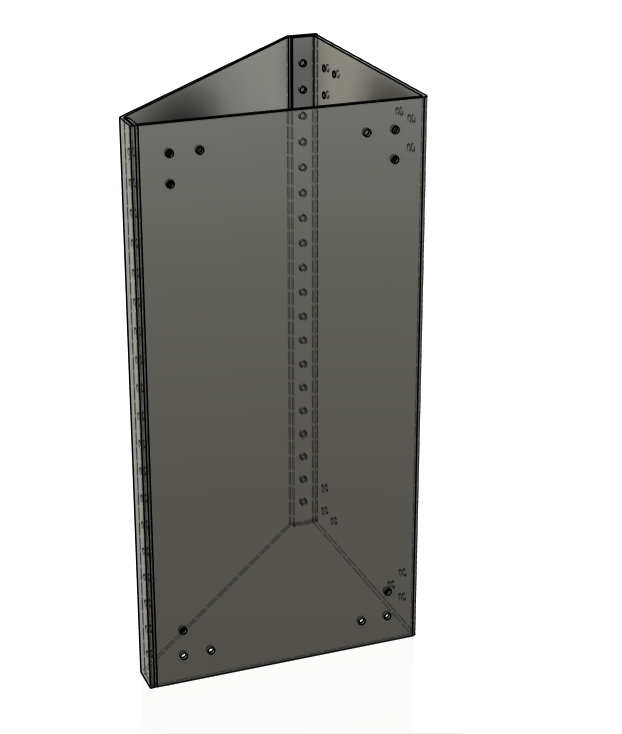
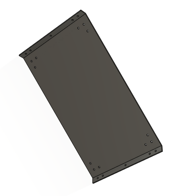
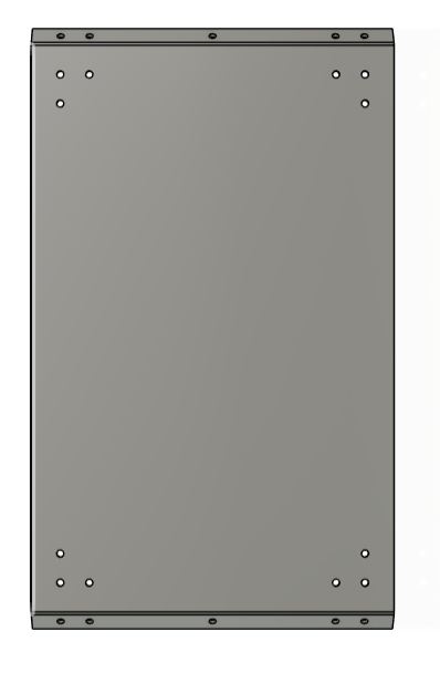
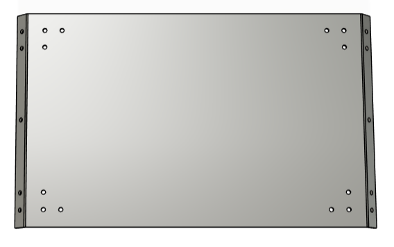
These images show the hole placement, but this was a design decision which happened later on in this process. I didn't get any screenshots of the piece without the holes, so I compromised with these. I really liked the idea of creating these specialised components, as it wasn't something I had done before. I had always been so obsessed with trying to create components that can do everything and really feed into modularity. This was too much as it blocked my vision of the bigger picture of creating a functional piece. The only time I can think of a sofa being built by one component replicated is a Lego sofa, but I'm sure they also have multiple different brick sizes and shapes.
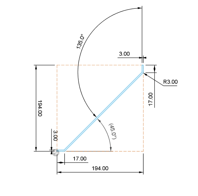
My next challenge was to create the most technical component I have made so far. I needed to create a piece that would sit inside these 2 components as a face to rest on. Using the inside dims, I sketched the side profile of the folded-back component. I found that there needed to be a slot for the tabs of these two side components to fit in. I initially thought to create 2 separate components for each side of the backrest; I decided against this as it would create a weak point where weight would be taken and needed to be distributed evenly.
I created this 'jiggle' towards the base of this piece. This was so the edge would completely follow the edge, making it all still flush. The aim was to get this 'jiggle' to sit on top of the 3mm edge of the side components and then wrap back around and down the inside, creating another hidden connection. I later found that this wasn't possible at most fabrication factories, so I later removed this.
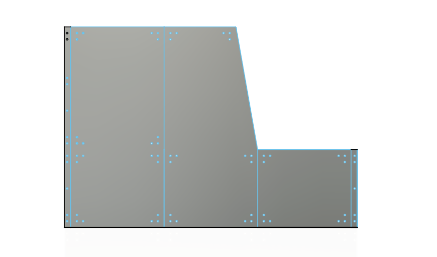
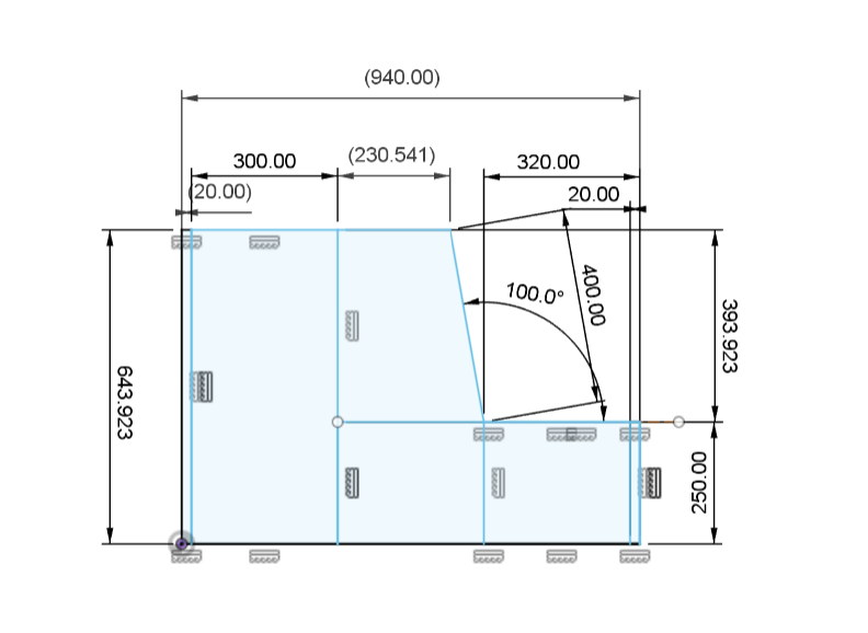
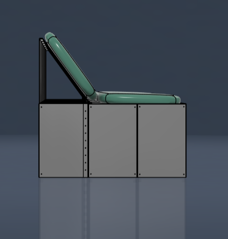
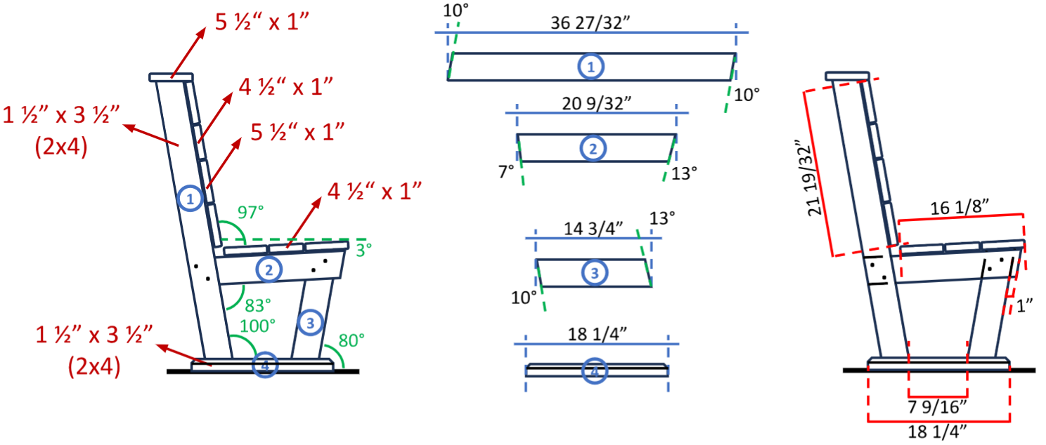
As you can see, I adjusted some of the dimensions of some of the side components of the back panel. While working through these sketches, I set myself a few specific design rules to guide the process. I knew the average height for the base of a sofa sits around 450mm from the ground. Since I had already decided I didn’t want to angle the base, I planned to compensate by using thick foam cushions on top of the frame. This approach would not only maintain comfort but also lower the centre of mass, which I believe would improve the overall structural stability.
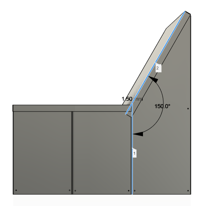
These decisions led to some key changes in the flat lay dimensions: the front height was reduced from 400mm to 200mm, and the rear height was changed from 800mm to 643mm. A few other final tweaks included reducing the length of the backrest from 425mm to 400mm, and I changed the angle from 110 degrees to just 100 degrees. This wasn’t a huge change, but it was intentional — I wanted the back cushions to extend slightly above the frame, giving the piece a more inviting and finished look.
These adjustments didn’t just impact the technical dimensions — they also had a significant effect on the aesthetic and usability of the final piece. By lowering the front panel and allowing the cushions to sit more visibly above the frame, the sofa instantly looked softer and more approachable, counterbalancing the industrial feel of the metal structure. Functionally, this also helped with comfort, as the thicker cushions added necessary support while ensuring the cold metal didn’t come into direct contact with the user. The lowered seat height combined with a higher backrest also created a more supportive and ergonomic seating position, helping to establish a balance between form and function. This step marked a key turning point in the project, where visual refinement and physical practicality finally started to align.
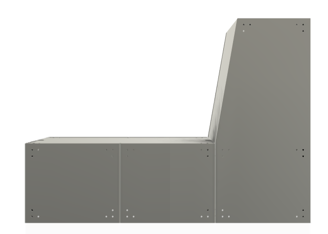
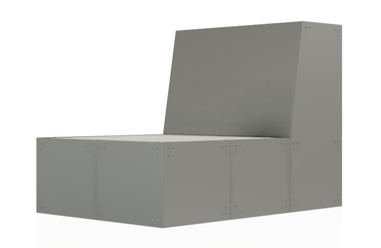
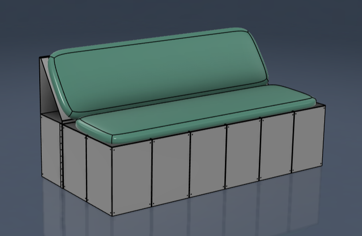
I now had a base structure I was happy with. All of these dimensions were based on my research, and this idea was built upon a similar framework to my coffee table design. It was now constructed from five different components. But there was one thing still bugging me. A crucial aspect of any structural design is triangulation — the method of using triangular shapes or supports to prevent movement and add rigidity. Without triangulation, flat panels and right angles are more likely to flex or collapse under weight or pressure. It’s a principle widely used in architecture and engineering, especially when working with sheet materials or frameworks like mine. I realised I needed to think about how to subtly bring this concept into my design to reinforce the sofa without compromising its clean, modular look.
I knew I didn't want any components to sit external to the frame we already had; this was because it may get in the way when connecting these seats together to form the sofa.
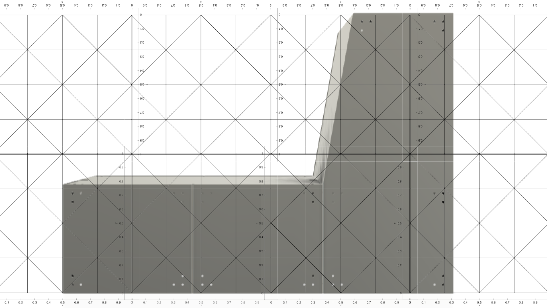
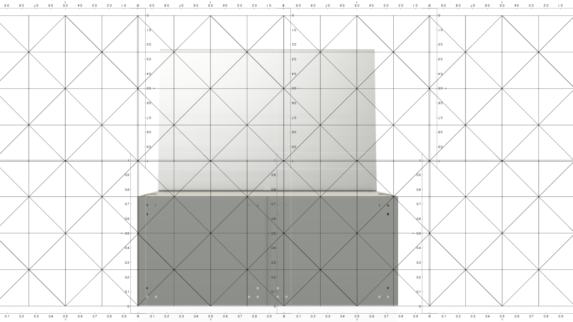

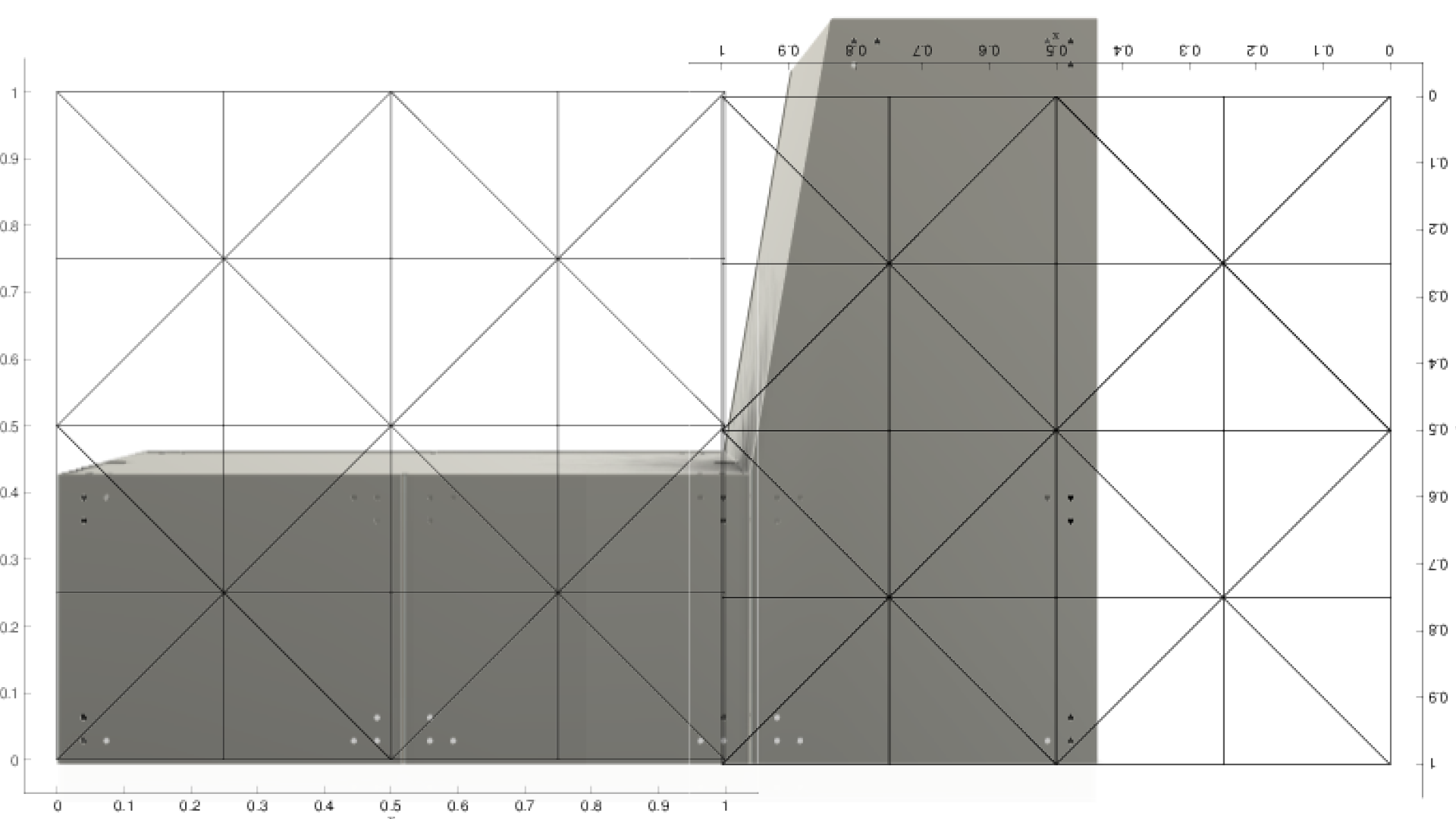
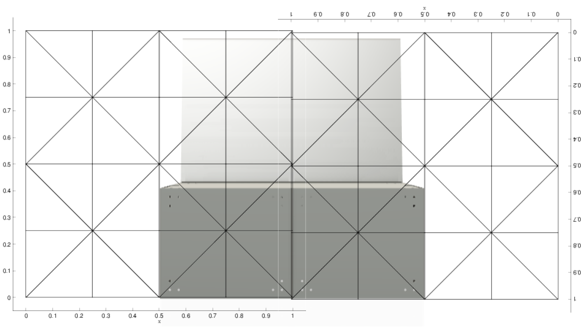
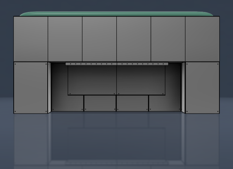
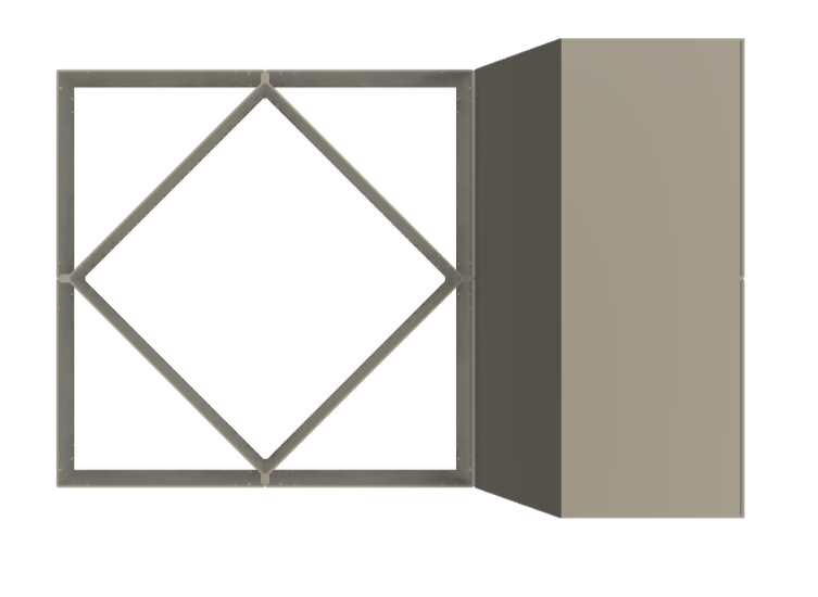
To explore how I could introduce triangulation without compromising the design, I overlaid an orthogonal triangular grid onto three different perspectives of my frame. I repeated this process three times, each time increasing the grid scale. This allowed me to visualise potential points for cross braces or structural reinforcement. I experimented with larger grid patterns because the frame already consisted of several components — adding too many small braces would have cluttered the design and made assembly unnecessarily complex. I eventually settled on the layout shown in the bottom-right image. Rather than using diagonal braces from corner to corner, I focused on the diamond shape formed in the centre. This worked well because it aligned with existing connection points, making it practical to reinforce without redesigning everything. My plan was to add internal supports at these central junctions and simply use longer bolts to pass through the current holes — maintaining both the visual simplicity and modularity of the structure.
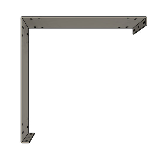
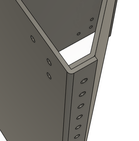
I moved this idea straight into Fusion to visualise how the triangulated brace would integrate with the existing frame. Since this component would be hidden and serve a purely structural purpose, it didn’t make sense to rely on CAD alone. I headed back into the workshop and made a quick prototype using the components I already had. While I didn’t take any formal measurements, I could clearly feel the increased strength when applying weight — it noticeably reinforced the structure. However, I spotted one key issue: I had originally designed this brace to sit on the outside of the tabs on the [L-Bracket] component. This created misalignment in the assembly. I revised the design so the brace would sit neatly inside the tabs instead, which made for a much cleaner and more functional solution. You can see the updated component designs below.
I initially thought this would be the final refinement, but once I slotted the new component into the full sofa framework, a few more issues came up. The first problem was that the new tabs, designed to sit inside the outer L-Brackets, doubled in thickness to 12mm, rather than the original 6mm. This created a clearance issue when adding the ‘lid’ component on top. To solve this, I cut a 50mm x 3mm slit from the top edge of each tab. I only removed material from the upper section, so the lower part still made full contact with the ground to distribute pressure effectively.
The second issue was that the ‘lid’ wouldn’t sit flush; the new cross-bracing components were the same height as the L-Brackets, preventing proper alignment. To fix this, I reduced the height of the cross-brace by 3mm—again, only from the top—so the holes would remain in line with the rest of the structure. You can see the final design below, which uses almost the same dimensions as the previous iteration but solves both structural and fitting issues.
Easter Week Meeting
The week leading up to the Easter break was quite stressful. I had received most of my quotes back and had pretty much confirmed my manufacturer. However, I had a meeting with Kate and Victoria to share where we were at in terms of design and production. I was nervous going into it because I knew that both Rebecca and I were struggling to keep our designs within the original budget.
Initially, I thought £1,500 would be more than enough for us to produce the full piece. But by this point, it was looking like £1,500 would barely cover the cost of just manufacturing my frame. I hadn’t anticipated how quickly all the hidden costs would add up. As I explained the situation, I was expecting them to tell us to cut back and possibly scale it down to a one- or two-seater chair.
Thankfully, they said the complete opposite. I felt so relieved after that meeting — I really didn’t want to compromise the design or not produce it at all. Victoria understood the scale of the project and reassured us that they’re here to support us. She even mentioned the potential of showcasing the work through New Designers, which could give both of us some great exposure.
They told us they were happy to double our budget to £3,000, which was incredible. They understood the project could end up costing more or less but wanted to make sure we had the support to do it properly. This gave me the green light to go ahead and get all of my pieces manufactured with my chosen supplier. Around this time, I confirmed with HSL that I was ready to send over the payment and officially begin production.
From here, I didn’t waste any time and went ahead with confirming the order with my chosen manufacturer. Because they needed to be registered as an official university supplier, the setup process could have taken an extra week, which would’ve pushed everything too close to the deadline. To avoid this delay, I paid for the full order upfront using my own savings. Thankfully, I had enough set aside to cover it; otherwise, the pieces wouldn’t have arrived on time. I’ll be reimbursed once the Fin1c form—the document confirming the amount I spent—has been processed by the university.
The next stages
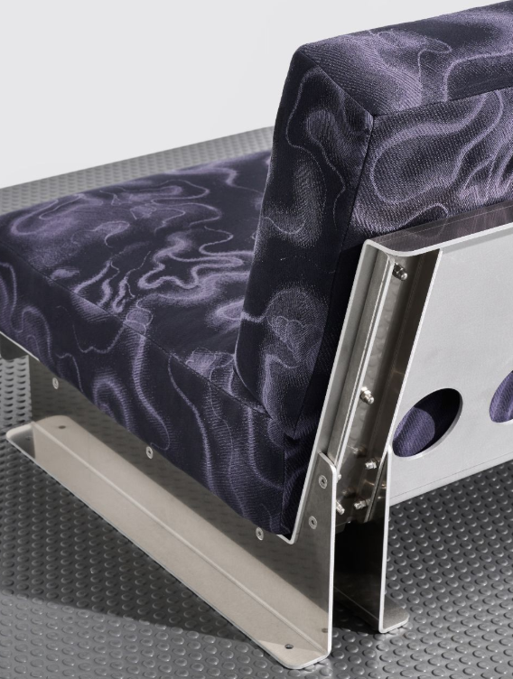
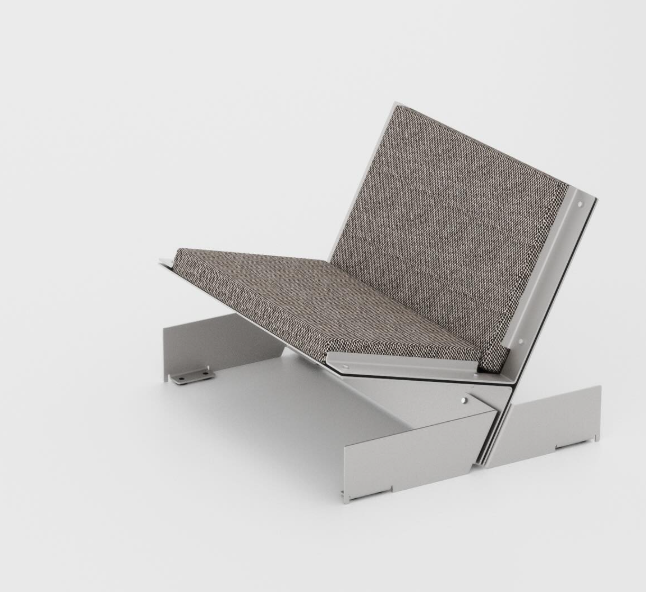
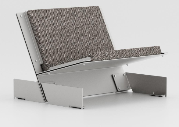
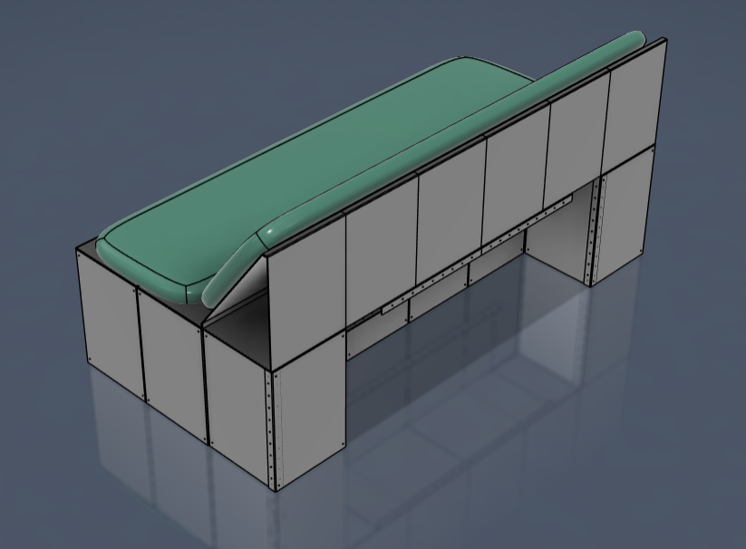
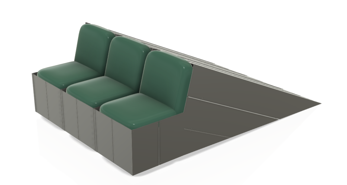
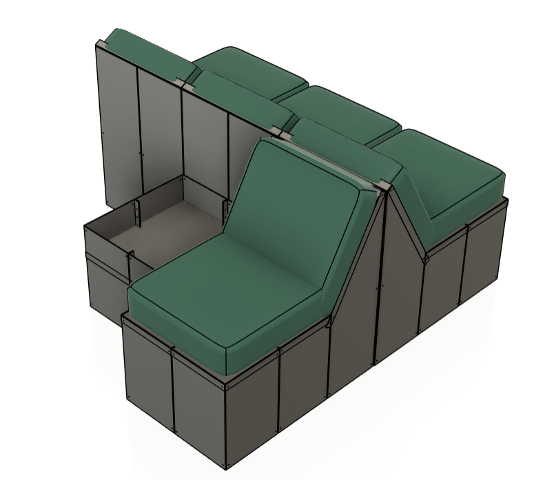
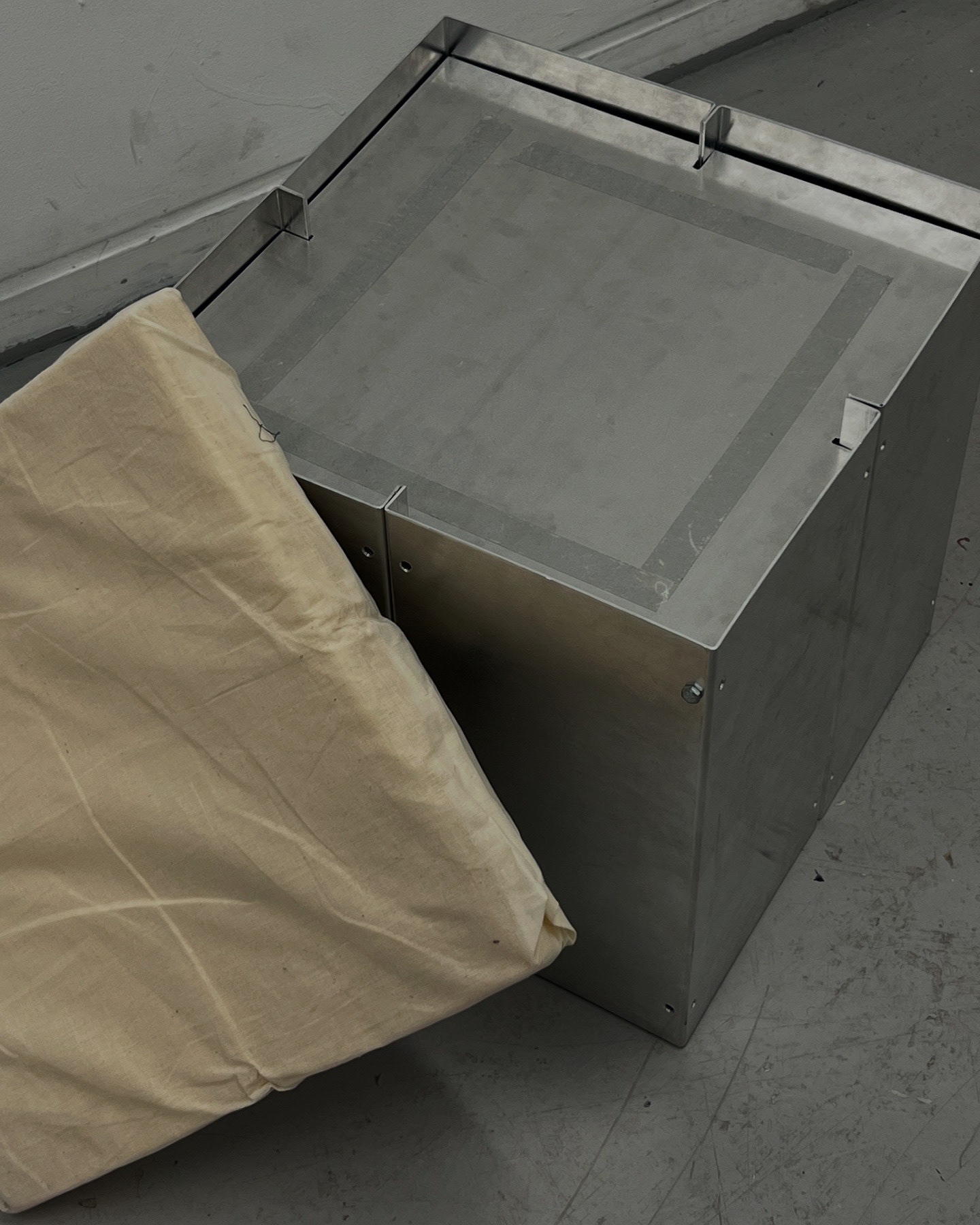
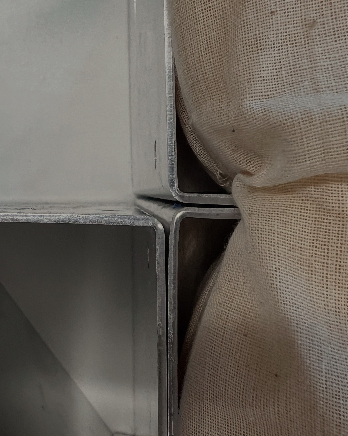
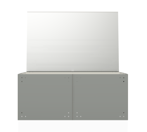
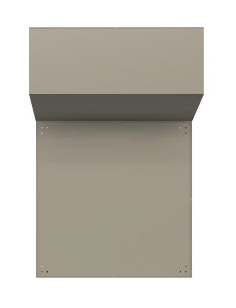
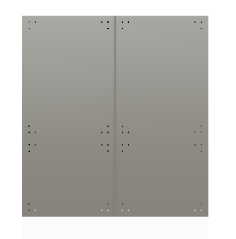
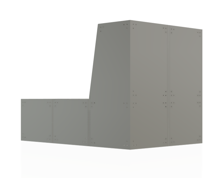
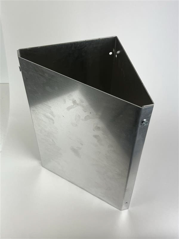
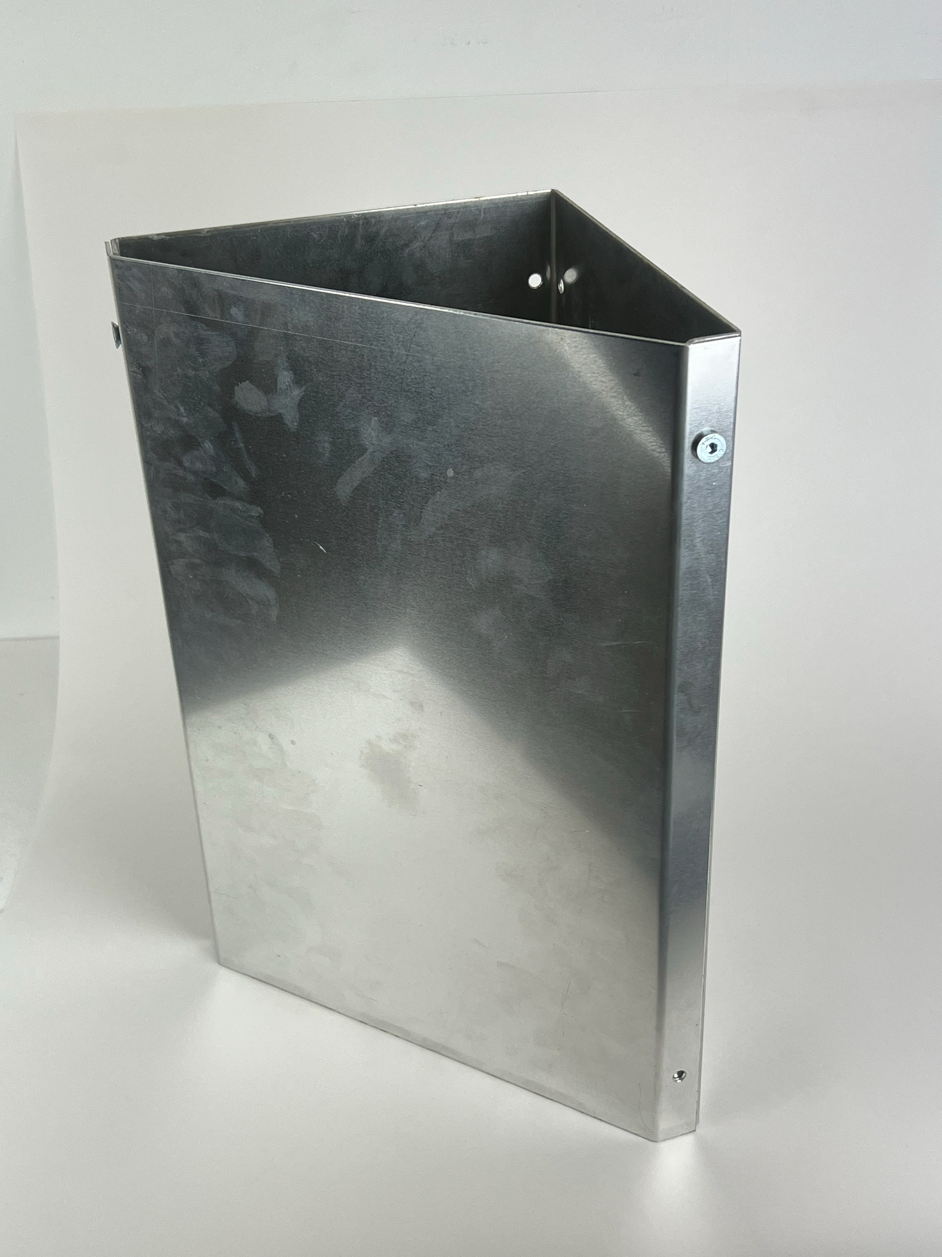
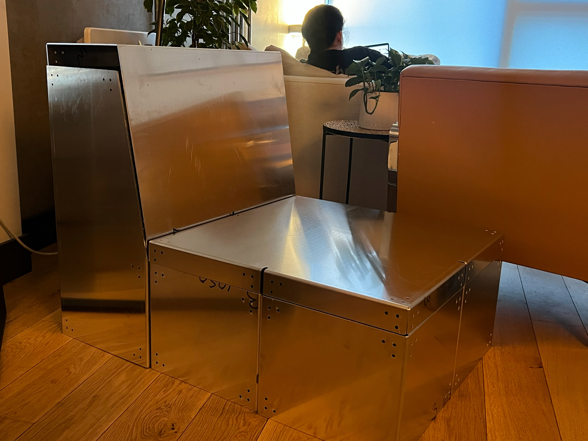
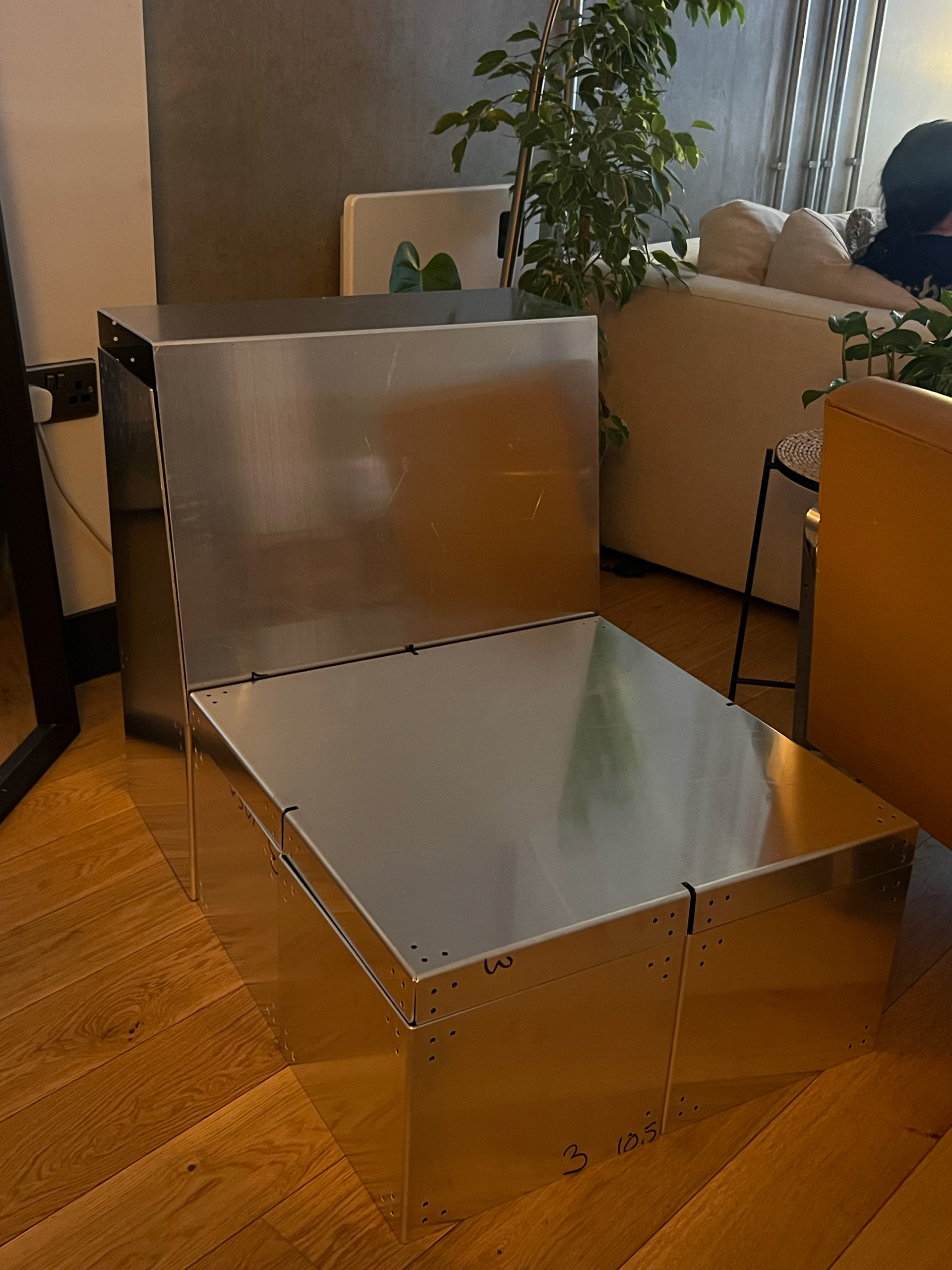
The next step after receiving the pieces from the manufacturer was to fix the issues I had encountered with my Module 1 piece. This involved grinding down the components and fitting them together using new hardware. You can see photos of the framework in its current state, not yet fully assembled. I’m really pleased with the scale so far—while it might seem small at first glance, once the cushions are added to fill it out, I think it will be just right.
Reflection
This project has been one of the major highlights of my semester. Collaborating with different artists to curate a gallery spread throughout the art school has truly been an amazing experience. Working on this piece has taught me so much—I’ve learned just how much thought goes into creating something truly functional. I never originally considered the level of detail required in every aspect of the design process.
Working with Rebecca has also been great, and although it’s a shame her weave design couldn’t be featured in the final piece, the collaboration was still incredibly valuable. I'm really looking forward to showcasing these pieces at the degree show.
I hope that when people see the final outcome, they can appreciate not only the design itself but also the process, problem-solving, and collaboration that went into making it happen.
To think this all started by Geoff saying a sofa was too ambitious.