
Reflection on Last Semester’s Work
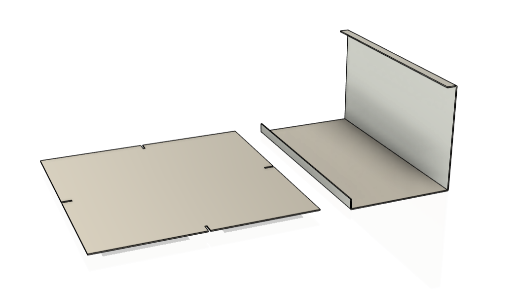
The first stage of my process involved critically reflecting on the work I produced last semester. This was essential for identifying both strengths and areas for development, guiding the direction of my new project. One of the aspects I particularly enjoyed was working with large sheets of metal, appreciating the direct and efficient transition from 2D to 3D through simple folds. This method not only allowed for clean, structured forms but also aligned with my interest in minimal yet functional design.
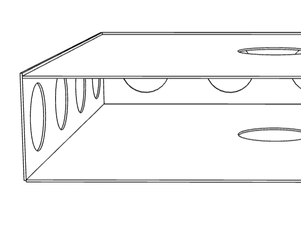
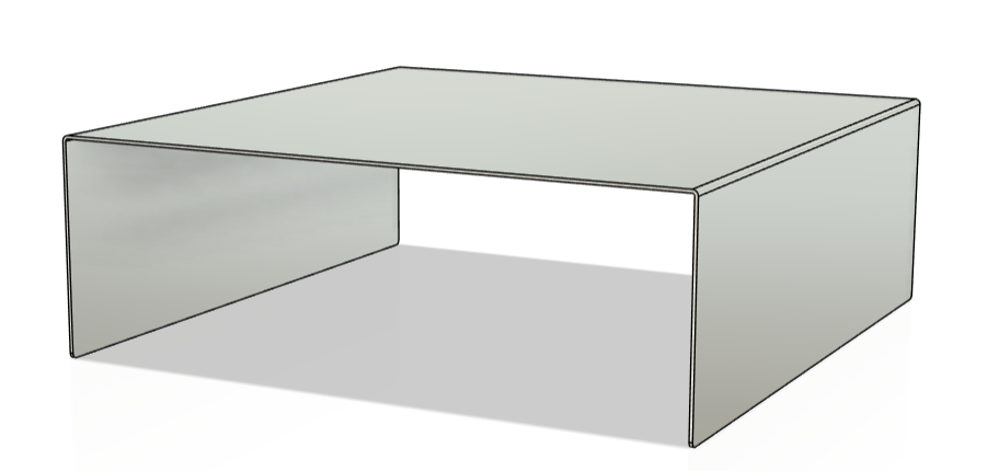
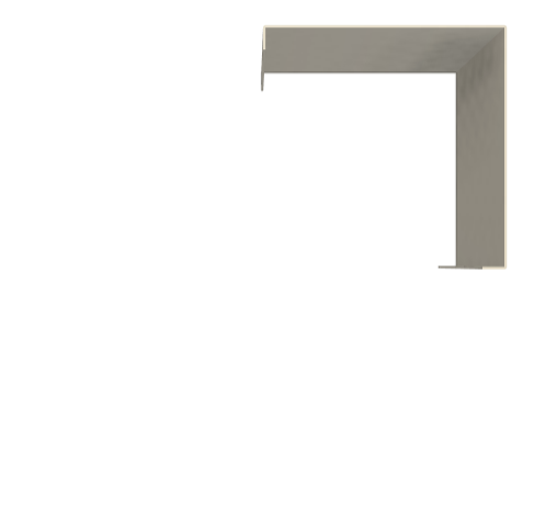
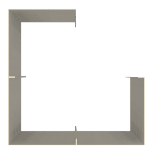
A key detail that stood out to me was the back panel/seam of the cabinets I previously made. I was drawn to how it subtly functioned as a hidden connection, seamlessly integrating structural necessity with aesthetic refinement. This element intrigued me because it balanced practicality with a refined visual outcome—an approach I wanted to explore further.
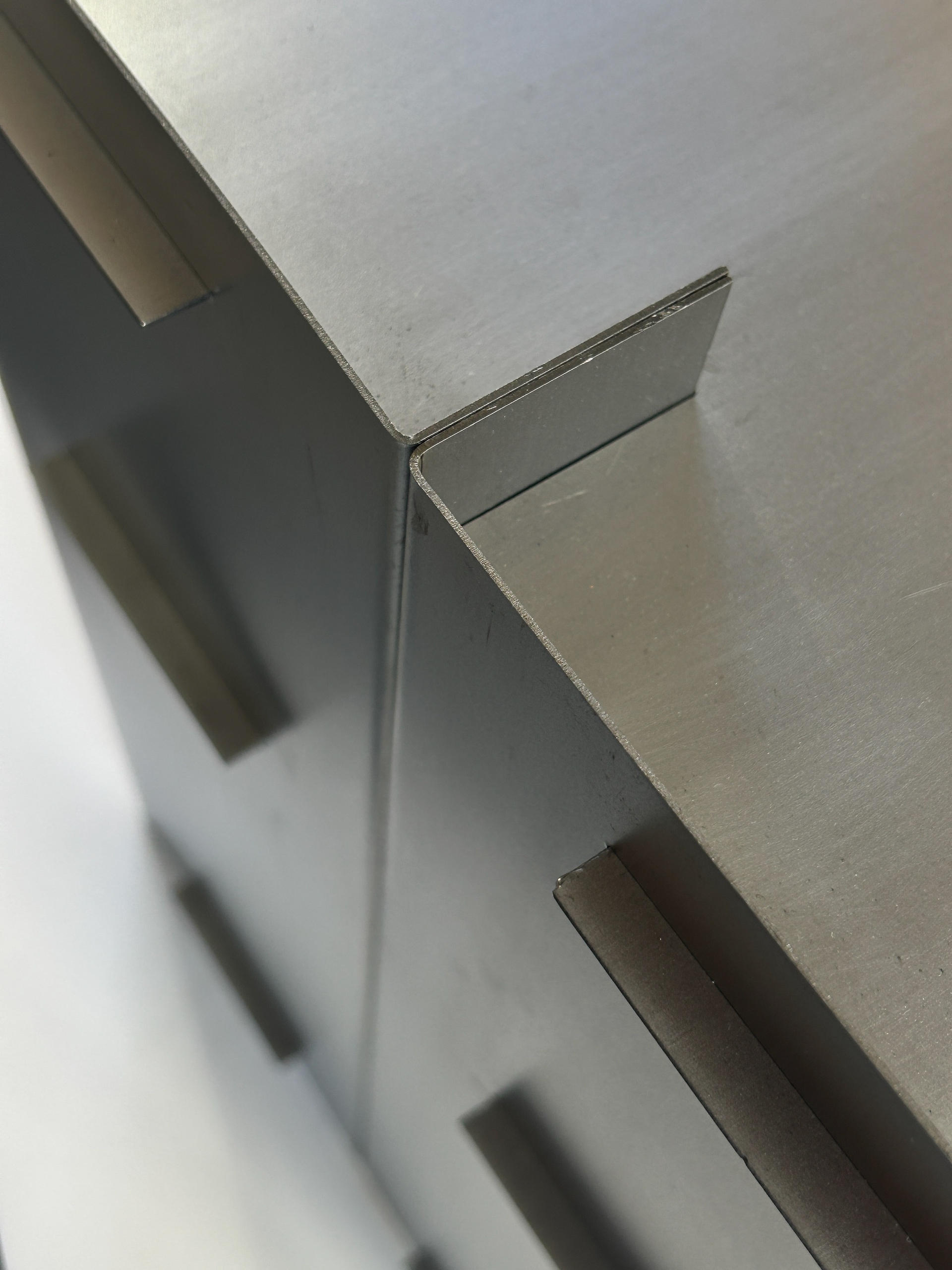
Reflecting on these aspects shaped my next steps, as I became interested in pushing this folded form aesthetic further. I wanted to experiment with the seam as both a visual and functional element, using it as a foundation for new design ideas. This reflection provided a clear starting point, prompting me to investigate different ways of manipulating metal sheets while maintaining a focus on hidden connections and structural elegance.
Initial Material Experimentation
Building on my reflection from last semester, I moved directly into material experimentation, aiming to quickly visualize the aesthetic I was drawn to. Rather than overthinking the early stages, I chose to work with folded grey board and hot glue—materials that allowed for fast, low-commitment sampling. This rapid prototyping was crucial in translating my ideas into physical form without the constraints of metalwork at this stage.
I arranged pieces with two folds each in a sequence of four, testing how repeated folded elements interacted visually and structurally. While this was not a refined outcome, it served as a way to further explore the design language I was considering. The simplicity of the process allowed me to focus purely on form and proportion rather than technical precision.
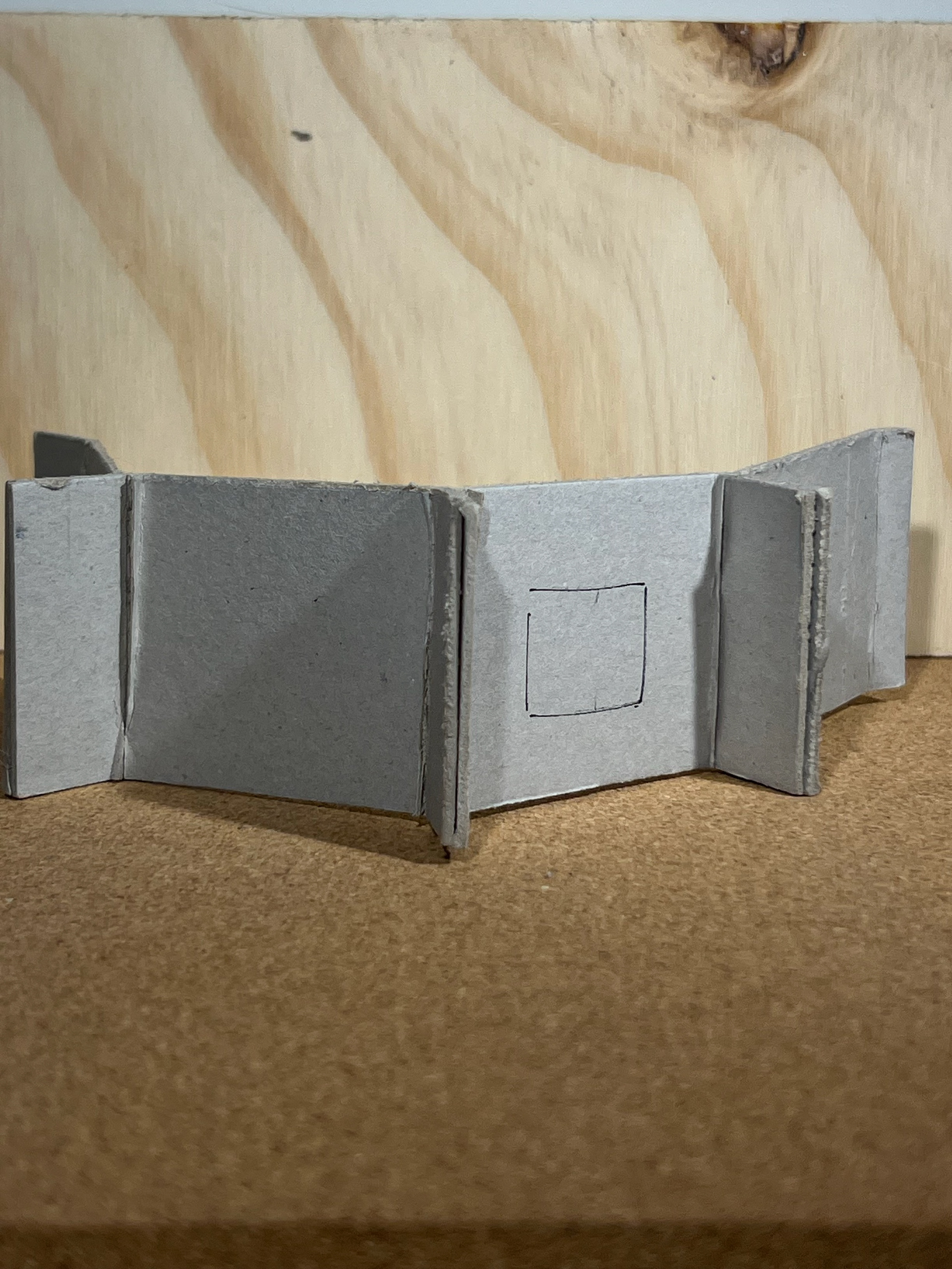
This stage had both strengths and limitations. On the positive side, it helped solidify my interest in the folded aesthetic and gave me an immediate sense of its potential. However, the rough nature of the materials meant I couldn’t fully explore the structural integrity or material behaviors that metal would later introduce. Despite this, the exercise succeeded in sparking further ideas, pushing me towards the next step of refining these forms in a more developed material.
Transitioning to Metal & Exploring Connections
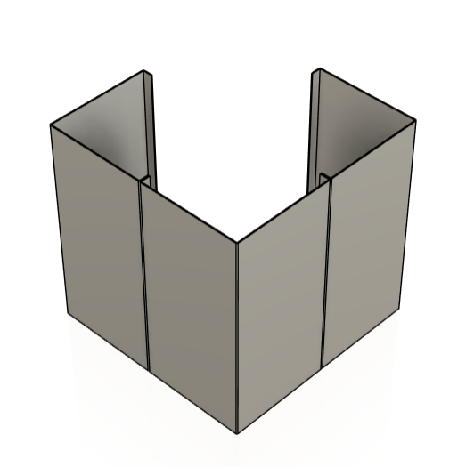
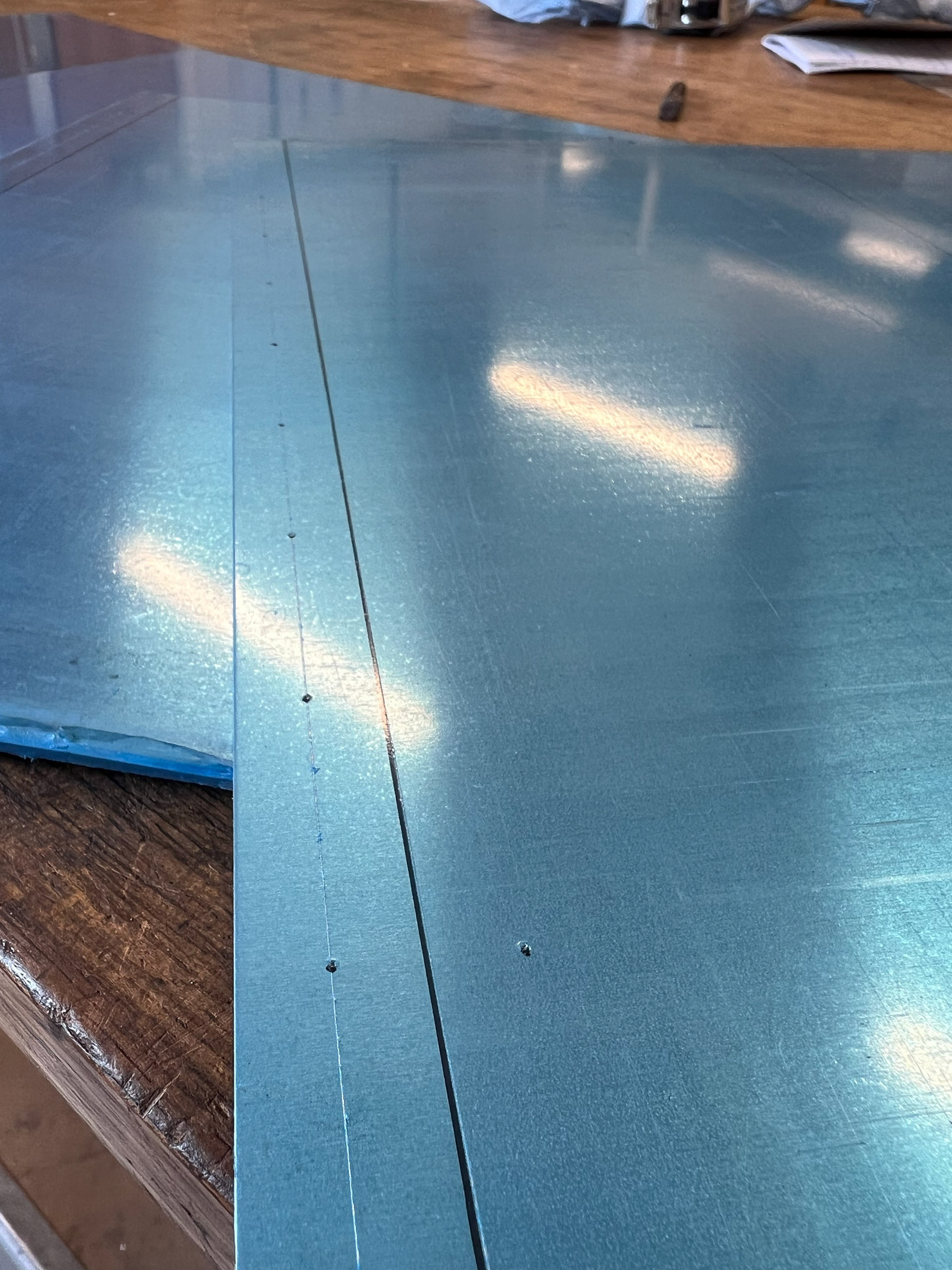
Without hesitation, I moved into the metal workshop to test how the folded forms translated into a more rigid, structured material. While the grey board provided a quick visual reference, working directly with metal was necessary to understand how these bends interacted physically—how they would hold, align, and complement each other when subjected to real material forces. This stage reinforced my appreciation for the clean, geometric strength of folded metal and allowed me to assess the feasibility of my aesthetic intentions in a practical setting.
Following this, my focus naturally shifted to material connections. From my previous project, I had experience designing around unconventional connection methods, relying solely on the elastic tension of steel rather than traditional hardware. While this approach had been an interesting challenge, I recognized that incorporating hardware in this project would elevate my work—improving both structural integrity and usability. This was a key step in pushing my practice towards a more refined, functional outcome.
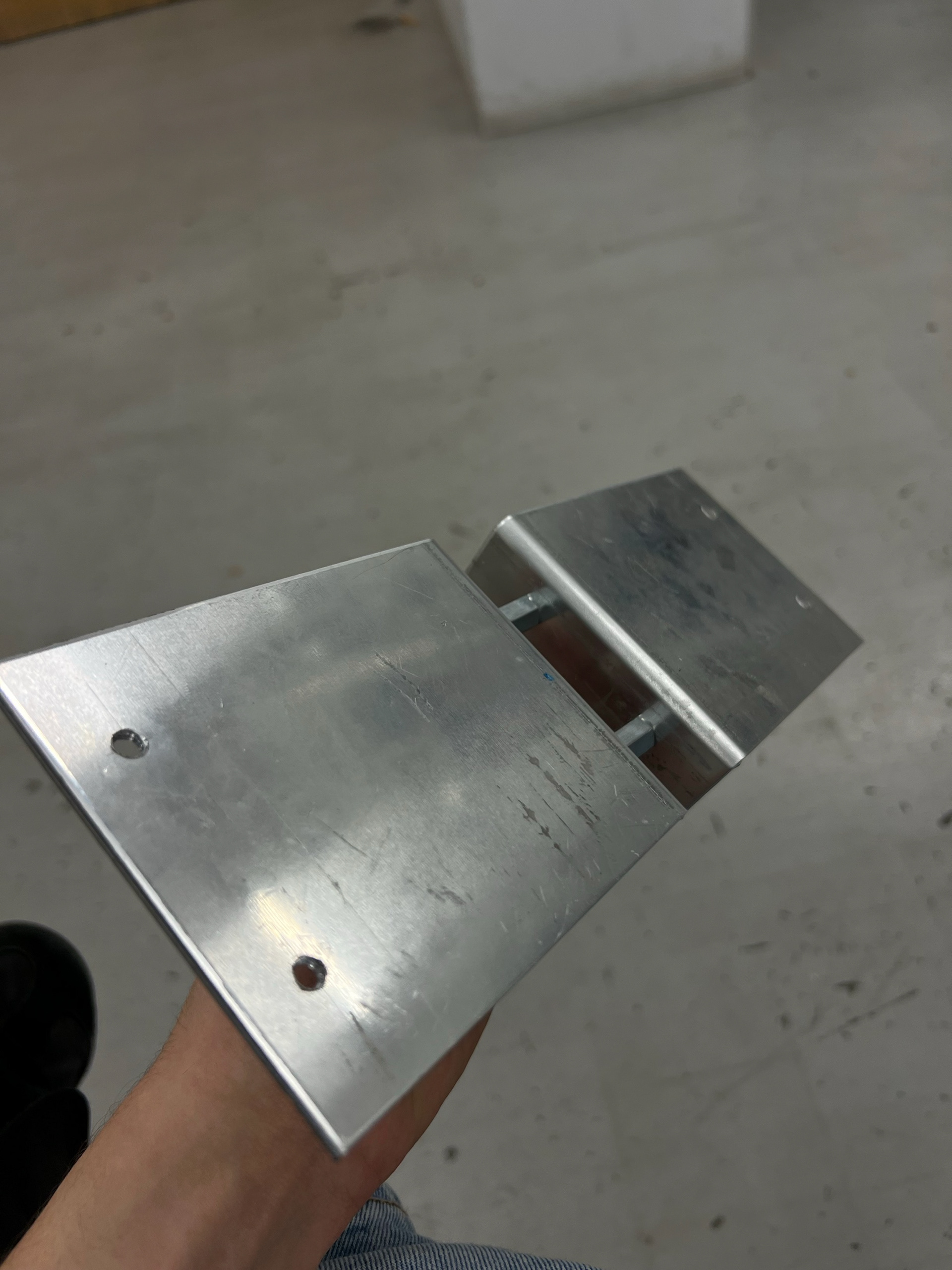
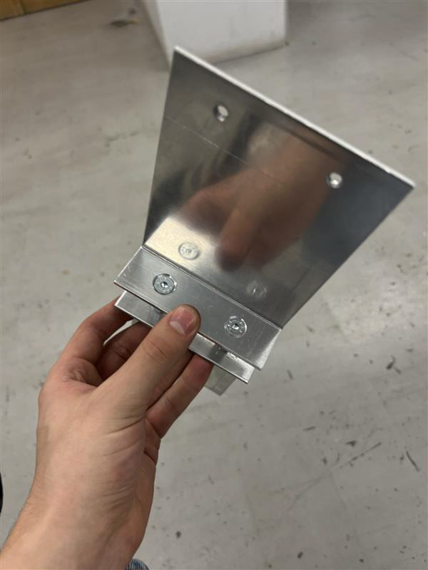
I began experimenting with different types of hardware, testing screws, nuts, and bolts to see how they interacted with the folded metal. A significant early test involved countersinking screws to create a flush connection, which introduced new considerations about precision and finish. This phase highlighted the balance between maintaining my desired aesthetic and ensuring practicality, leading me toward the next step of refining these connections further in both design and application.
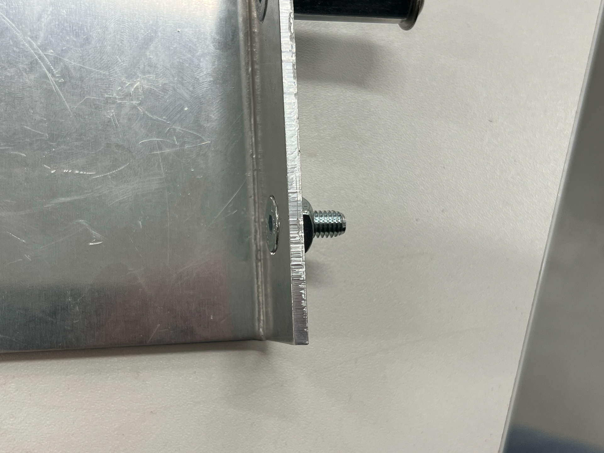
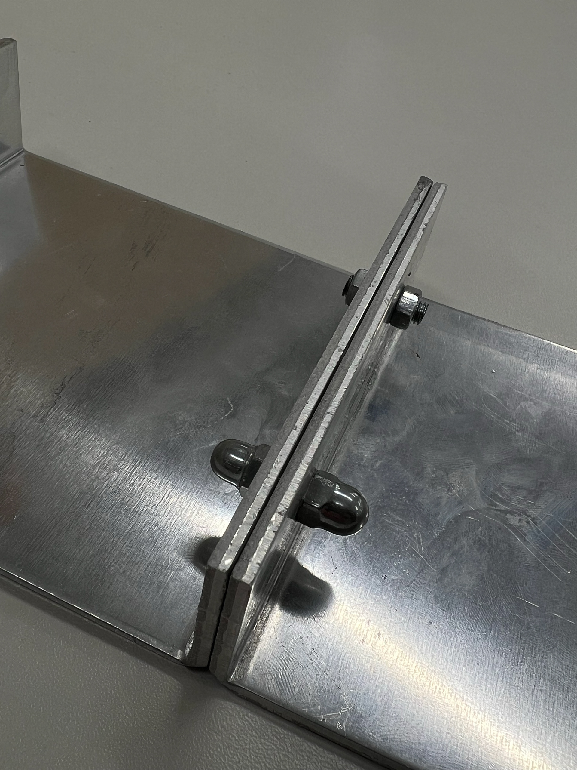
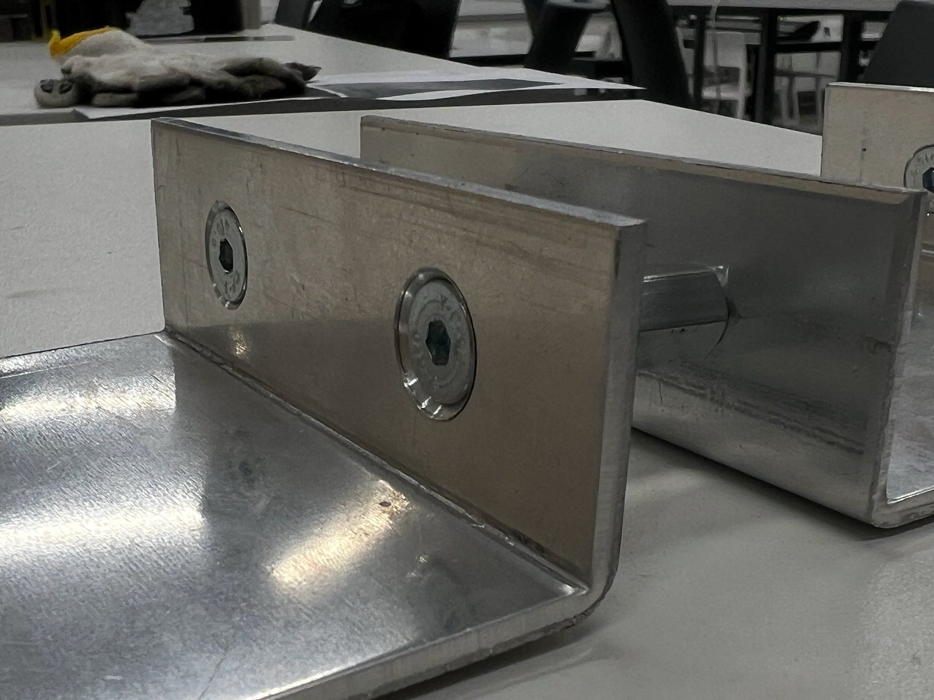
I was particularly pleased with the outcome of the countersunk hex head screws. They sat flush with the metal, creating a clean and seamless finish that aligned with the refined aesthetic I was aiming for. This method not only improved the visual quality of the connections but also enhanced the overall functionality by reducing protrusions that could interfere with the design. The precision required for countersinking also pushed me to be more meticulous in my fabrication process, reinforcing my commitment to higher-quality construction. This success further solidified my decision to integrate hardware as a key element in my project.
Exploring Form Through Smaller Metal Samples
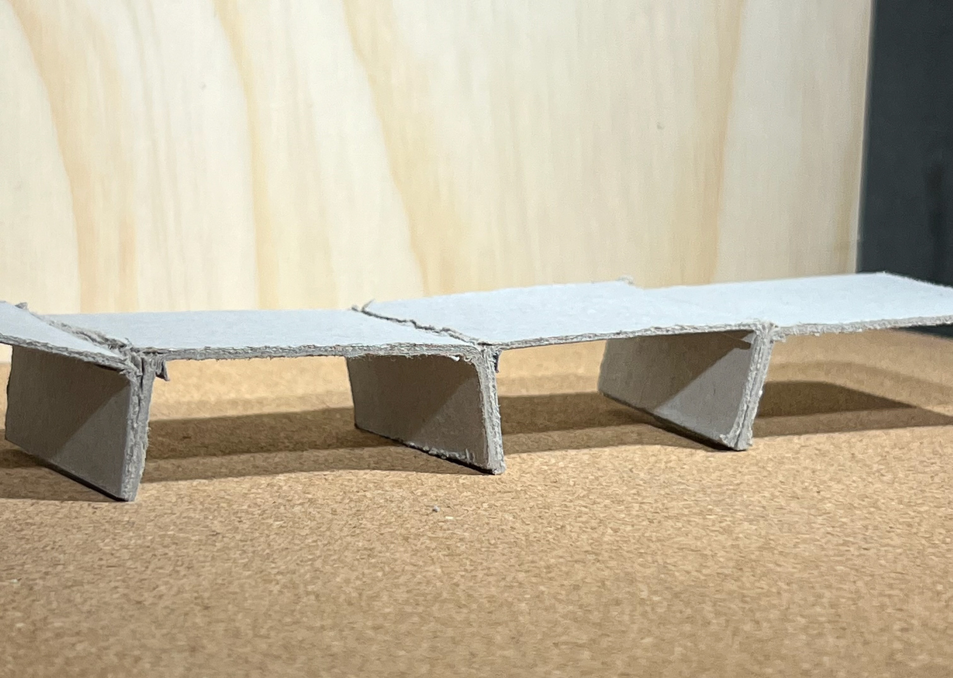
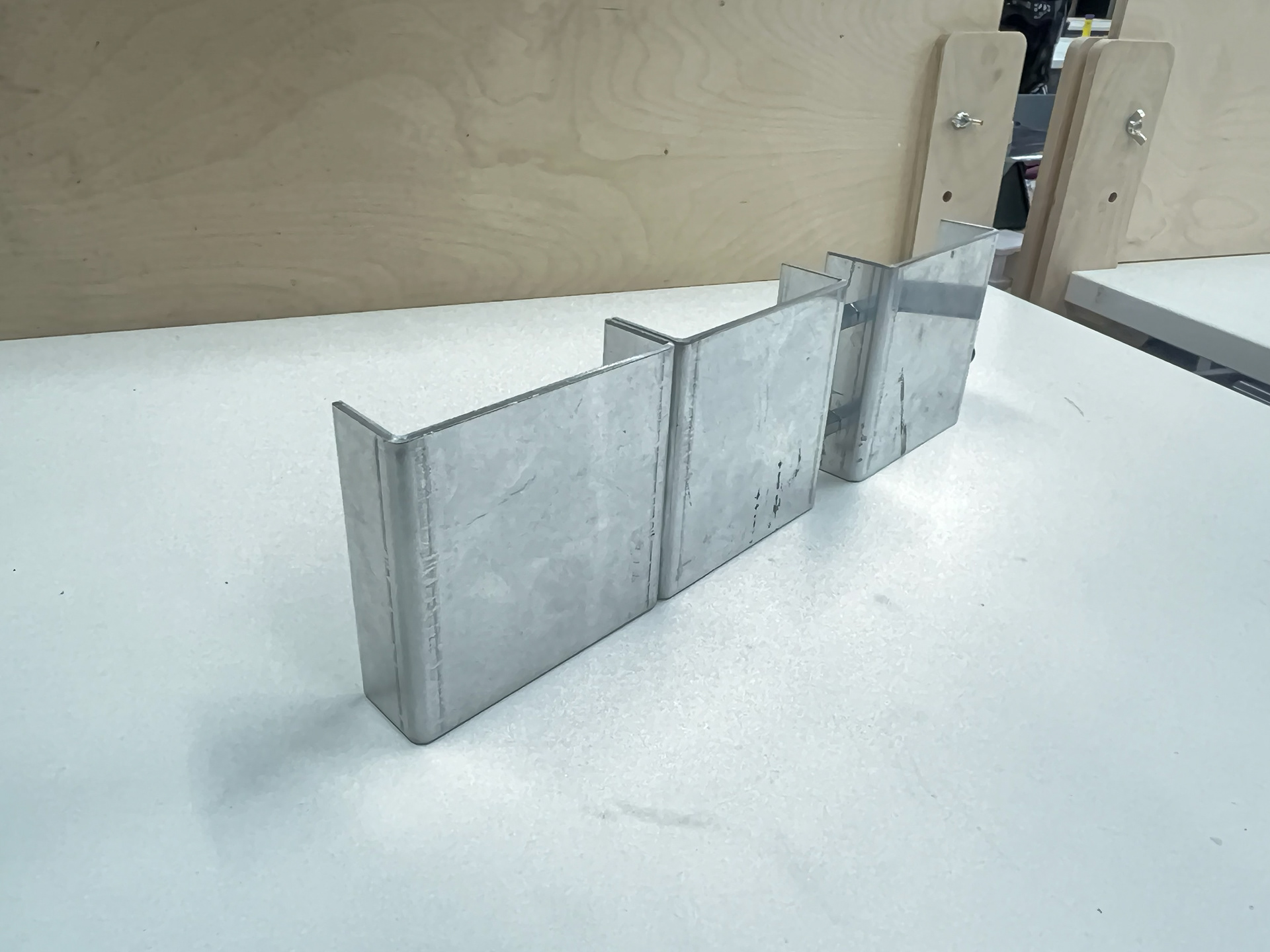
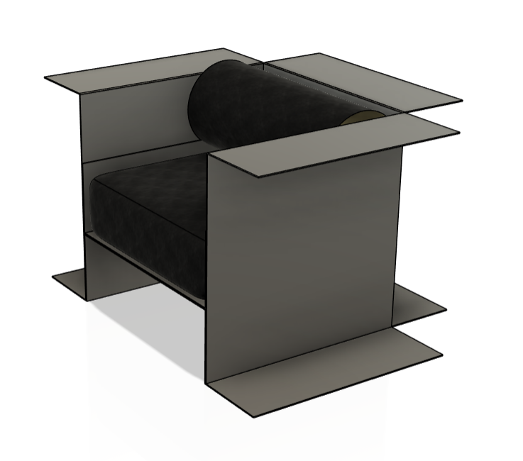
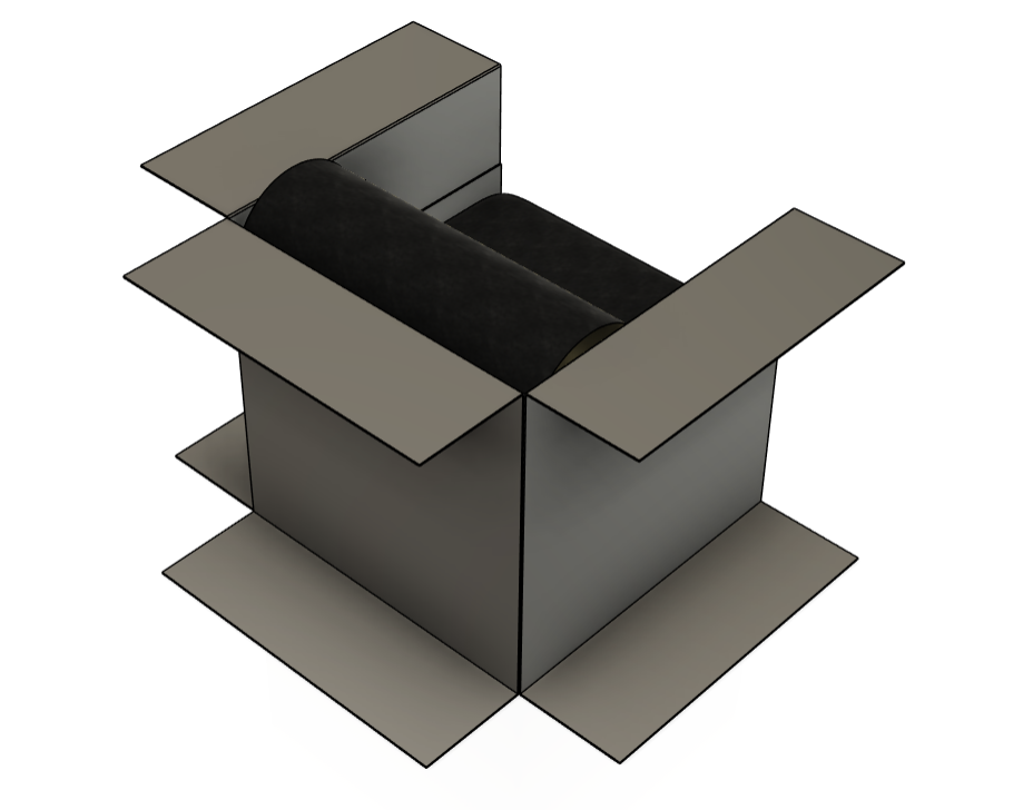
After refining my approach to hardware connections, I shifted focus back to form exploration. This time, I worked with smaller, thinner aluminum pieces, removing the consideration of holes and fixings to purely investigate shape and function. By bending these samples in the same manner as my earlier tests, I aimed to recreate the initial seam that had caught my interest, but with the added intention of discovering forms that suggested a specific function.
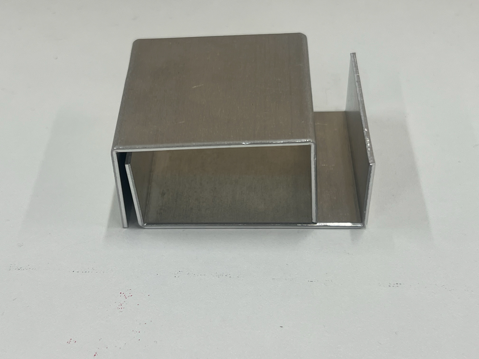
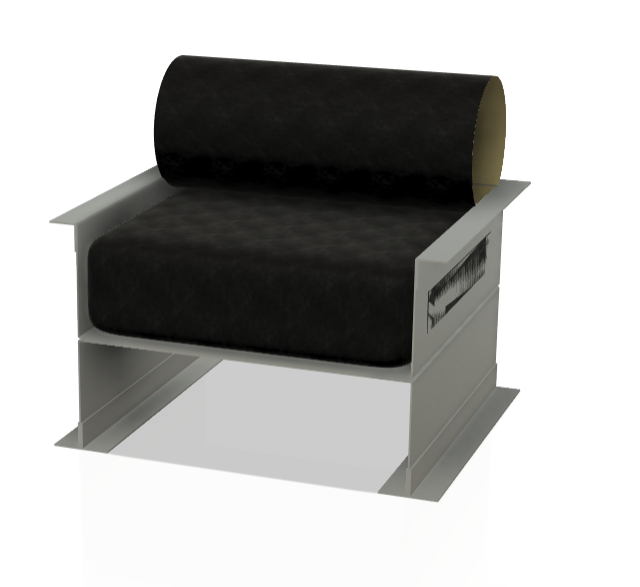
Through this process, I found that when two matching pieces were placed on top of one another, they naturally mimicked the proportions of a coffee table. This realization sparked further development—I began thinking about creating a complementary component that would fit seamlessly inside the original sample. This step proved valuable as it led to the discovery of new configurations and opened the possibility of designing seating. By breaking the process down into smaller iterations, I was able to generate new ideas organically rather than forcing a predetermined outcome.
This stage reinforced the importance of hands-on experimentation in my workflow. While my initial goal was simply to study form, the process itself revealed unexpected design directions. The way these folded metal pieces interacted suggested practical applications, pushing me towards the idea of modular components and multifunctional structures. This realization naturally guided my next steps towards refining these forms with function in mind.
Exploring a New Material: Perspex Sampling
At this stage, I decided to introduce a new material into my process. While I was eager to continue working with metal, I knew that accurately placing holes in my components without a water jet cutter would be difficult. Unfortunately, the water jet cutter was down for maintenance at this point in my project. Rather than stalling my progress, I pivoted to working with perspex (acrylic), which allowed me to keep developing my ideas while also refining my CAD skills.
To do this, I designed flat layouts in Autodesk Fusion 360, ensuring I continued practicing digital modeling while preparing my pieces for laser cutting. I used scrap perspex from a previous project to keep costs down, making this stage both practical and efficient. Since perspex required a different forming method than metal, I had to learn a new skill: the acrylic line bender. Fortunately, I was able to get inducted on this tool early in the semester, and the process itself was fairly straightforward.
Using the heat bender was an interesting shift from metalworking. The technique required patience, as I had to hold the material still until I saw slight warping—indicating the plastic was softening—before carefully pressing it into the desired angle with a gauge. This process was physically demanding, as I had to push against the material’s resistance until it cooled and held its shape. However, I was excited by the potential of perspex as a furniture material. It was durable, lightweight, and available in various colors, opening up new aesthetic possibilities.
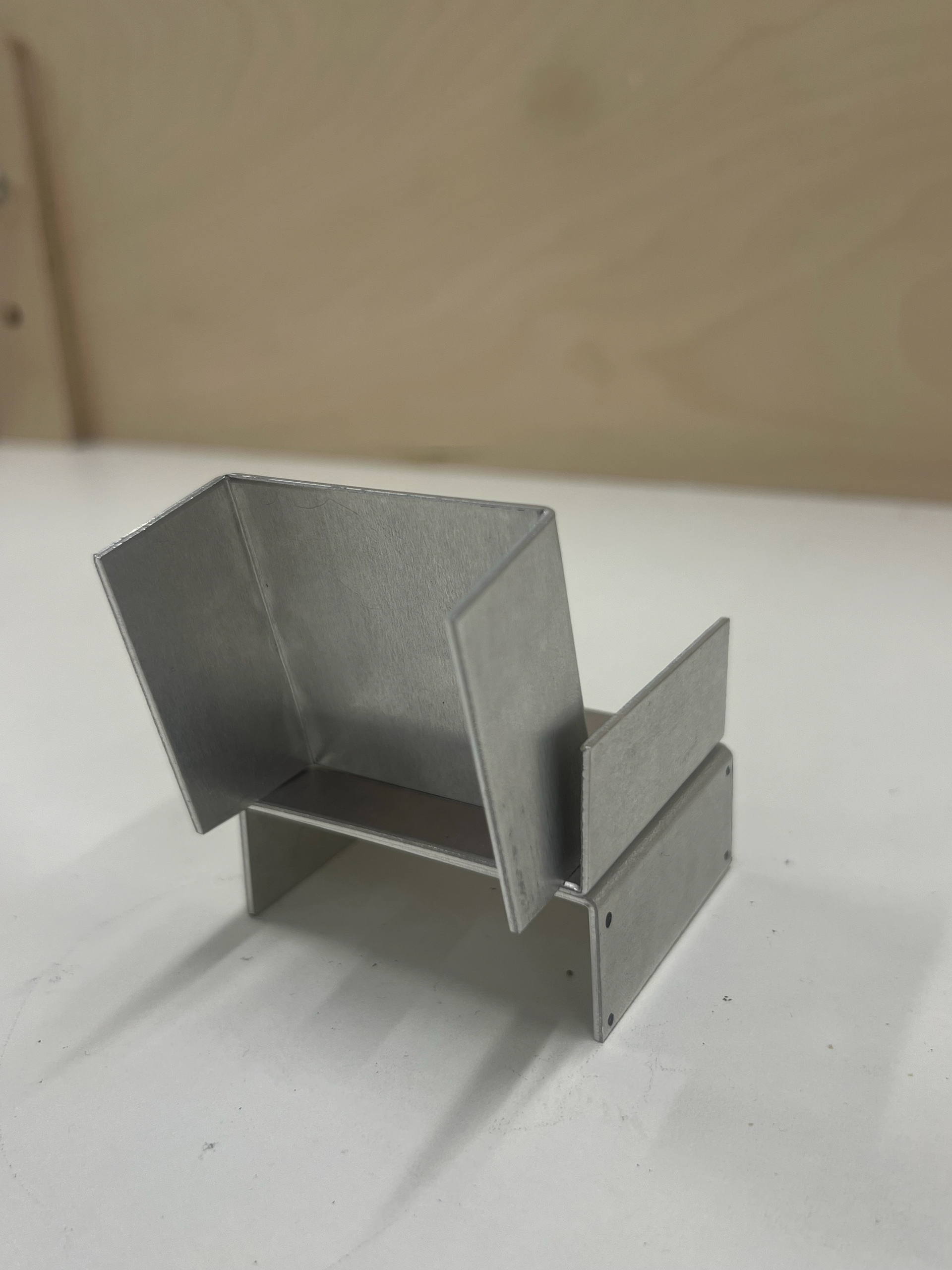
One challenge I encountered was how the bending process affected pre-cut holes. Because the holes were placed close to the bends, the heat caused slight warping, making assembly difficult. To resolve this, I had to manually file the holes or use smaller hardware to fit the pieces together. Despite this issue, I was able to recreate the ‘chair’ form I had previously discovered by cutting and bending two identical panels alongside a smaller central panel.
This stage of my process reinforced the importance of adaptability. While I initially turned to perspex as a workaround, it ended up opening new possibilities for material exploration. The shift from metal to plastic introduced new technical challenges but also expanded my perspective on what materials could be suitable for my final outcome.
CAD MODELLING
At this stage, I transitioned from physical prototyping to digital design, using Fusion 360 to refine my ideas. While I had primarily worked with 2D flat-lay drawings in the past, I recognized the need to expand my skills into 3D modeling. Beyond this project, I saw CAD as a valuable tool for my future practice, allowing me to prototype digitally before committing to costly material experiments.
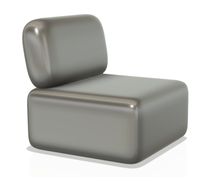
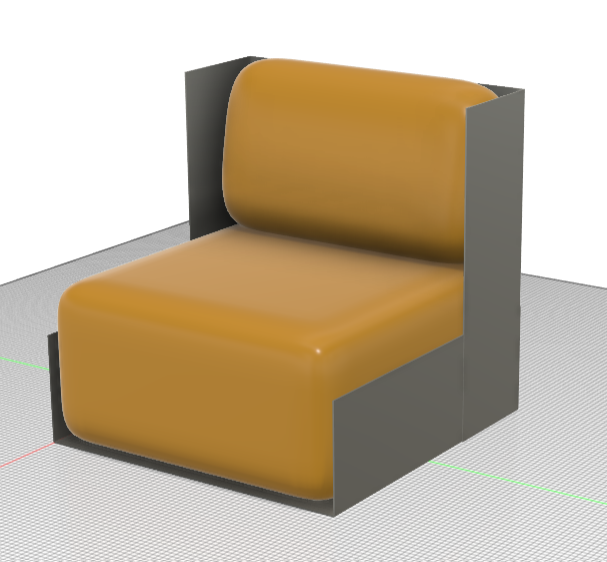
Despite my limited experience with Fusion 360, I quickly recreated my design in 3D and was thrilled with the outcome. This was my first attempt at a more complex model—though still relatively straightforward, it marked a significant step in my skill development. One unexpected observation was that the design somewhat resembled airplane seats, which I wasn’t entirely pleased with. However, I reminded myself that this was just an initial concept rather than a final resolved design.
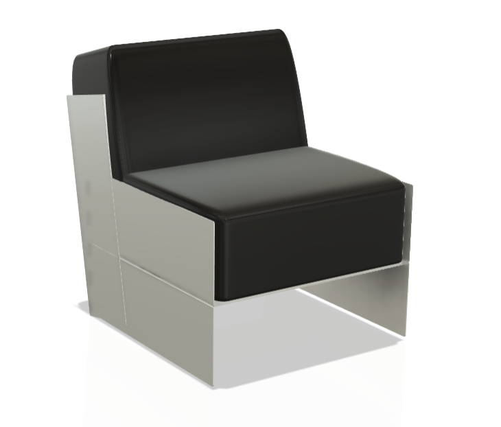
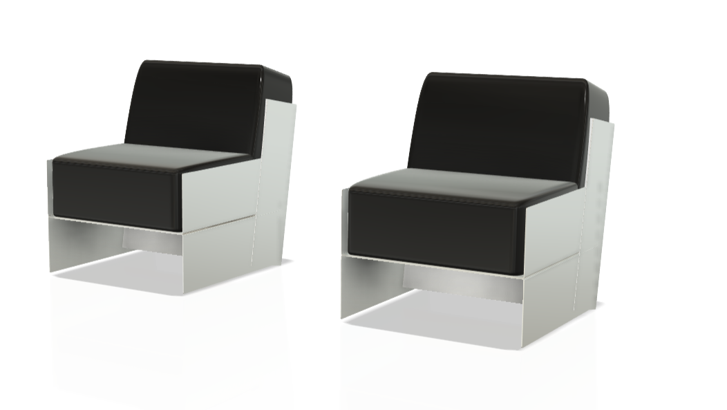
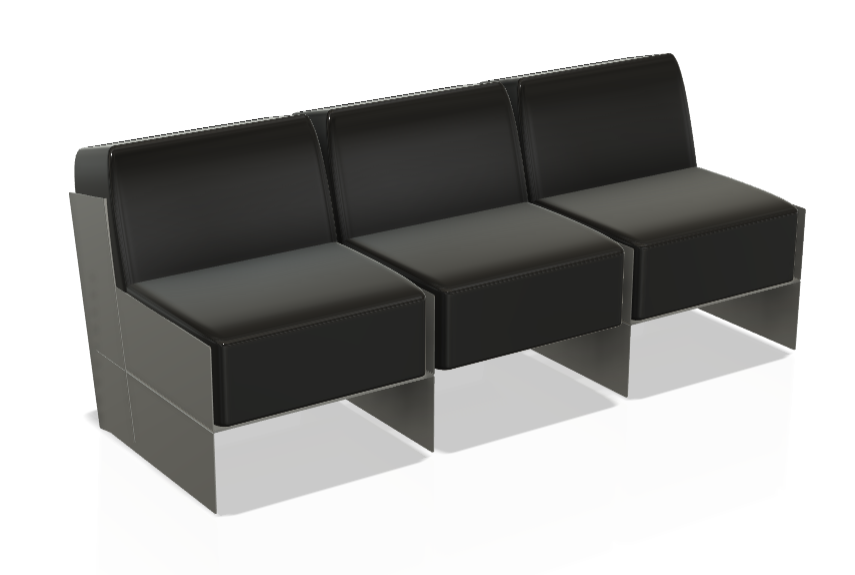
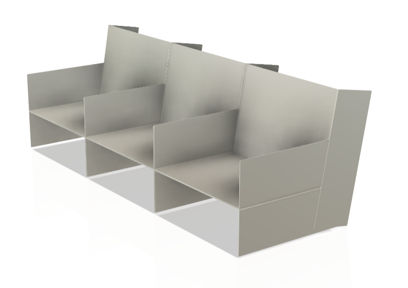
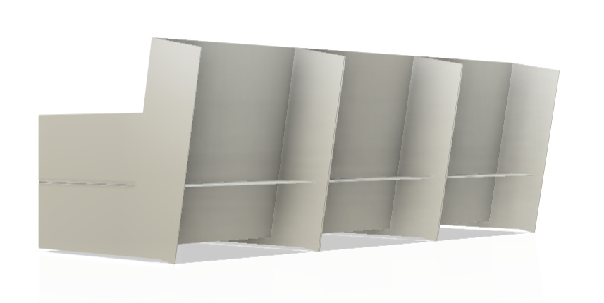
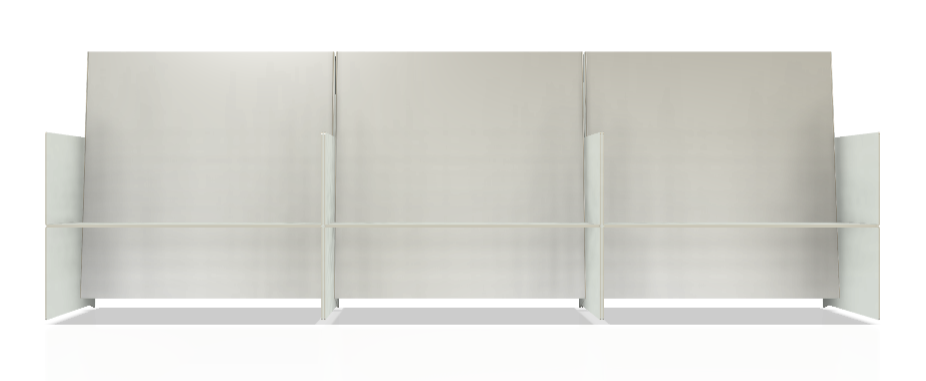
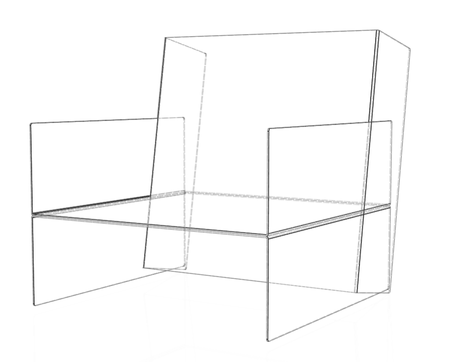
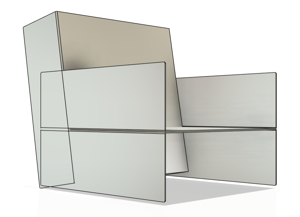
For this first model, I deliberately ignored material connections and real-world physics, focusing instead on form exploration within the software. By merging three separate bodies—despite them not working structurally in reality—I was able to push the visualization of my idea further. This process was essential in helping me question how I could make the design functionally viable in the next stages. Rather than seeing CAD purely as a means of finalizing a design, I began to use it as an iterative tool, allowing digital exploration to inform my next material developments.
These are the drawings I used for my EOI for the vertical gallery. This was an opportunity I didn't want to miss, as I would help by providing space and funding for such a big project. You can see more information about the vertical gallery HERE.
RESEARCH & SCALING UP
After experimenting with perspex and creating a good digital replica of my design, I shifted my focus back to research, specifically on scaling up my design. From the start of this project, I had considered making a cabinet, chair, or sofa, but as my experimentation progressed, I became increasingly drawn to the idea of creating a chair or possibly even a sofa. This ambition was reinforced by a conversation I had during my Semester 2 presentation with Geoff, my course leader. When I mentioned the idea of making a sofa, he expressed that it was an overly ambitious goal. Rather than discouraging me, this only motivated me further—I wanted to take on the challenge and prove that I could achieve it.
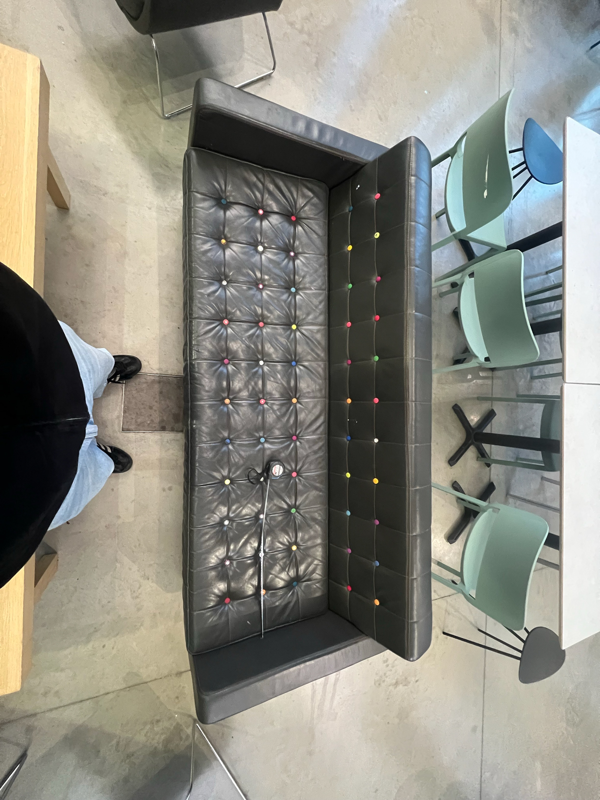
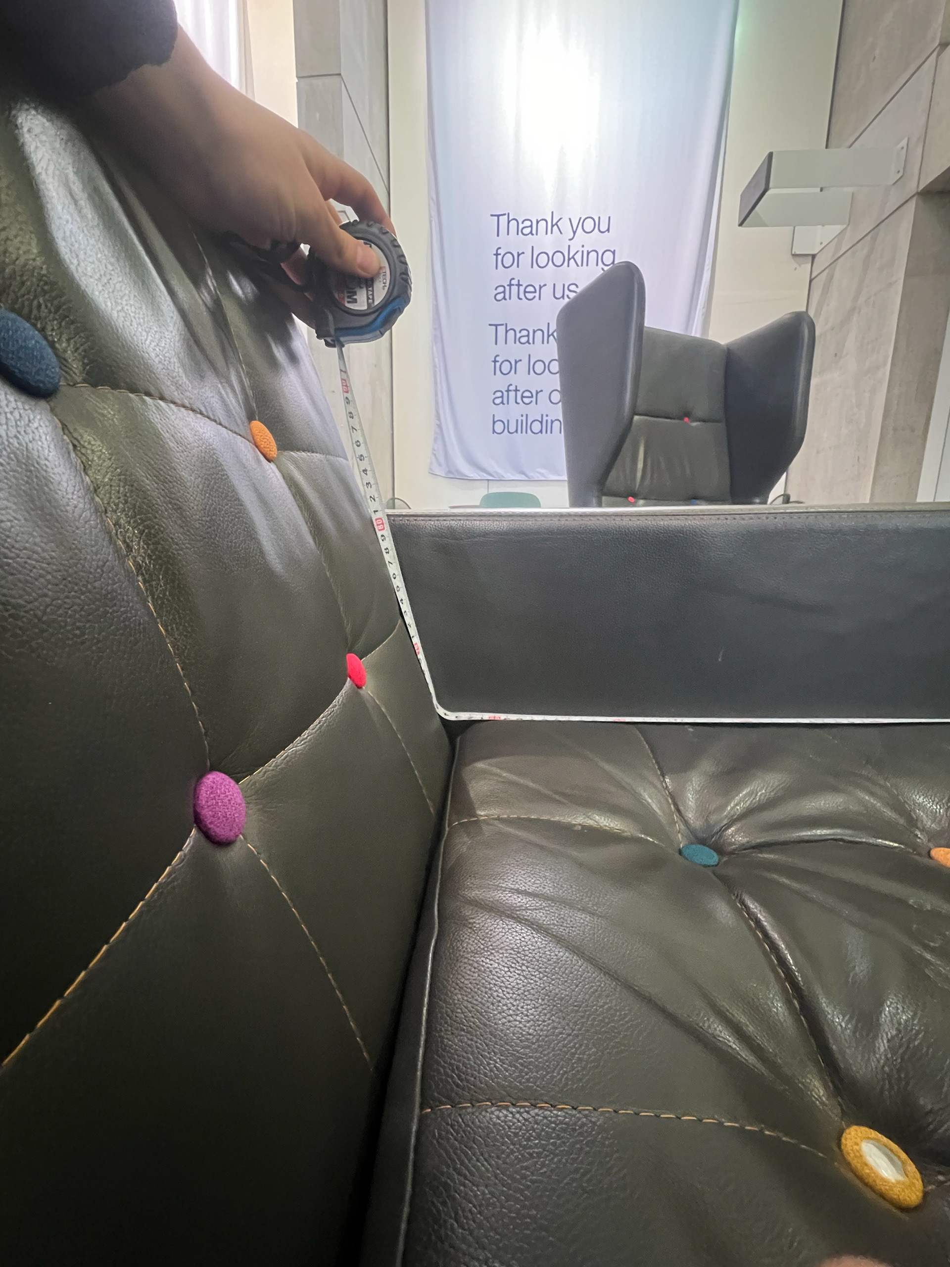
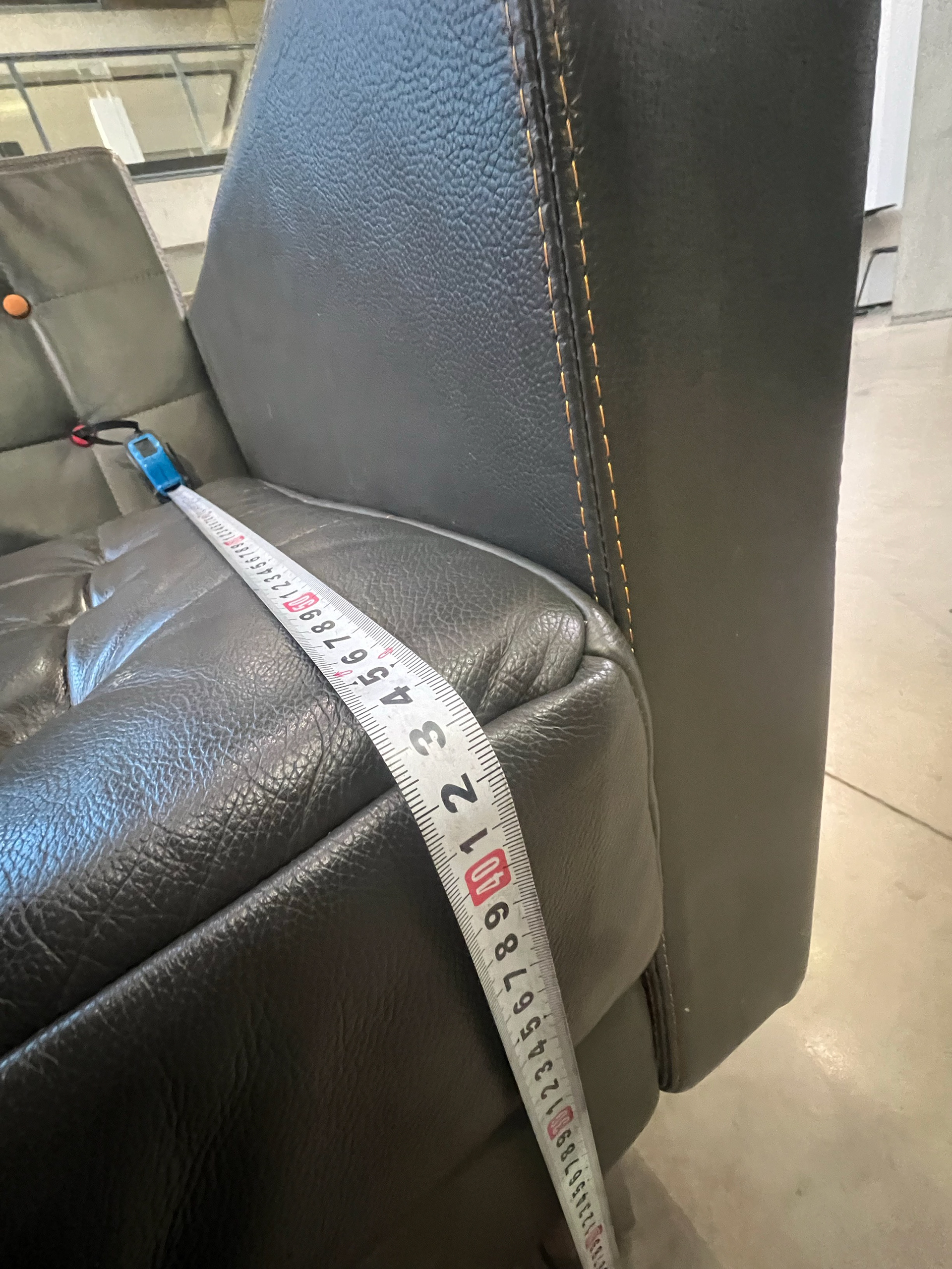
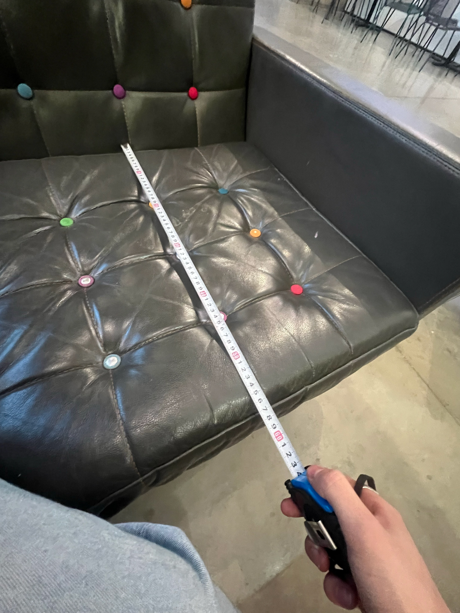
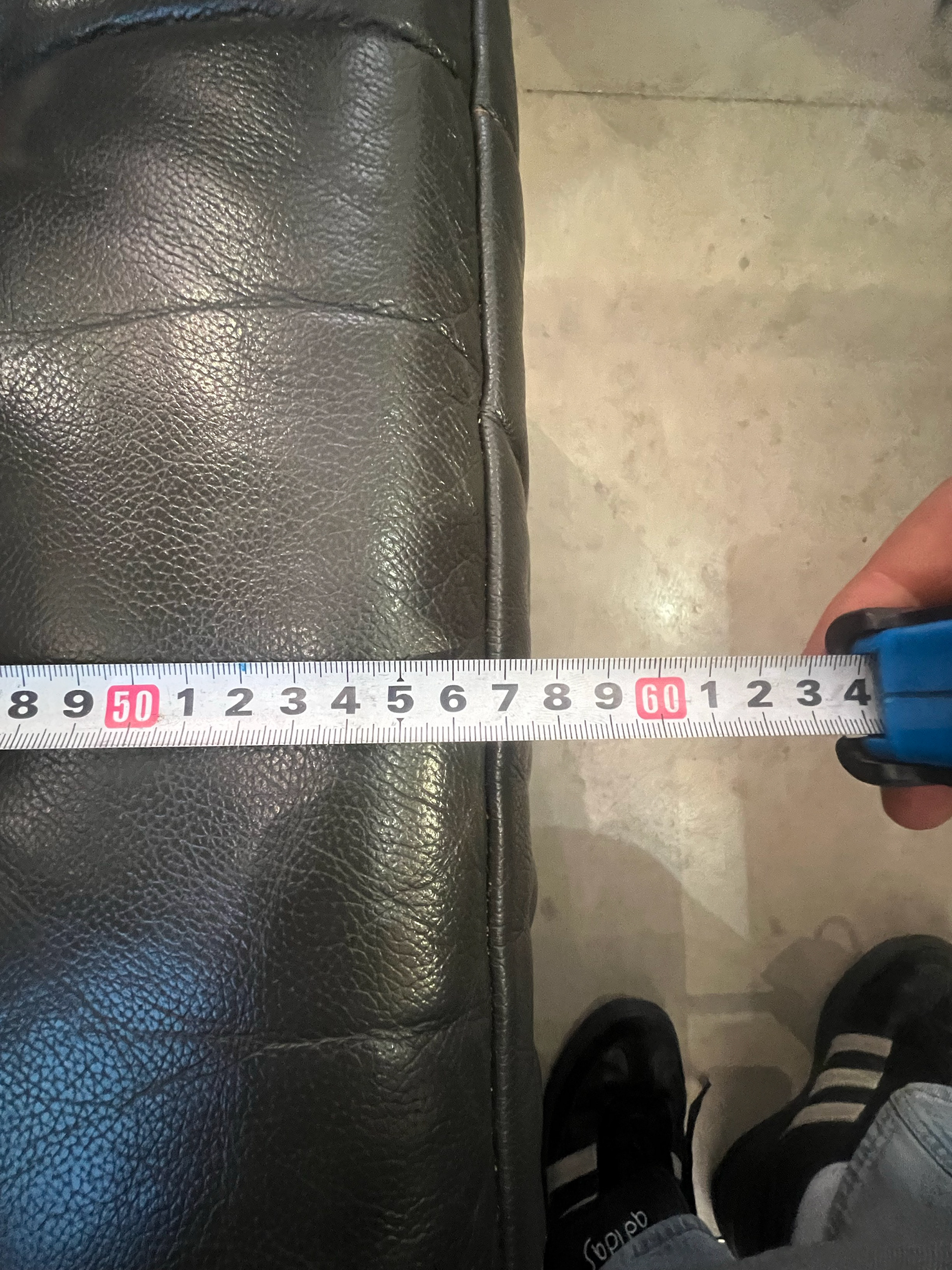
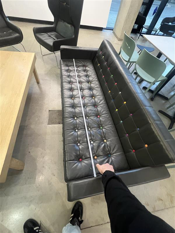
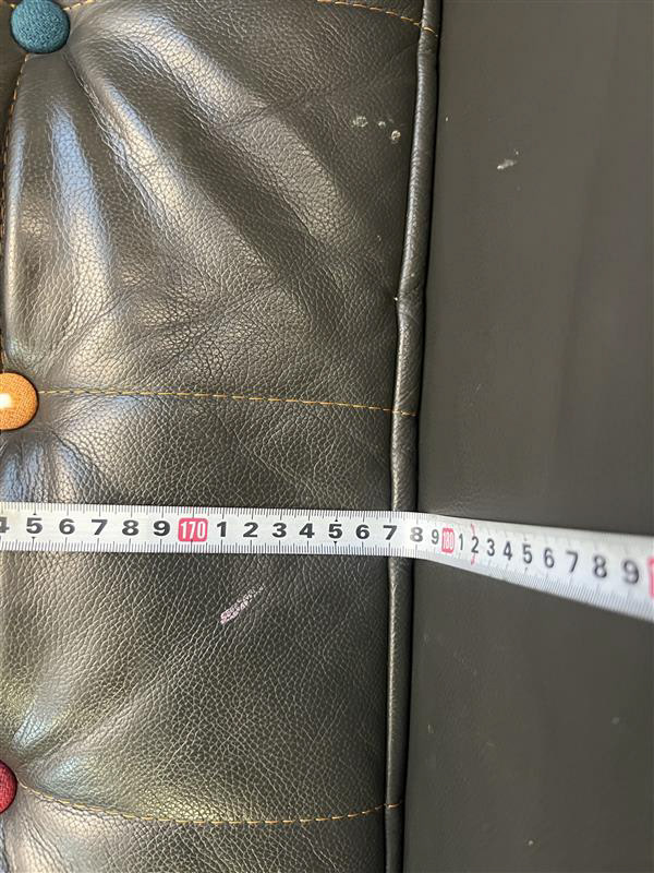
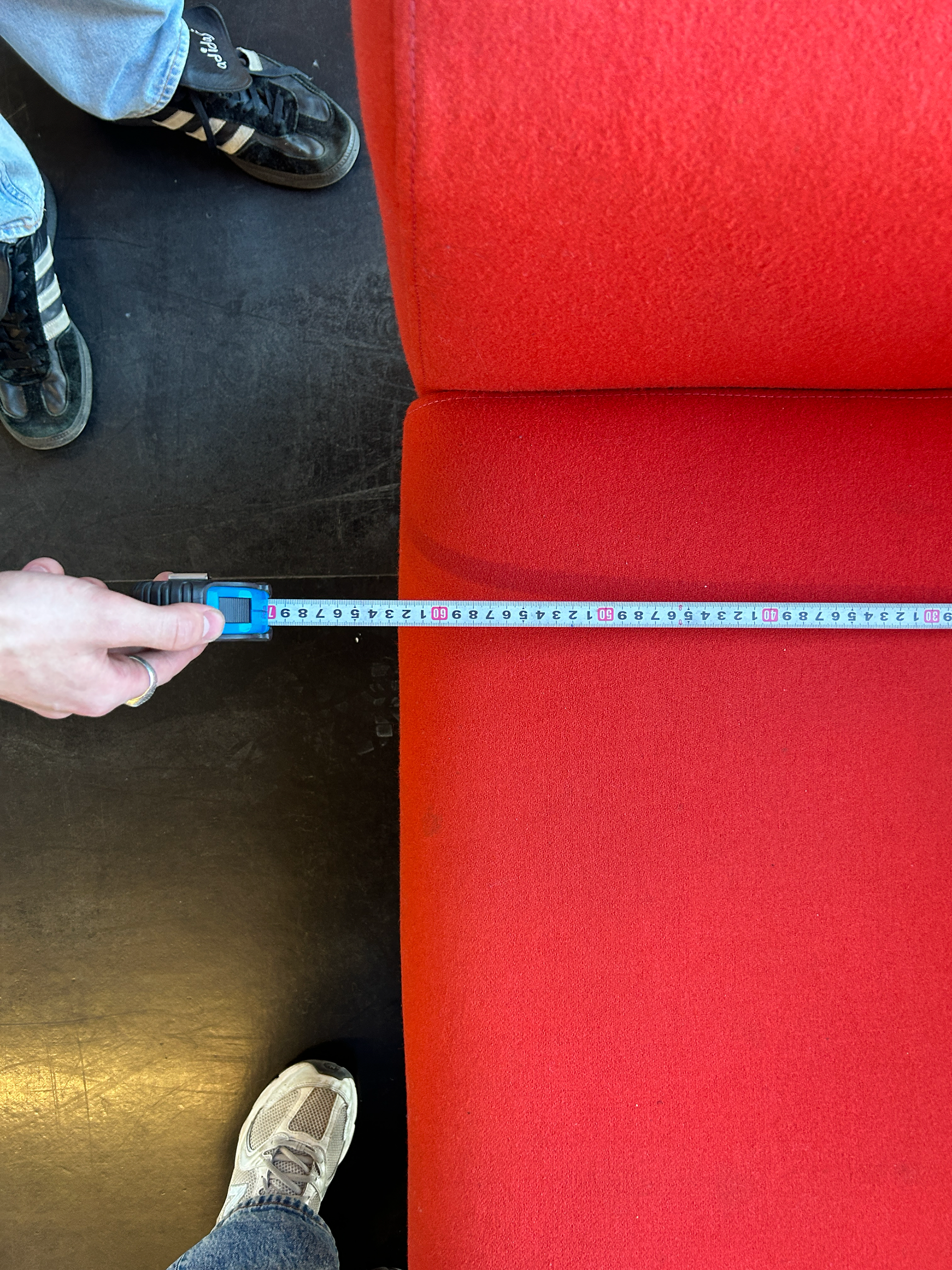
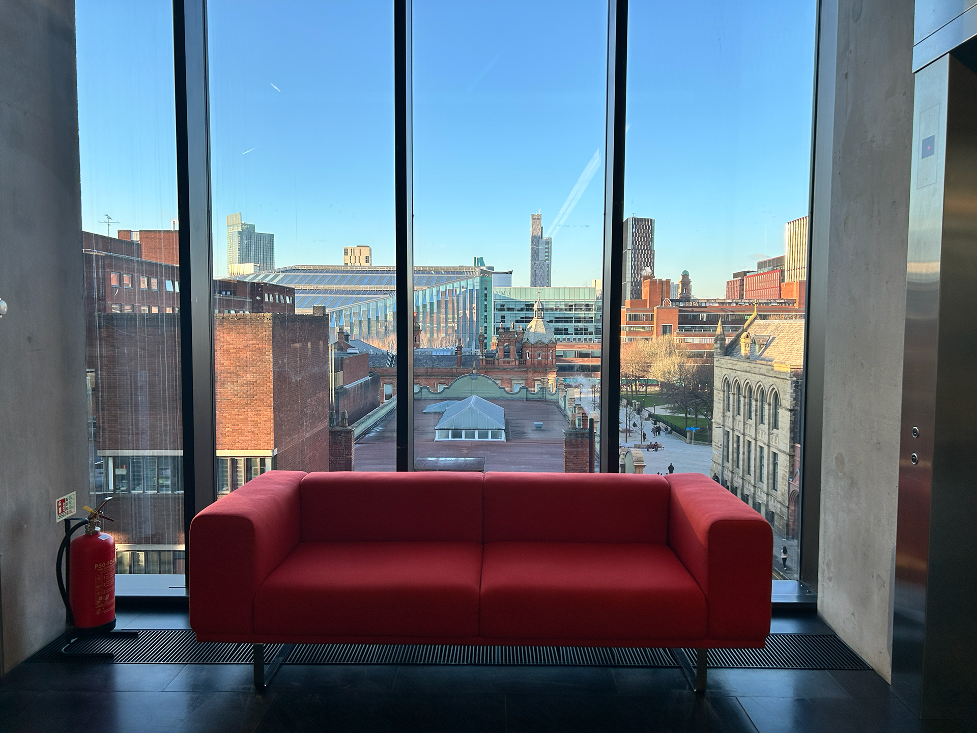
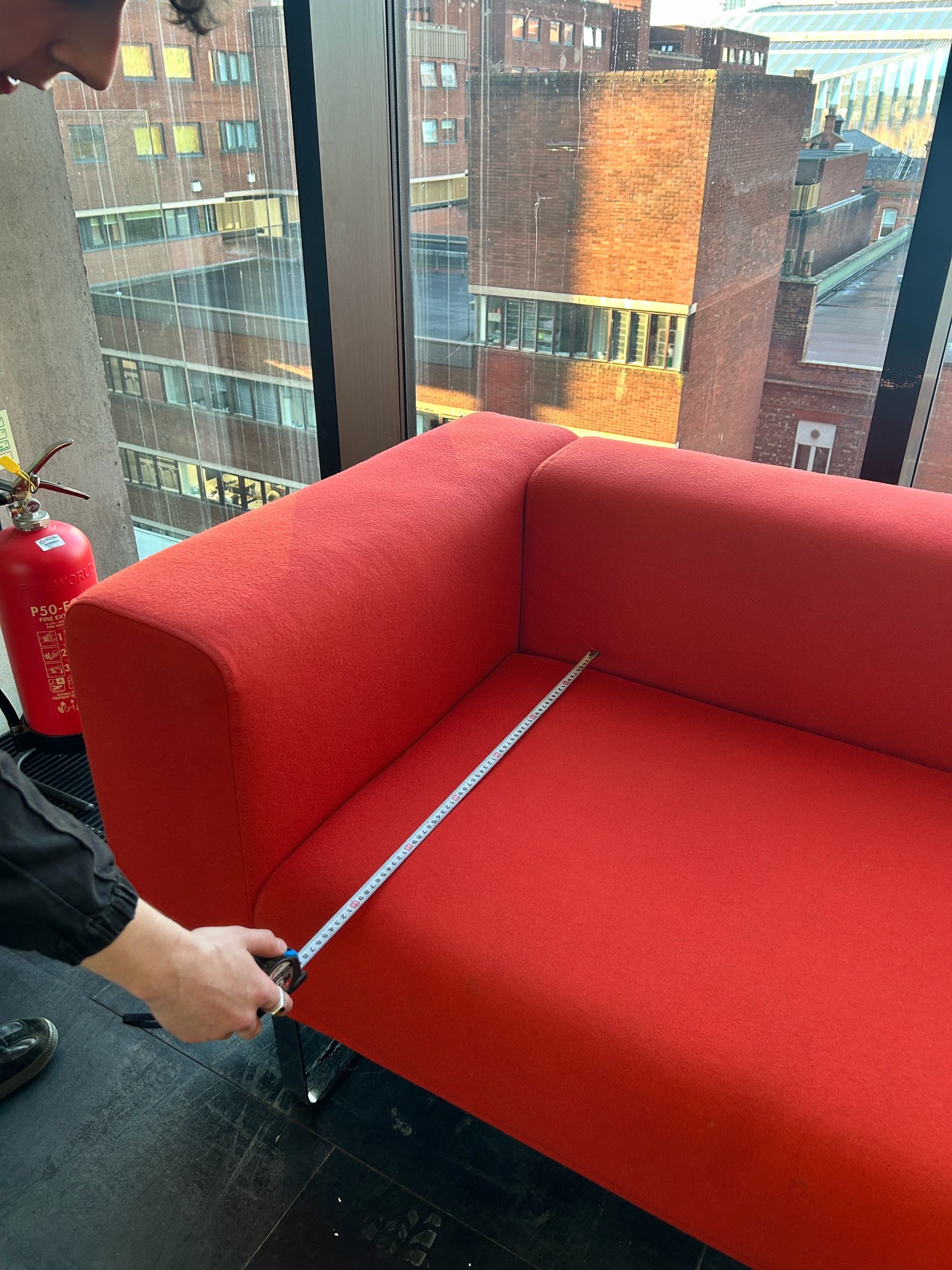
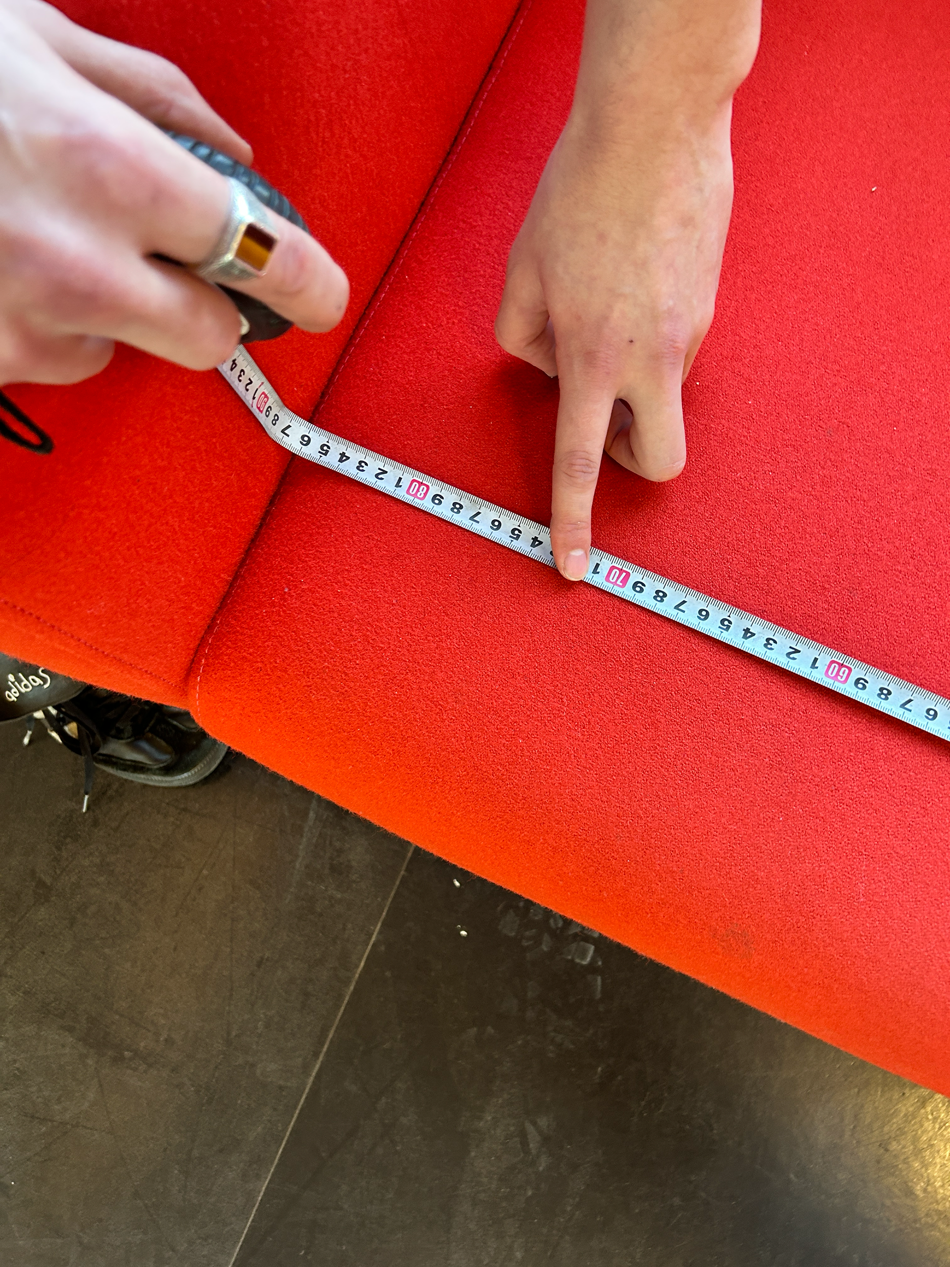
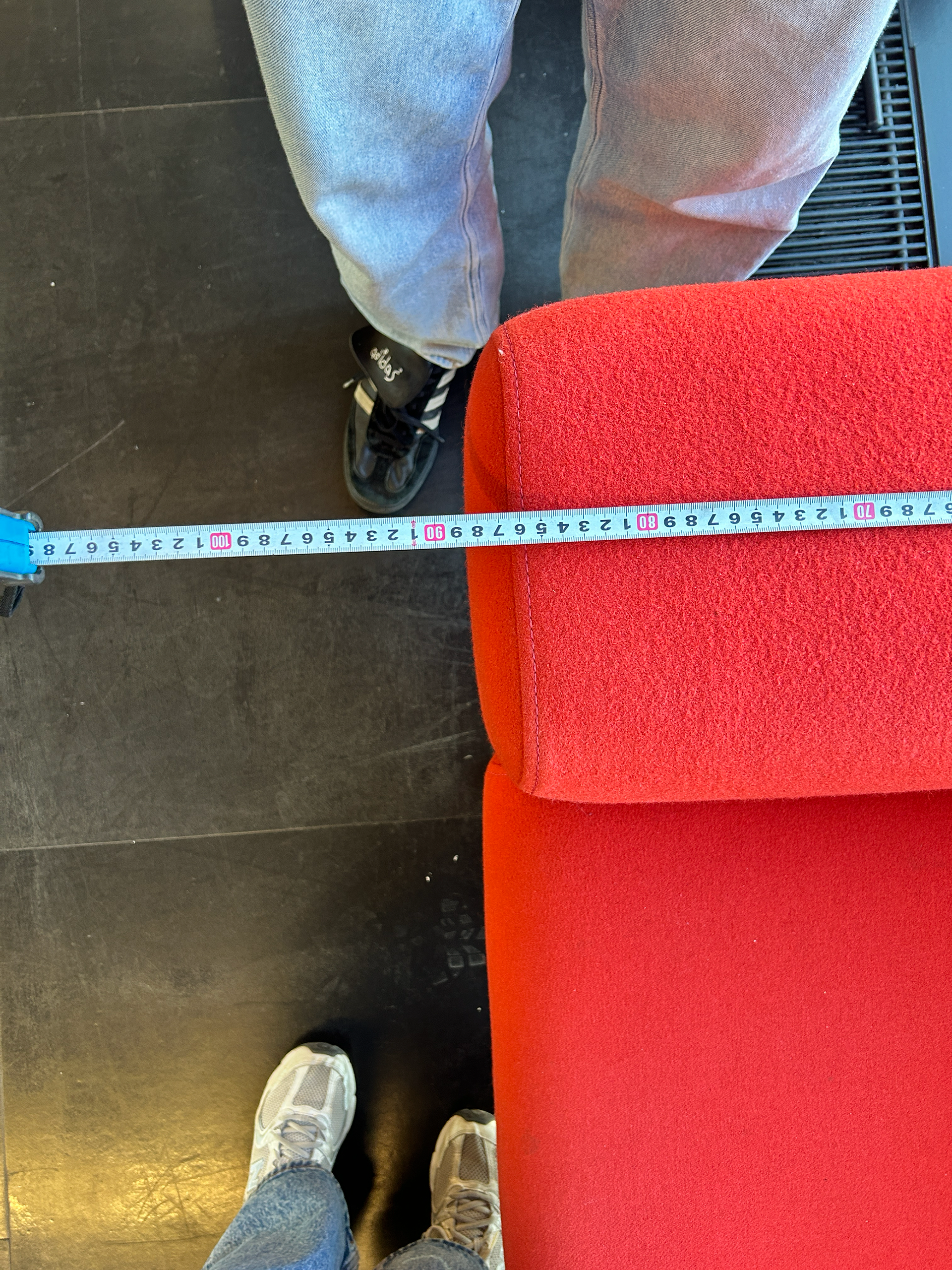
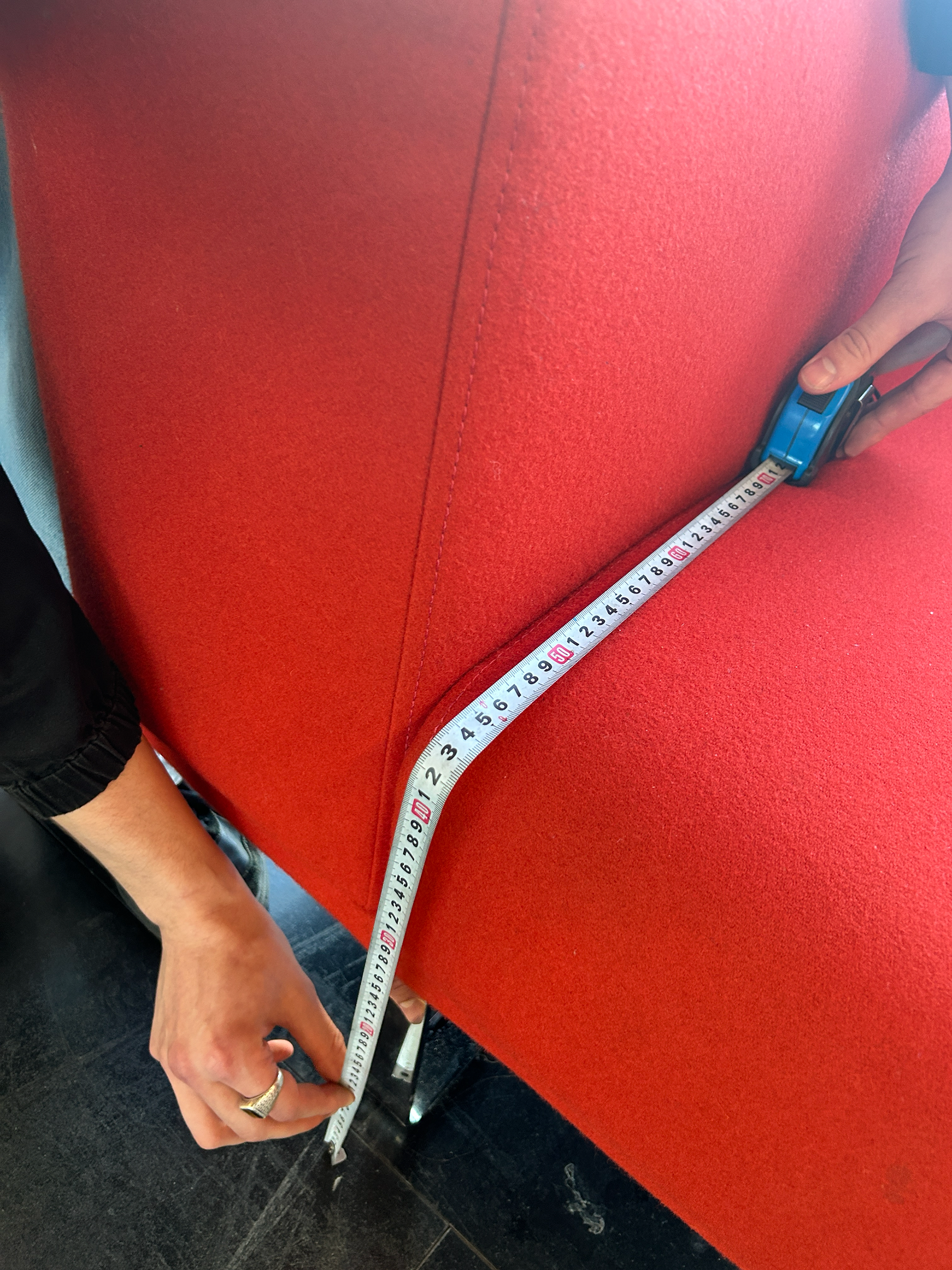
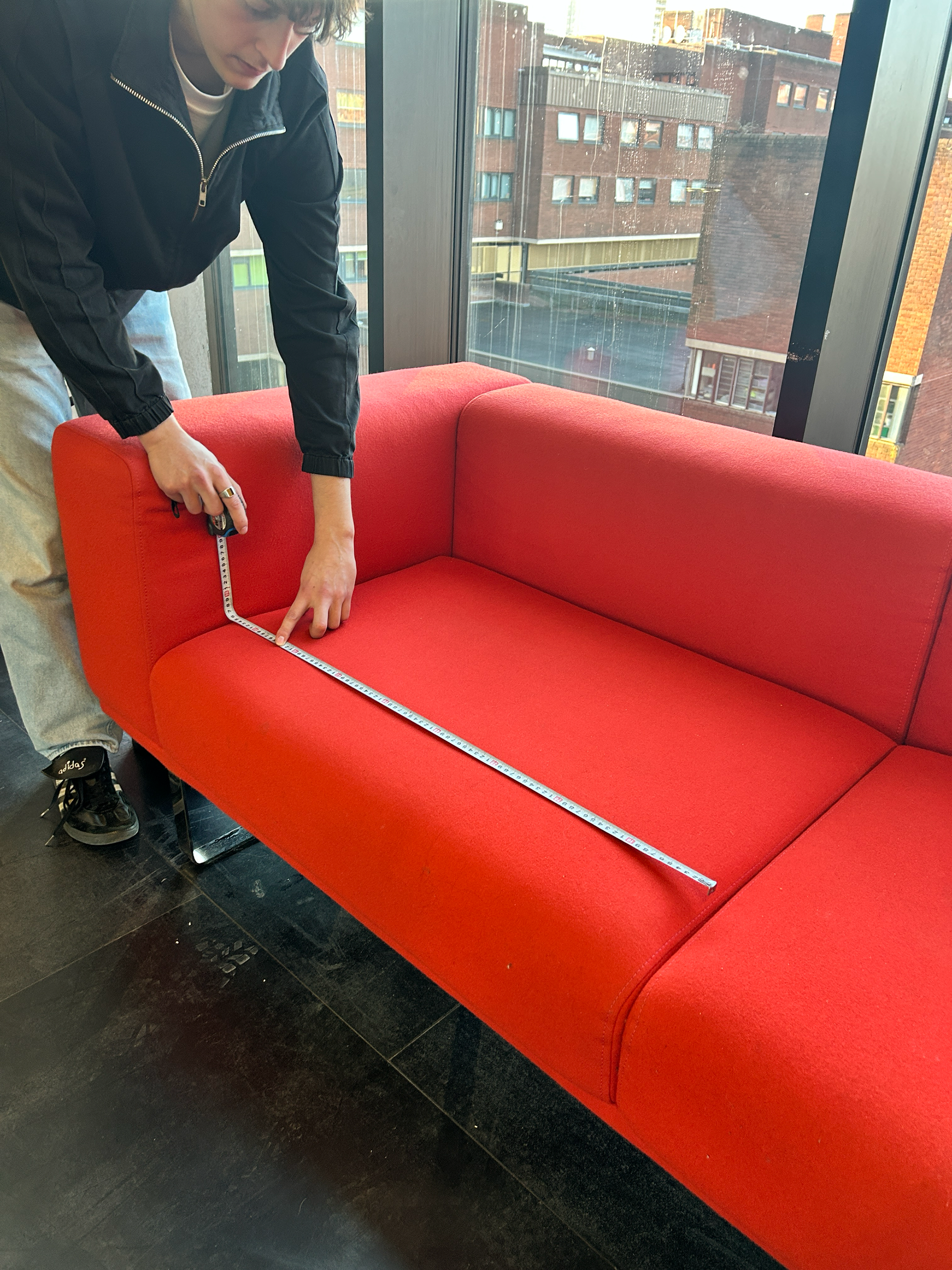
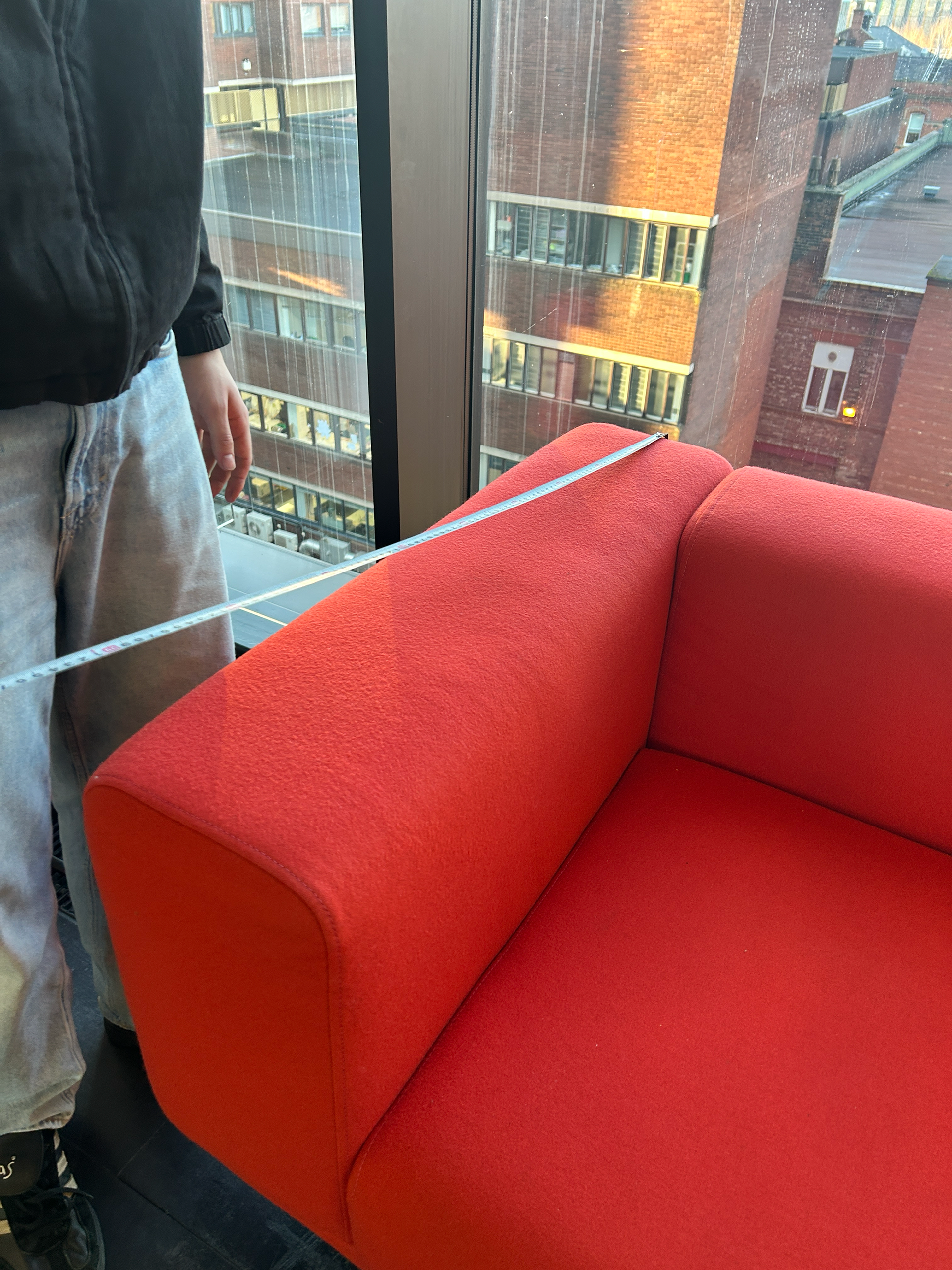
To ensure I approached this in a structured way, I set out to gather primary research on the dimensions and proportions of sofas. I went around the university, measuring various sofas with a tape measure to understand their scale. This was an important step in making informed design decisions, ensuring my final piece would be functional and well-proportioned.
Starting this process early was a direct response to a challenge I faced last semester—scaling up too late. I had learned that designs can reveal unexpected structural or functional issues when enlarged, and I wanted to mitigate this risk by addressing scale as soon as possible. Given the tight timeline of my project, I couldn’t afford delays, so prioritizing this research allowed me to refine my ideas and anticipate potential challenges before moving into full-scale prototyping.
This stage reinforced the necessity of research-driven design. By taking real-world measurements and considering practical constraints early on, I was able to set a strong foundation for my next steps—moving towards designing and constructing a full-scale prototype.
Full-Scale Mockups & Refining Dimensions
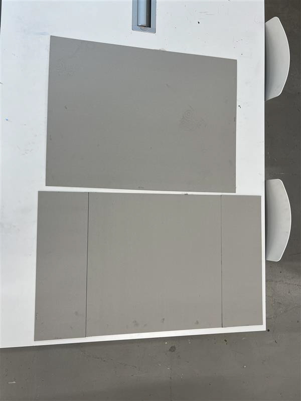
Following my primary research, I moved on to physically mapping out my sofa concept using greyboard. I measured and cut the material based on what I believed to be the average dimensions of a one-seater sofa. However, I quickly realized that my initial estimates were significantly larger than expected—exceeding the size of an A1 sheet of greyboard. At first, I questioned whether this was a mistake, but after seeing it in context, I considered the possibility of embracing a more "luxury-sized" design.
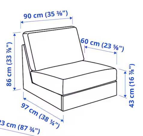
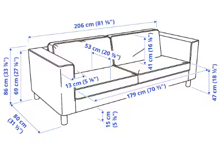
For reference, my measurements resulted in a one-seater sofa that could realistically fit 1.5 to 2 people. While this wasn’t entirely impractical, I needed to reassess whether it aligned with my project constraints. To validate my findings, I conducted secondary online research to compare my measurements with standard one-seater sofa dimensions. While I wasn’t drastically off, I realized that sticking closer to the standard sizing was the better option. The decision ultimately came down to practicality—without external funding, producing a larger piece would have been financially unfeasible.
To visualize the changes, I cut two greyboard templates. The top piece represented the base seating area, while the lower piece was adjusted to fit the average one-seater dimensions with an additional 20cm on each side. This extra width was intentional, aligning with my design concept, where the "legs" of the chair/sofa extended beyond the seat itself.
This stage was critical in refining my approach before committing to full-scale fabrication. It reinforced the importance of balancing design ambition with practical constraints—ensuring that my work remained both achievable and well-proportioned. By identifying these issues early through physical prototyping, I saved time and resources that would have otherwise been wasted on incorrect scaling.
You can also see the secondary research for standard one-seater sofa dimensions below, which helped me compare my initial measurements and refine my design to be more practical and achievable.
Refining the Design Before Full-Scale Sampling
With a clearer understanding of the scale, I returned to the metal workshop to refine my design further before moving into full-scale sampling. I selected 3mm aluminum and cut smaller pieces to match the ratios of my larger scale mockups. Based on my primary and secondary research, I settled on a 60cm x 60cm base size for the seat and a 40cm height from the ground, which seemed to be the most common dimensions for seating.
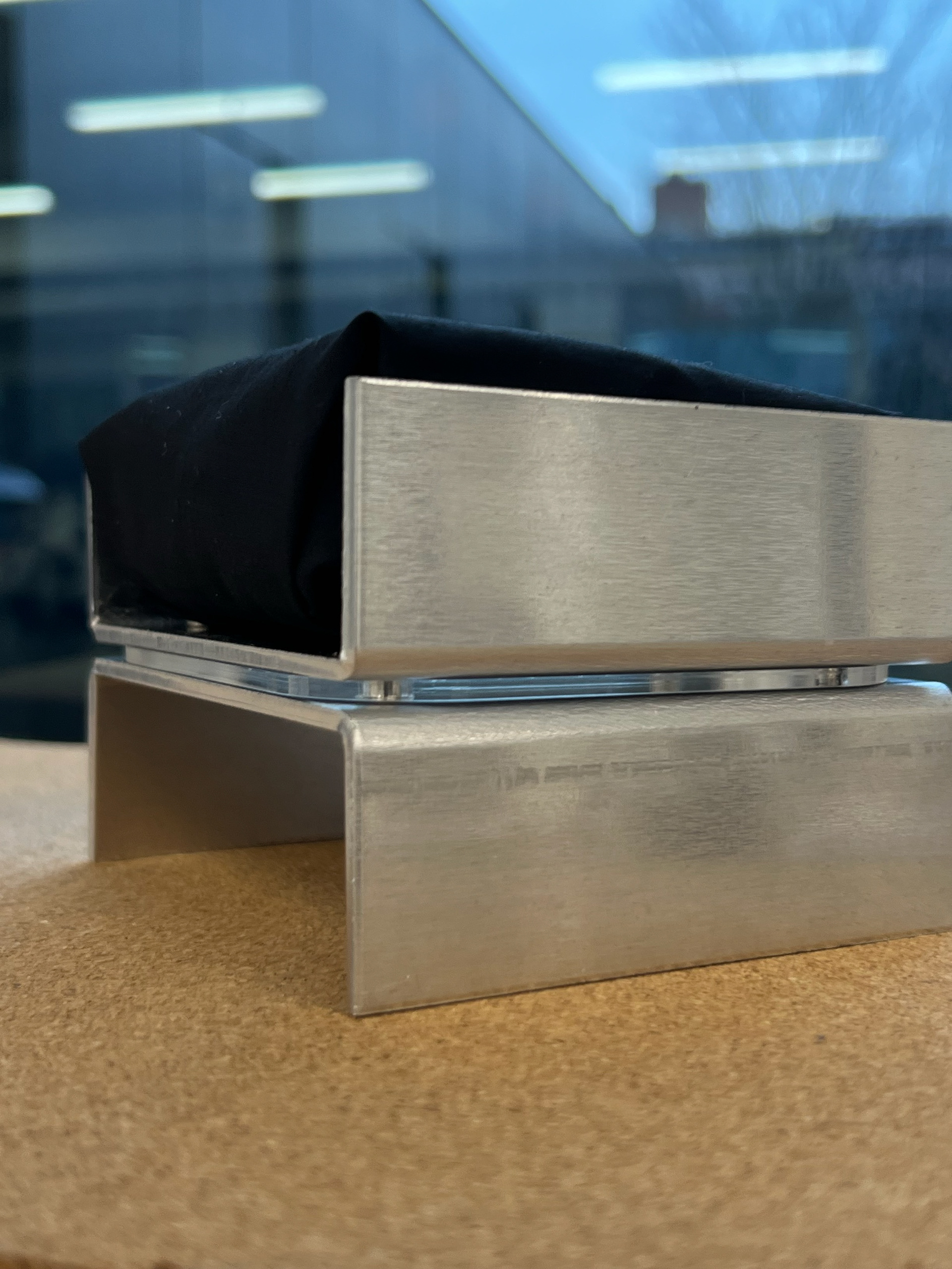
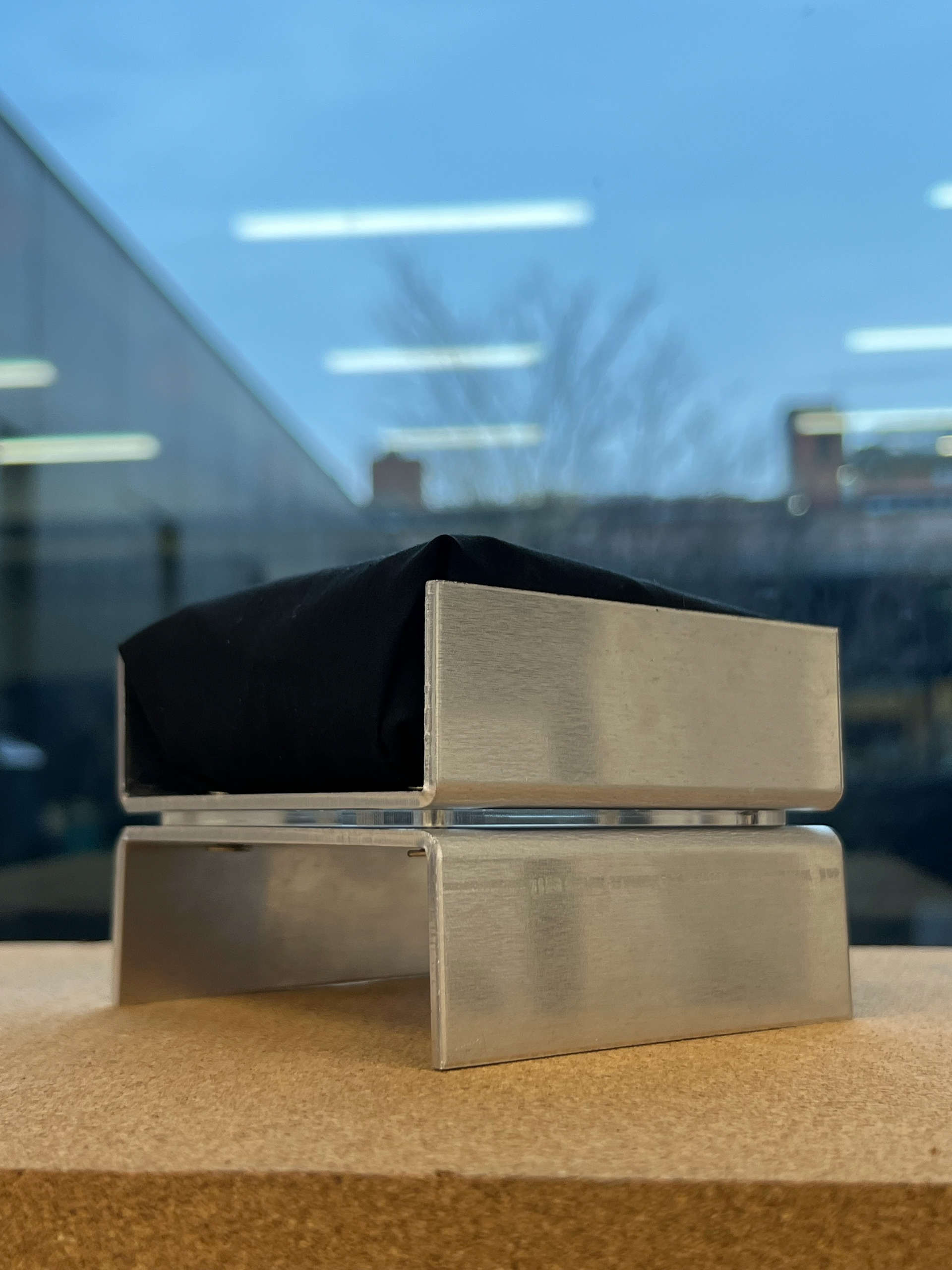
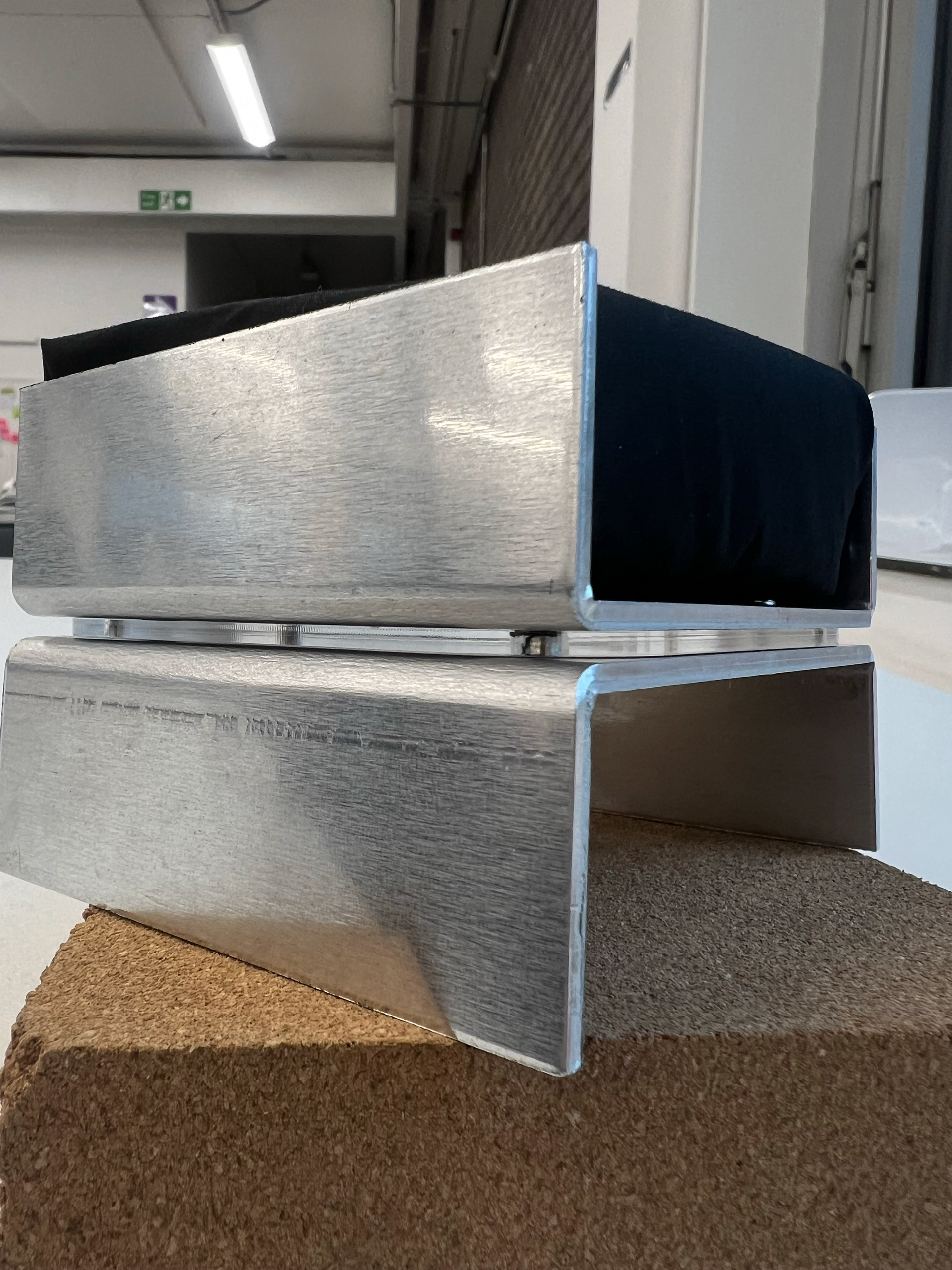
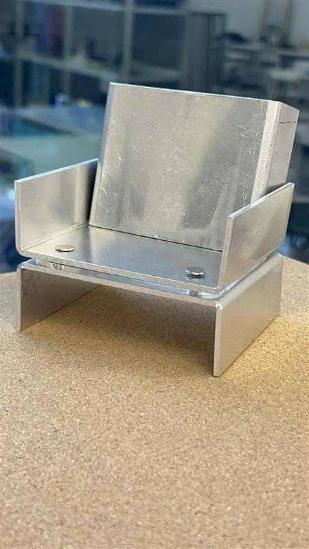
I then scaled this down to a 10cm x 10cm square as a smaller sample to explore connection methods and aesthetic choices on a manageable scale. The result was a well-aligned, finely measured piece that incorporated barrel screws—something I had previously researched and wanted to test out.
I also maintained my interest in incorporating acrylic into the design, so I experimented with 3mm clear acrylic between the two metal components. This addition created an intriguing contrast and added depth to the overall design. To further visualize the concept, I quickly mocked up a small cushion using black fabric and scrap foam to bring the idea to life.
SCALING & TESTING BASE COMPONENT
With the design fully thought through, it was time to determine whether it could actually work. From past projects, I had learned the importance of testing materials at a 1:1 scale early on—small samples can hold weight differently than full-scale components, and skipping this step could lead to major setbacks later.
For this test, I used a large 60cm x 100cm sheet of 3mm thick metal, bending it to leave two 20cm tabs on either side. This was a crucial step, as this component was intended to bear the majority of the weight. Unfortunately, but unsurprisingly, the thin points of the structure didn’t hold up under pressure. Even with a small amount of weight applied, the material warped and bent, making it clear that this approach wouldn’t work.
While this meant a significant design rethink, I was relieved to have tested it so early in my process. Had I delayed this step, I could have wasted valuable time pursuing a design that wasn’t structurally viable. With this information, I now had the opportunity to explore alternative solutions while still keeping my project on track.
RETHINKING MY DESIGN``
Before entirely moving away from this idea, I wanted to see if I could reconfigure these components to add more strength and stability to the form.
I built up this form by copying and rotating the component. I thought it looked too much like Standard Equipment's sofa, and I wanted to see if I could create something unique.
I then switched my focus to the cushions. As upholstery isn't my strong point in design and craft, I thought it would be better to understand this earlier on in the project instead of leaving it as a final thought, like I did for my project in the second year.
It was also around this time that I went on my trip to Vitsoe and was analysing the 620 chair, which had cushions built up from a wooden frame, springs, coconut husk, foam, dacron, stockinette, and the upholstery fabric. This was intimidating, and I thought I had underestimated the amount of thought that goes into creating a sofa.
I decided to draw up some bigger measurements of cushions to see if that would impact my design. I created these shapes using the form tool to expand my knowledge and skills on Autodesk Fusion 360. I then used the components I already had to create a sort of shell around these cushion forms.
I think this idea would've worked structurally, but I wasn't loving this and decided not to waste time and move on to altering the component, as it had also lost the primary inspiration that I took from my last project.
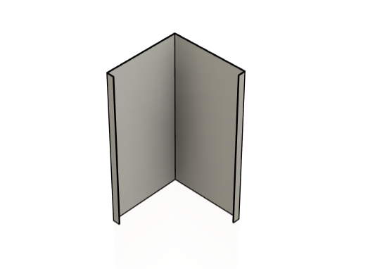
I refined this design by adding two more side faces and bending small tabs at the ends of each one. I believed this would improve the overall stability of the structure, as it increased the surface area in contact with the ground.
From there, I multiplied and experimented with these pieces until I discovered a form that resembled a shelving unit. While this wasn’t the exact direction I initially intended, I could see its potential as a multifunctional component.
I then began reconfiguring the piece into various modular forms, aiming to create shapes that resembled chairs and sofas. However, I ran into a new issue; these additional folded tabs started interfering with where the cushions would sit. They ended up either inside or on top of the seating areas, which made the design less functional.
At this point, I began reviewing my research and analysing existing modular furniture systems. I realised I had been chasing an unrealistic goal, expecting a single component to do everything. This has been a recurring challenge in my work across different projects. It became clear that a successful modular system doesn’t rely on one catch-all piece but rather on a collection of well-designed components that work together. Shifting my focus away from a “one-size-fits-all” approach allowed me to reframe the way I approached modular design entirely.
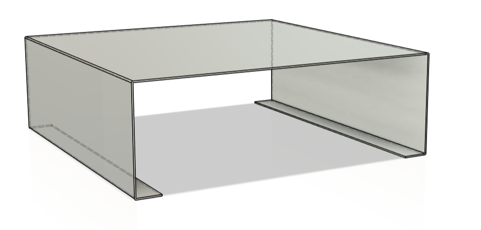
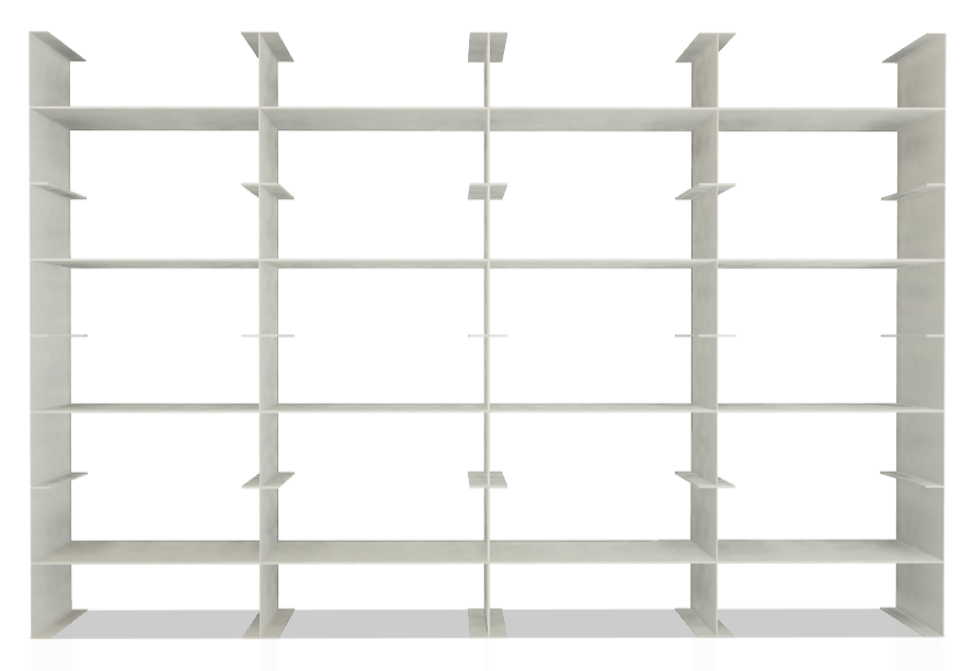
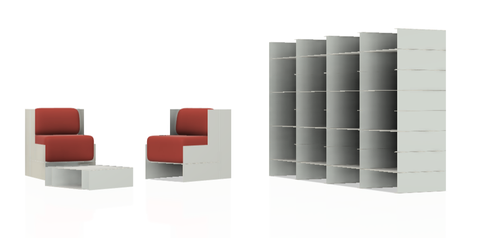

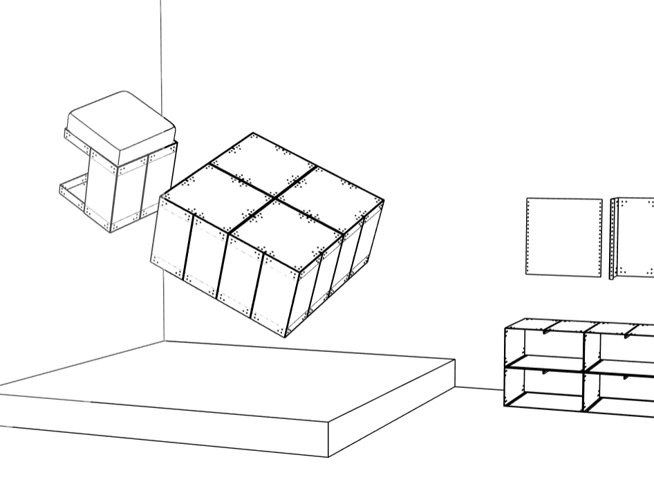
While experimenting with different forms, I decided to start building out entire spaces within the CAD software I was using. I began by creating a shelving unit and then imported my original sofa design into the same file. Using the simpler component from earlier, I mocked up a makeshift coffee table to go alongside it.
Seeing all these elements come together as part of a single, cohesive interior was a turning point for me. It was the first time I’d created something that truly resembled a complete space—something I had always hoped to achieve since the beginning of my final year. Designing furniture that works together within a space was at the heart of my original project proposal.
I had been advised early on that designing and fabricating an entire interior space in just 11 weeks might be too ambitious, especially when considering time, cost, and practicality. I understood that and tried to stay realistic with my goals. Still, there was something really motivating about seeing the potential of these designs laid out as part of a real environment. The immediate sense of gratification and renewed inspiration from those drawings and renders made me want to push myself just that little bit further and not be afraid to aim slightly bigger.
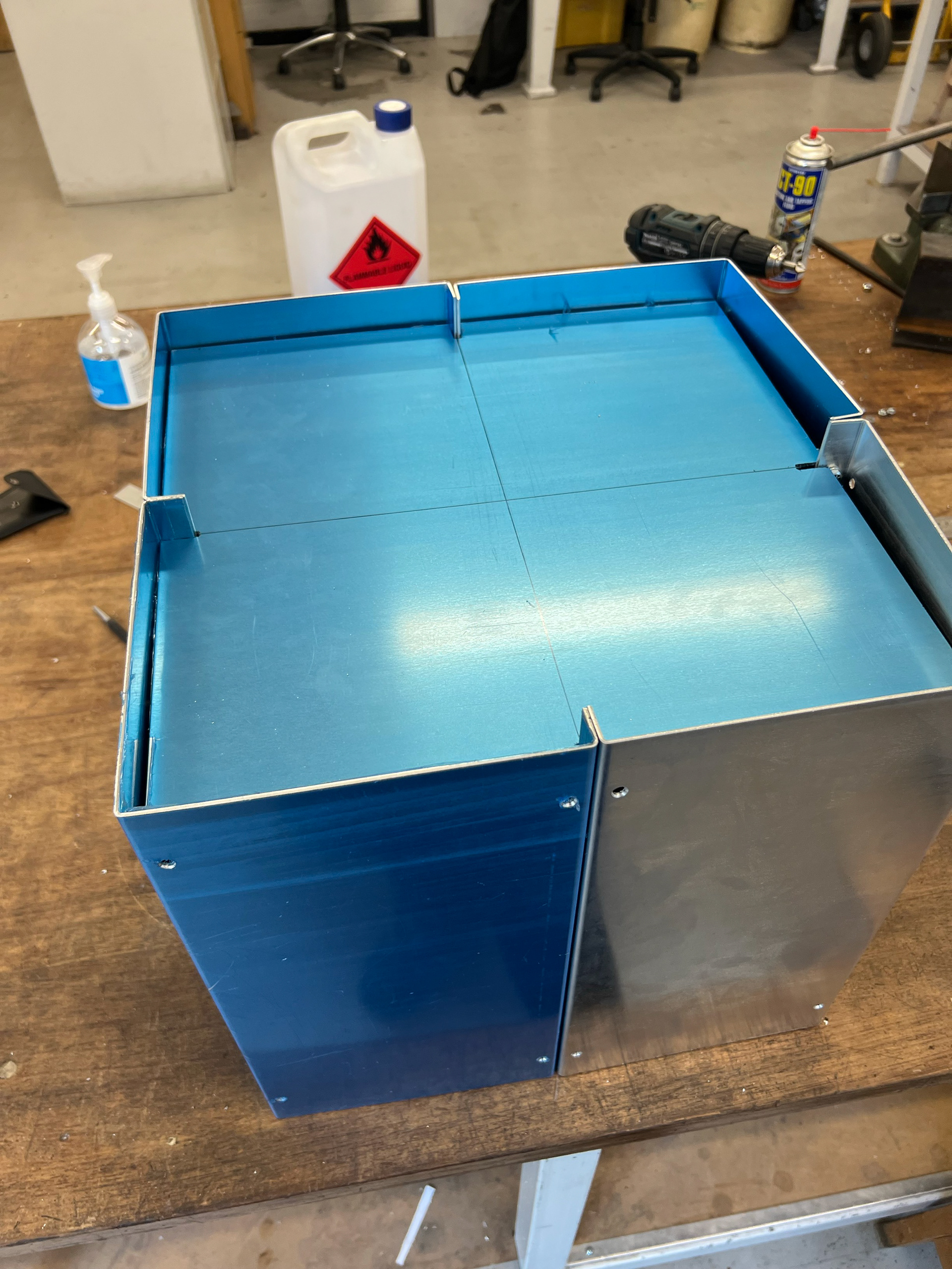
Without wasting any time, I started exploring how I could break down my original component into multiple, smaller pieces that would still function together within a modular system, while also adding more structural integrity. During a review of my 1:1 model with technician Paul, we discussed how incorporating more bends into the design could increase its overall strength and rigidity.
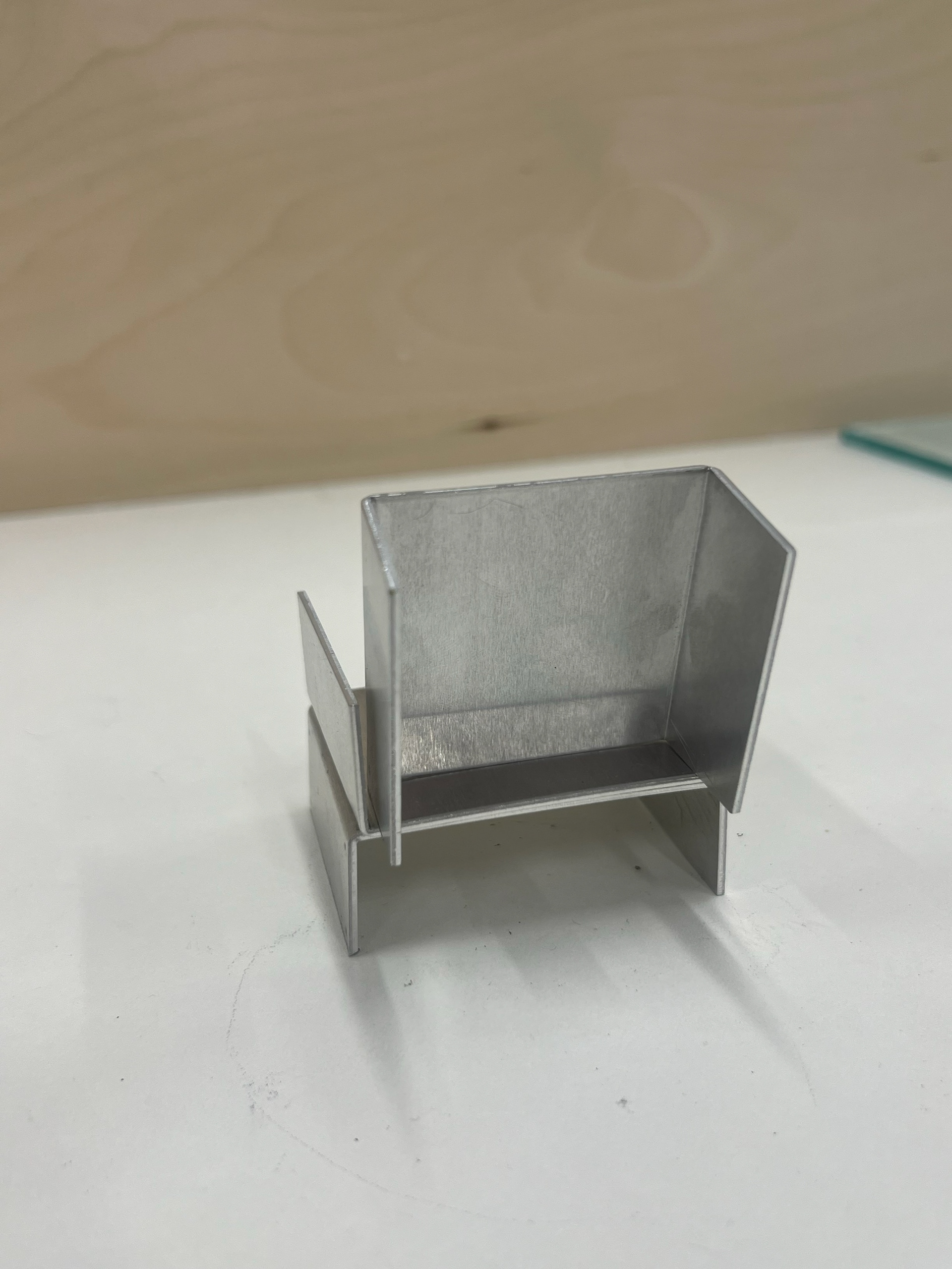
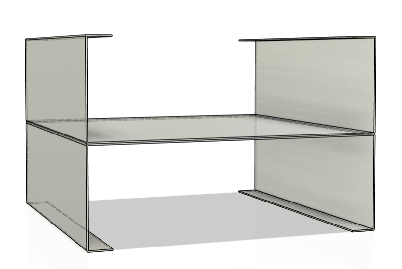
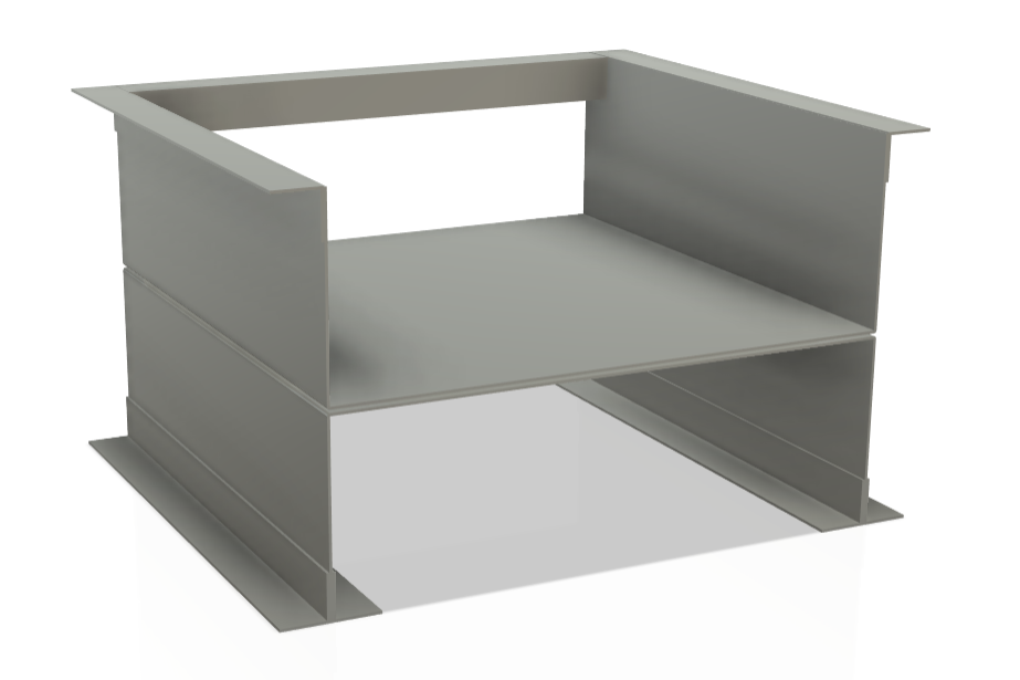
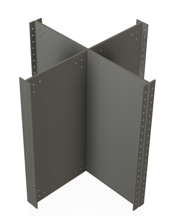
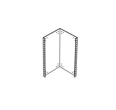
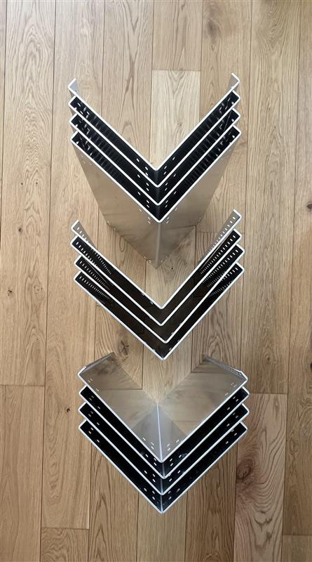
This insight led me to re-analyse the component I had already developed. I started to imagine each face of the structure as its own independent part. Through this process, I ended up with smaller bracket-like elements that began to resemble L-brackets—components commonly found in furniture design already.
I really liked the form I had landed on here. It felt functional and minimal and had the potential to serve as a solid foundation for a seating structure. However, I still had doubts. Despite being excited about the direction, I remained unsure about how well the brackets would perform under real conditions. The last thing I wanted was to waste more time and resources pursuing an idea that still looked fragile and unresolved in terms of load-bearing potential.
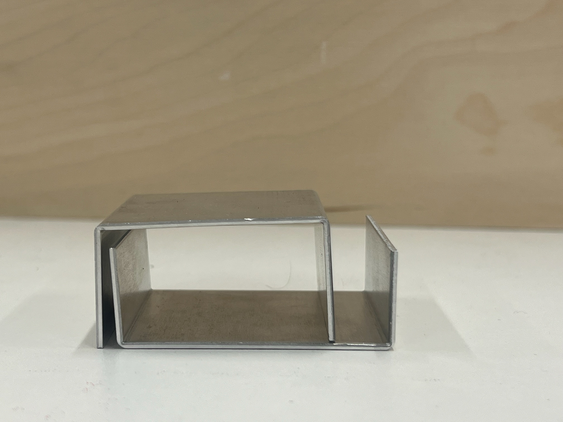
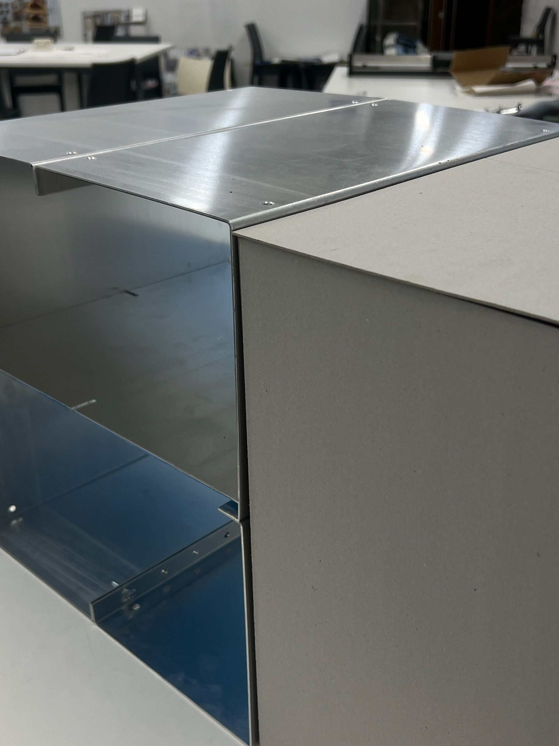
I continued refining the design by developing a new variation of the component. This version was closely related to my second iteration; essentially split in half. Despite its simplicity, the piece held a lot of potential. I found that by rearranging the parts, I could form a variety of structures like box shapes or cross-shaped assemblies, offering new possibilities for both function and form.
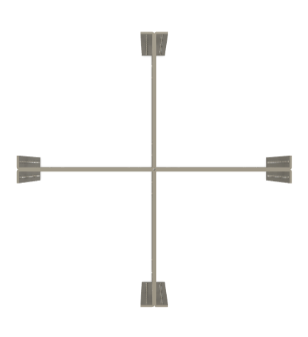
As I experimented with these configurations, I started thinking more critically about the orientation of the sheet metal components. I realised that positioning the panels vertically, rather than horizontally, could provide significantly more structural strength. This is due to how vertical orientation allows the material to better resist bending under load. In structural terms, when a flat sheet is vertical, its cross-section distributes weight more effectively, similar to the way an I-beam works in architecture or construction. Horizontally positioned sheets are more prone to sag or deform under weight because they lack the same depth and stiffness in their profile.

This realisation encouraged me to push the design further. I began considering how I could add another component to act as a lid or fifth face to these modular boxes. Not only would this cap complete the form visually, but it could also enhance rigidity, give structure to seating or storage configurations, and help the overall design feel more cohesive and finished.
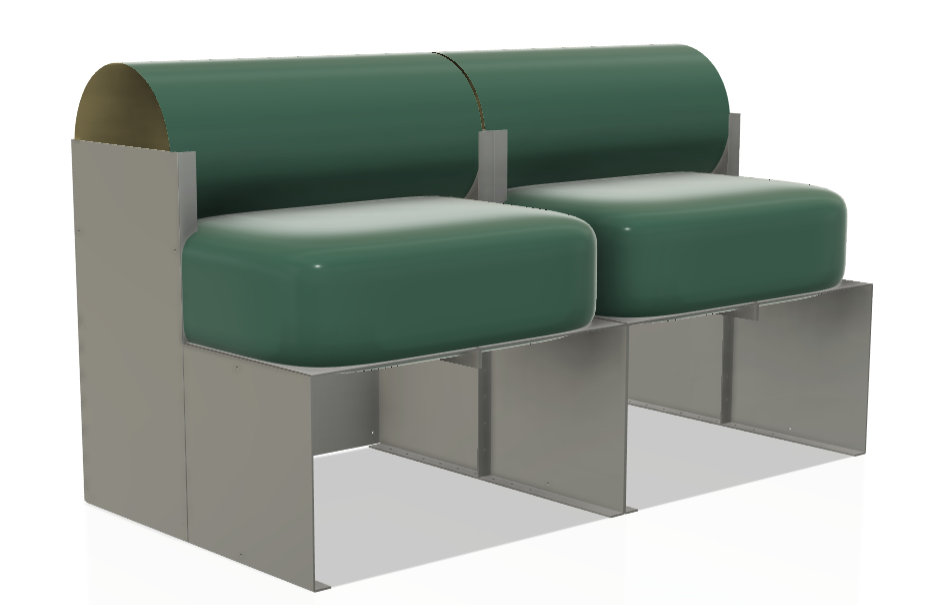
I started exploring new ways to arrange these components, thinking more critically about how they could come together to form practical furniture. Since I had now been accepted into the Vertical Gallery, it became essential for me to find a way to transform these individual parts into a functioning sofa design that would suit the exhibition format.
This shift gave me a new sense of urgency and focus. I needed to make the components not only structurally sound and modular but also visually cohesive as a single piece of furniture. The challenge was to create a configuration that felt intentional and resolved—something that communicated the modular nature of the system while clearly serving as a sofa. I began playing with arrangements that allowed for repeated use of the same bracket forms, looking for clever ways to join them together that would support weight, create comfort, and still highlight the flexibility of the system.
This was also the point when I created my proposal for New Designers—another opportunity I was really excited to apply for. I knew from the start that I had to clearly differentiate what I was developing for the Vertical Gallery from what I would need to present for Synthesis and Resolution. That’s when the idea of turning my box components into a modular coffee table came to mind.
I began researching standard dimensions and proportions for coffee tables, looking specifically at typical heights and footprints. I found that by placing four of my existing box components together, I could create a compact, adaptable table unit that felt both functional and versatile. It also became clear that these same components could be wall-mounted to function as floating shelves, which added even more flexibility to the system.
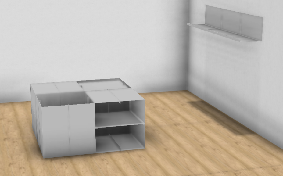
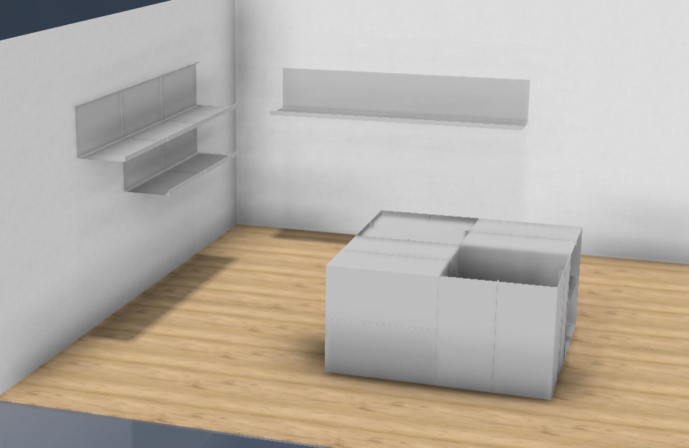
To visualise the proposal, I put together a 3D render of a small room to represent the space I would be allocated at New Designers. Since I hadn't seen the space in person yet, I worked off the basics: two walls and a floor. From my earlier experiences creating spatial renders, I felt confident that I could elevate this scene by layering in materials, textures, and lighting to make the setup feel realistic and considered.
Overall, I was really pleased with how the render turned out and how well it communicated my concept. I felt that my Expression of Interest (EOI) for New Designers came together confidently and clearly—giving a strong sense of what I aimed to show and how the components could live within a curated space. You can see the final 3D drawings and proposal below.
NEW DESIGNERS EOI
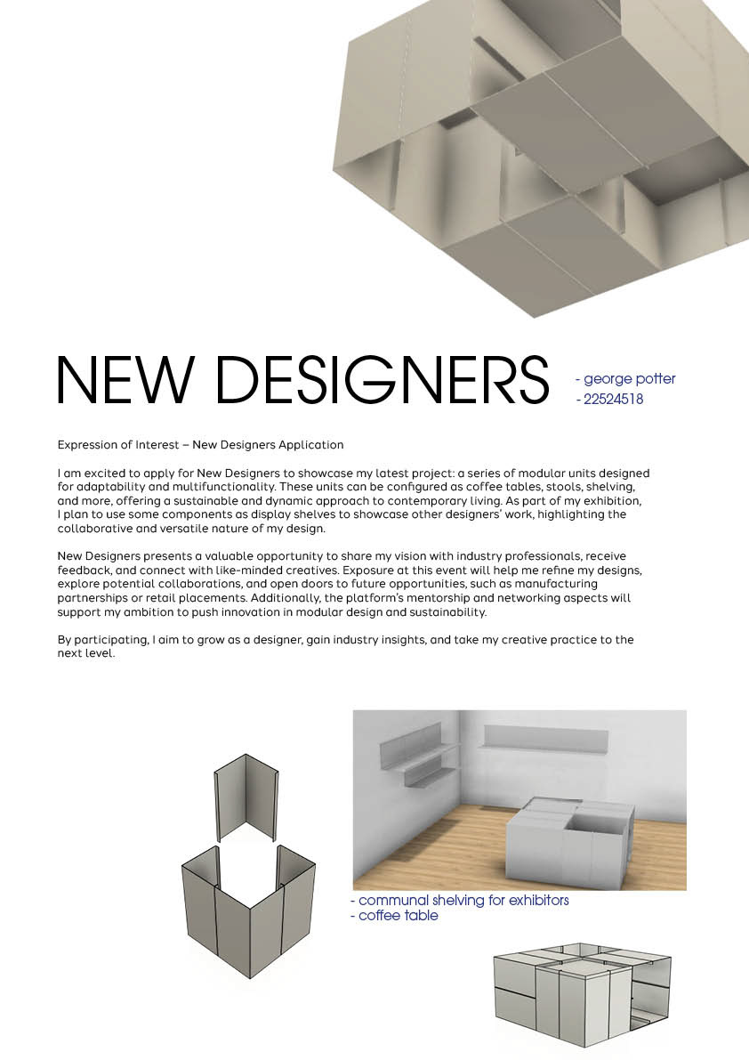
This was the first point in my project where I started thinking about how I would curate and display my work. I have always been focused on creating a space to be functional and wanted my work to be a place for other people to display their work. I wanted people to use my components as shelves to host their bodies of work. I speak in more detail about this on my curation page which you can find here.
As I’m not sure where else to document this, I’ve also been accepted into New Designers 2025! I’m so excited about this because I had applied not only to attend with my course but also to join the Product Design course the following week. I chose to do this because Week 2 of New Designers focuses more on furniture and product design, whereas Week 1 is centered around craft and textiles. Luckily, the Product Design team were thrilled that I showed interest and were happy to have me join them. This does mean I won’t be going down to London with my peers during week 1, but it made much more sense for me to attend in Week 2.
RESEARCHING STANDARD COFFEE TABLE DIMENSIONS
Following a similar workflow to what had previously served me well, my next step was to research and identify standard dimensions for coffee tables in order to refine my new design into a truly functional piece. Up to this point, the model I had been working with was still loosely based on the dimensions from my earlier sofa mock-ups—something I quickly recognised would need to be adjusted.
I was aware that coffee tables are typically lower than the seat base of a sofa, so my aim was to bring the proportions down while retaining the structural and visual integrity of the cube system I had designed. I turned to accessible, mass-market examples, such as those from IKEA, to get a sense of what was typical.
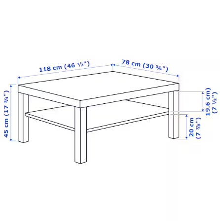
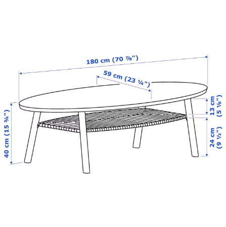
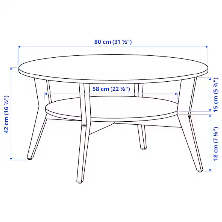
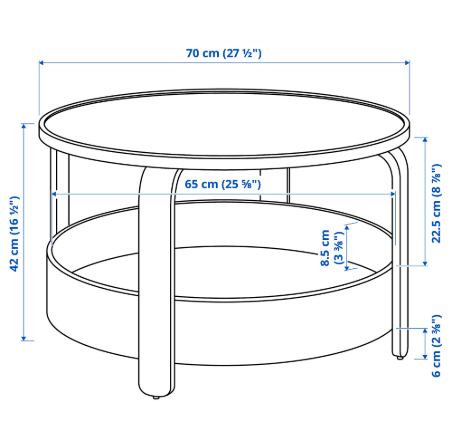
After looking at the IKEA coffee table examples on the left, I noticed that the sizes were different for each design. What I focused on most was the height, because it’s the one part that can’t really be changed once the piece is built. I knew I could adjust the width and depth later if I needed to, but the height would be fixed.
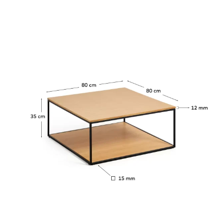
From my research, I found that most coffee tables are between 40–45cm tall. Since my design uses cube-shaped parts that are all the same size, I had to pick a height that would also work when the pieces are joined together side-by-side.
I chose 40cm for the height because it’s a nice round number that fits well into a modular system. This meant that the full coffee table would be about 40cm tall, 80cm wide, and 80cm deep, which felt like a good, practical size.
I searched for existing tables with similar dimensions (40cm x 80cm x 80cm) to help visualise the proportions. This confirmed the size felt practical and balanced in a real setting. I found this one, which helped me confirm the size, despite not being my preferred design style.
PROTOTYPING THIS DESIGN
With the dimensions confirmed, it was time to start prototyping. I knew from earlier in the project how important it is to test designs at 1:1 scale early, especially after my previous full-scale test had failed. I didn’t want to waste time, so I moved quickly to model the design at its actual size to check strength, fit, and overall practicality.
I made a quick model using greyboard and duct tape to help me visualise the 2D flat lays as 3D forms. I realised that once I had made this, I had adjusted the height to match my research but had forgotten to adjust the widths of the pieces, so this final size came to 40cm x 60cm x 60cm. This did prove helpful later on, as it gave me the size I would need when designing a sofa.
I went back to my CAD design and adjusted the dimensions to match the new, final sizes. From there, I created simple flat lays by laying out each face of the component side by side—this helped me figure out exactly how much sheet material I’d need.
BEFORE
AFTER
Doing this beforehand meant I could head into the workshop with a clear plan, saving time and avoiding confusion when it came to cutting and bending. It was important to know all my sizes and angles before starting the physical build.
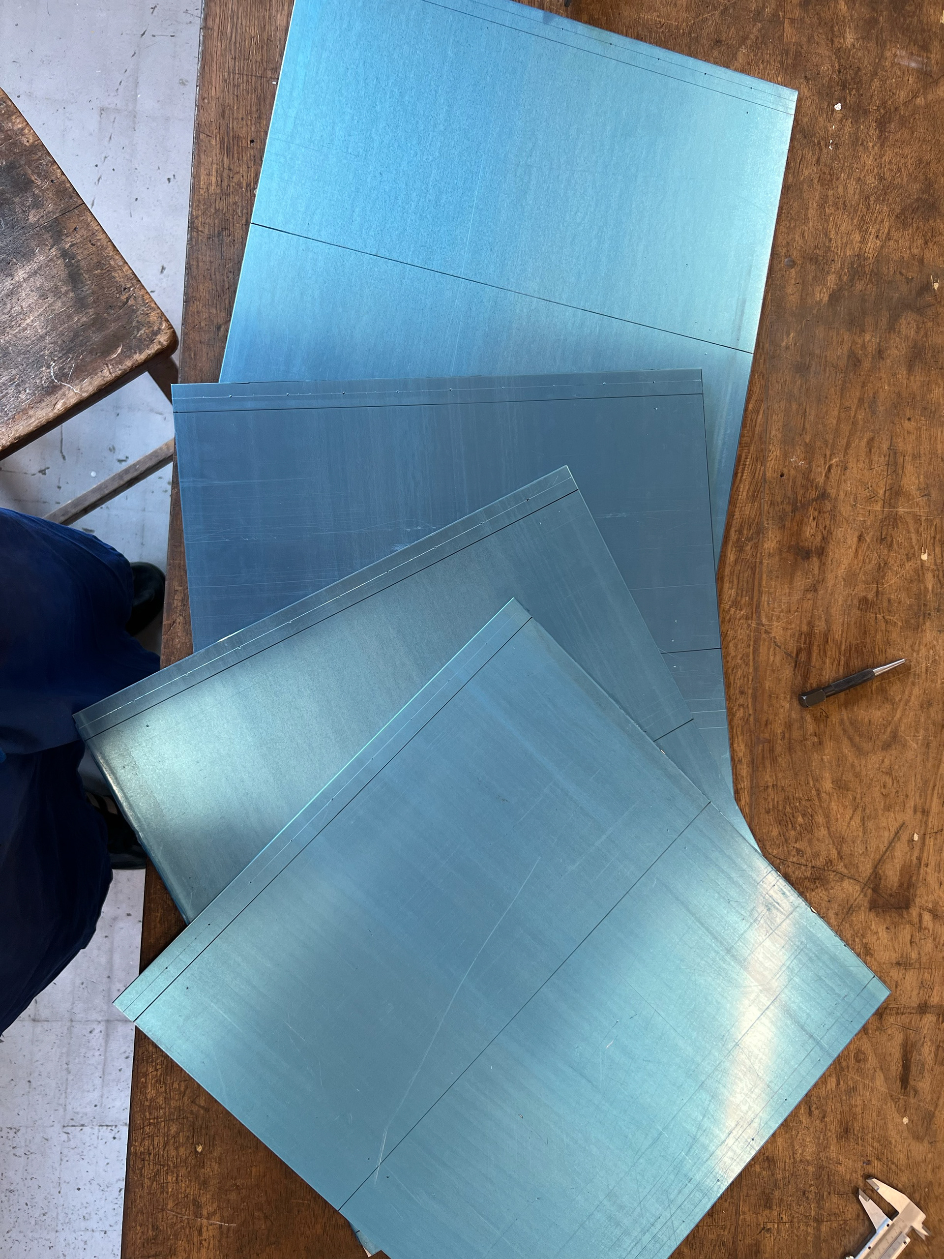
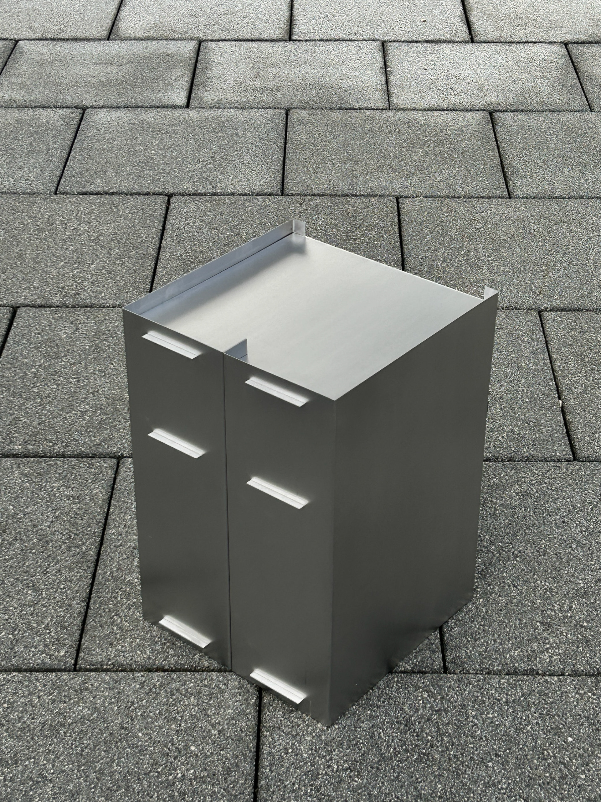
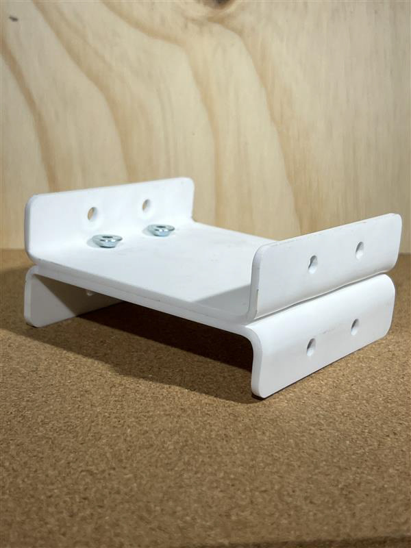
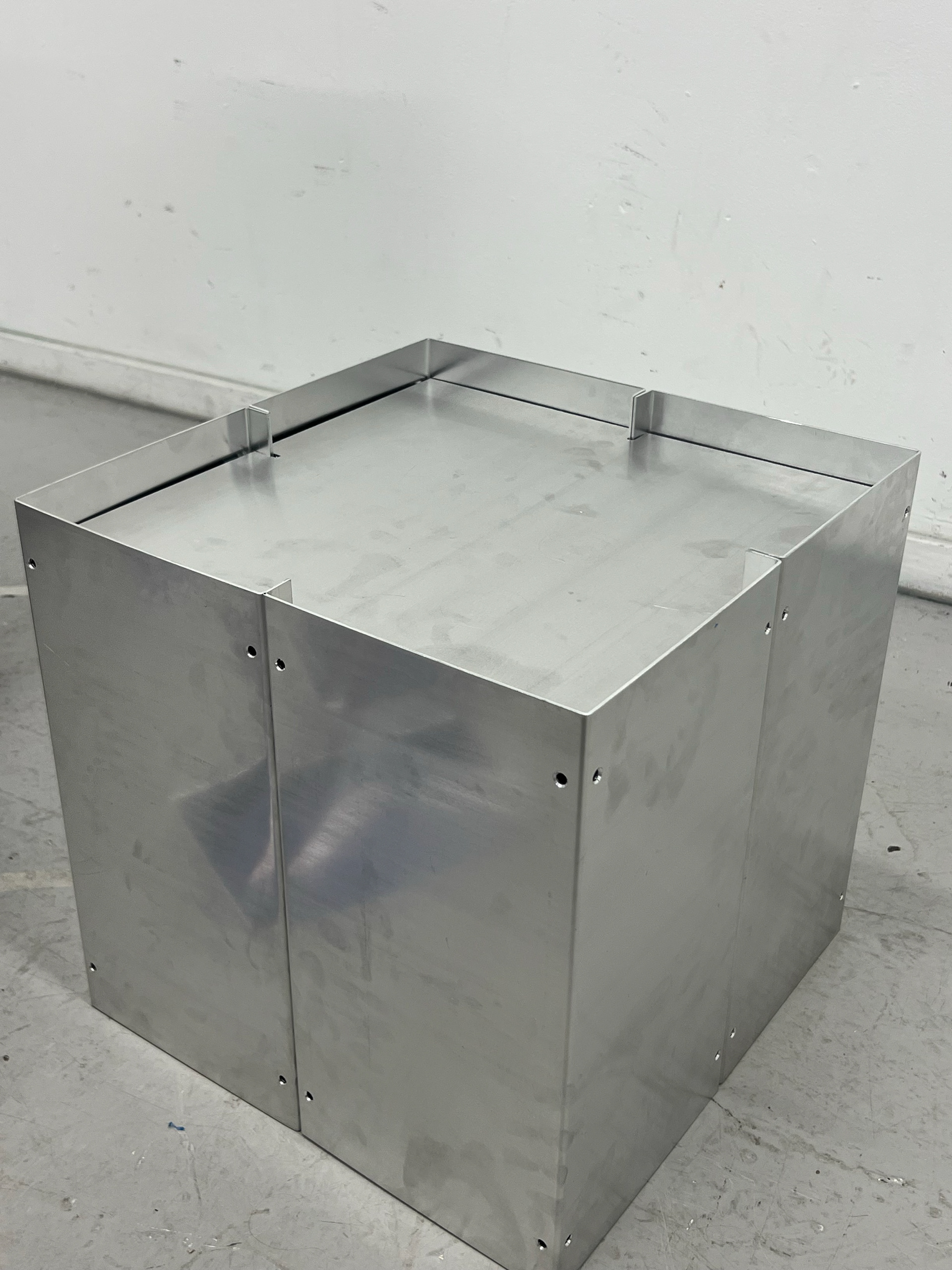
To make things easier, I quickly sketched the flat lays onto paper so I wouldn’t have to bring my laptop into the workshop. I measured and cut all the components based on the updated dimensions. For this first prototype, I chose 2mm aluminium instead of the 3mm I had originally planned, mainly to save on cost.
Looking back, I probably should’ve used 3mm to stay consistent, but it wasn’t a major issue. I knew that if the 2mm version held up, the 3mm would only improve the strength.
Another key reason for building this prototype early was to figure out hole placements. I wanted the piece to be modular and reconfigurable, so the number and position of holes were important, but I needed to test physically to get that right.
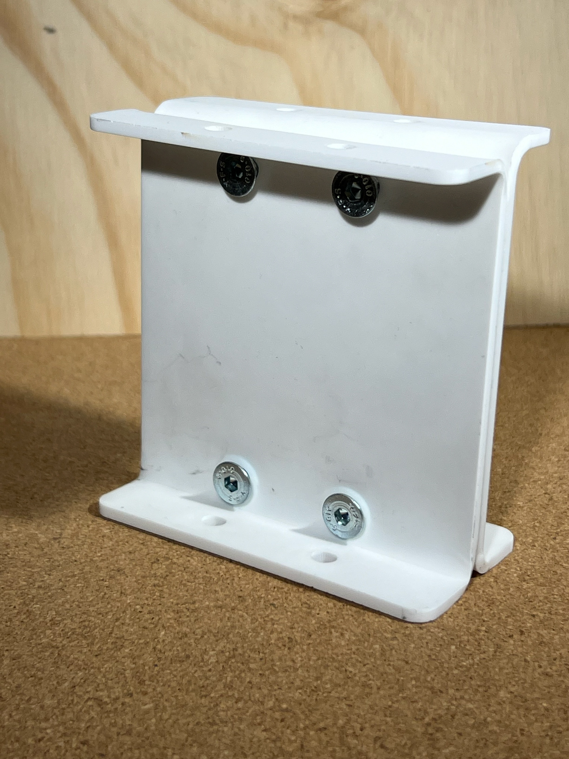
For this prototype, I settled on 9 holes per tab and 4 holes on each side face. This setup gave me enough connection points to keep the structure secure while still being quick to assemble during this early stage.
The 9 holes on each tab were spaced 20mm apart, giving me 10 equal gaps for a clean, consistent look. The 4 holes on each larger face were placed 10mm from the fold line, aligned with the top and bottom holes of the tabs. So, the centre of each hole sat 20mm across and 10mm down from the fold, keeping everything neat and properly aligned.
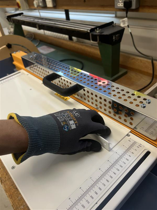
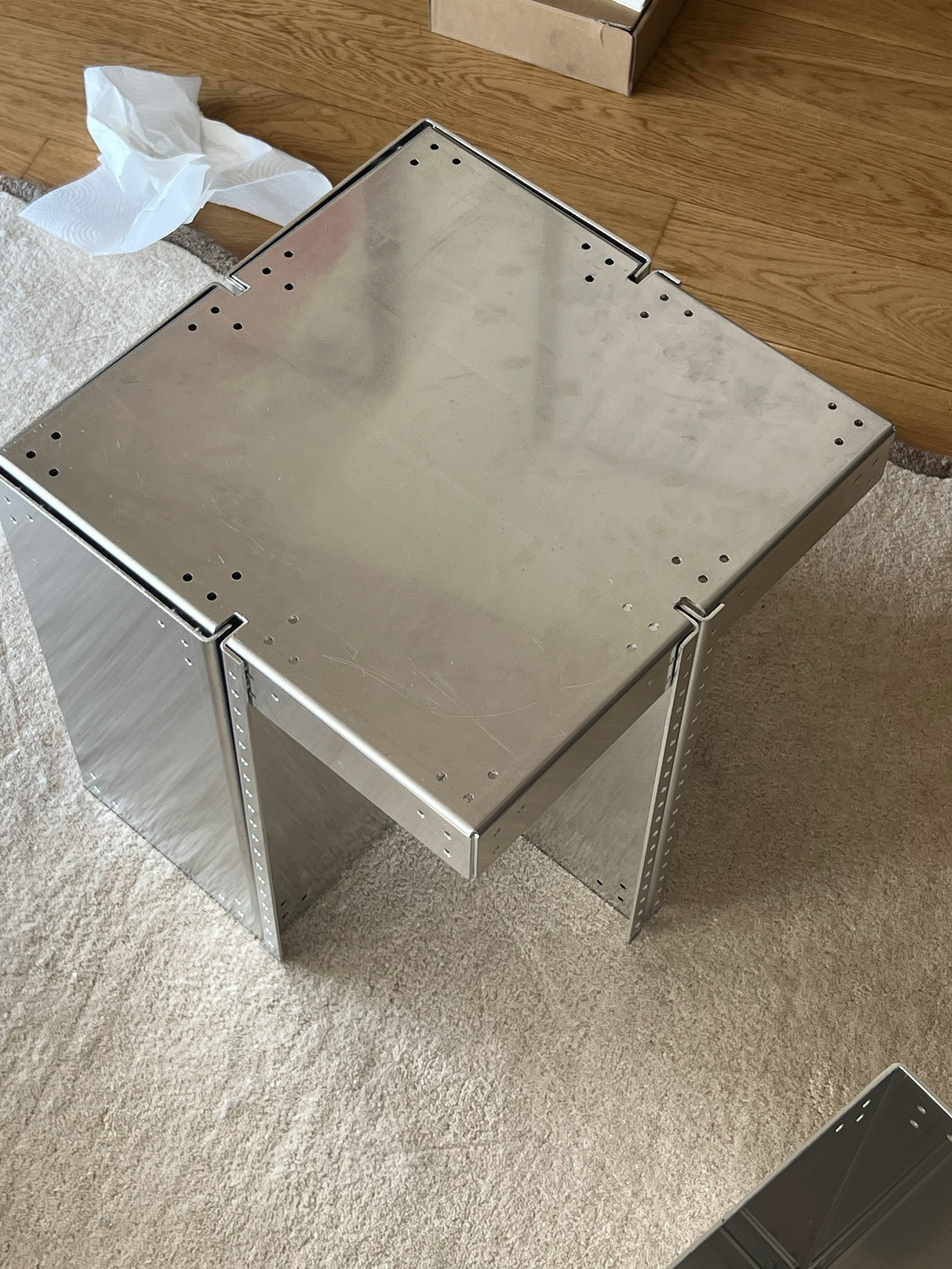
Once I was happy with the hole placement, I scored out all the fold lines and carefully marked each hole. Using the skills I’d built up from previous projects, I centre-punched each mark and used the pillar drill to cut a total of 104 holes (5mm) across the 4 pieces. I did all the drilling before bending, so I could work on a flat surface for better accuracy.
The bending process came next—12 bends per piece, each aiming for 90 degrees. Since the workshop bender doesn’t have an angle gauge, I bent each section slowly and incrementally to get as close to 90 degrees as possible. Even then, it was clear that achieving perfect accuracy by hand would be extremely difficult, especially for final pieces.
I also realised the bending machine only allows material up to 120cm wide, which limits the size I could work with. This confirmed my decision to outsource final production using more precise manufacturing methods to ensure accuracy and a professional finish.
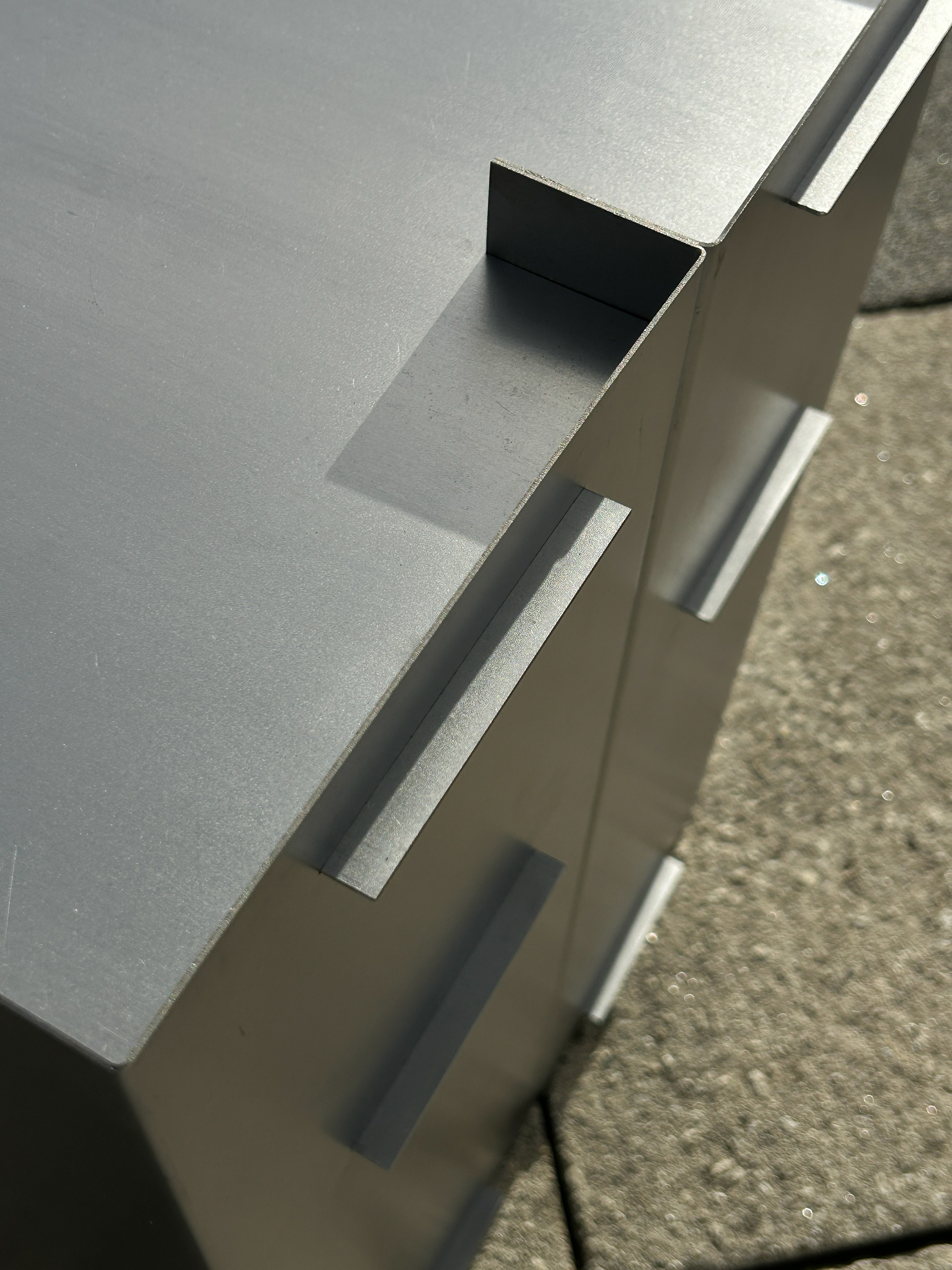
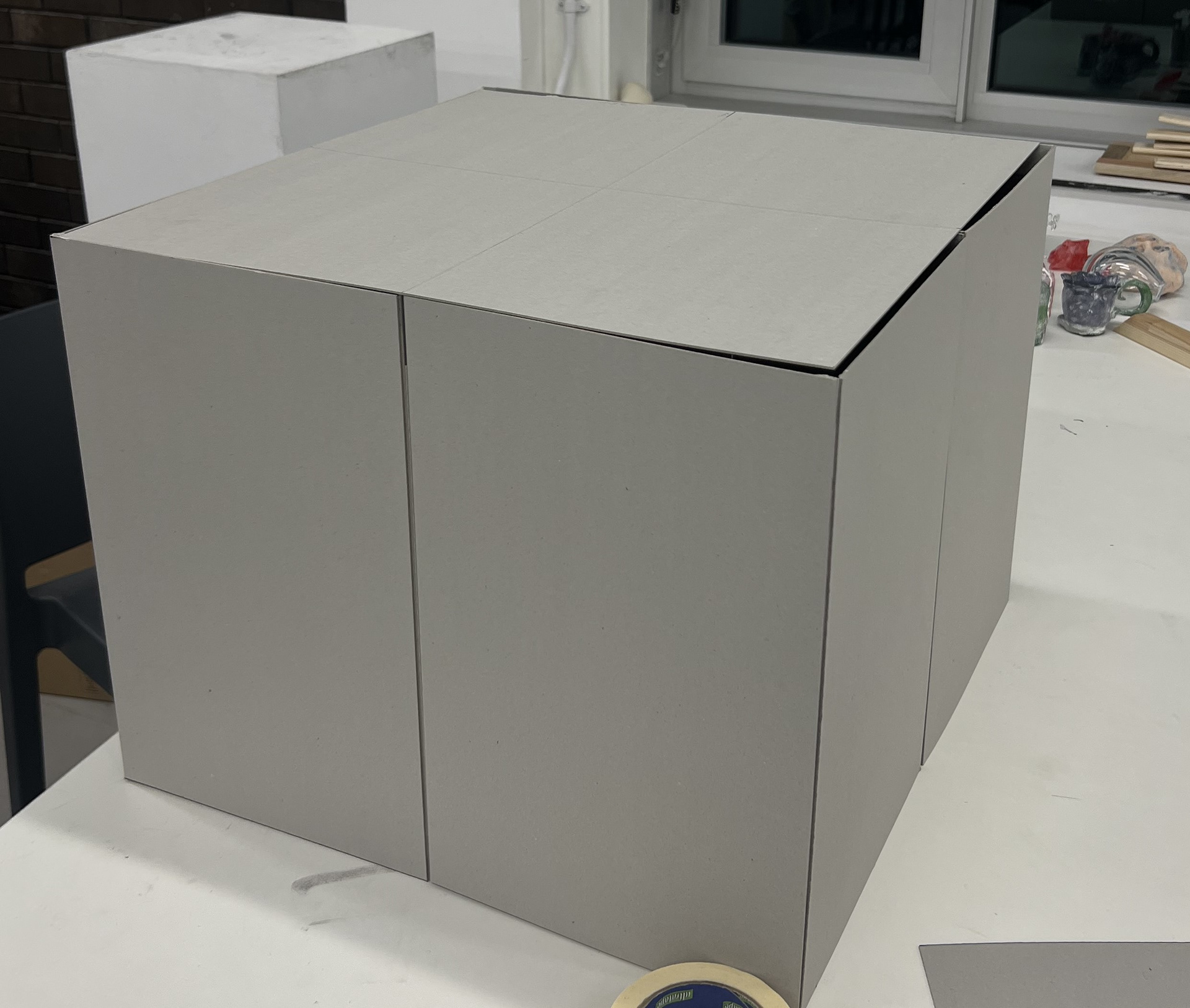
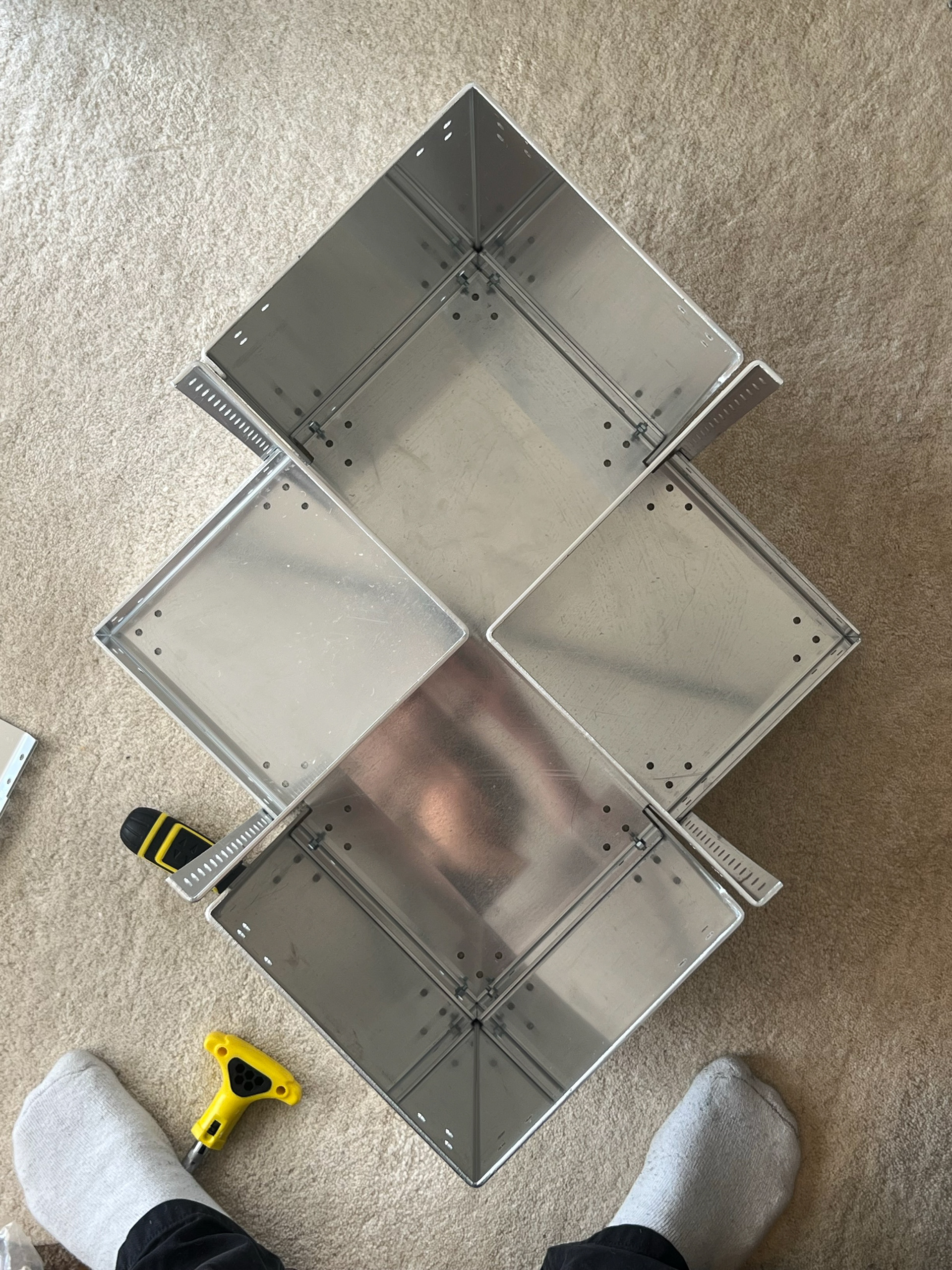
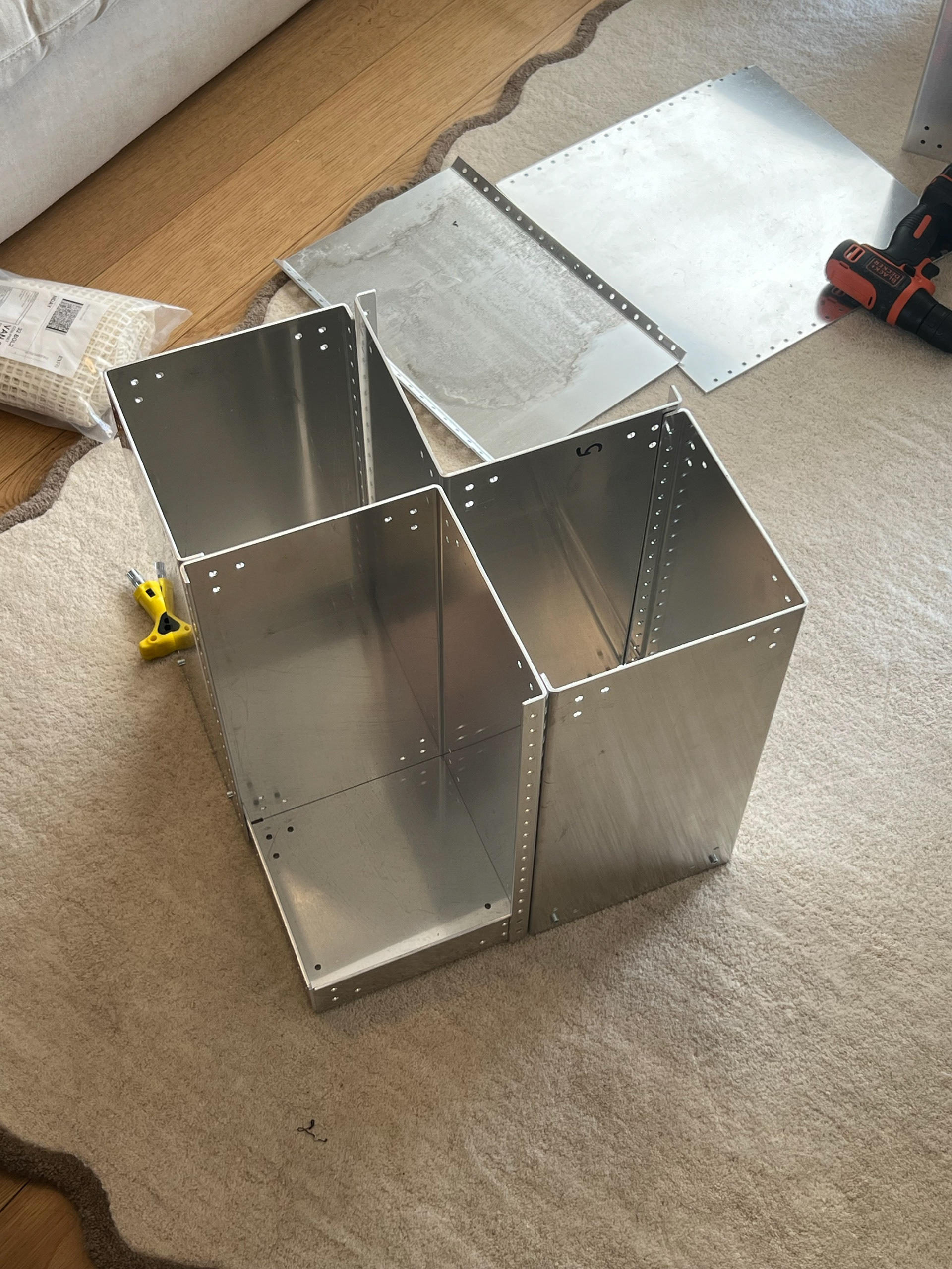
Alongside creating the 4 corner components, I also quickly made the top component, which I had worked out to be a simple square measuring 397mm x 397mm. This was because it was to sit inside the box, and you lose 3mm due to the thickness. This is why I could've used 3 mm-thick material; luckily, it still fit with the 2mm material. I also cut small slits from each center, which I measured at 17-20mm long and 6mm thick so everything would snap together tightly. You can see how the box came together below, and I had paired it with my previous card sample so I could look at how 2 boxes would look next to each other. You can also see the size difference where I mismeasured the first sample.
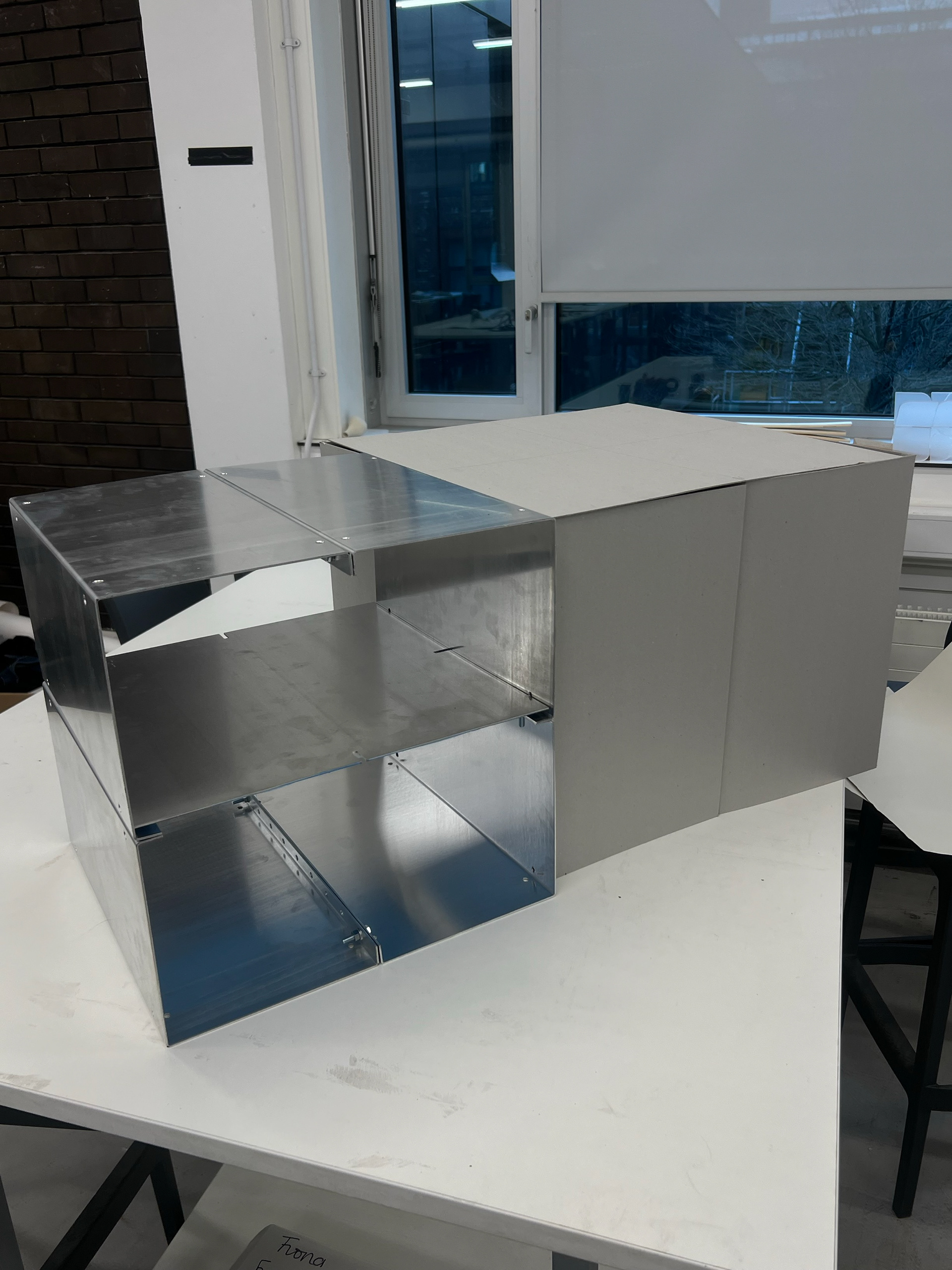
Now that I had my prototype pieces, I wanted to play around and see if there were any other ways I could assemble them. I took this work into the box to get some photos; you can already see 2 different orientations of this design above, which both work well. And there are some more photos below where I had dressed this to demonstrate modularity and functionality.
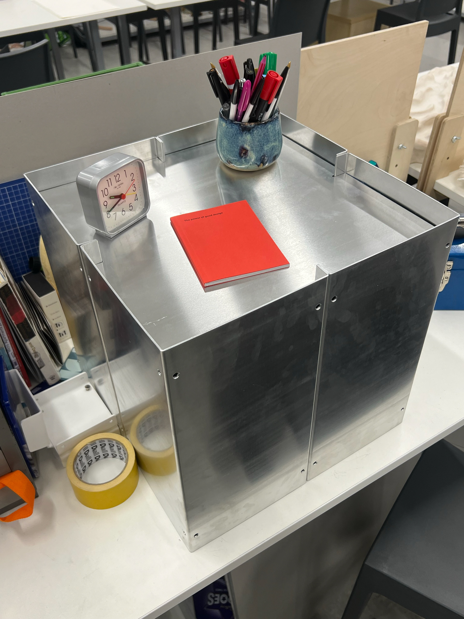
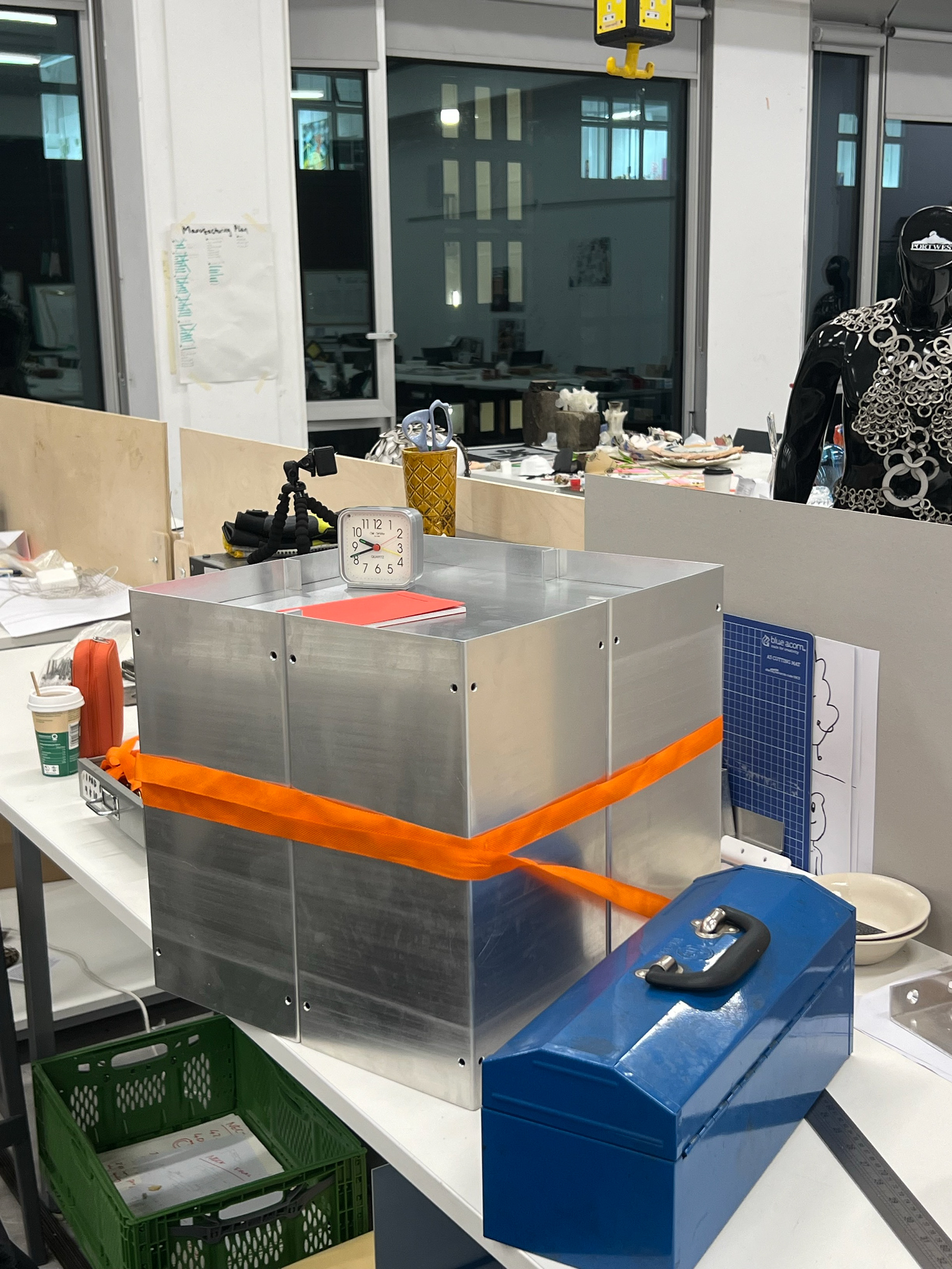
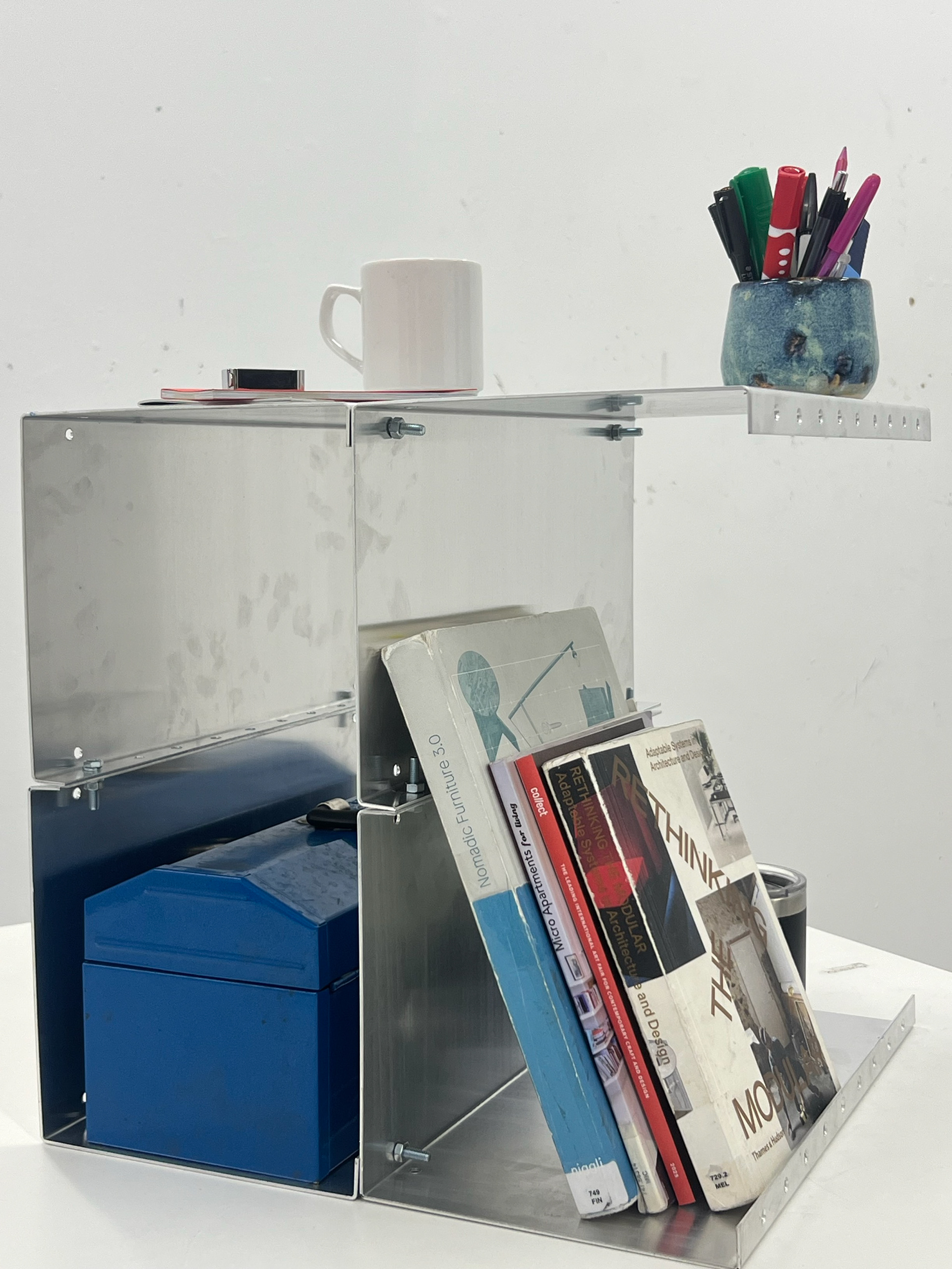
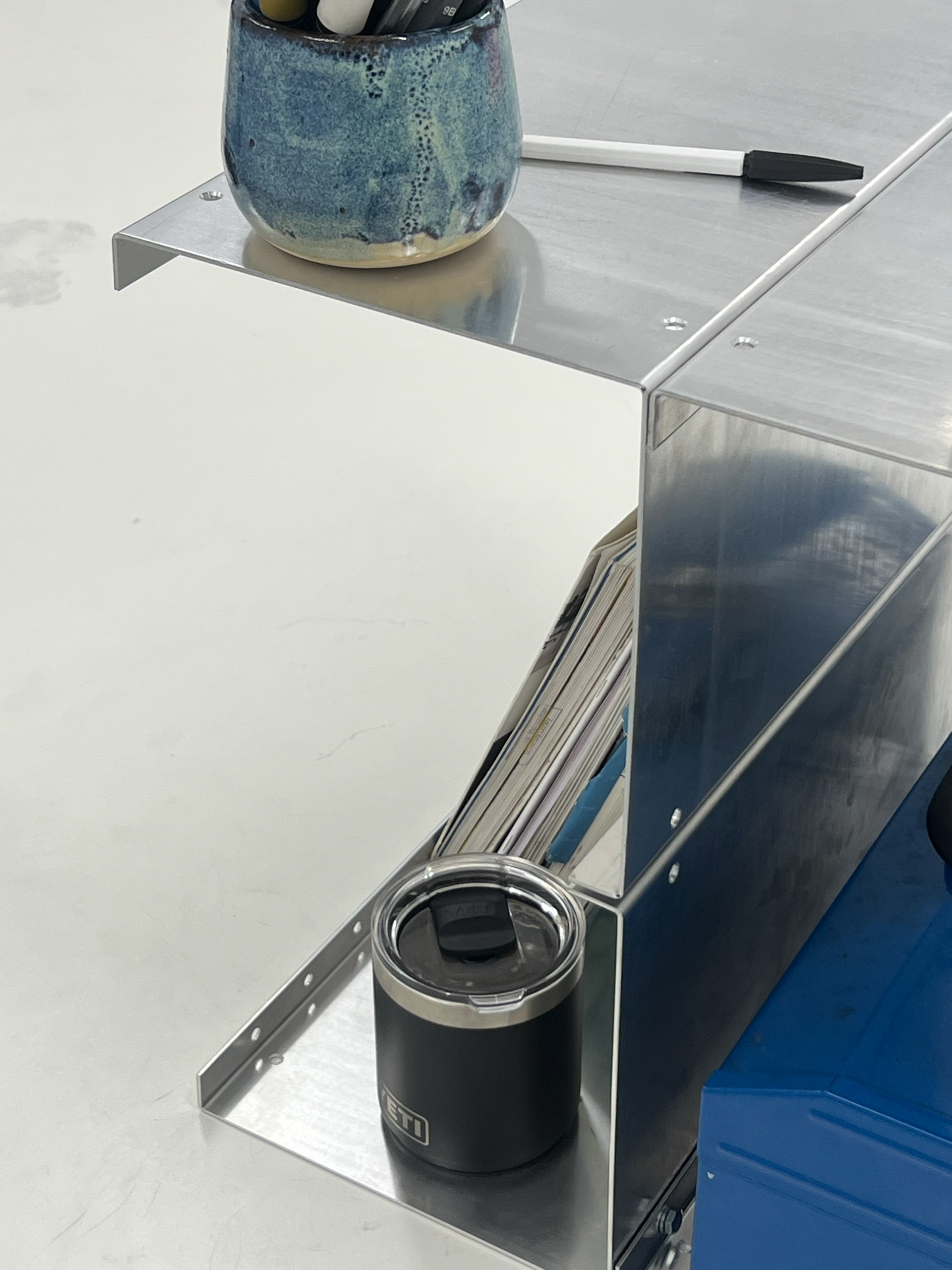
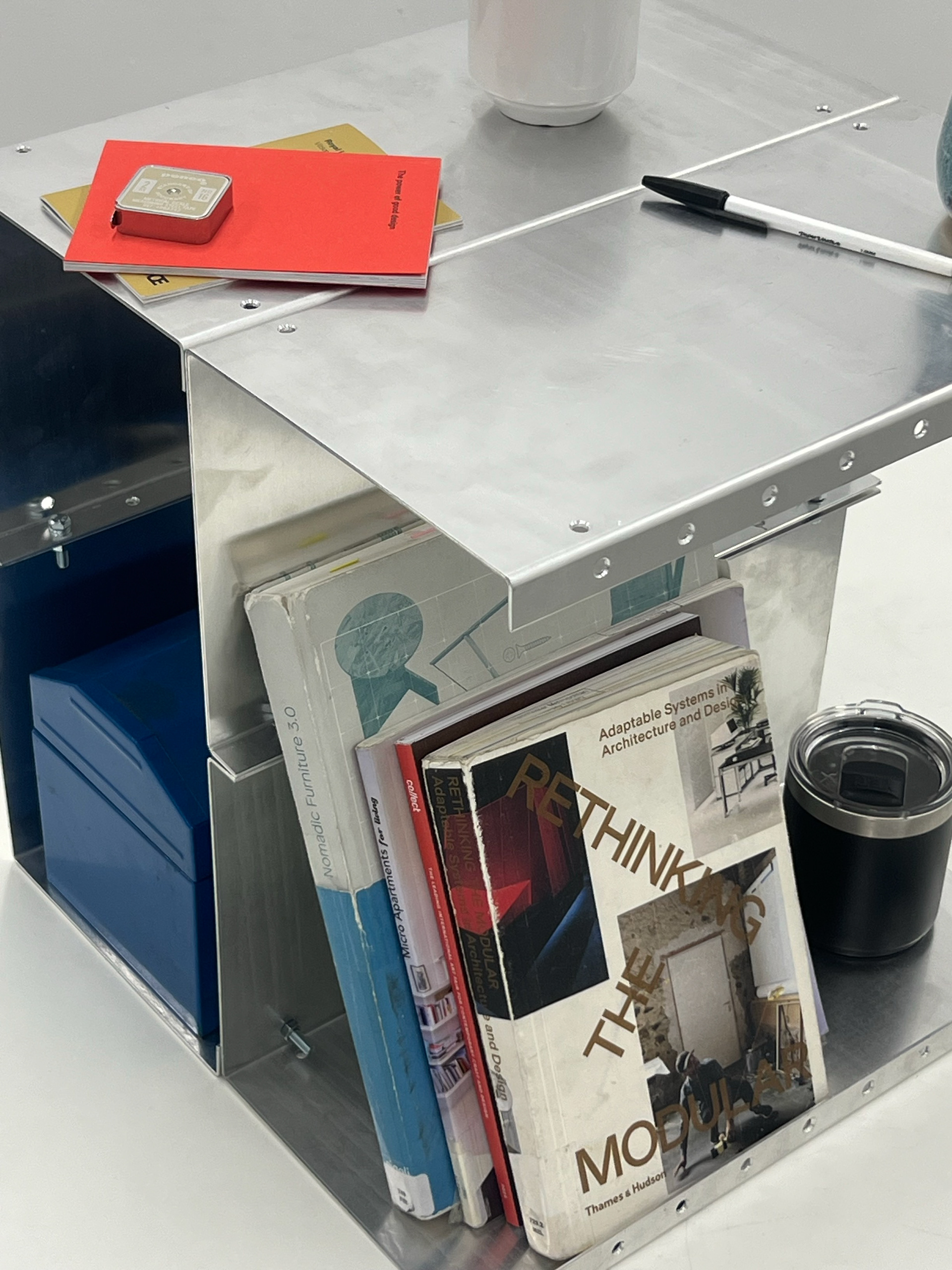
I love this part of my projects, as you get to see my ideas come to life. I think adding props brings the piece into reality and makes it look and feel like a part of a household. One part of this prototype which did need looking into further was the connection method. Despite these bolts doing a good job of holding these pieces together, they were awkward to tighten, and when I have more of these pieces, I want it to be as easy as possible for users, and I don't want to have to require 2 spanners or a socket head drill bit.

This prototype only took me 1 day to make, start to finish. Knowing this, I knew I had time to create 2 more of the brackets in time for our curation workshop, which would be mounted to the wall as shelves. You can see more about this on my curation page linked HERE.
The next stage of my process was to redesign a sofa using this framework. I started to get really anxious about both of the projects I had to complete, and time was ticking away. I continued this part of my process on my vertical gallery page, which you can get to HERE. On this page, you can also find further development of this prototype.
REFINING THIS DESIGN
Once I had completed the prototype and fully re-designed the sofa, I returned to developing the modular unit. I had learned a lot through the sofa design process, and many of the decisions I made during that time directly influenced updates to this piece. You can find a breakdown of those influences on my Vertical Gallery page.
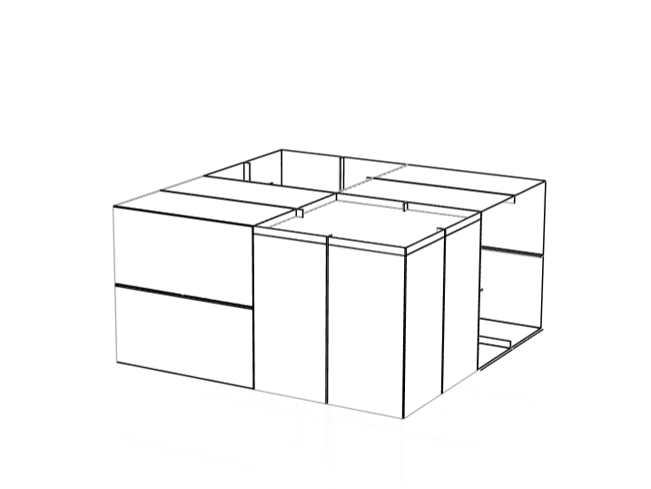
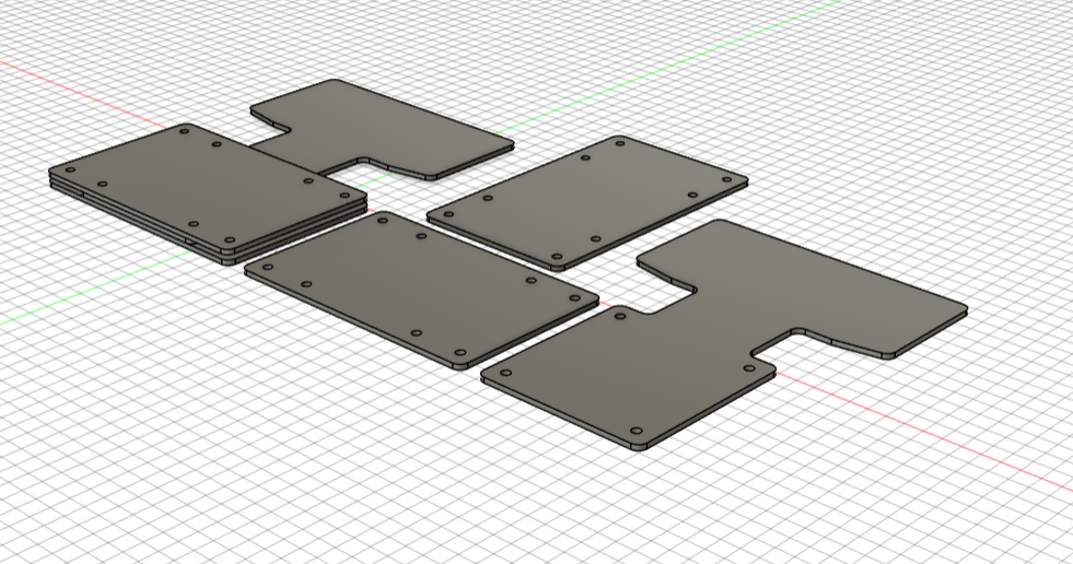
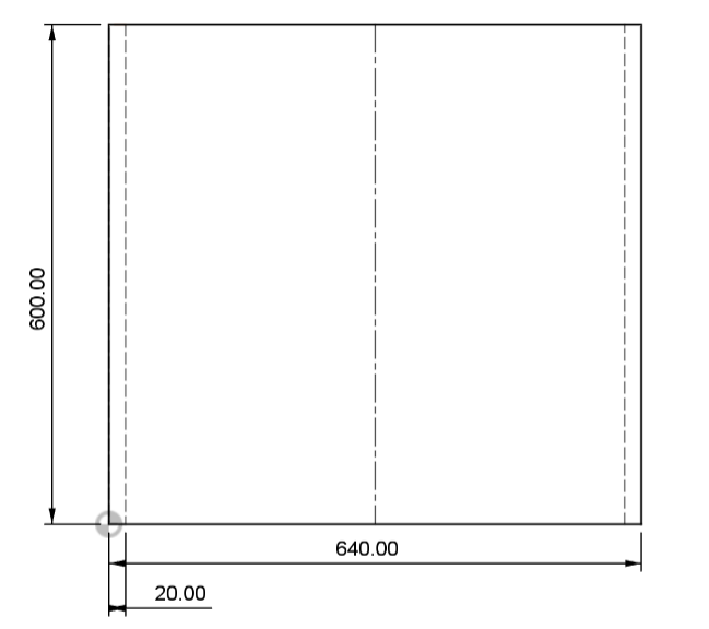
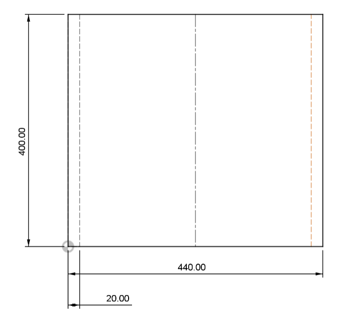
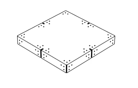
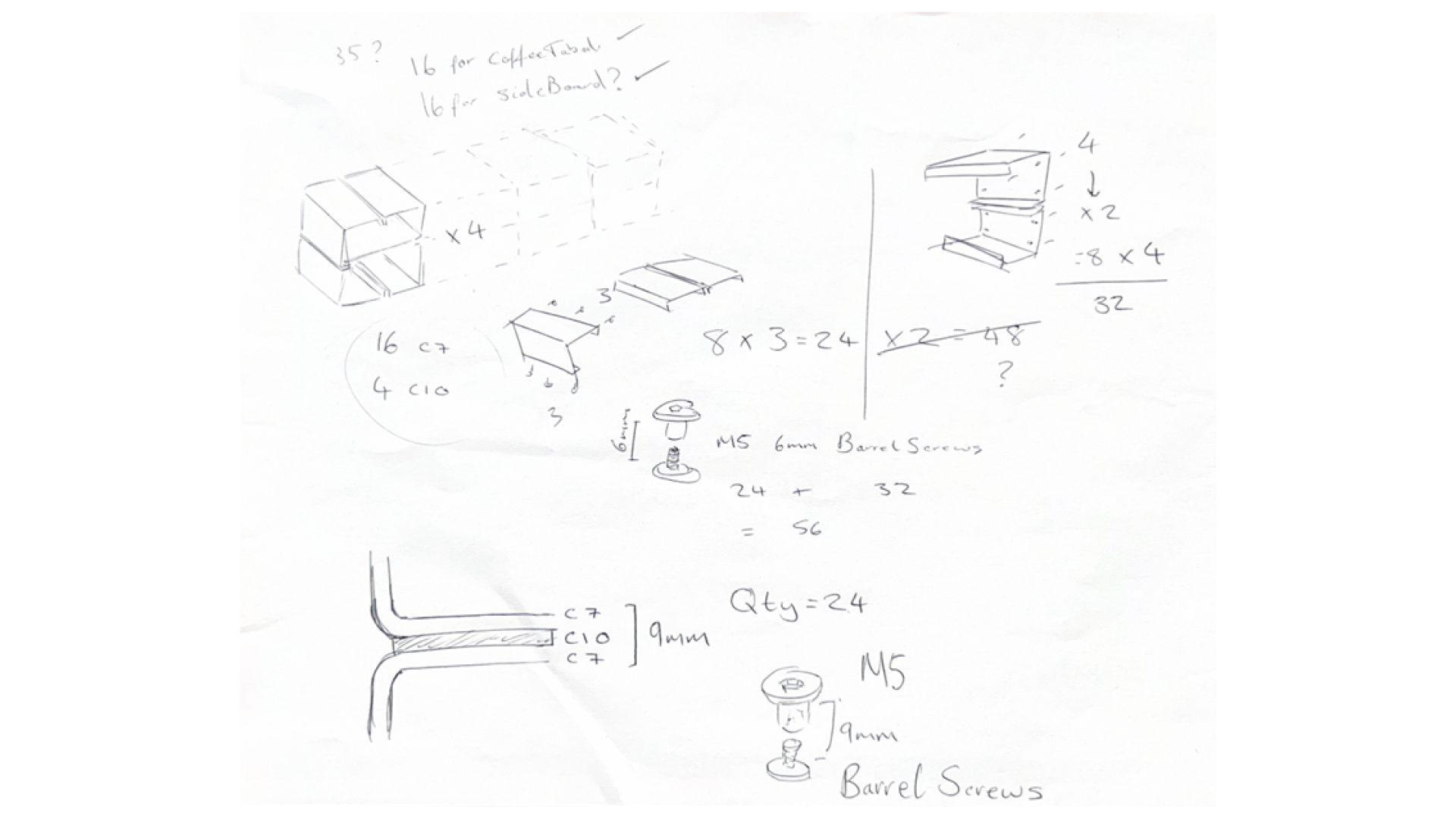
I began with the base component—the piece that originally inspired this entire modular framework. From here on, I’ll refer to this part as C7. The core design of C7 was already established, but it needed adjusting to match my final, confirmed dimensions. Based on my research into standard coffee table sizes, I refined the C7 flat lay to measure 440mm x 400mm, which results in a final coffee table size of approximately 800mm x 800mm x 400mm.
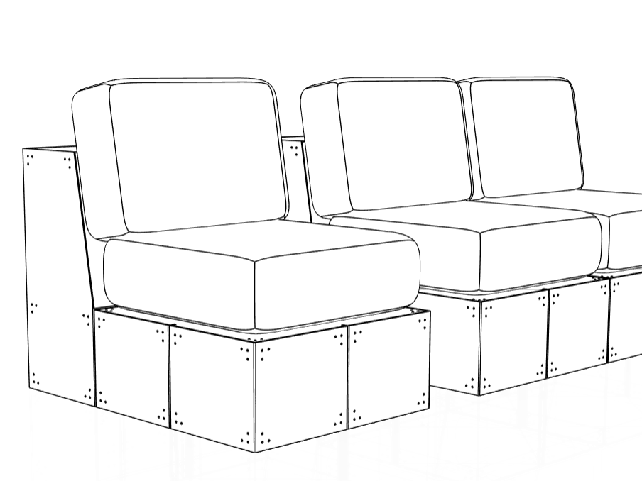
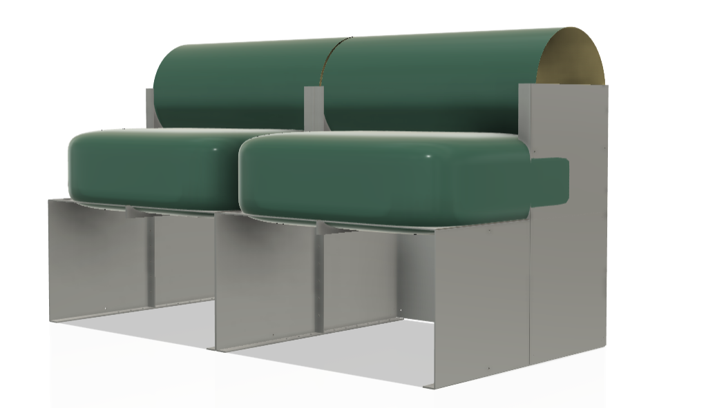
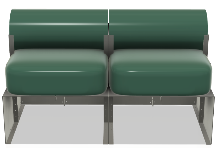
Next, I moved on to developing C8, a new component originally designed specifically for the sofa. However, I saw potential for it to be adapted into the modular system, so I altered its dimensions to fit within this broader framework. C8 was created to introduce triangulation and structural support, making the overall build much more functional for seating applications.
By integrating this component into the coffee table and shelving framework, I was able to open up the possibility for users to create stools as part of the collection. This decision helps to unify both the sofa and table systems, allowing them to function within the same design language and offering more flexibility in how users engage with the components.
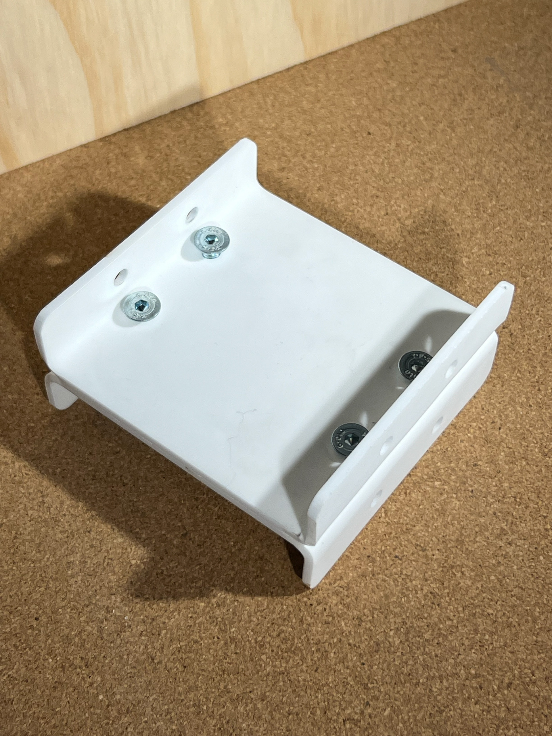
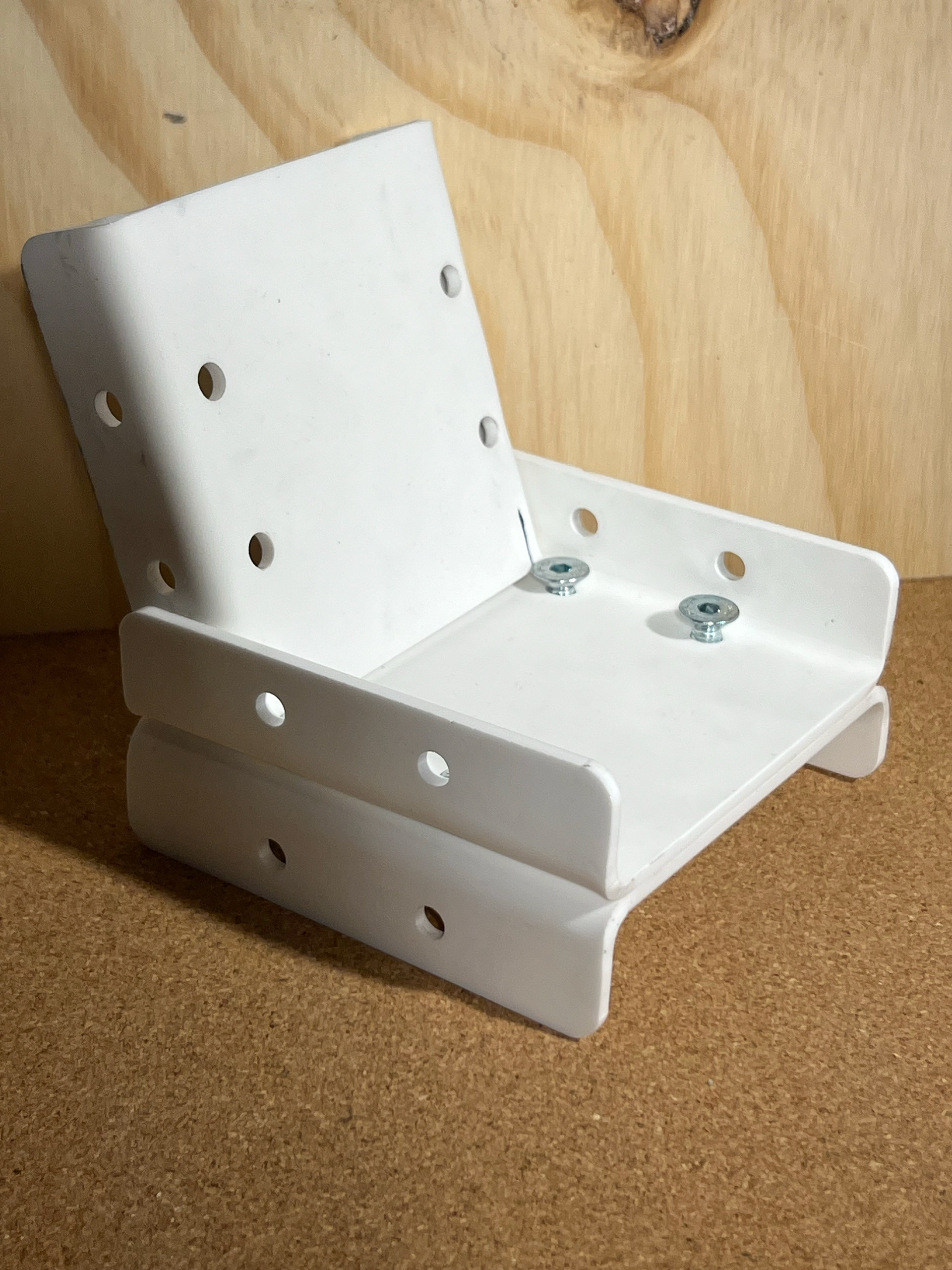
We then moved on to C9, which I believe represents the most significant redesign out of all the components. Originally, C9 was a simple flat sheet with slits along each edge. However, I have now added four folded tabs that can be bolted directly to the sides. This was a simple but crucial design decision that greatly increased the strength and stability of the entire structure.
These updates may seem minor at first glance, but they play an important role in how the piece holds together under pressure. More details on the design reasoning and development process for C9 can be found on my Vertical Gallery page.
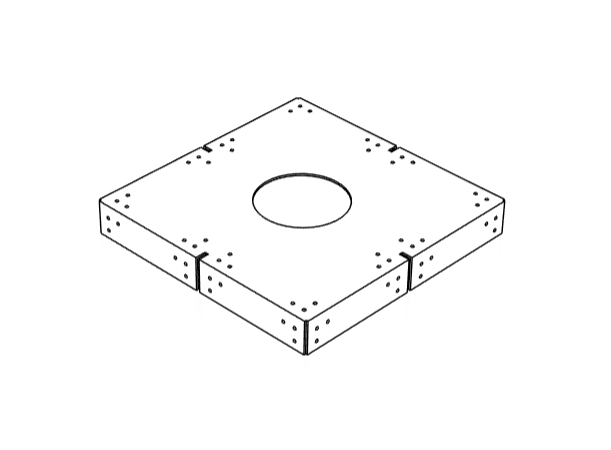
While reflecting on C9, I had the idea to incorporate a built-in planter, allowing a plant to sit flush with the top of the table. I researched the average diameter of a medium-sized plant pot and determined that a 135mm circular cut-out would securely hold the pot without it falling through. This same opening also fits a globe light, offering an alternative use for the space. I manufactured just one of these modified C9 components to demonstrate the potential for variation and expanded functionality within the system.
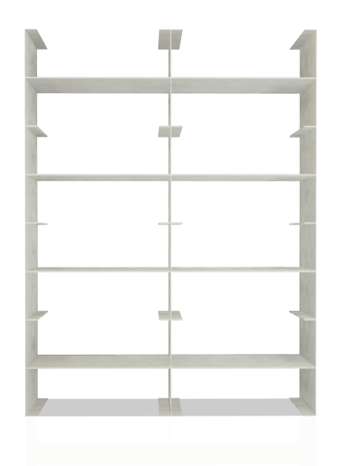
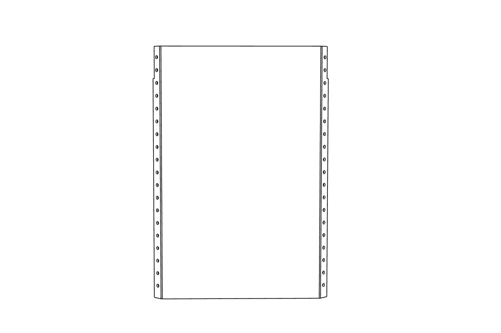
Finally, I designed a new component to add to this framework — C10, the simplest yet potentially most versatile piece in the system. C10 is a flat panel with pre-drilled holes that align perfectly with the connection points on just two sides of the existing components. It has no bends, making it quick and easy to manufacture and integrate. Originally created for Module 2, which explored a shelving unit, this piece expands the possibilities of the framework significantly.
By using the internal dimensions of C7, C10 fits snugly inside the modular frame, allowing users to split the space horizontally, ideal for creating extra shelving or internal storage compartments. It opens the door for even more creative, user-driven configurations and reflects the system’s flexibility as a modular toolkit.
Although I haven’t fully explored the potential of these pieces yet, I can already imagine how this framework could allow users to create functional, custom pieces that perfectly fit their space. When pricing my components, I plan to offer the framework from C7 to C10 as a set of individual pieces, giving users the freedom to choose how many of each they need for their designs.
So far, I’ve successfully created a coffee table, a shelving system (which works both horizontally and vertically), and stools (although these may require additional cushion designs to make them more comfortable). The versatility of the system means users can mix and match pieces to create furniture solutions tailored to their needs.
Hole Placement
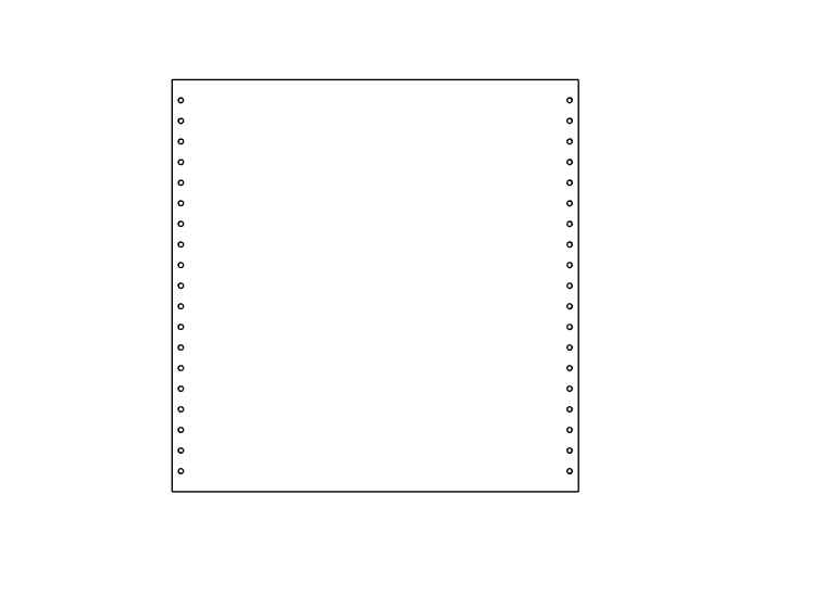
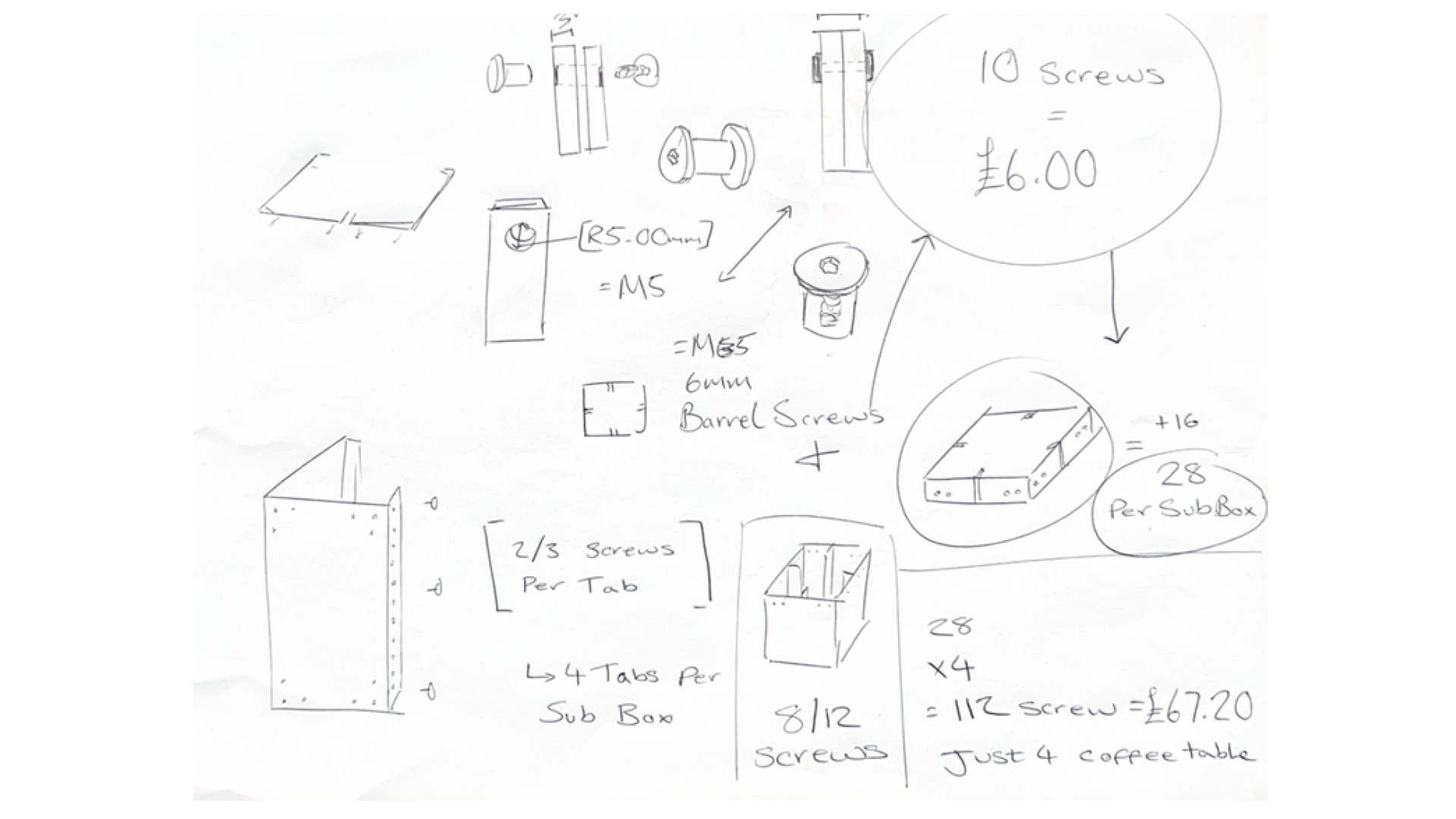
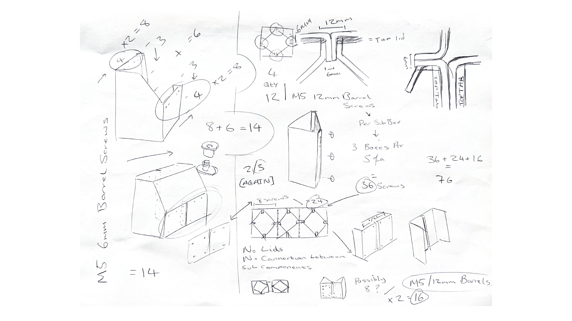
You might be wondering about the hole placement on all of these components. I haven’t yet explained the distance between each hole or the reason behind having so many. This was something I had to thoroughly explain to manufacturers, as it was crucial for the pieces to align properly when being assembled.
The reason I grouped the holes in threes on the larger faces was to allow more flexibility when connecting the subunits of Module 1 in different orientations. By using three holes, I was able to achieve various configurations while maintaining a secure and stable structure. Additionally, the inclusion of multiple holes provided an industrial and stable aesthetic, which was inspired by the look of fences I had seen in my research.
The hole placement along the tabs was a bit more calculated, ensuring accuracy for easy and reliable assembly. I’ve attached a detailed document outlining all the measurements for the hole placements, which I sent to the manufacturer to ensure everything fit perfectly.
I kept the measurements fairly consistent across all 10 components. For the hole placements, I centered them on the inside dimensions of each tab, which were 17mm wide. The central line for each hole was positioned 8.5mm from the closest edge. I spaced each hole 20mm apart, which allowed for maximum flexibility in assembly. I applied this same approach to the larger surfaces, ensuring the top corner holes were 20mm x 20mm away from the closest corner.
The most challenging aspect of this process was factoring in the thickness of the material. There were instances when I needed to measure from the inside dimensions, and other times I had to measure from the outside dimensions. This made it tricky to maintain consistency across all components while ensuring everything lined up properly during assembly.
Alongside hole measurements, I sent another document better explaining the outer dims across each piece, giving every angle, etc.
CREATING FEET
This next section of my process logs the additional steps that may get overlooked but are crucial to how the final outcome would function. These are steps that I have previously ignored when making furniture, and I knew I had to consider them to take my pieces to the next level. This is, of course, the feet of the furniture.
Not only did I need to consider this for my coffee table unit, but I also needed something that could withstand people's weight for my sofa. I first looked at what it was that I needed. I knew the thickness and dimensions of the material I was working with, so I looked to see if I could buy thin rubber tracks that could clip into the bottom edge of the frame.
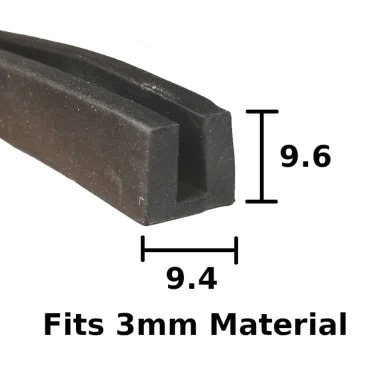
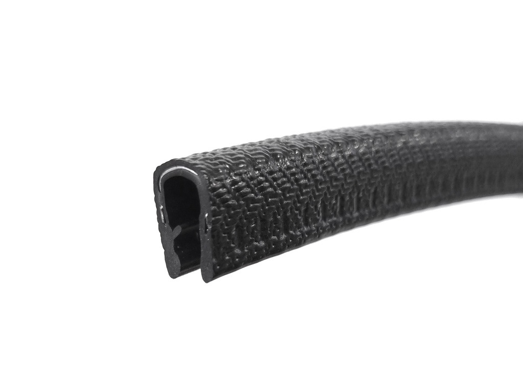
Price: £1.65 per metre (inc VAT)
Material: Black EPDM rubber
Dimensions: 9.4mm wide x 9.6mm high
Features: Hard-wearing, washable, flexible; suitable for
various materials
Stock: 171 metres available
Price: £2.90 per metre (ex VAT)
Material: PVC with metal spine
Dimensions: 14.2mm high x 10mm wide
Features: Self-gripping, no adhesive needed, reusable
Stock: Unknown
I found these 2 options, which seemed perfect. They weren't too expensive to buy, and they would stop the edges of my piece from scratching any floors. The only problem with these is that it would be hard to get a clean and seamless look. I also thought the base may be too thin and wanted something thicker to elevate the piece ever so slightly. I also didn't want to just buy an existing product and call it my own design. The links to the websites to buy these are on the buttons above.
I had spoken with product design alumnus Joe Jackson and asked about the feet he used on his side tables. He said he had quickly 3D printed them, so I thought with my skills in Fusion, I could quickly model and design some feet. My problem with this is that I wanted something that would cover all of the base edges and not just have 2 small points of contact.
In a new Fusion file, I imported component 7 to use as a starting point. From there, I copied and moved this component 16 times to create the frame of the coffee table I wanted to present. I knew that if I was going to design my own tracks, I’d need two types: one with a 3mm gap to fit the thickness of a single component, and another with a 6mm gap so that when the pieces came together, they would fit neatly into the wider feet. I also took inspiration from some of the rubber track designs I had looked at earlier.
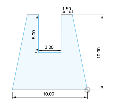
I began by sketching a 10mm x 10mm square. Then I found the centre point and cut out a 3mm wide by 5mm deep space. I chose not to add any rounded edges or chamfers because I wanted to stick with the clean, sharp lines of my design style. However, I did want the cutout to be wider at the bottom than at the top. To do this, I left a 1.5mm gap on either side of the cutout for the components to fit into, then angled the sides down to the corners of the square, making the base 2mm wider than the top. This resembled the first rubber tracks I had seen but included more material between the back and the base of the cutout.
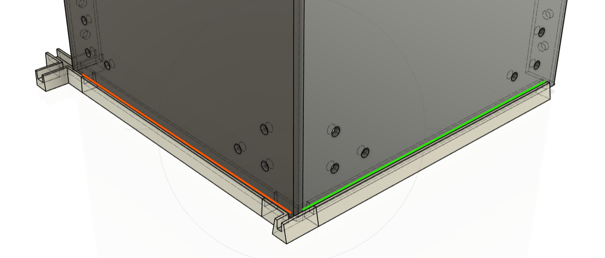
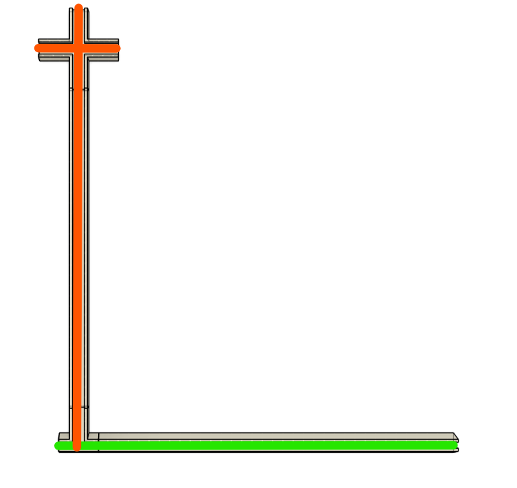
The tracks, which have a 6mm wide cut-out are orange. The tracks, which have a 3mm wide cut-out, are green.
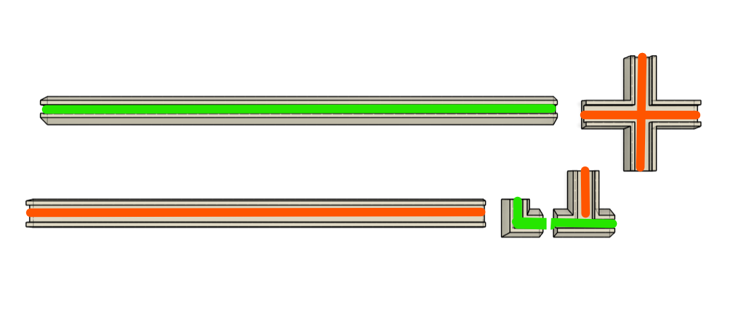
The reason I made 5 separate small components and not just one large shape that could clip all of my component 7 pieces together was to allow for a more modular design. This did also mean i needed a total of:
Cross Joint x 10
T Joint x 24
Small Corner x 16
Thin tracks x 32
Thick tracks x8
Another reason I chose to work with smaller parts was because of the limited size of the print bed — something I’m really glad I asked for advice on. I teamed up with the 3D printing expert himself, Mr. William Mawdsley. Since I’d never used a 3D printer before, it was a huge help having someone experienced by my side. Will kindly offered to walk me through the process, showing me how the printer works and explaining the different filament options.
I told him I needed something that was flexible but still held its shape, and also wouldn’t leave marks on different types of flooring. He recommended using TPU, even though it takes a bit longer to print than PLA. I’m really glad I went with his suggestion because I was really happy with how the prints turned out.
Over Easter, our schedules didn’t line up and the deadline was getting close, so Will offered to print the parts at home himself. That was a lifesaver — it meant I didn’t have to learn a whole new machine with just a few weeks left. I gave him the quantities I needed for each part and paid him for both his time and the material costs.
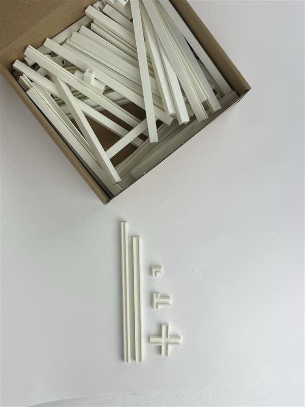
HARDWARE
Hardware has been a consistent focus throughout my entire project. From the beginning, I knew I wanted to explore a variety of hardware options to find a solution that best suited both the function and aesthetic of my design. In my initial samples, I was particularly drawn to countersunk screws for their clean finish. However, as the project progressed, it became clear that I needed a fastening method that was more efficient and practical for larger-scale production.
With all of my designs finalized, the next step was to determine how many screws I would actually need. Each connection in my design allowed for flexibility—there were multiple holes, but it was never my intention to fill every single one. The goal was to strike a balance between ease of assembly for the user and ensuring the structure was secure and stable. I needed just enough screws to hold the components firmly in place without overcomplicating the build process.
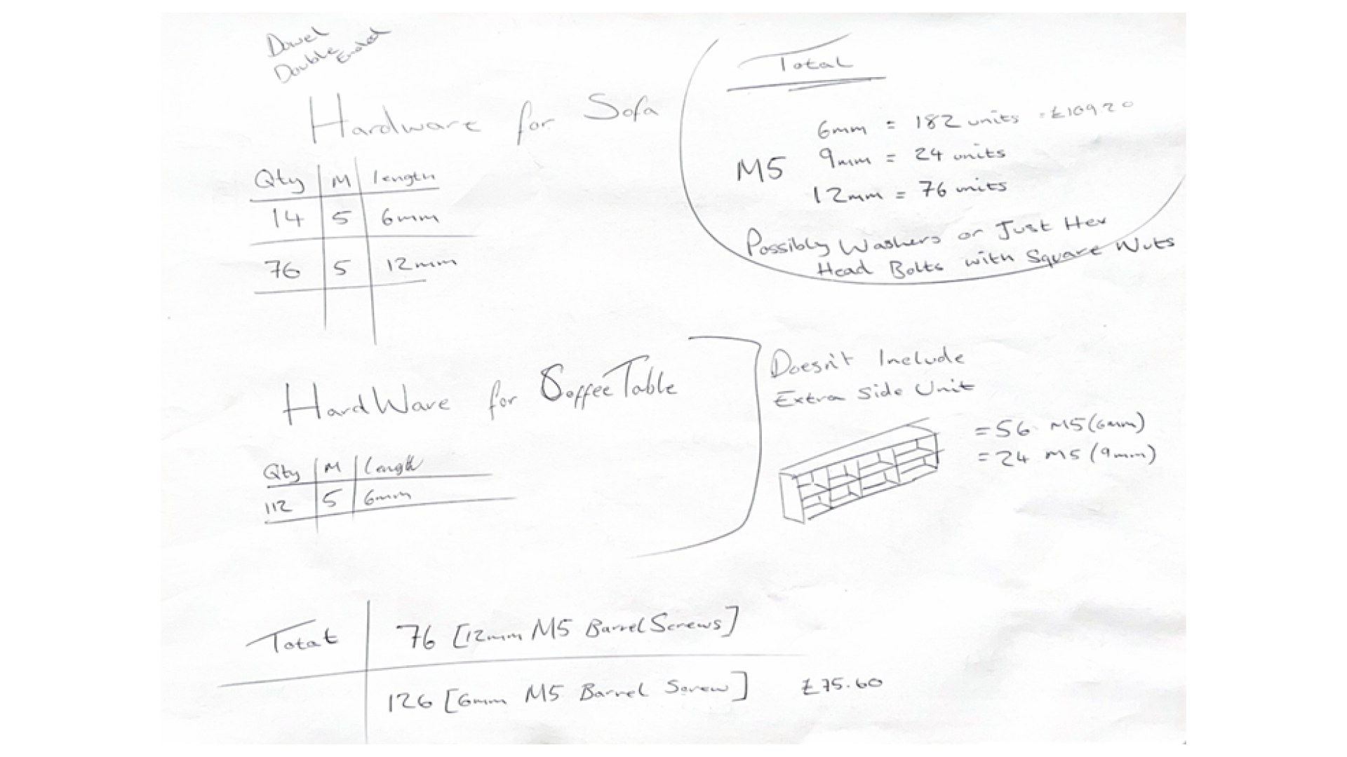
The cost breakdown and comparison, which helped me decide which screws to use, can be found on my pricing page.
Day Of Delivery
The day finally arrived, and I was flooded with mixed emotions—anxious yet excited to see the components I had worked so hard to bring to life. Initially, the pieces were scheduled to arrive on Tuesday, May 6. I contacted the manufacturers to confirm the delivery, and they assured me everything was on track.
On Tuesday morning, I called the suppliers again to get an estimated time of arrival. After being placed on hold for several minutes, I was told they weren’t entirely sure and that I’d receive a follow-up call. As the day went on without any updates, I called back. This time, I spoke to the production manager, Matt, who explained that the components hadn’t been fully formed yet and would arrive in a couple of days.
With a submission deadline on Friday, I was running out of time. I asked for clarification, especially since I was promised a 5–7 working day turnaround from the date of payment. Matt explained that a machine had broken down and required maintenance, and that they had also experienced three bank holidays. While I understood this, I had transferred the payment on April 17, giving them a total of 14 calendar days, so the delay was frustrating.
Eventually, I received an email stating the pieces would arrive on Thursday, May 8. This gave me very little margin, as I had planned to film the assembly that day, edit the footage that night, and submit everything the next morning. It felt far too tight, so I applied for an extension, which proved to be the right decision. By Thursday, I still hadn’t received an update, so I made another call. After further back-and-forth, the delivery finally arrived on Friday, just in time.
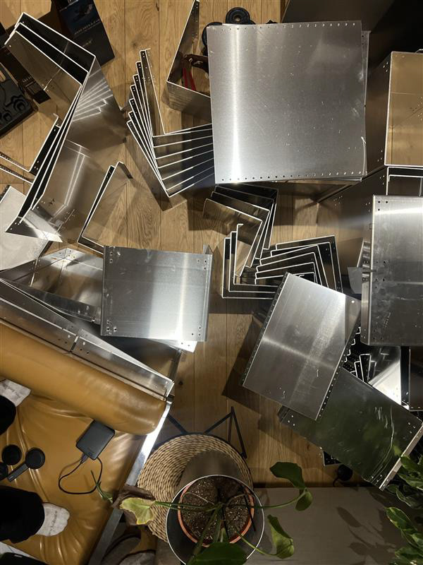
Two large crates arrived, and it was a surreal moment seeing everything in physical form. I dragged them into my flat and began unboxing each piece, preparing for the shoot. Almost immediately, I noticed most of the pieces still had burrs on their edges—something I hadn’t anticipated. I quickly realised these would need to be removed for any components used in the film.
Unexpected Setbacks
Naively, I thought my process would be finished once my pieces arrived. Little did I know—that moment actually marked the beginning of a whole new set of challenges. The pieces wouldn’t fit together. This was something I had worried about during the design process, but I avoided thinking about it too much, almost hoping I wouldn't manifest the issue into existence. Unfortunately, it became very real, very fast, and I needed to act quickly.
The problem came as a shock, though in hindsight, it shouldn’t have. I had assumed the manufacturer would deliver the pieces ready to assemble, but instead, each piece arrived with burrs on the edges, making them unsafe to handle and impossible to fit together. Worse still, I had overlooked material tolerances—a critical detail when working with manufactured components. My lack of prototyping and testing had led to a key error: the 6mm slot I designed for 3mm aluminium tabs left no wiggle room at all. As a result, the components just wouldn't slot together.
The pressure was mounting—I only had two days to fix everything. I'd already committed to freelance work with Factory International, and although I had been granted an extension, I couldn’t afford to delay this any longer. I had to make the most of every minute.
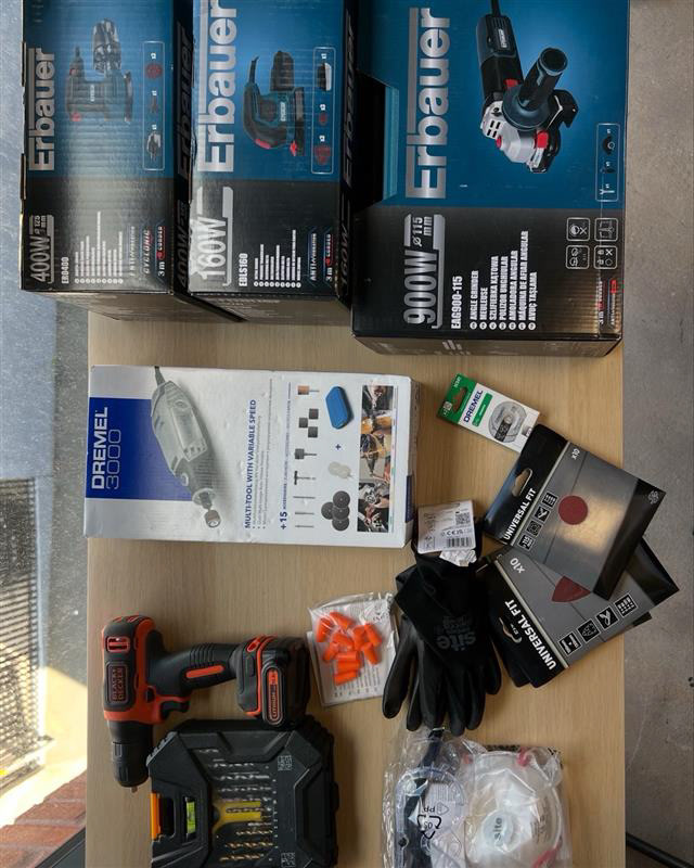
I started with a Dremel to try and grind down the material gently, hoping for precision. Unfortunately, aluminium is soft, and the grinding wheels clogged within minutes, barely removing enough material. I reached out to Aaron at M3 Industries for advice, and he recommended using an angle grinder with a thin cutting disc. Luckily, I had just purchased an angle grinder using money from the Flash Fund. After a quick trip to B&Q for extra cutting discs and some proper PPE, I got to work.
To avoid covering my flat in metal dust, I converted the stairwell in my building into a makeshift workshop. It’s rarely used, as most residents take the lift, and it offered decent ventilation. I found two discarded tables by the bins, set up all my tools, and got to work shaping the components by hand. It wasn’t ideal—but it worked.
Using the angle grinder, I carefully cut down the middle slits of the components, making sure not to damage anything unintentionally. I’ve used an angle grinder before, so I felt confident in my handling. Before cutting, I clamped each piece securely to the table to ensure both safety and precision. I cut off small amounts at a time and tested the fit each time making sure I wasn't cutting too much. I controlled this by ticking the sides that were cut down enough to fit the piece together.
Out of courtesy, I also let my neighbours know what I was doing and where I’d be working, so no one would be surprised or walk into a potentially dangerous space. I had expected some complaints due to the noise—especially since I ended up working into the evening—but to my surprise, everyone was extremely supportive and even curious about the project. A few people came by to ask what I was working on, and many were impressed. They even reassured me that the noise wasn’t a problem thanks to the thick walls in our building.
You can see here the first time I successfully assembled the pieces. It was a huge relief—until another issue came up. The furniture screws I had ordered (M5 12mm barrel screws) didn’t fit. I had assumed that “M5” referred to the external diameter, matching the 5mm holes I’d designed. Unfortunately, M5 actually refers to the internal thread size, and the barrel screws themselves were too wide to fit into the 5mm holes. I was absolutely gutted and now had two options:
Drill the holes larger so the barrel screws could fit.
Return the screws and find a better-fitting alternative.
Drilling out the holes felt like a poor option—it would likely look tacky and inconsistent, especially since the placement and clean finish of each hole was important to the design. I considered ordering the same style of barrel screws in M4, but the delivery date was after my extended deadline, which made that impossible.
Instead, I decided to look at alternative fastenings. This wasn’t ideal, but I needed something that was both aesthetically appropriate and structurally sound. I eventually chose cap bolts—fittings I had considered earlier in the design process. They weren’t my original plan, but they worked well and visually aligned with the industrial aesthetic of the overall design.
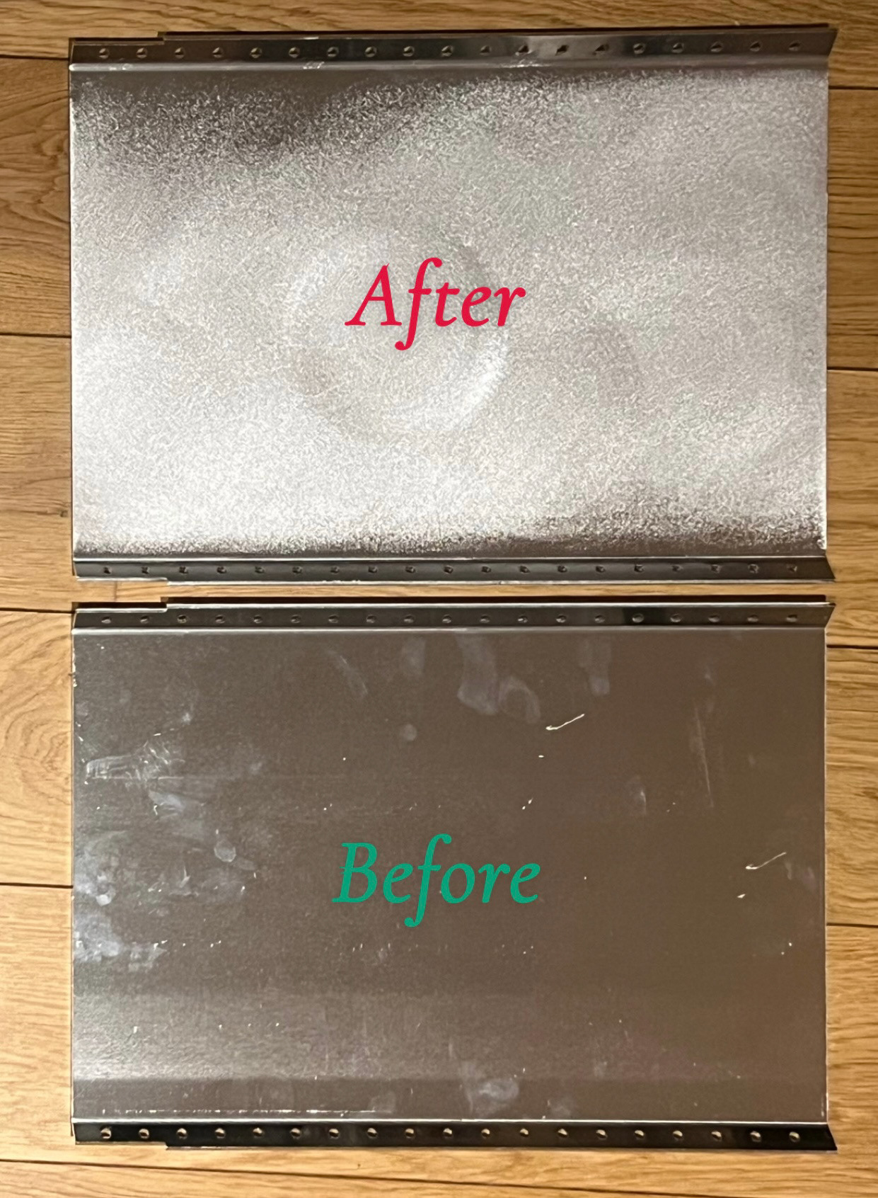
Once I had successfully ground down the top components, I moved on to filing and sanding each piece. I also wanted to experiment with a sanded finish to see if it would enhance the look. I tested this on a damaged piece that was included in the delivery.
As soon as I started sanding, I realised it wasn’t the finish I wanted. The raw aluminium already had a subtle satin sheen that felt much more in line with my intended aesthetic. Rather than waste time trying to achieve an even sanded texture, I decided to leave the pieces in their natural state.
I then focused on filing every edge by hand. I prioritised the components needed for my submission first, as I had a little more time to continue processing the sofa elements later on.
Play-Time
This is my final and favourite part of my projects. As i have made standardised pieces before this time is all about creating new ideas through play. there was the obvious original form but then i started to play with how they could fit together in unique ways.
Reflection
Looking back on this project as a whole, I can confidently say it has been one of the most demanding, yet rewarding, creative processes I’ve undertaken. From the initial concept to the final delivery and assembly, the journey has tested not only my design skills but also my patience, problem-solving abilities, and adaptability.
At the outset, I had a strong vision: to create a modular, flexible framework that could be adapted into different functional forms—tables, shelving units, and seating. The core idea was simple, but executing it was anything but. Every decision I made had to balance aesthetics, structural integrity, ease of manufacturing, and user experience. From material thickness and triangulation to hole placements and tolerances, every detail mattered—and often, the smallest ones had the biggest impact.
I’ve learned that designing in theory and CAD is vastly different from real-world production. One of my biggest challenges was tolerancing. What looked perfect on-screen didn’t necessarily work in physical form. The 1.5mm misalignment may sound minor, but it brought the entire assembly process to a halt. That moment of panic—when I realised my components wouldn’t fit—was humbling. I was forced to think on my feet, communicate clearly under stress, and make pragmatic decisions under immense time pressure.
Another major hurdle was the unpredictability of manufacturing timelines. Despite clear communication and what I thought was a generous lead time, unforeseen delays caused by equipment failures and bank holidays pushed delivery dangerously close to my final deadline. This taught me the importance of over-communicating with manufacturers and building in a buffer period—because once the work leaves your hands, you lose a degree of control.
I also underestimated the finishing process. Burrs, scratches, and inconsistencies in the metalwork forced me to rethink my approach to the overall aesthetic. I went from embracing the raw, industrial look to committing hours of sanding and grinding just to ensure visual and tactile consistency. This experience deepened my respect for finishing work and the level of craftsmanship required to take a piece from functional to refined.
Despite the stress, I’m proud of the way I handled the challenges. I improvised, asked for help when needed, and didn’t let the setbacks completely derail the final outcome. What I ended up with might not have been exactly as I imagined, but it is still a functioning, adaptable system with real potential.
This project has taught me far more than technical design principles. It taught me how to manage expectations, communicate with suppliers, and deal with setbacks in real-time. It taught me about material behaviour, production limitations, and the value of prototyping. It taught me the importance of flexibility—not just in design, but in mindset.
More than anything, it reminded me that design is rarely linear. It’s messy, unpredictable, and often disappointing before it’s satisfying. But it’s through those struggles that the real learning happens. I now leave this project not just with a product I believe in, but with a stronger sense of resilience, better foresight, and a far deeper understanding of what it takes to turn an idea into reality.